For years, my brother, sister and I would take my grandfather to the beach each Sunday. Arriving early to collect him from his eastern-Sydney flat, he would be perched on his balcony with a tea in his hand, admiring the greenery below.
Built in '66, my grandpa’s building was one of the earliest apartment blocks designed by world-renowned Austrian-Australian architect, Harry Seidler.
Like all of Seidler's buildings, my grandfather's definitely has its imperfections: dead spaces, dark corridors and steep stairwells to name a few. But I can't imagine my Paps would have been happier in any other place.
Horizon Apartments in Darlinghurst, Sydney (1990-1998).
The large open-plan living spaces, split levels and north-east facing balconies were bold innovations at the time of its design, and each aided his psychological and physical health right until his final days.
What was important about this building – and any of Seidler's for that matter – was the desire to push engineering boundaries, question planning authorities and pursue modernist design principles in the hope of improving people’s lives.
Harry followed strict architectural principles under the premise that they were egalitarian, optimised function, or would simply create a beautiful building. And while some of his schemes are, today, viewed as design failures (see Blue Point Tower), each was designed upon a set of values which tried - at least - to make Sydney a better place to live... Even if that meant frustrating his clients and local planning officers in the process.
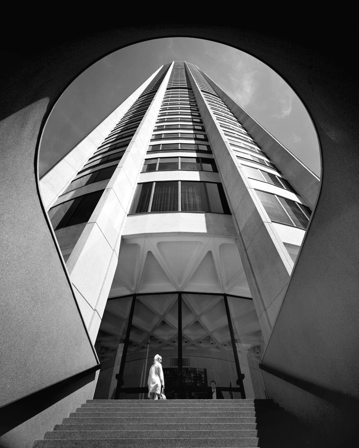
Probably the most iconic Harry Seidler building, Australia Square Tower (1961-1967). Photograph by the legendary Max Dupain.
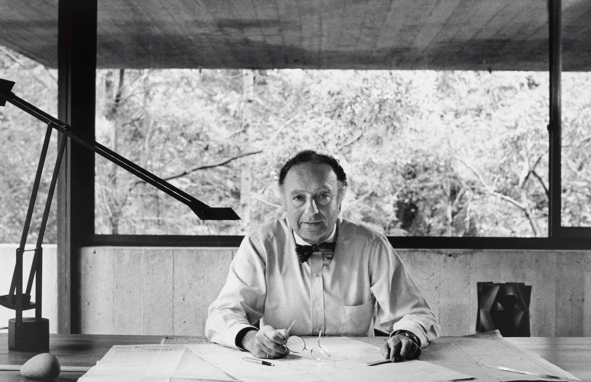
Harry Seidler in his home office. Photograph by David Moore.
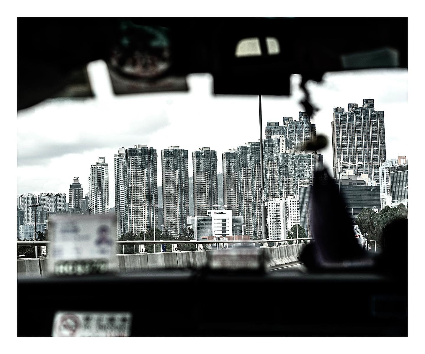
Since returning to the city from London a couple of months ago, I’ve noticed dozens – or possibly hundreds – of new high-rise developments, which resemble something akin to Ikea furniture, rather than architecture. These cookie-cut designs aren’t only badly built, but very little thought has been given to their design. The core principles which were deeply rooted in Harry Seidler's architecture (as well as other great modernists of the 20th Century) have seemingly been ignored.
Aside from the use of bland materials and repetitive form, which is far from inspiring, the structures are often poorly integrated with the existing urban fabric, don't maximise nature or natural light, and contrary to their promised community benefit, their so-called ‘public spaces’ look and feel like private gardens - dissected from surrounding neighbourhoods.
I guess it was Elizabeth Farrelly who put it best, “we used to think '60s apartments were austere and badly built. Now, they appear as paragons of generosity, grace and certitude”
As large-scale residential architecture appears to have creatively stagnated (perhaps as a result of Sydney's muddled planning system), Harry Seidler’s work remains a reminder that this city's tall buildings can be creative, brave and innovative.
More importantly, his architecture is a reminder that buildings are not just a commodity, but should seek – at the very least - to improve a city, and the wellness of the people within it.
