design

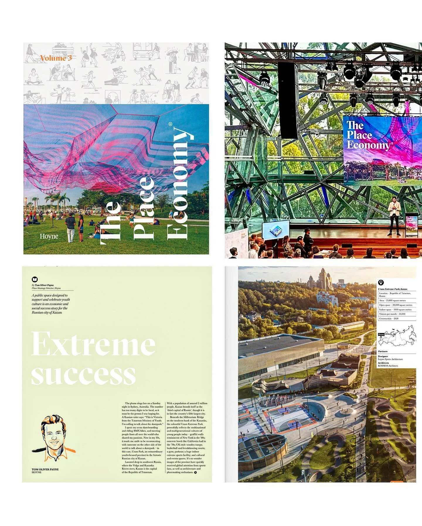
Talking Place Visioning on The Placemakers Podcast by Tom Oliver Payne

Great time chatting with Stephen Burton of POMO on the Placemakers Podcast recently. Summary written by Stephen:

β€œWhat's the relationship between placemaking and property marketing? From a property developer's point of view, placemaking is a often looked at as a way to differentiate their offering in the market. Is there still a role for community in this process? How does it intersect with branding and place visioning? As a leader in this field, Tom helps us understand the way placemaking is defining our privately made public realm.”

Check it out on Spotify here.

Instagram

What would ErnΕ‘ Goldfinger think of Balfron Tower today? by Tom Oliver Payne

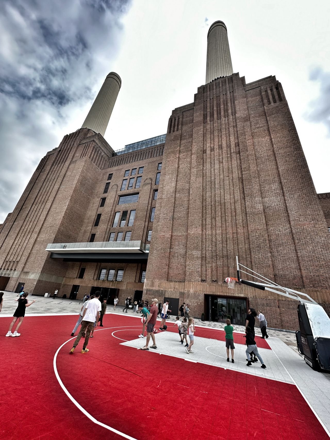
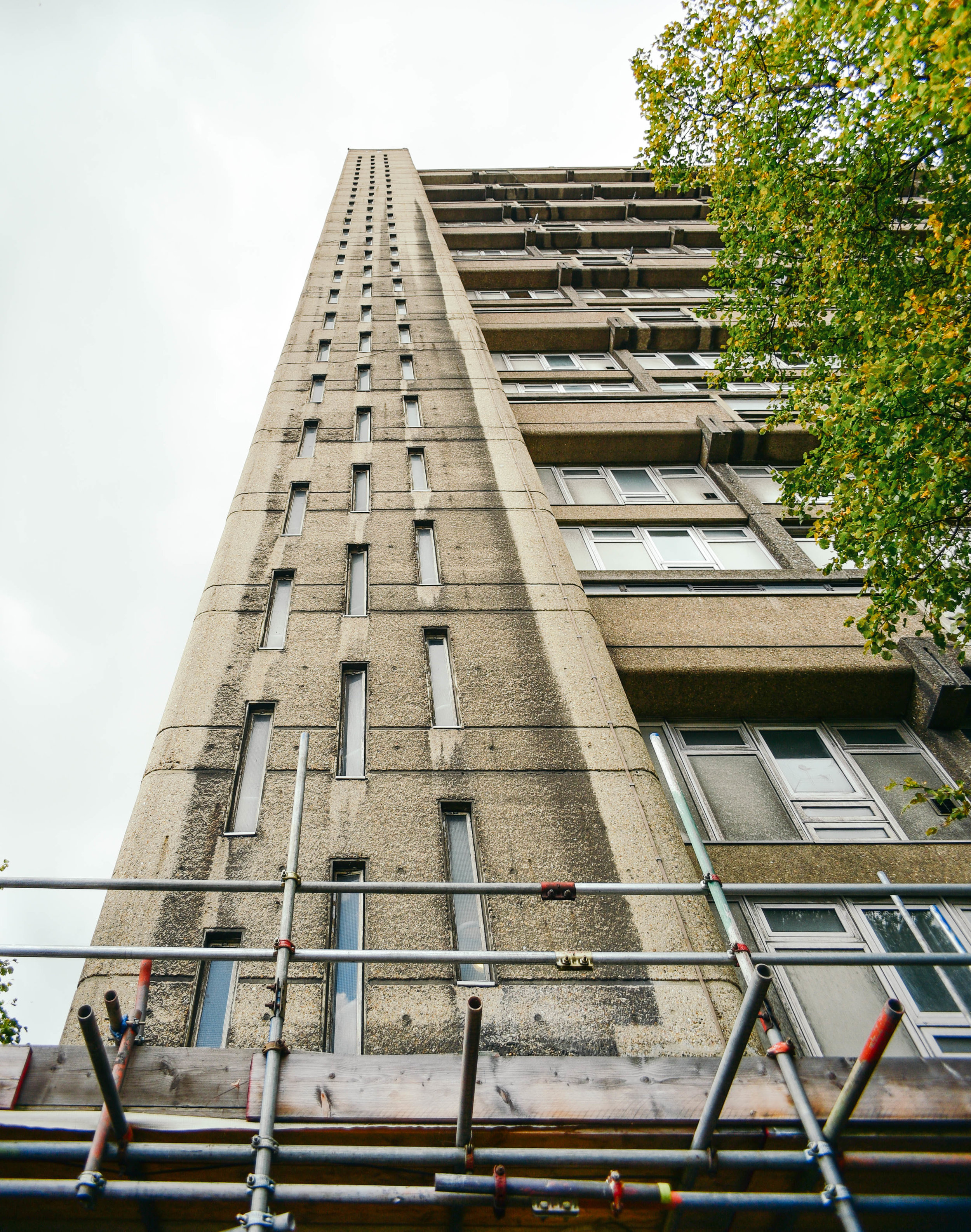
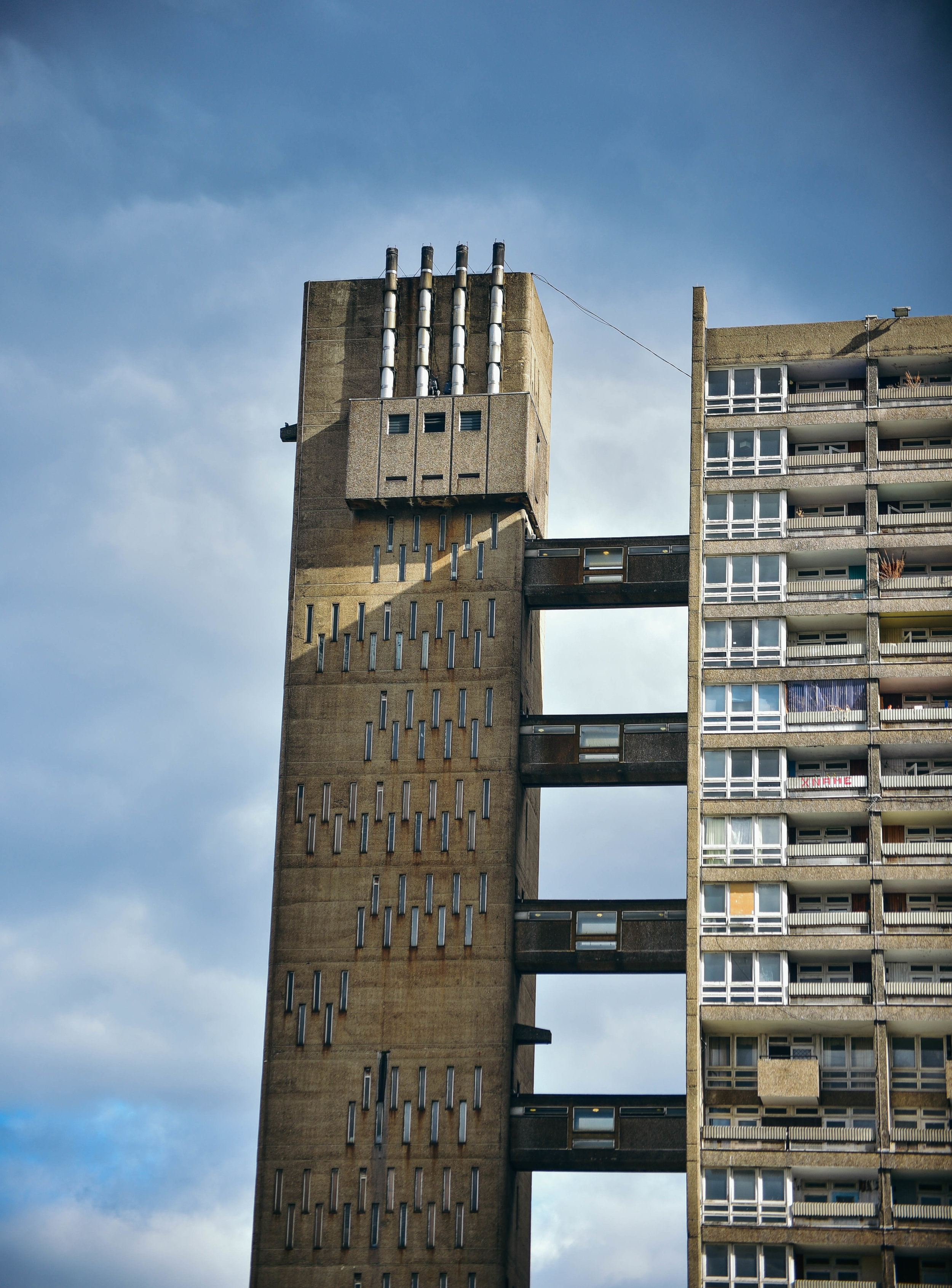
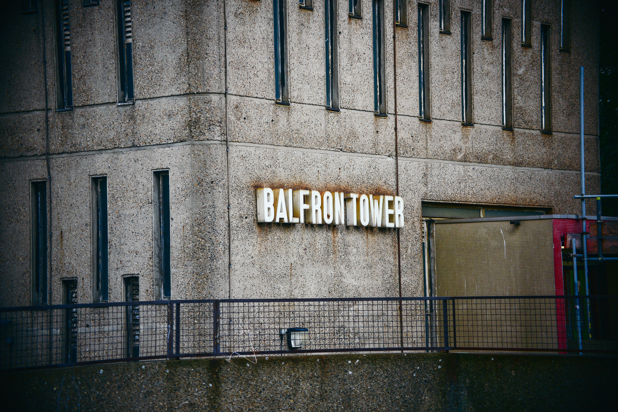
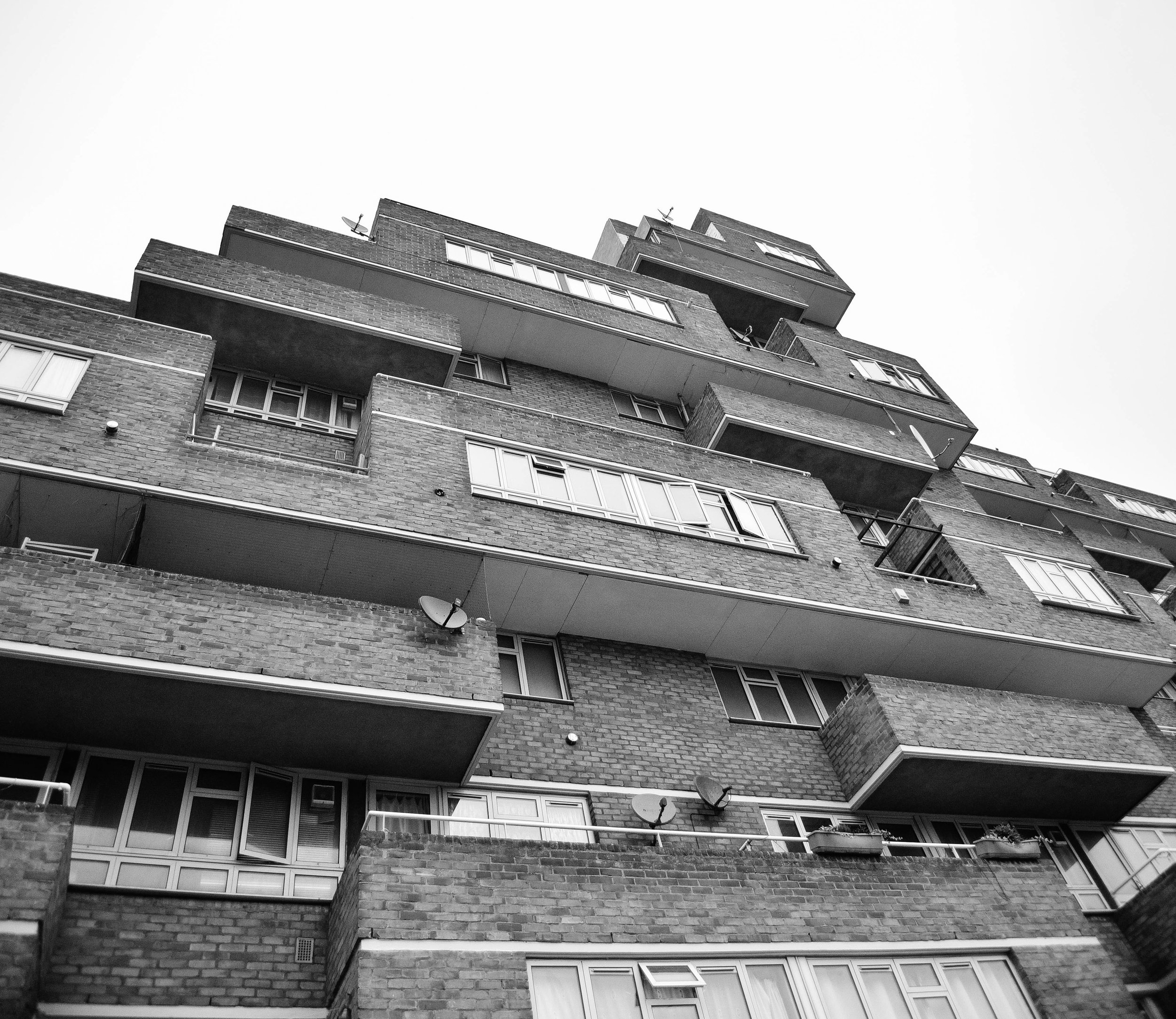
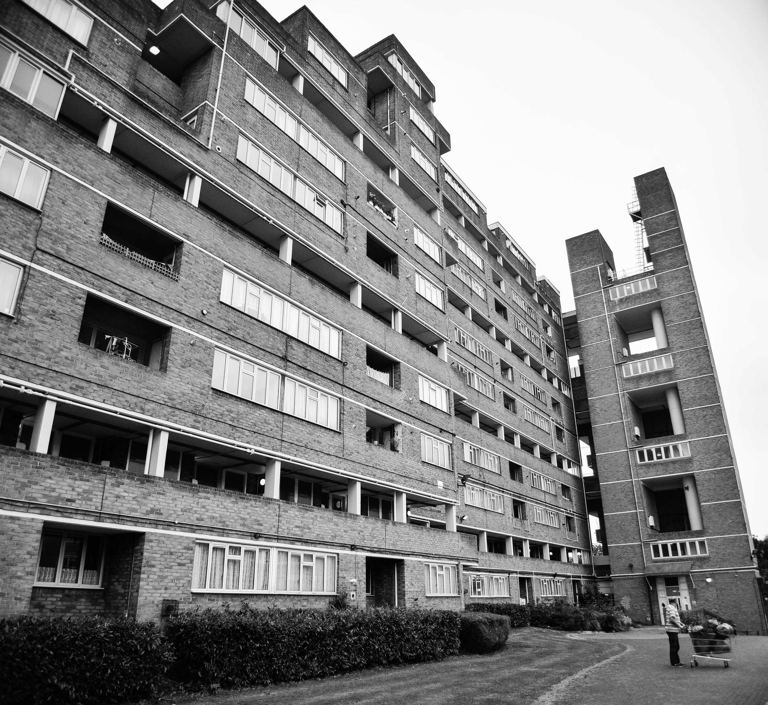
Designed by Hungarian-born architect Erno Goldfinger in 1963, Balfron Tower has become a global icon of brutalist architecture.  

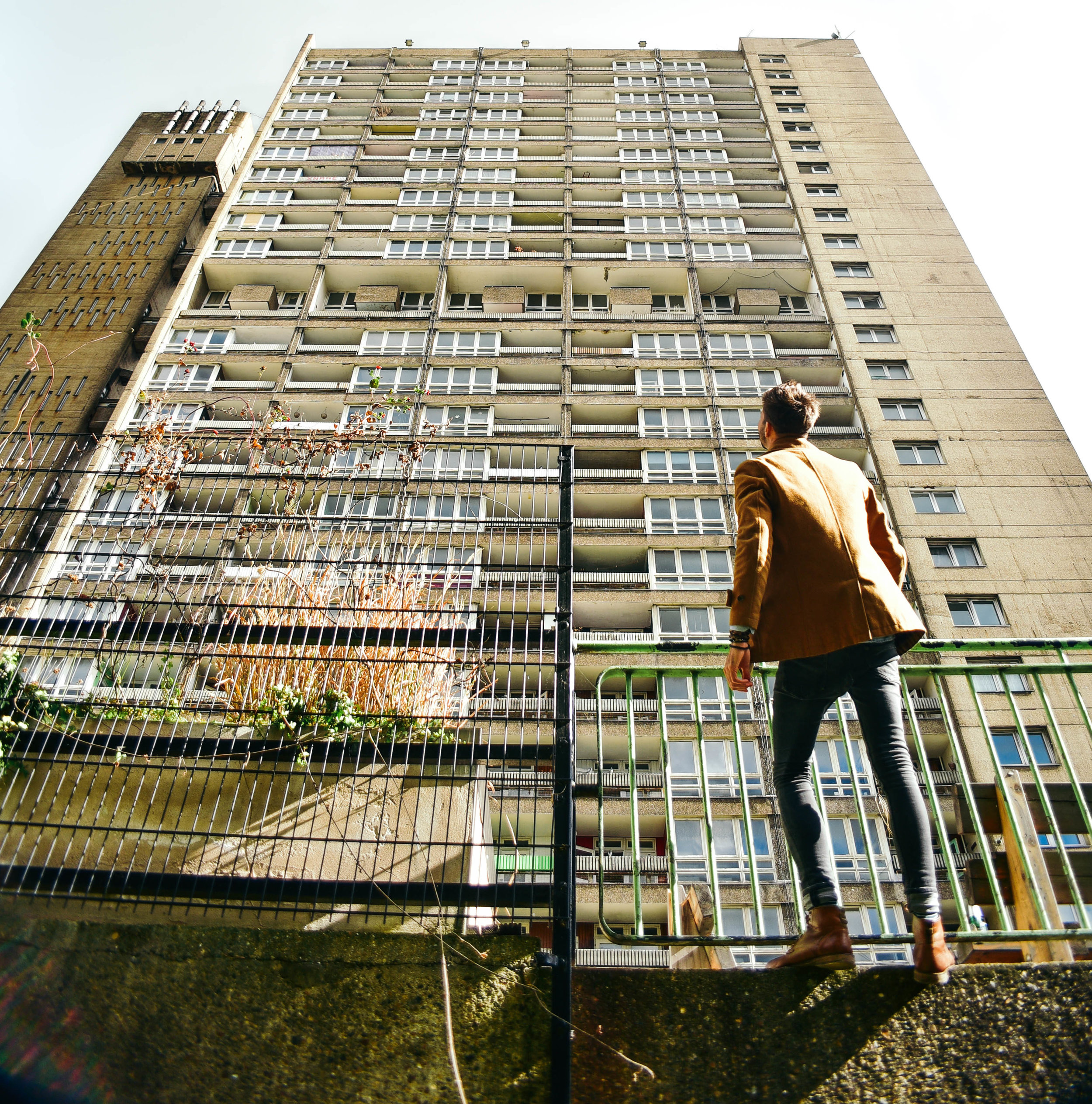
Last week I took off down to Balfron to take some photos. Although slightly smaller than its younger sister, Trellick, standing 26 storeys above East London, Balfron's harsh concrete was visible for miles. 

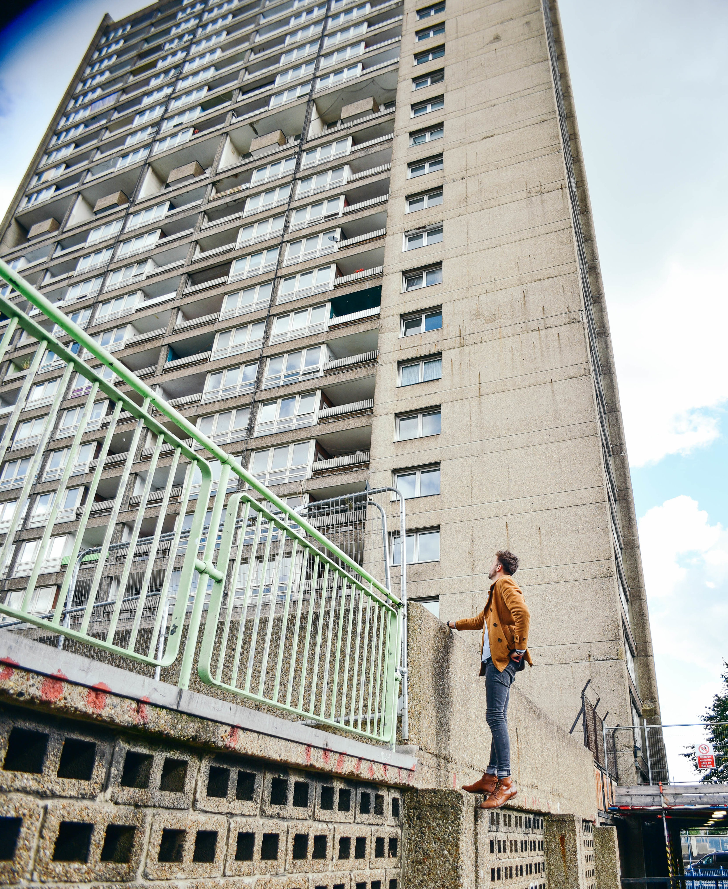
Walking towards the base of the building, the facade overshadowed me like the sheer of a cliff face. But as the building caught glimmers of the morning sunlight through the patchy clouds above, I became very aware of the elegant sophistication of Goldfinger’s design.

Stood taking photos of the towering monolith above, a man yelled, β€œwhat’s the intrigue!?” Sensing he was a pissed off resident, I gave him a simple answer, hoping he would move on. Staunchly walking towards me, he asked again, β€œwhat is the intrigue?”

Realising that this guy wasn’t about to just walk away I decided to open up explain to him exactly why I was there. I told him of my interest in Erno Goldfinger’s architecture and why I wanted to take photos of this building in particular.

It didn’t take long before the man’s tone of voice lifted, and his demeanor calmed. Suddenly all he wanted to do was tell me of his love for Balfron. As it turns out, he’d lived in the building for 25 years and was now the last social tenant before its sale to the private sector

He told me about the ensuing court case for his eviction, which was bound to come to close in the following weeks. The volume of his words increase as he explained his frustration at the powers and processes above him, this clearly wasn't the first time he'd told someone his story. 

For over 50 years Balfron had housed hundreds of families across 146 affordable housing flats. Now, 145 homes sat empty, and he was the last man standing.

β€œYou wanna come check it out from the inside?” he asked.

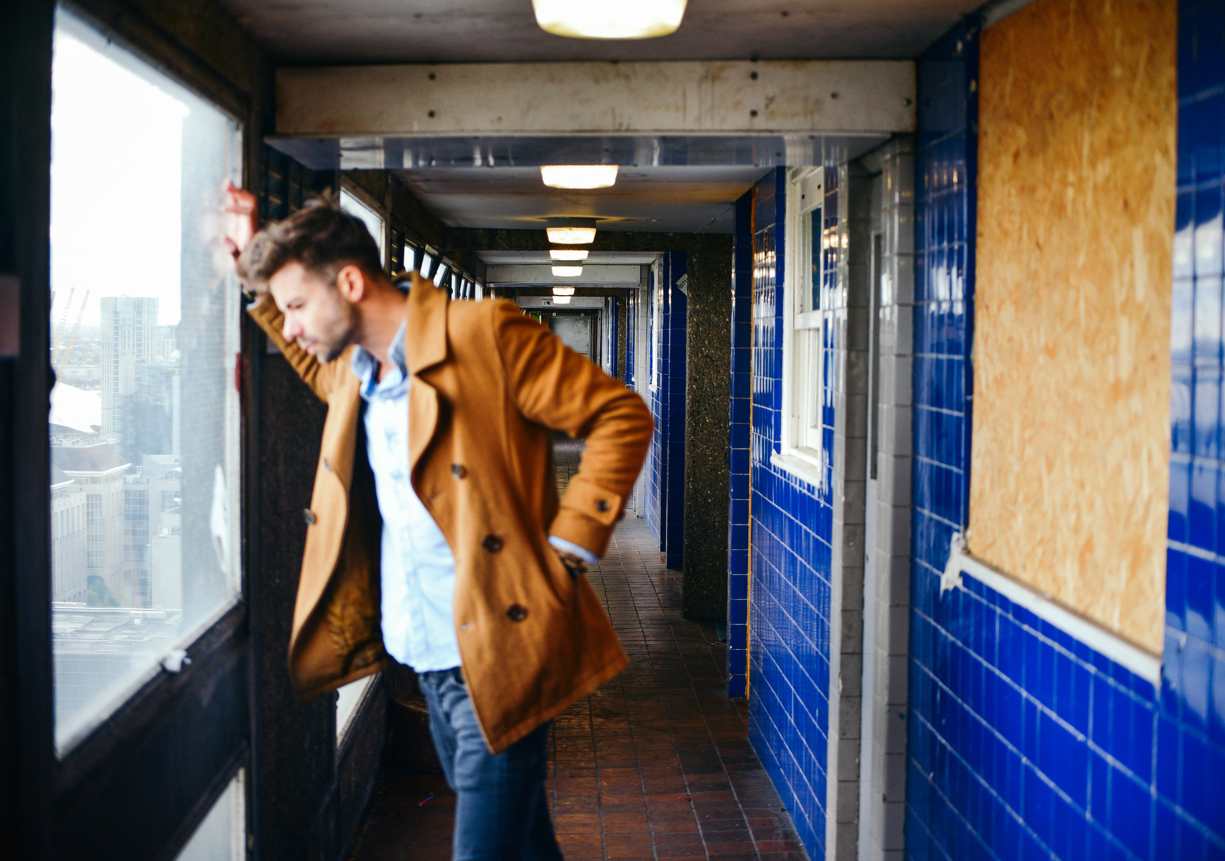
Minutes later we were sneaking behind security and shuffling into the building’s stainless steel elevator. Creaking up to level 26, and stepping out onto the grey, concrete flooring, I was immediately overwhelmed by smells of booze and urine. Fortunately for us the breeze from the awning-hinged windows helped to disperse the smell through the corridors.

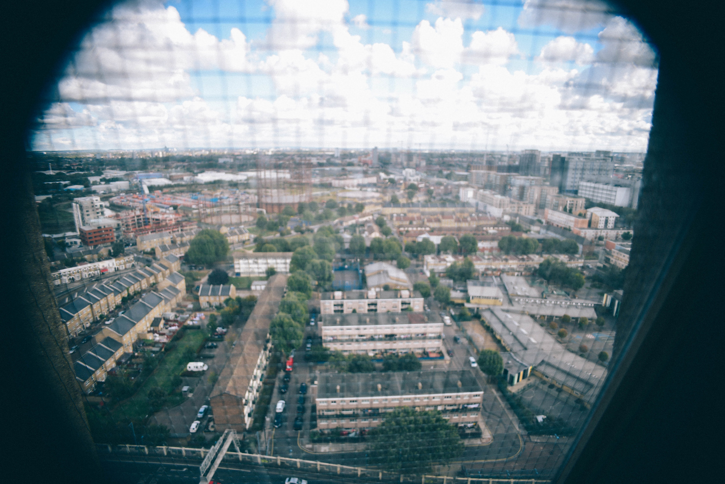
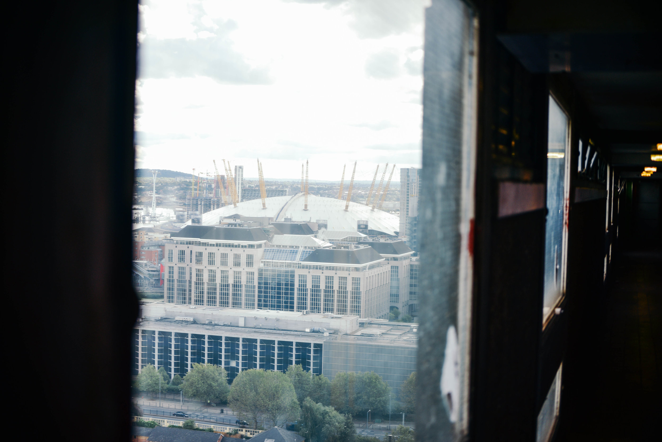
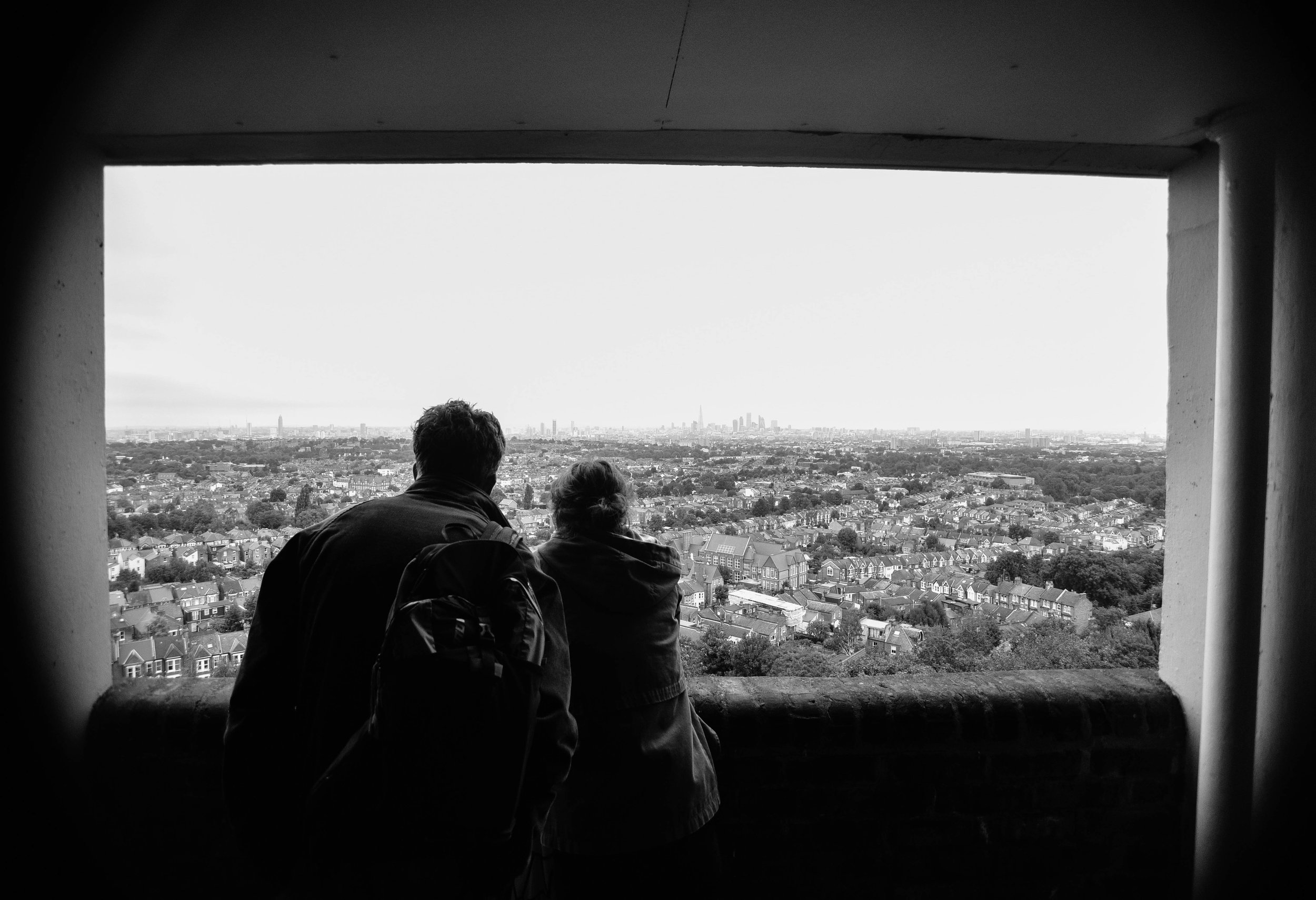
Peering through the horizontal pattern of windows, the view from the top was incredible: Poplar sat quietly below, the city skyline loomed in distance.

As I walked down the long corridors I imagined Erno’s ambition for β€˜streets in the sky’, where working class neighbours would socialise and kids would play games. It was too bad, bottles of half drunken bottles of beer and empty NOS canisters now lined the passageways. 

After sometime upstairs, it was a relief to break back into the autumn sunlight. I wondered if I could ever live in a dark, concrete tower like this one. For while I could understand Erno’s ambitions, I could also appreciate where his design concepts had failed

In fact, when I first arrived in the UK, I thought brutalist buildings were disgusting. Having grown up in sunny Australia where there's an abundance of low-rise bungalow-style architecture and spacious streetscapes, I often wondered why London’s huge concrete 'ghettos' hadn’t been ripped down and replaced with something more attractive. But over the years, and after some reading, I began to appreciate the ethos behind their design.

Mainly a reaction to the housing crisis following World War II, this form of architecture attempted to help London’s homelessness by creating large, affordable buildings within accessible inner city areas.  While in reality these concepts didn't always work, the ethos - at least - was admirable. 

Balfron's last remaining social tenant is likely to be removed by force in the coming weeks. With few places to go, he told me he will likely be pushed outside of London altogether.

In cities across the world, a lack of affordable housing is forcing young people and those on low incomes to look for housing alternatives. Many are moving out of the cities that they love, whilst others are feeling the impacts of living in a 'rental trap'. 

As the last social tenant is forced-out of one of the world's most famous brutalist buildings, I wonder what Erno Goldfinger thinks of his building, and architecture, today? Would he be ashamed that we now completely ignore the socialist principles of the brutalist era?

I would never suggest that contemporary designers should copy Balfron Tower, or even brutalism, as a concept. But the ambition of its developers, and their architectural boldness, would be something to emulate. 


Photographs by Dan Young & Tom Oliver Payne.

INSTAGRAM


Dawson’s Heights: architecture with social conscience by Tom Oliver Payne

Architecture today is generally about making other people big bucks. But Dawson's Heights  reminds us of a time when architecture strived to create a better society through design. 

Land development today basically works like this: an investor will buy a plot of land, they then hire a developer with a track record of maximising value who will in turn hire architect who knows how to maximise floorspace. For the sake of profit, all parties will hope construction is over and done with as quick as possible, and each bit of land will sell for maximum value. Job done. 

But before you call me a pessimist, let me iterate that I don't necessarily think this process is all a bad thing. This process is simply a reaction to our economic market and continual development profits ensures a pipeline of construction and as a result, people - from construction workers to web designers - have jobs. 

Unfortunately however, development is too often, too greedy. Due to the speed and aggression of investors and developers, new buildings and spaces often lack quality design or a social conscience. What we are commonly left with is architecture with few zero-to-no societal benefits, doing nothing more than providing the mega-wealthy some real estate to dump their cash. Property has become more concerned with international asset management rather than the provision of housing or the creation of communities. 

Clearly, we've seen a recent swing towards capitalist-dominated architecture. But it hasn’t always been this way. 

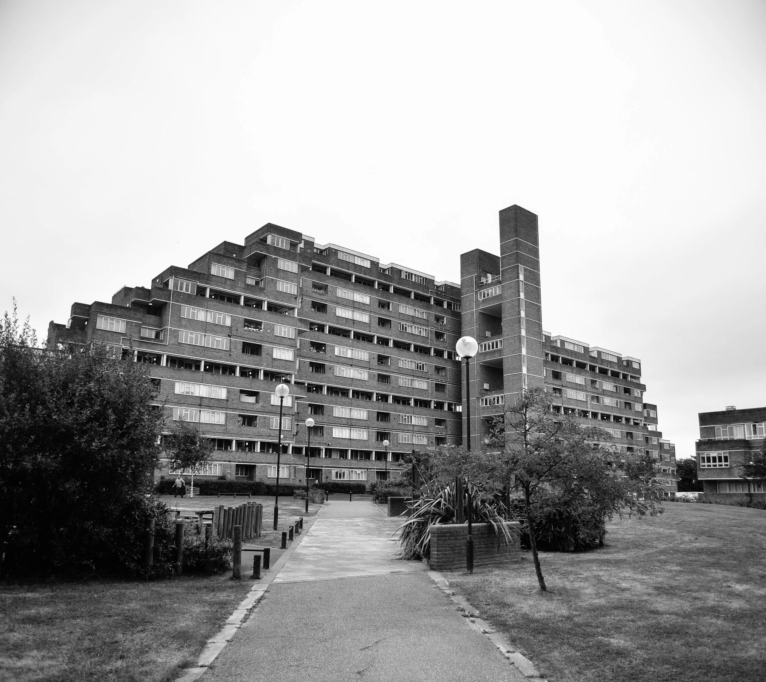
Dawson's Heights' northern block seen from its central public space.

Dawson's Heights' northern block seen from its central public space.

Back in the 60s, architecture in London operated in a very different context. Emerging from the Nazi bombings of World War II, the city was battered and bruised, and thousands were homeless or living in slums. The government took it upon itself to deliver tens of thousands of homes every year through mass redevelopment projects.

While often criticised for their top-down approach to design, no one can argue that they were’t at least ambitious, and at most, incredibly bold.

The Barbican Centre, Trellick Tower and Balfron are some of London’s most famous examples. These brutalist monuments are remnants of a past when - although they didn’t always get it right - architects could at least attempt to solve social problems through creative design. 

Not all of the examples from this time were dominating brutalist buildings. Some were smaller incisions in the existing urban fabric such as Golden Lane Estate, and others were modernist creations which boldly - but appropriately - inserted themselves into the remains of pre-war London.

Last week London opened its doors for Open House 2016 and I had the opportunity to check out one of the most impressive examples. 

A view worth millions: looking from the northern block of Dawson's Heights.

A view worth millions: looking from the northern block of Dawson's Heights.

In 1964, at just 28 years old, architect Kate Macintosh was given the job of designing Dawson's Heights in south London. 

Working for the Southwark local authority, Kate was given a job which today is almost unthinkable - the freedom to design new London housing on a large plot of vacant land. With strongly socialist parents and a clear drive to help generate social justice through architecture, Kate was given the opportunity to deliver a scheme which would stand the test of time.

Clearly, it has. 

Decades later Dawson's heights is now considered 'one of the most remarkable housing developments of the country'. 

As I walked through Dawson's Heights' many street-like corridors, and entered into its beautiful modernist flats, it was clear to me that this building was designed with a different agenda compared to developments today.   

It was built with a genuine ambition to create a community, and a more just society. Every decision that Kate made had logic to it: blocks were oriented to increase sunlight to  flats, room arrangements were such that every flat had a balcony, levels were split to improve acoustics, and the building's form and massing ensured an abundance of green space and views across the city from its public corridors.

Whether through a change in political-will or a shift in the behaviour of our markets, architecture may re-emerge as a discipline which seeks to fix societal problems. 

Until then, at least we have reminders from a time when it did. 

If you're interested in exploring London's most incredible buildings, be sure to check out Open House 2017

INSTAGRAM


The best of Oslo's new architecture by Tom Oliver Payne

One of my favourite bars in London is called 'Oslo'. It has a super clean design and generally nice aesthetic and it's always filled with really good looking people... I guess the main reason I travelled to the real Oslo last week is because I figured it would be a bigger version of that bar.

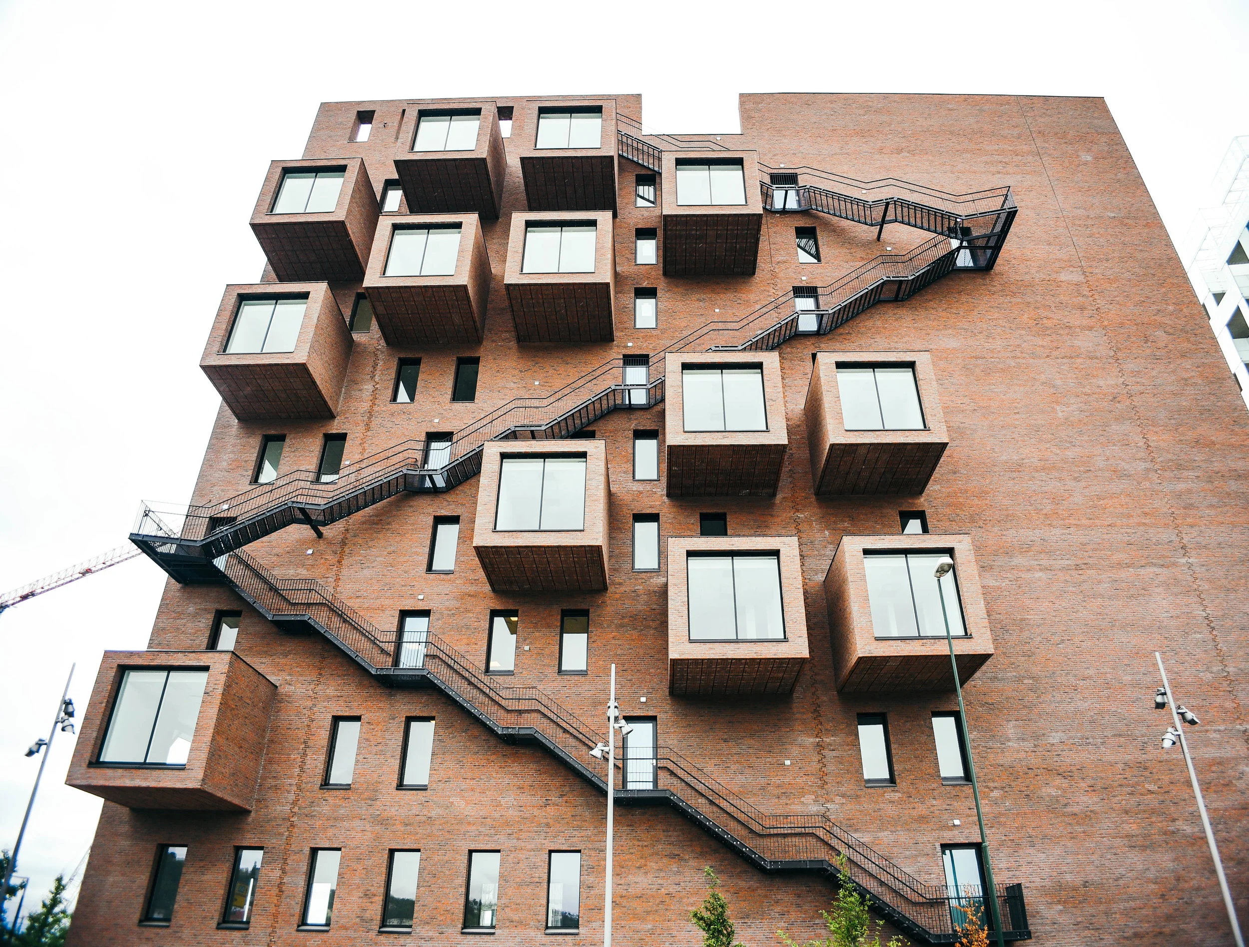
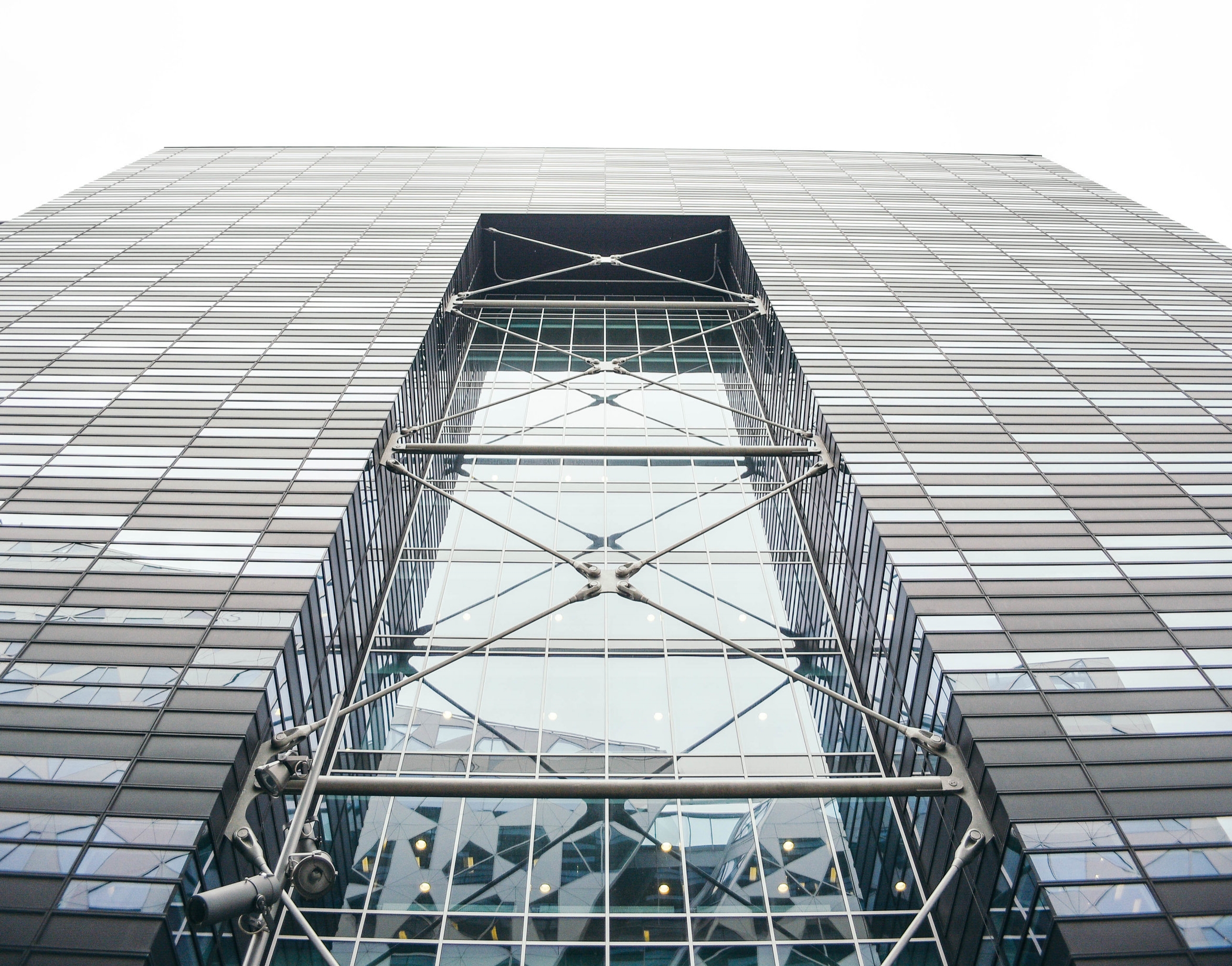
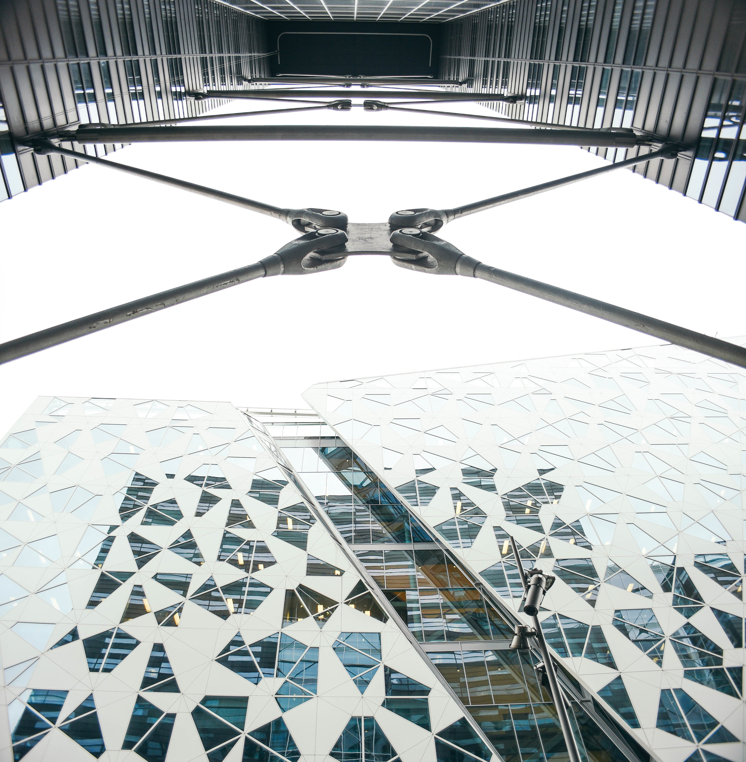
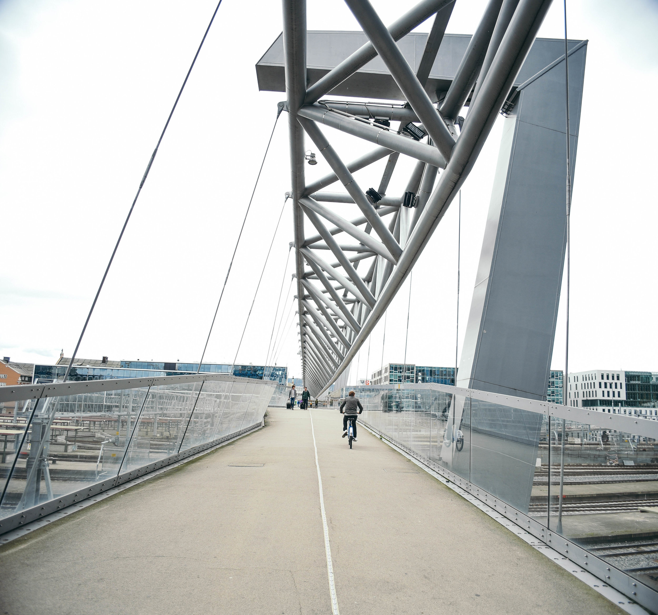
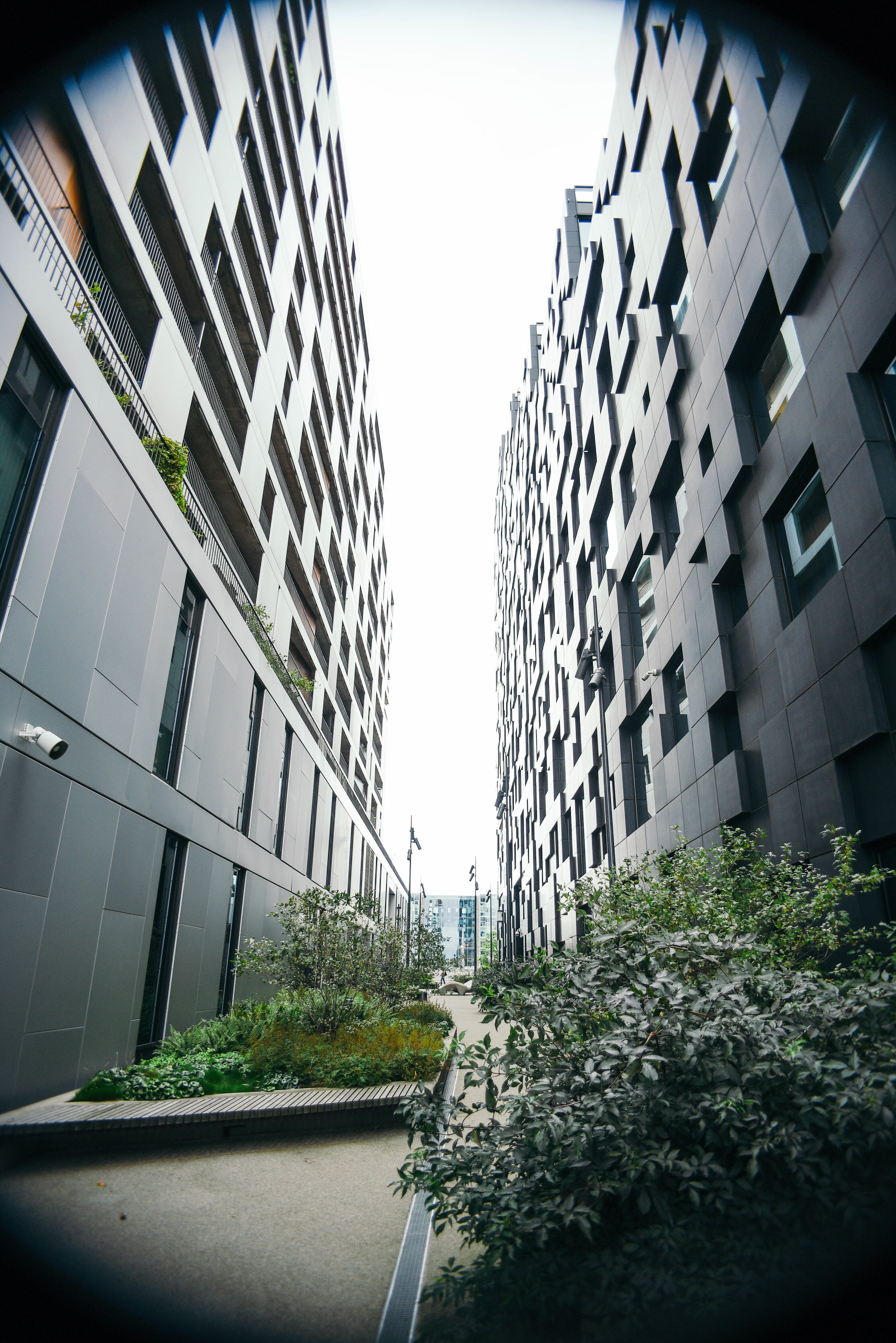
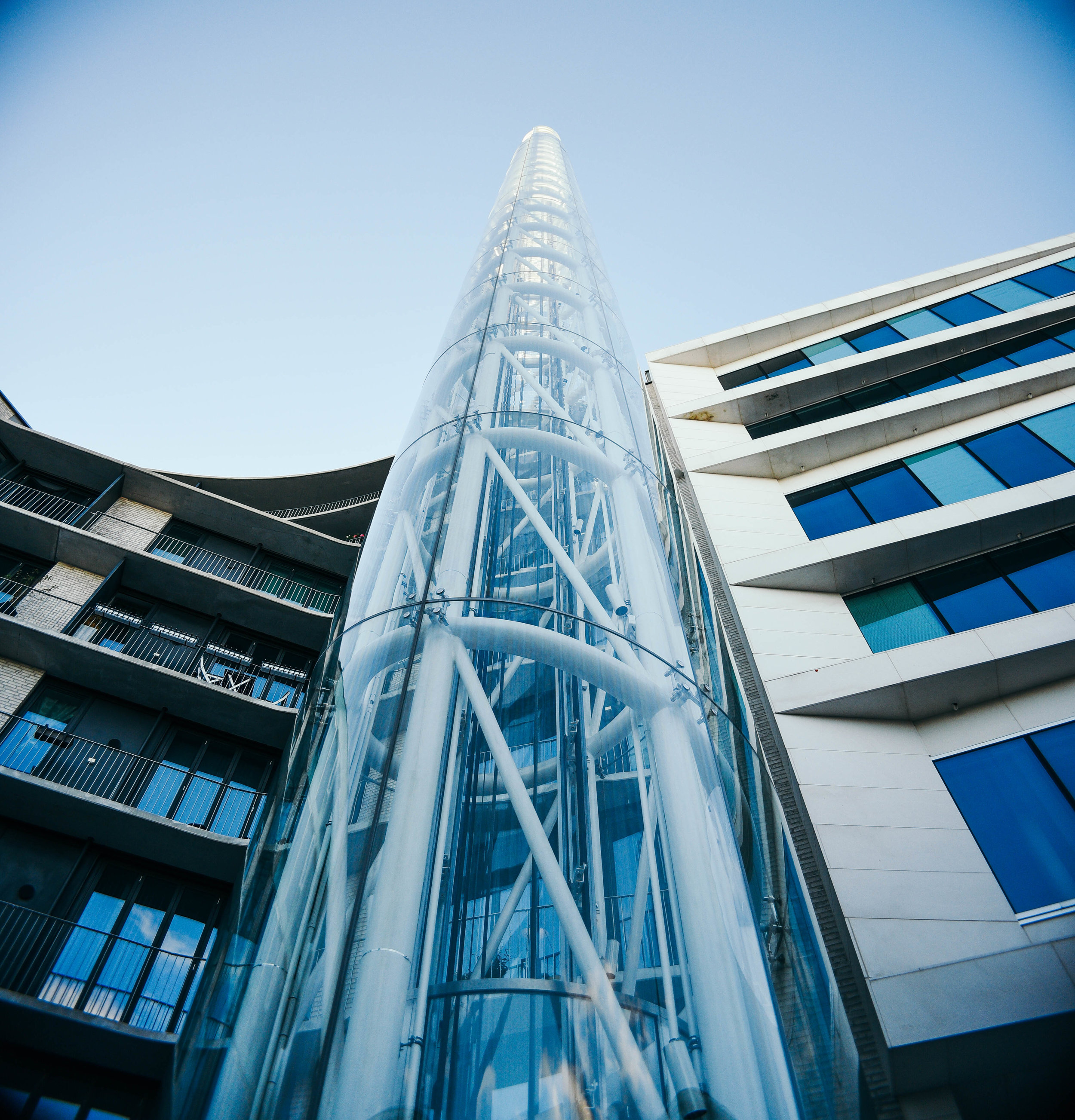
While both of these expectations were surpassed, the city's sense of design in particular, far exceeded my predictions. When I stepped out at Oslo Central Station, I found myself surrounded by incredible new buildings encompassing a mix of interesting shapes and sizes. But of course, all details finished with a subtle air of elegance. In true Nordic fashion. 

After two decades of financial growth and a thriving arts and cultural scene, the city is drawing in buyers and investors from around the world. And fortunately (unlike many cities), they're working with some of the best designers to show off their ideas. 

With half the waterfront still under construction, it quickly became clear to me that Oslo is experiencing an architectural explosion. 

Here are my three favourite contemporary architecture projects in the city.

The Barcode Project

The Barcode Project is a huge area of redevelopment along the edge of Oslo's waterfront. Full of mixed-use high rise buildings, it's home to incredible designs by some of Scandinavia's best architects. 

From west to east, its main buildings include PriceWaterhouseCoopers Building by A-lab Architects, the Kommunal Landspensjonskasse Building by Solheim & Jacobsen, the Deloitte Buidling Building by SnΓΈhetta, Visma designed by Dark Arkitekter and DnB NOR from MVRDV Architects. In addition to these, Barcode includes loads of buildings and hundreds of apartments with designs that architects in many cities around the world are rarely given the creative freedom to explore.

With the tallest heights in the city and over 20,000 of development, the Project has changed the face of Oslo. Suddenly the city does not just sit flat along the water's edge, but this impressive cluster of beautiful towers is now attracting residents, visitors and businesses from around the world. 

THE OSLO OPERA HOUSE (OPERAHUSET)

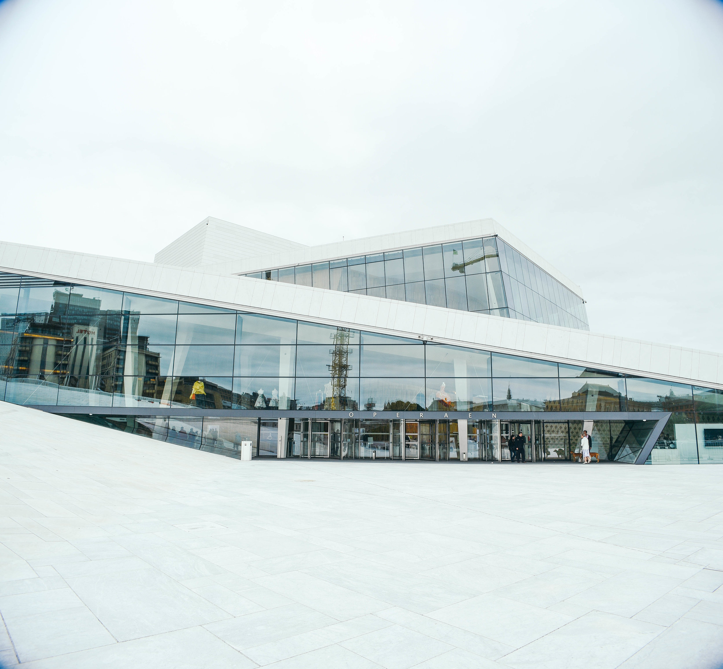
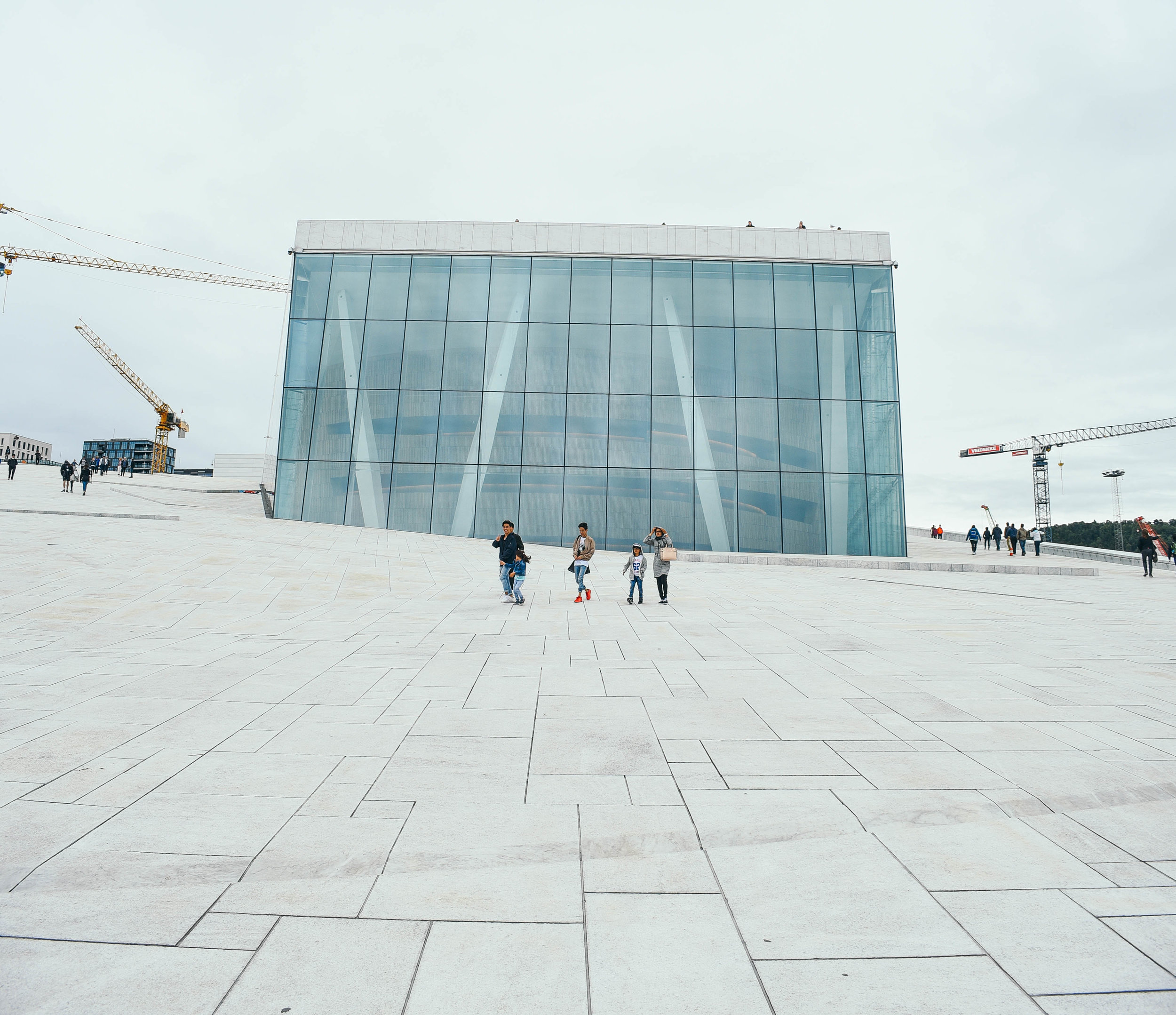
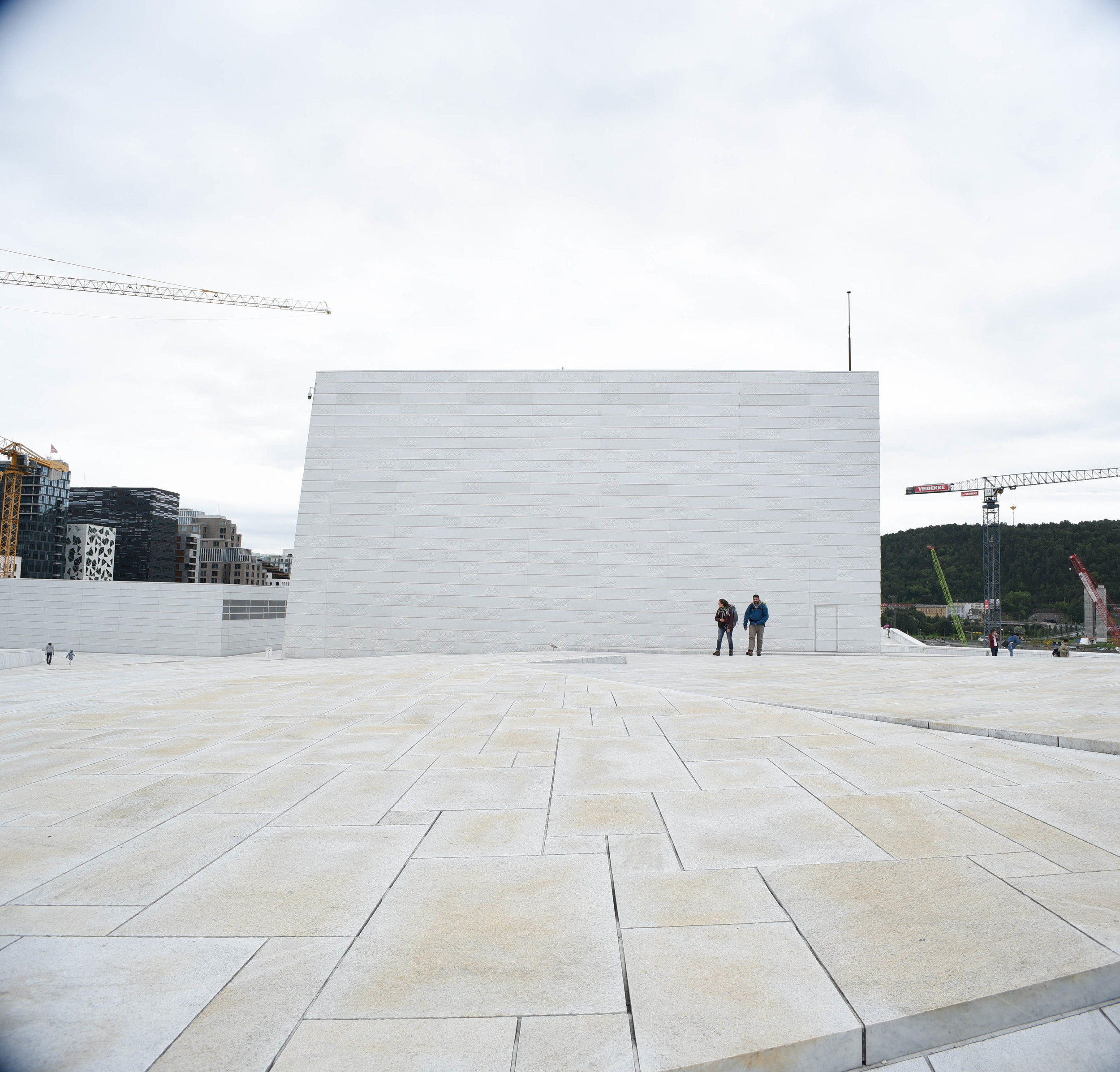
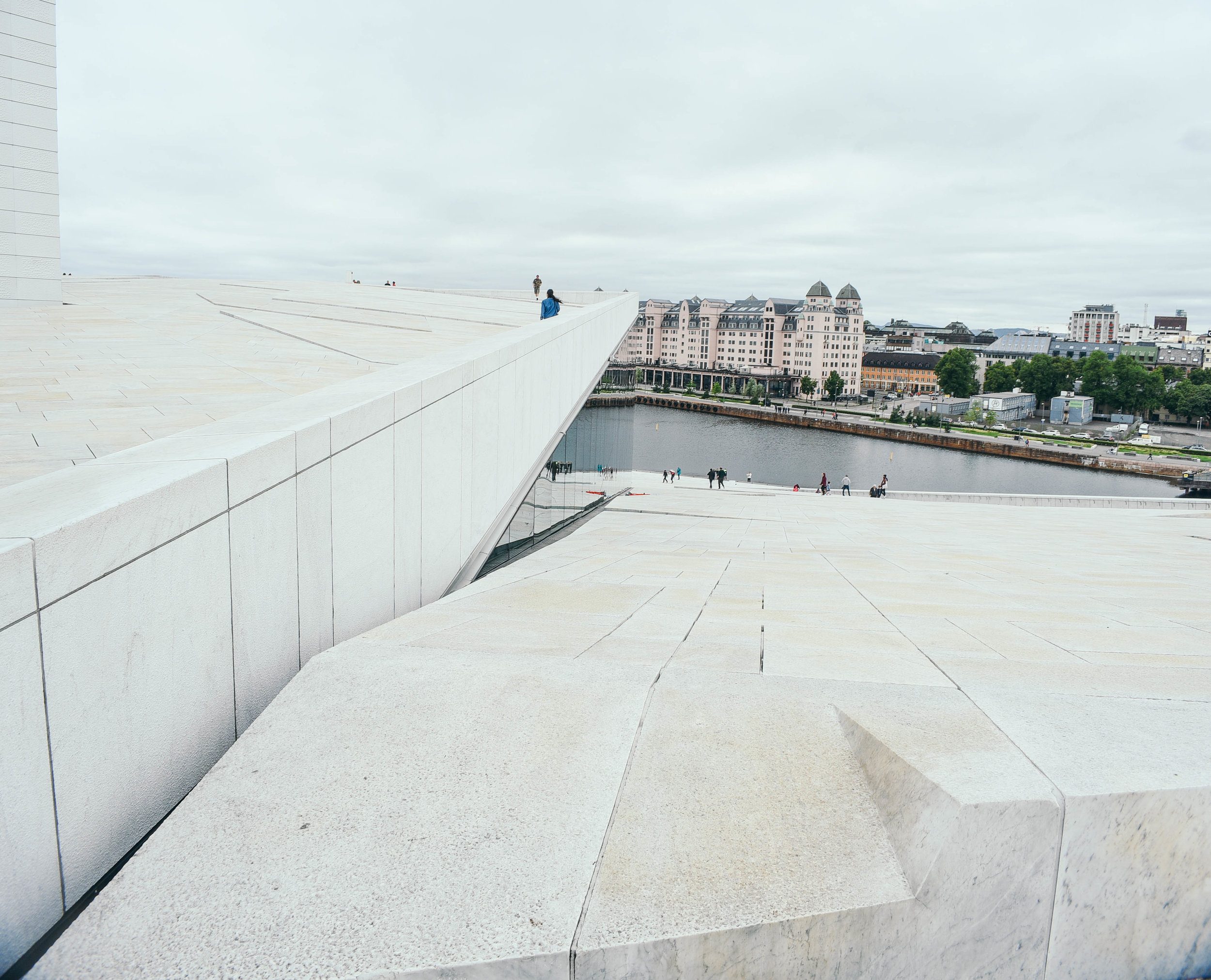
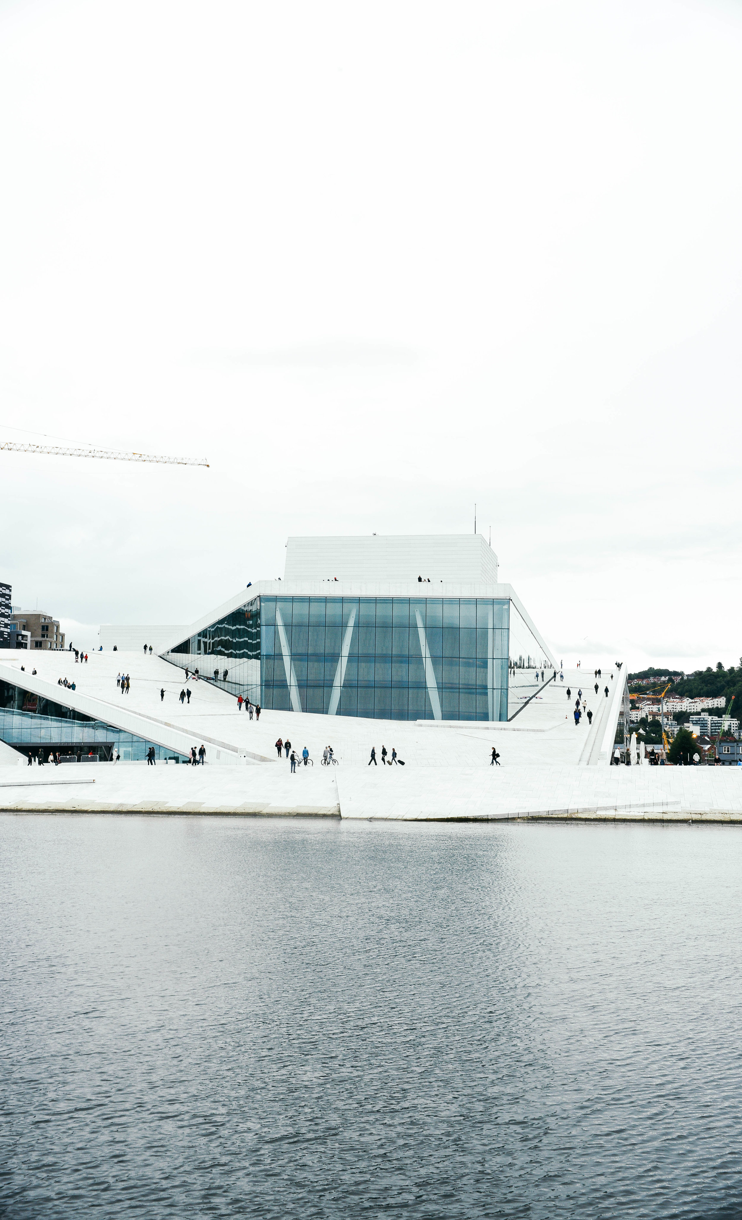
Designed by SnΓΈhetta and opening in 2008, the Oslo Opera House is the home of Norway's National Opera and Ballet. Located just across from the Barcode Project, the building has helped to completely transform this part of the city. 

Made up of 1,100 rooms and with a main stage which can seat 1,364 people, the Opera House is the largest cultural building in Norway since 1300 - finally taking out Trondheim's Nidaros Cathedra as the top-dog. 

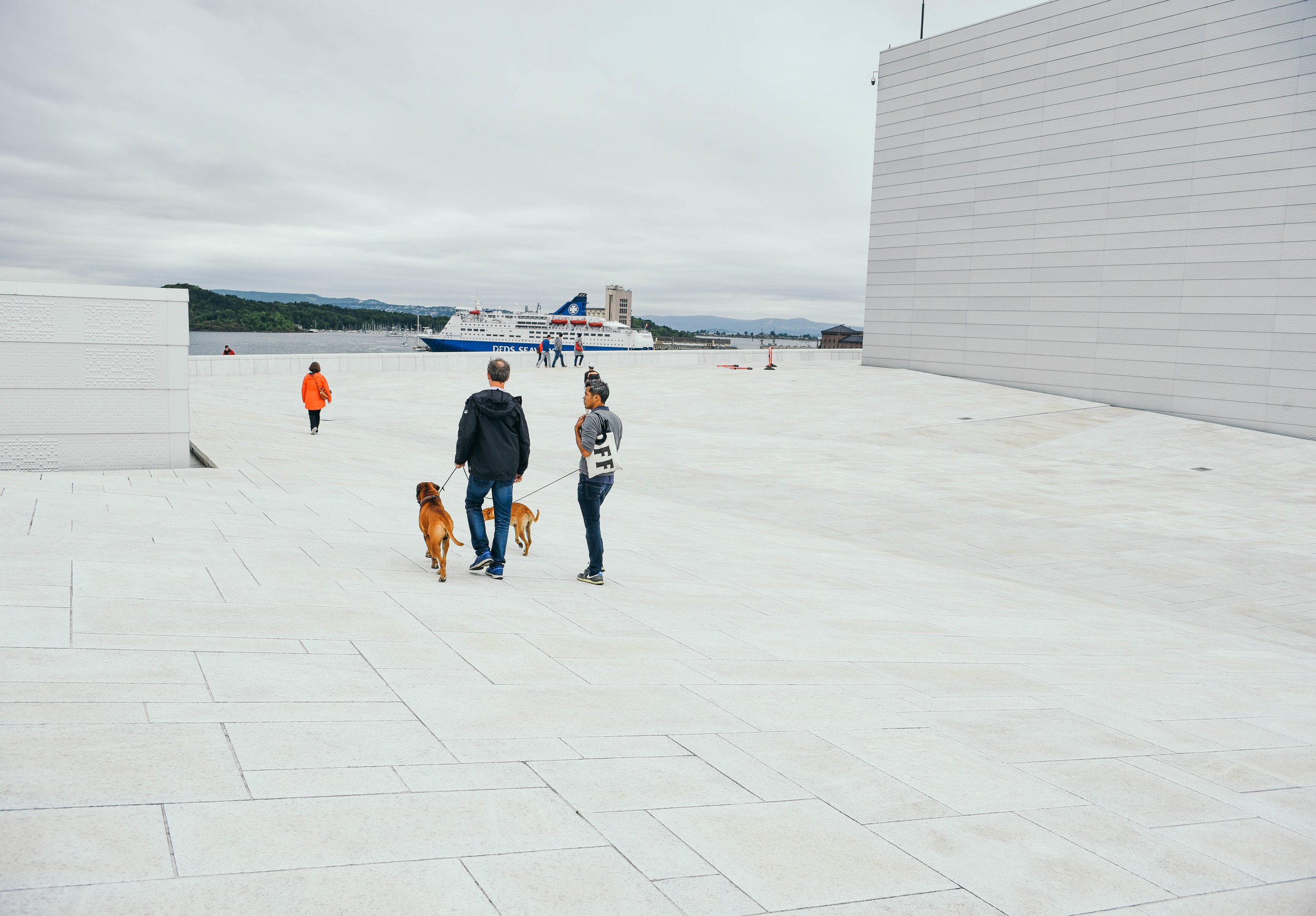
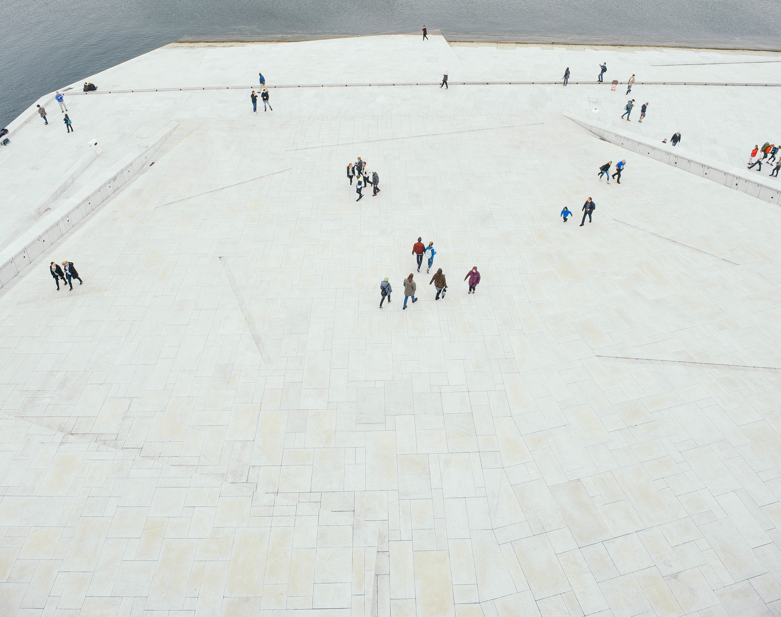
But what I found even cooler than the size or extravagance of the design, is how the building has created an entirely new public urban space for people to check our views of the city. With two sloping ramps on either side of the building, pedestrians are invited to walk onto the rooftop to make the most of this reclaimed section of the harbour.

In addition, its beautiful white materials and clean shapes make it an awesome place for film and photography. While I didn't check out any shows on my visit, I can only imagine the internal auditorium is pretty cool too. 

Tjuvholmen

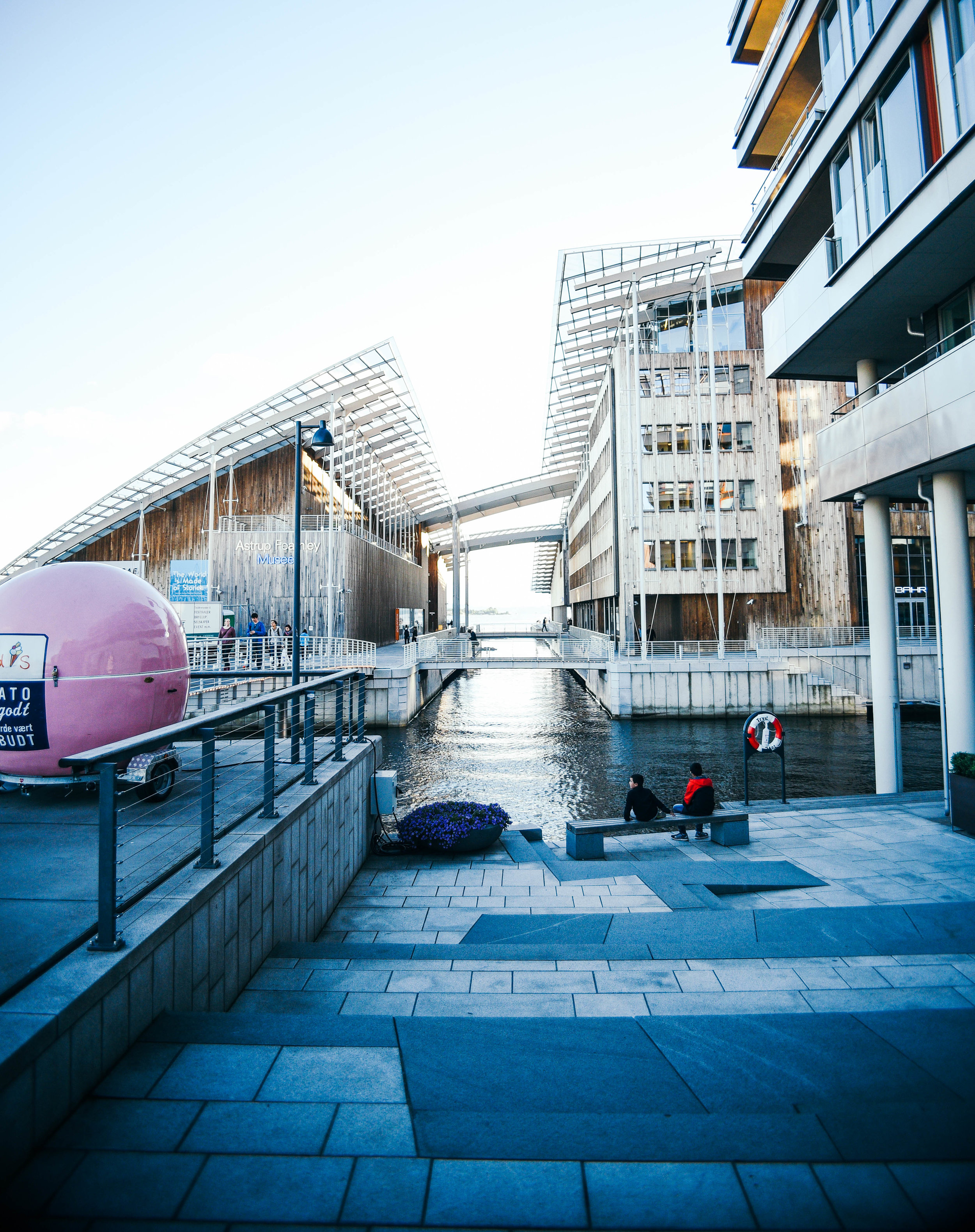
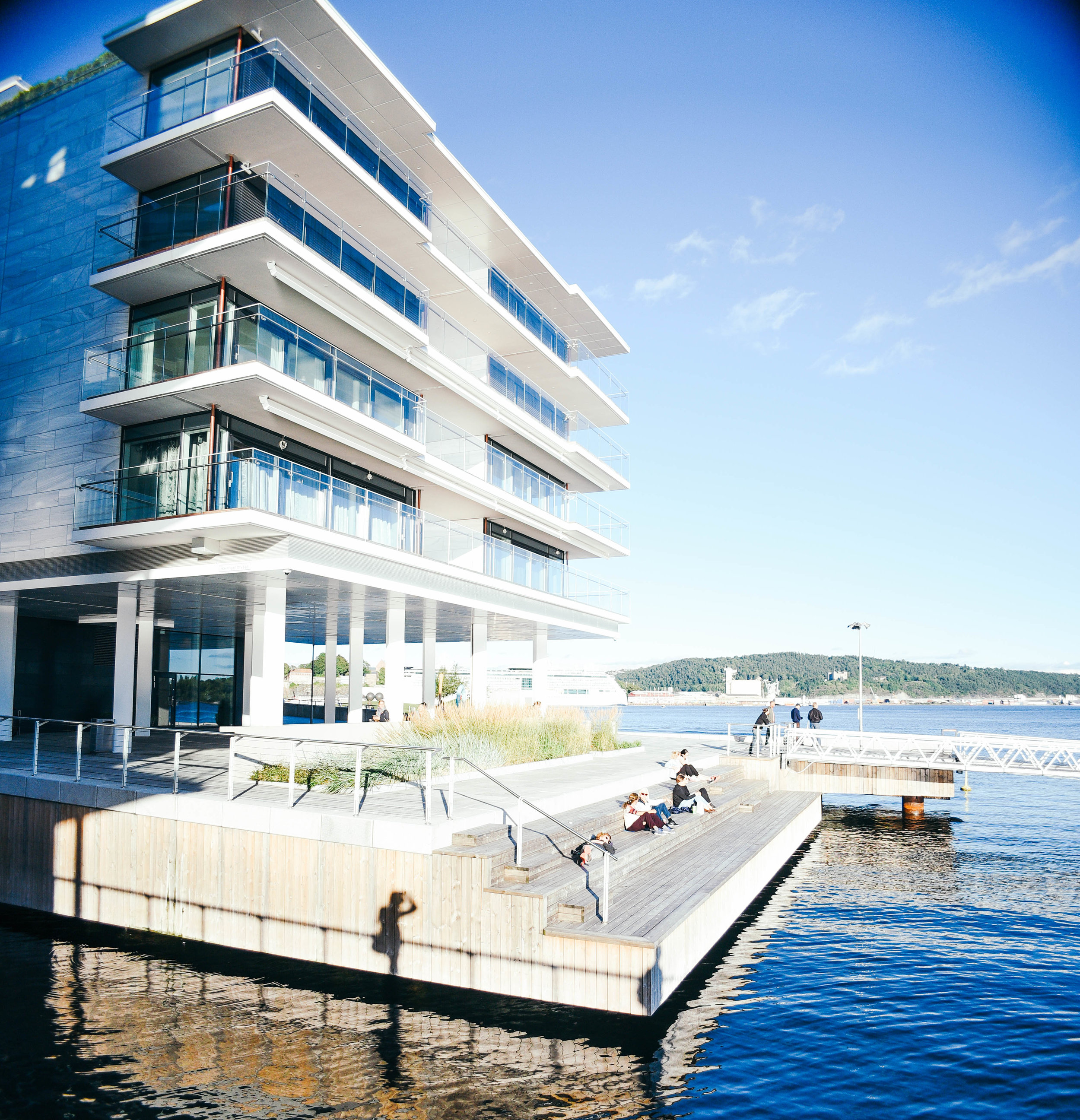
Once only 5 hectares in size, Tjuvhomen was increased to 33 hectares in the early 1900's to be used as a docking area for ships. After years of disuse the area was bought by private landowners, and since 2005 has been the centre of a huge urban renewal project.

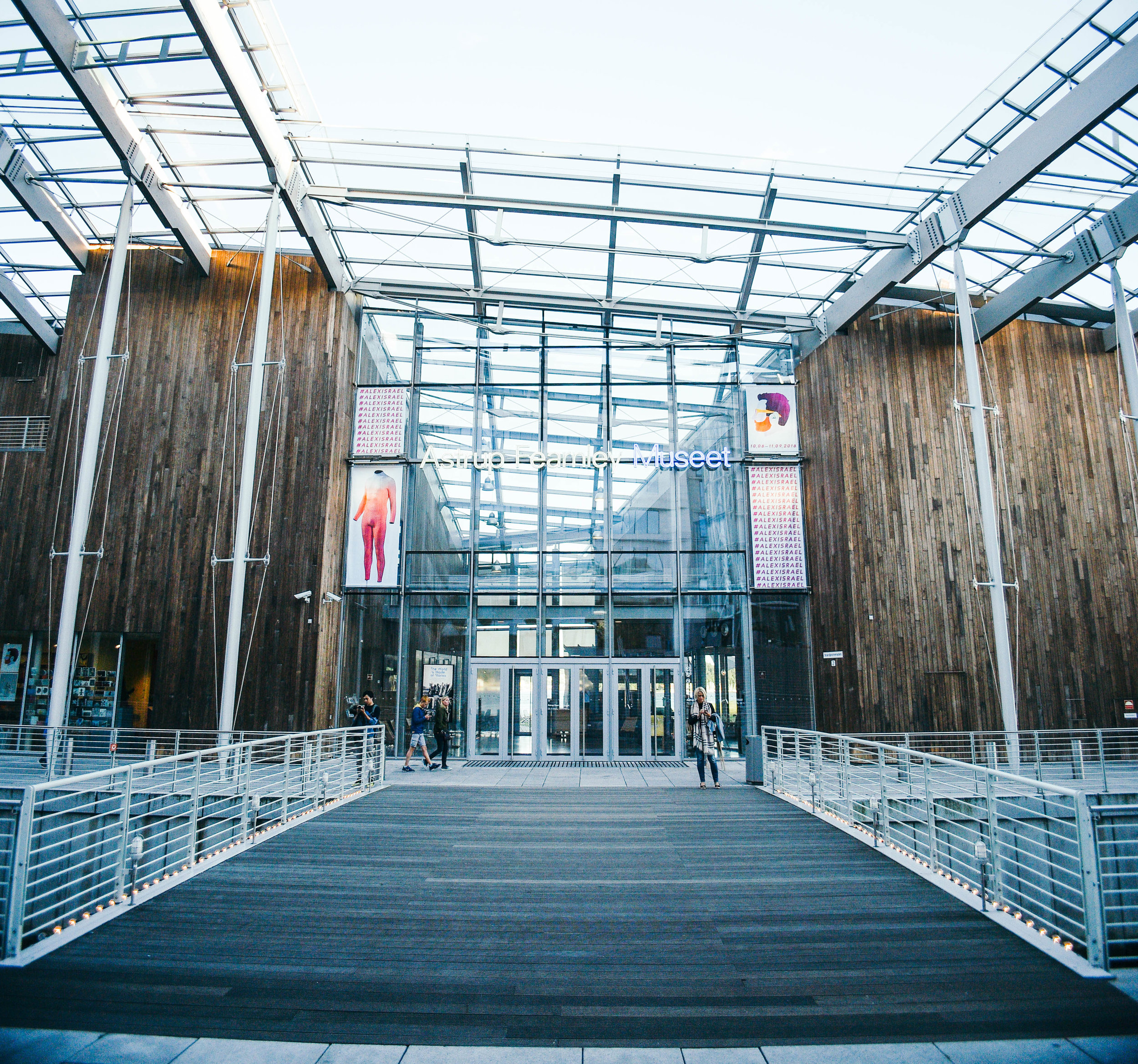
With Renzo Piano's Astrup Fearnley Museum of Modern Art and Skulpurpark being the 2 most incredible architectural pieces on the peninsula, credit should also be given to architectural practices including Kristin Jarmund and Scmidt Hammer Lassen, who've created amazing buildings and public spaces within the neighbourhood.
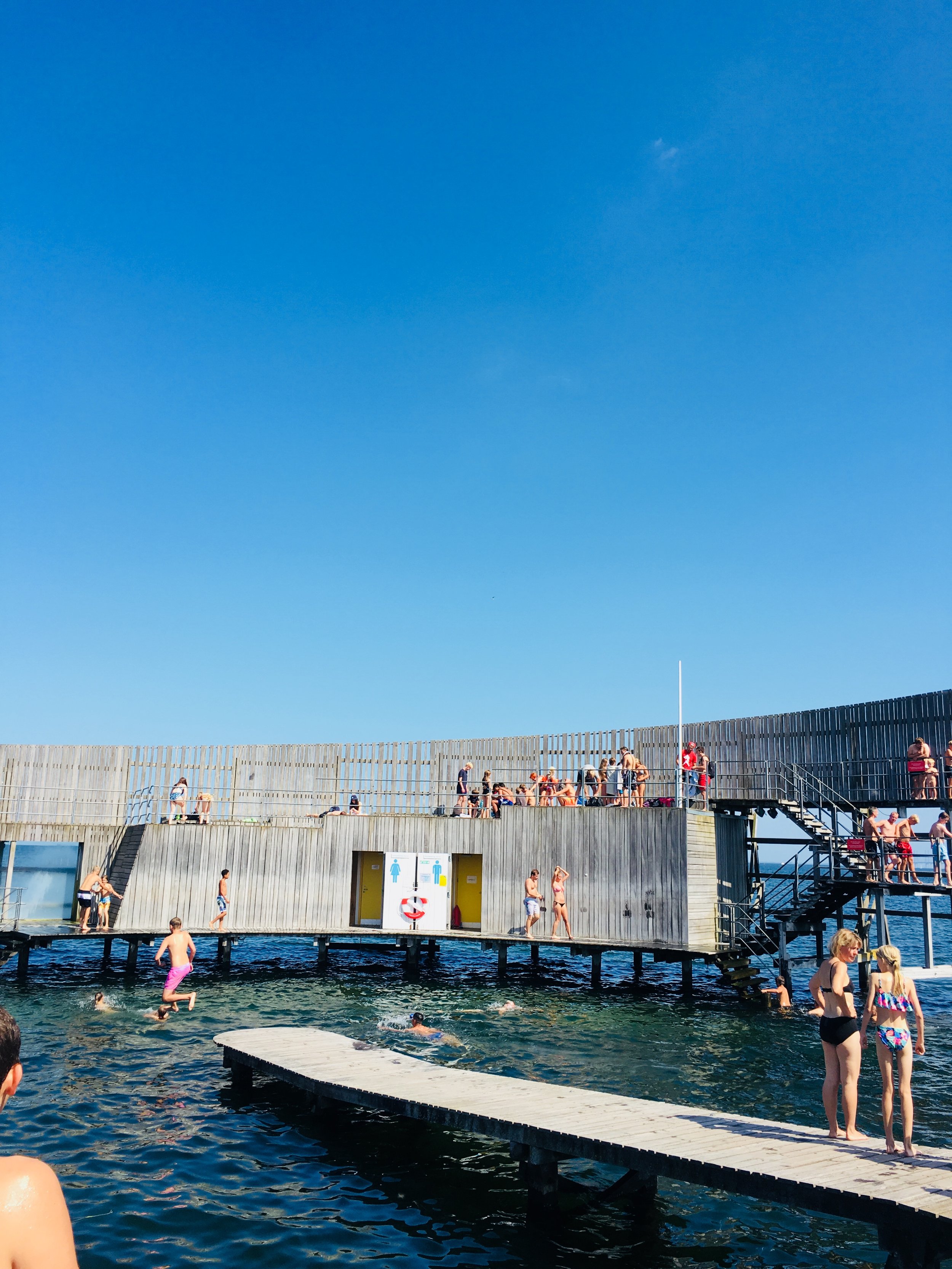
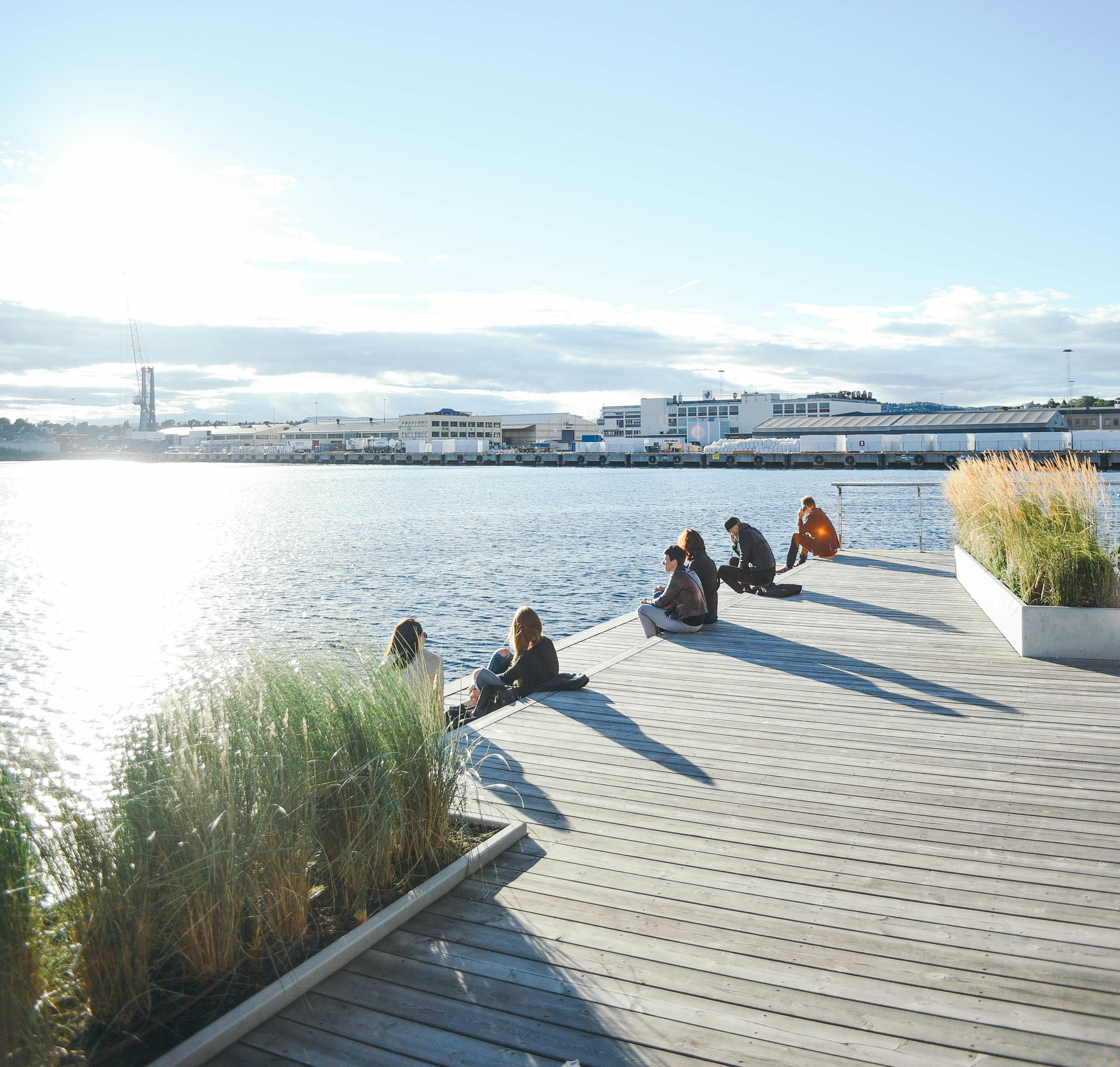
Similar to Copenhagen's Islands Brygge, as part of the development, the Tjuvholmen water's edge now also includes an amazing swimming area, making a great summer chill-spot...
If only every city did the same.

Get yourself to Oslo and take a wander.

- Tom 

INSTAGRAM


Creating digital cities: Interview with Ross Atkin by Tom Oliver Payne

Time is flying, and the world is developing at a rate of knots. Blink and we’re onto the next iteration of iPhone. The world is changing, and quickly. I mean, who knew that it’s been 100 years since the first BMW went into production. To mark its centennial year, the BMW Group and its four brands – MINI, BMW, Rolls Royce and BMW Motorrad, are exploring groundbreaking technology that will affect how we live over the next 100 years.

MINI particularly has always been recognised for its personalisation in design so it’s fitting that as part of the centenary year it has created the β€˜Future Shapers’ project. Bringing together cutting edge designers Marcus Lyall, an audio-visual director, Margot Bowman, a multi-media artist, and Julia Koerner a fashion designer, to explore the future of personalisation in design, technology, fashion, and mobility.

MINI’s project inspired me to find other pioneers doing great things to improve our future. I’ve often wondered why technology isn’t more widely used to improve cities. It seems kind of stupid that we can chat face to face with friends on the other side of the world at any given moment, yet I have no idea when a free black cab is going to pass or when the traffic lights will change.

This is when I discovered Ross Atkin. I interviewed Ross - maker of Sight Lines - about his own vision for the future of mass personalisation.

As a designer who integrates technology into public spaces, and gives talks around the world on how we can better use technology in the city, Ross’s work is both inspiring and practical. Focusing his ideas on improving cities for the elderly and disabled, it’s clear his heart is in it for the right reasons.

Trained as an engineer, Atkin worked in design before getting involved in technology for cities. From this experience, his focus has always been on the small-scale – creating specific items for specific purposes, β€œby working from the ground up”, he told me β€œwe’ll end up shaping an amazing future.”

Most of Ross’s work focuses on street design and using technology to help disabled people to navigate the city. He does things like create street lights which brighten for pedestrians with poor vision and has created an app which tells its user whether access routes are open. By following his ambition, his day-to-day work has branched out into a whole range of areas. He now creates a wide range of products, as well as advises companies and government bodies.

photo-product-21.jpg

I had never given much thought before to how difficult it must be to move about the city as an elderly or disabled person. Ross explained to me the frustrations of people bumping into a temporary sign, or walking onto the road when there’s no way of knowing the pavement will end. I soon realised that for many people, the whole idea of trying to navigate the city – which changes every day – seemed pretty damn scary. My constant complains about bad bus timetables and traffic lights suddenly seemed pretty petty.

Chatting with Ross, it became clear to me that although his interests are broad, he’s mainly passionate about improving urban environments for people who need it most, β€œdifferent people experience different things in cities which are inconvenient and annoying,” he told me, β€œI’m very interested in working with disabled and elderly people because the level of inconvenience they experience in cities is much higher. So, there is an amazing opportunity to make a big impact.”

With over half of the world’s population now living in cities, and with an ageing population, it’s easy to see just how big an impact this will have. The race for cities across the globe to become more beautiful and more β€˜liveable’ has begun, and technology will no doubt play a huge role in the way this race folds out.

In addition to creating apps and responsive street furniture, one of Ross’s coolest technology projects is called β€˜Sight Line’, which enables people with bad sight to learn all the details of construction sites through a transmitter, or app. Not only will the pedestrian quickly know how wide the construction site is, but they will know how long it will be there and even how to get around it.

β€œConstruction works on footpaths is seriously hard for the visually impaired,” Ross told me, β€œif somebody can’t access the path that they normally take, and they have no idea how to get around the construction works, they can get completely stuck.”

The awesome thing about Sight Lines is that it taps into existing data already recorded by contractors, so there’s no extra management work needed. By using existing technology and information, Ross’s work is able to completely transform the way people interact with their surroundings. Pretty cool.

When I asked Ross how he imagined the future of cities, he told me that it would probably look something pretty similar to today. Slightly disappointed, I asked, β€œno changes at all?”

Ross explained, β€œI just don't really buy into the idea of having a β€˜grand vision’ for how the city will look in the future. Instead, I’m focused on solving the problems that exist right now, with the technology we have today.” He imagines an incredible future with amazing improvements, but he doesn't think we’ll get there by drawing big plans. Instead, he thinks, we should focus more on making practical improvements to all the little things - one at a time.

With such simple, yet useful ideas, it was awesome to meet Ross who is at the forefront of creating products that will undoubtedly help to shape the future of our cities.

As part of MINI’s Future Shapers project, in the next few weeks I’ll have the opportunity to see how MINI is exploring its own vision of the future as part of its exhibition β€˜BMW Group Future Experience", at the Roundhouse 17 – 26 June 2016. The exhibition will look at groundbreaking new technology that will affect how we live in 100 years. Visitors will be able to see a future MINI, a β€œVision Vehicle”, that demonstrates applications of this new design and technology in an iconic car.

Visit MINI.co.uk for free tickets.

(And make sure you check out the full interview below!)


Photos and film by Sam D Jackson.


INSTAGRAM


Sydney's Broadway is getting a facelift by Tom Oliver Payne

Courtesy Central Park Sydney. 

Courtesy Central Park Sydney. 

A bunch of interesting developments have come alive in Sydney's broadway region over the past few years.

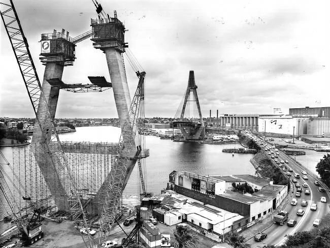
The scheme at Central Park has been well-received on both the local and international scale. The 235,000 sq m mixed use scheme has given the city a fascinating new addition to the skyline, has added some much needed public space and has set the bar with regard to environmental building standards. Designed by Jean Nouvel, One Central Park was ranked by Emporis as one of the world's best skyscrapers and ranked as Australia and Asia's best tall building by the Council for Tall Buildings and Urban Habitat.

The $1 billion UTS masterplan adjacent to Central Park promises a range of access routes and public space and of course, a host of new buildings throughout Ultimo - one of which has been designed by Frank Gehry. The Dr Chau Chak Wing Building, named after the Chinese-Australian business man and philanthropist, will accommodate 1,300 students and 400 academic staff in a unique tree house structure.

One Central Park. Image: greenroofsaustralasia

One Central Park. Image: greenroofsaustralasia

Both of these buildings provide an architectural quality that will be easily distinguishable from a city that still primarily comprises 1960s modernist towers. They also indicate something that's occurring at a much wider scale. With a new wave of tall building construction, Sydney is forming a distinct and interesting urban aesthetic. Hardly the destructive construction boom that the city experienced during the Green Ban years, these developments appear to be a respectful enhancement of the existing urban realm.

The Central Park and UTS schemes epitomise Australia in its modern context. As new environmental standards, strengthening connections with Asia and a desire for high density living increasingly influence the built environment, new buildings like these help to raise the standard in planning and architecture and positively represent a city to a global audience.

Re-thinking Architecture in Manilla by Tom Oliver Payne

As much as I love a cool bit of design for the sake of design, I'm much more interested in design which innovates the way we live. Today, we are faced with major environmental challenges, and it's important that everything we create seeks to improve the world we live in - even if these ideas are super simple. 

Read More