modernism

What would Ernő Goldfinger think of Balfron Tower today? by Tom Oliver Payne

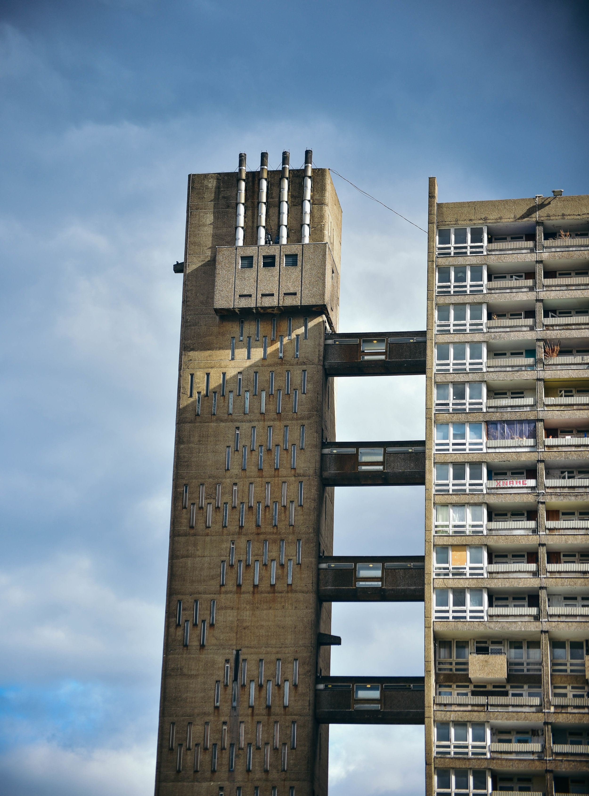
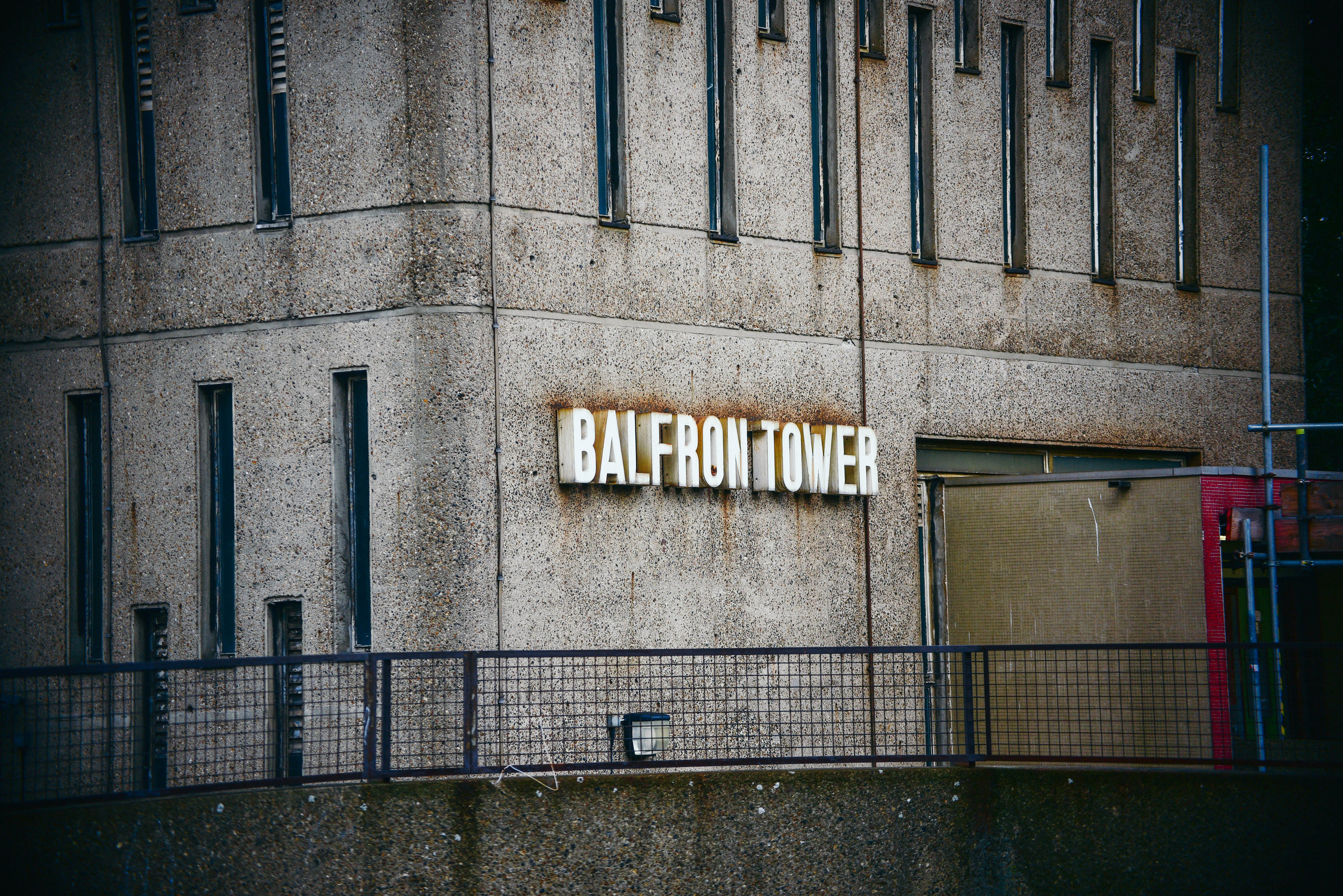
Designed by Hungarian-born architect Erno Goldfinger in 1963, Balfron Tower has become a global icon of brutalist architecture.  

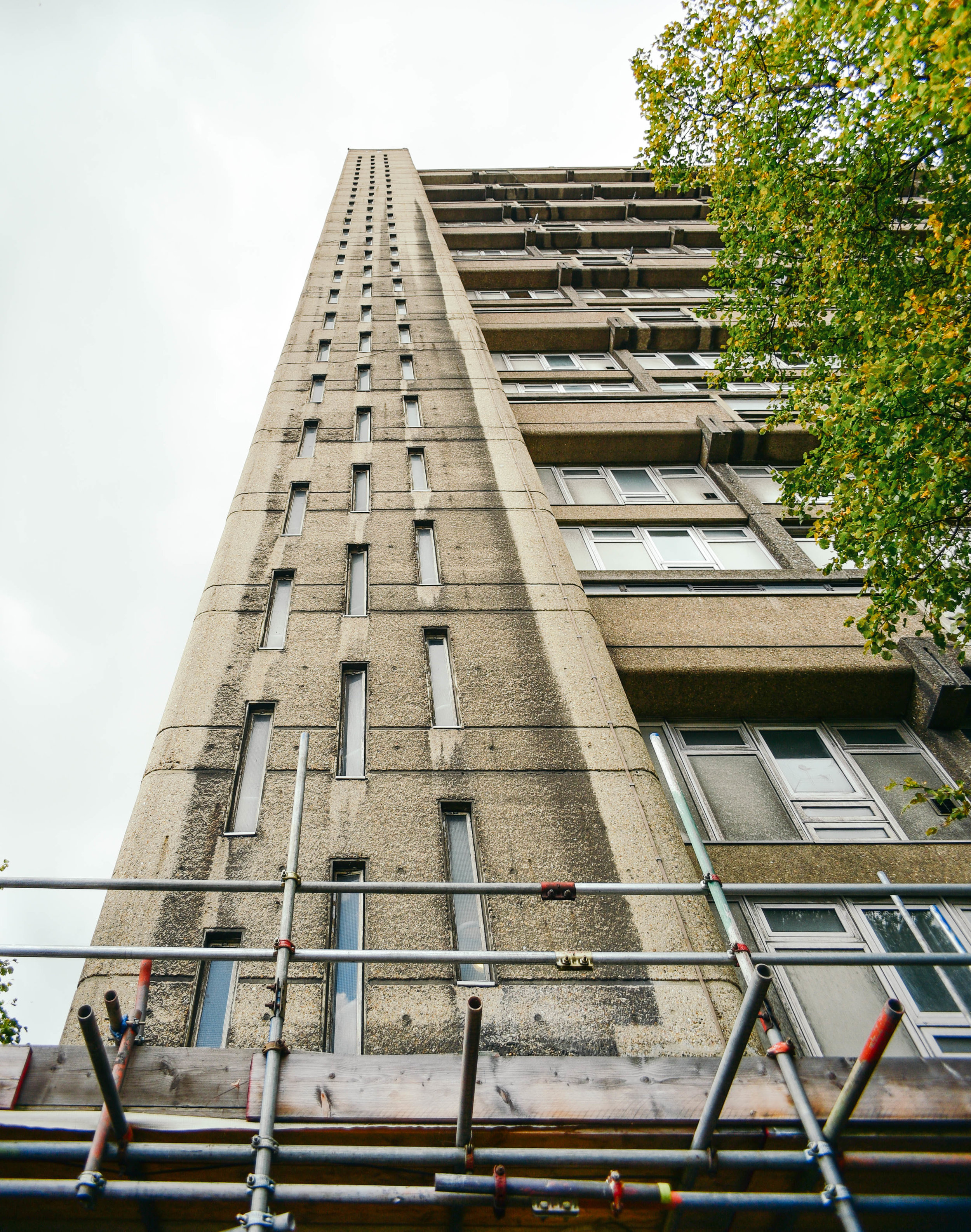
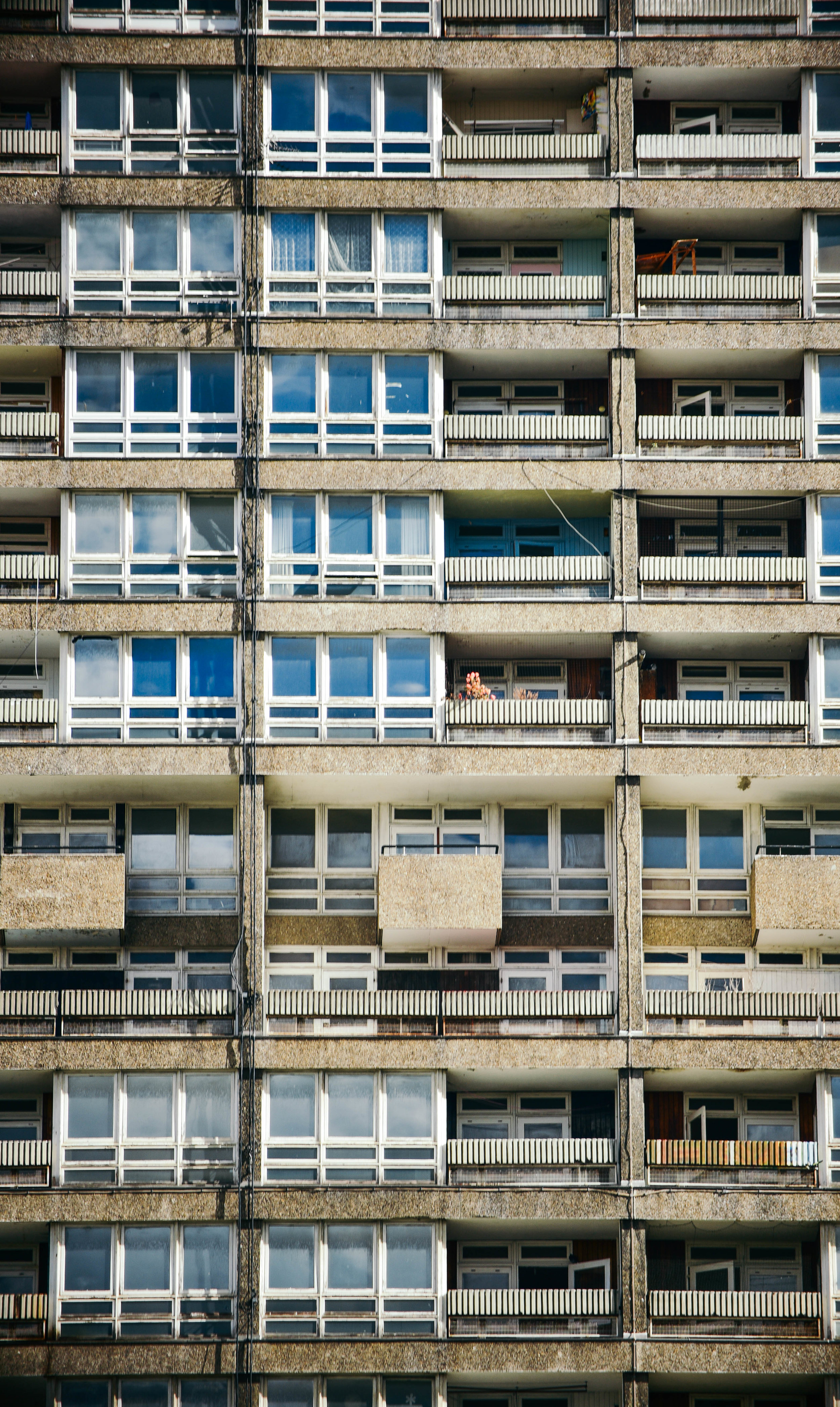
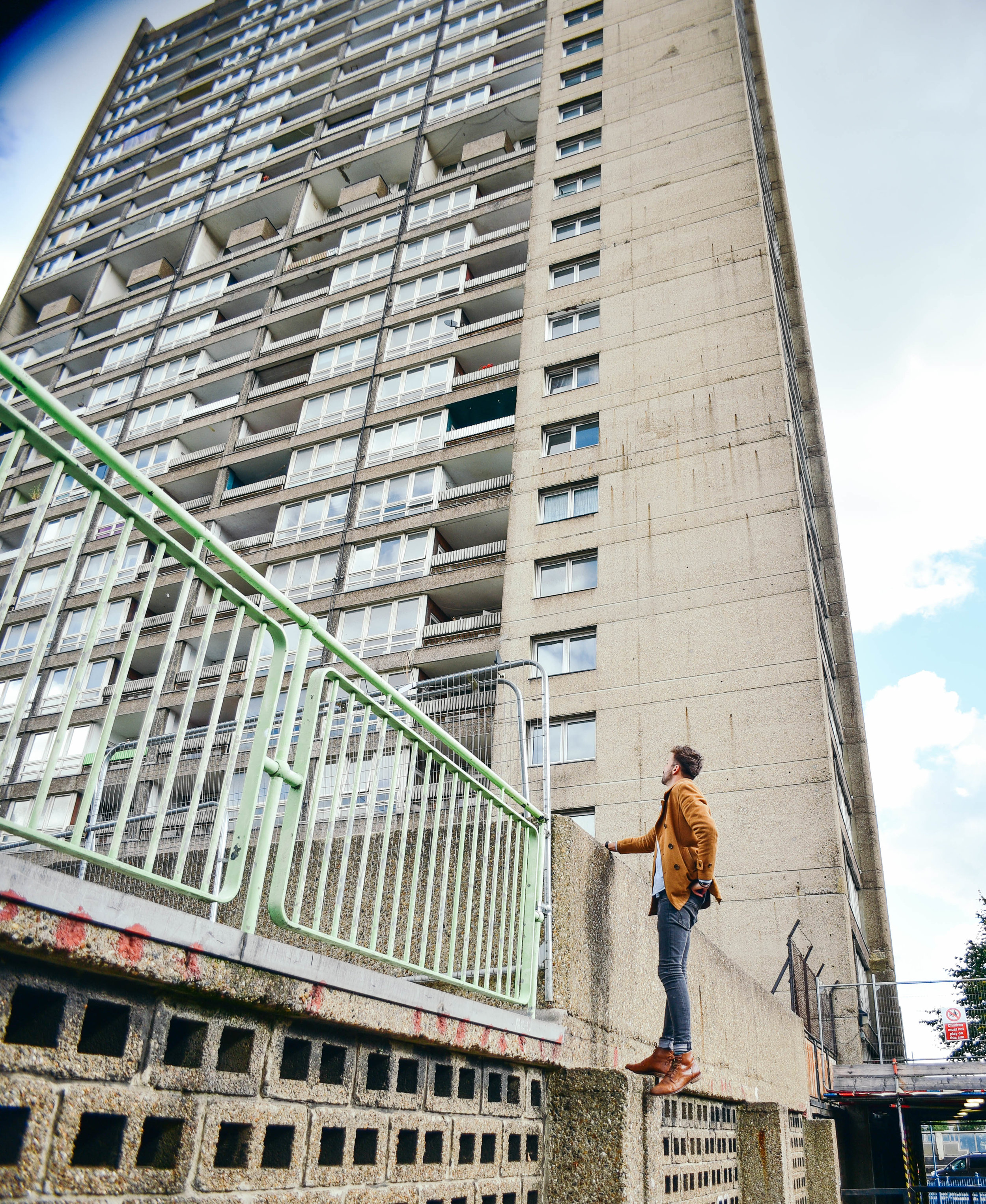
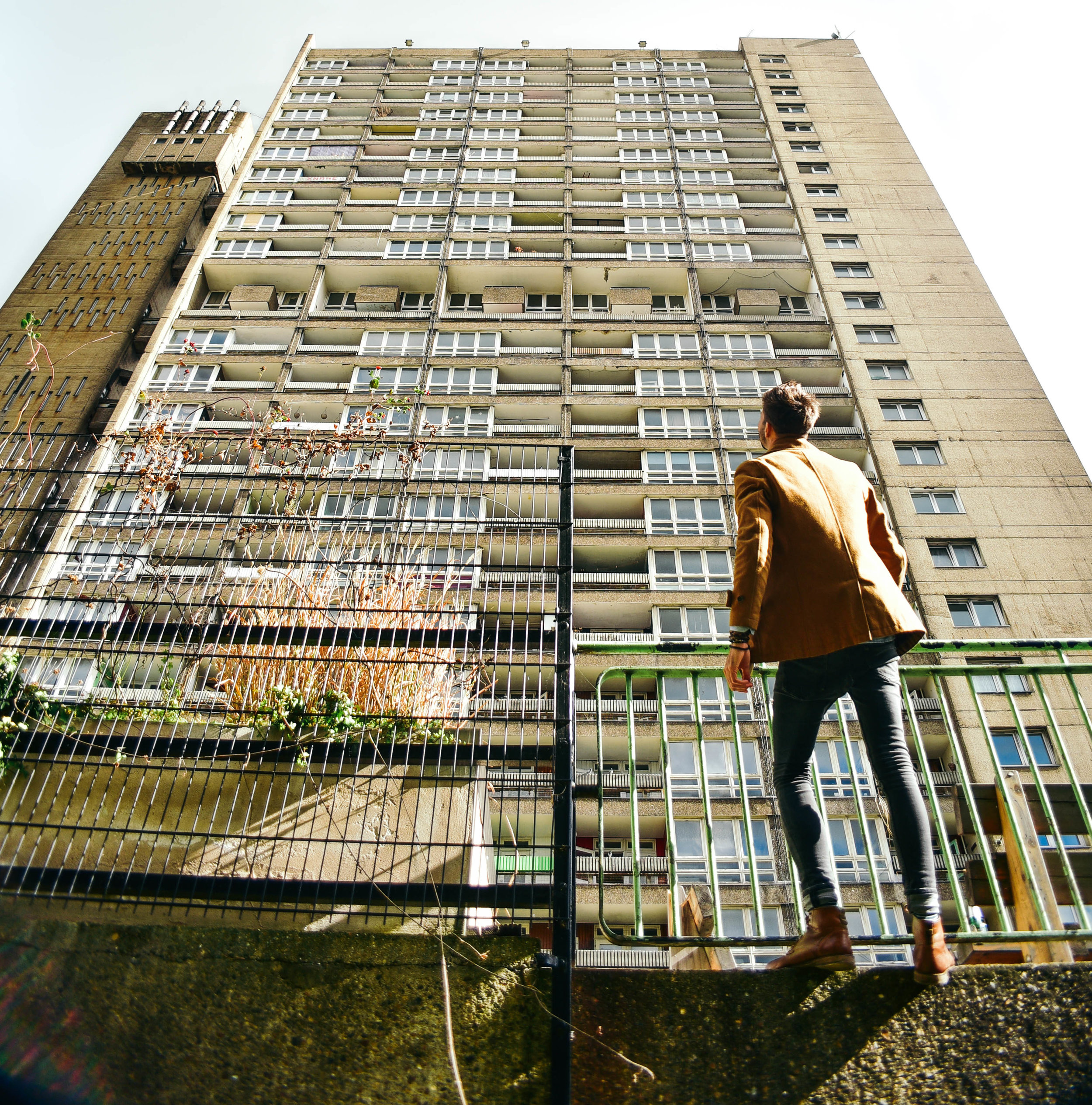
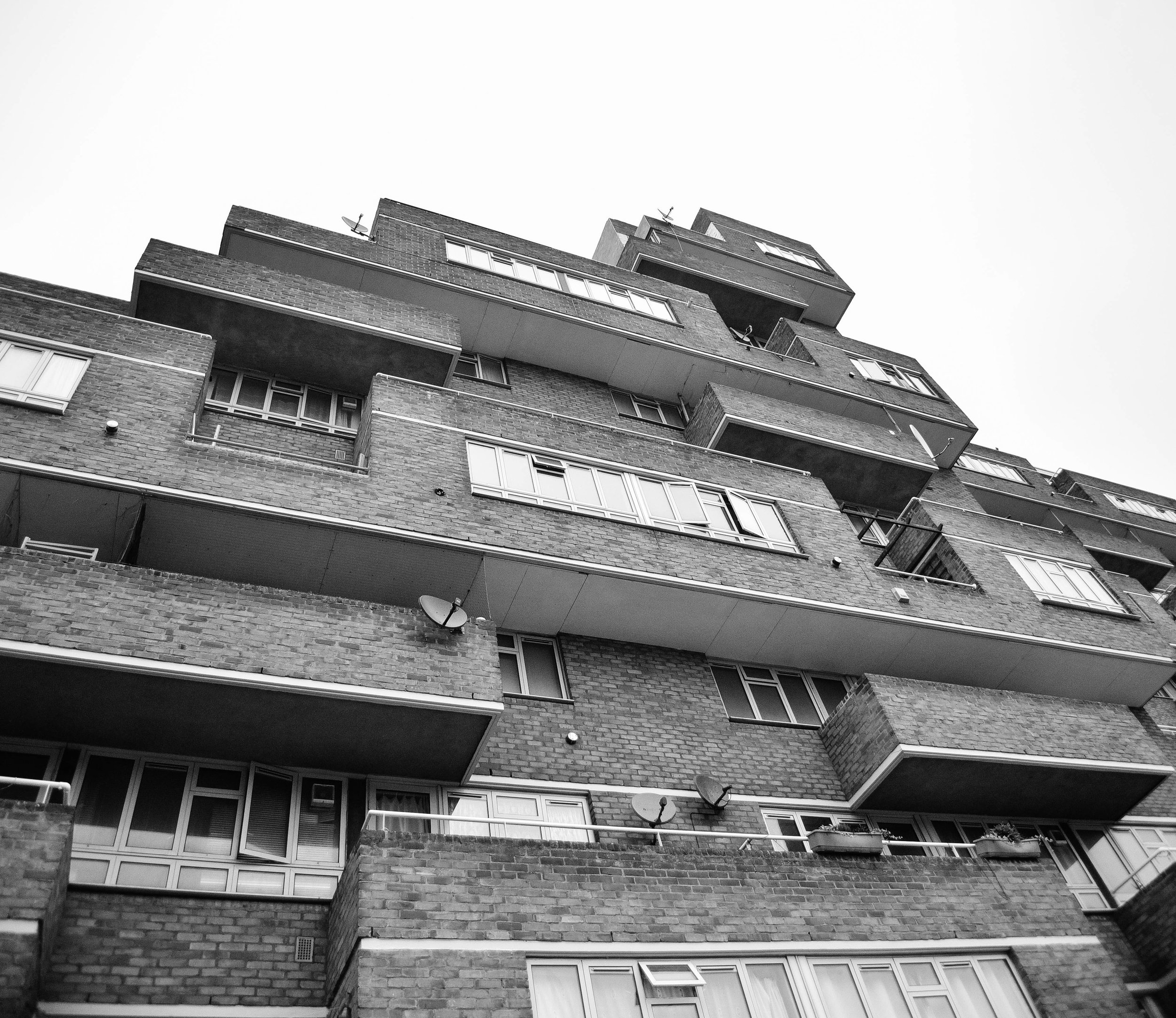
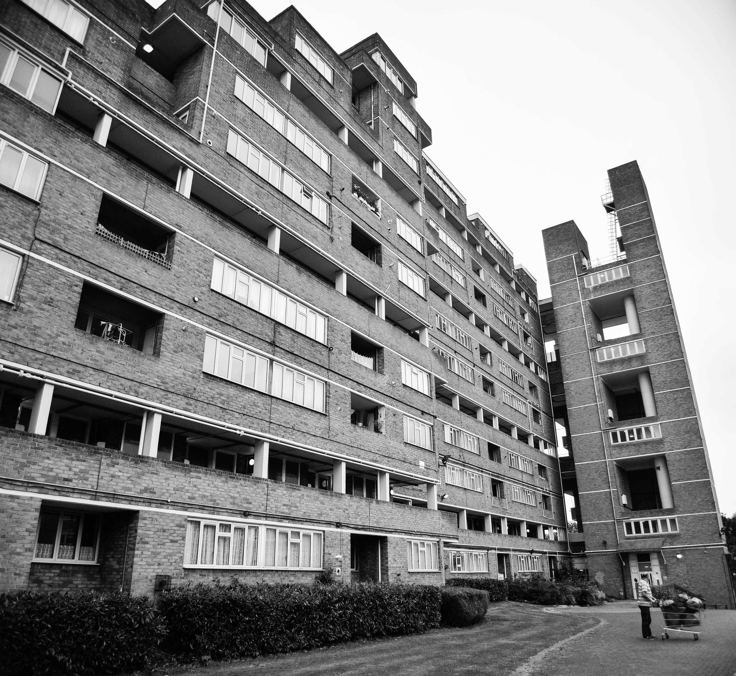
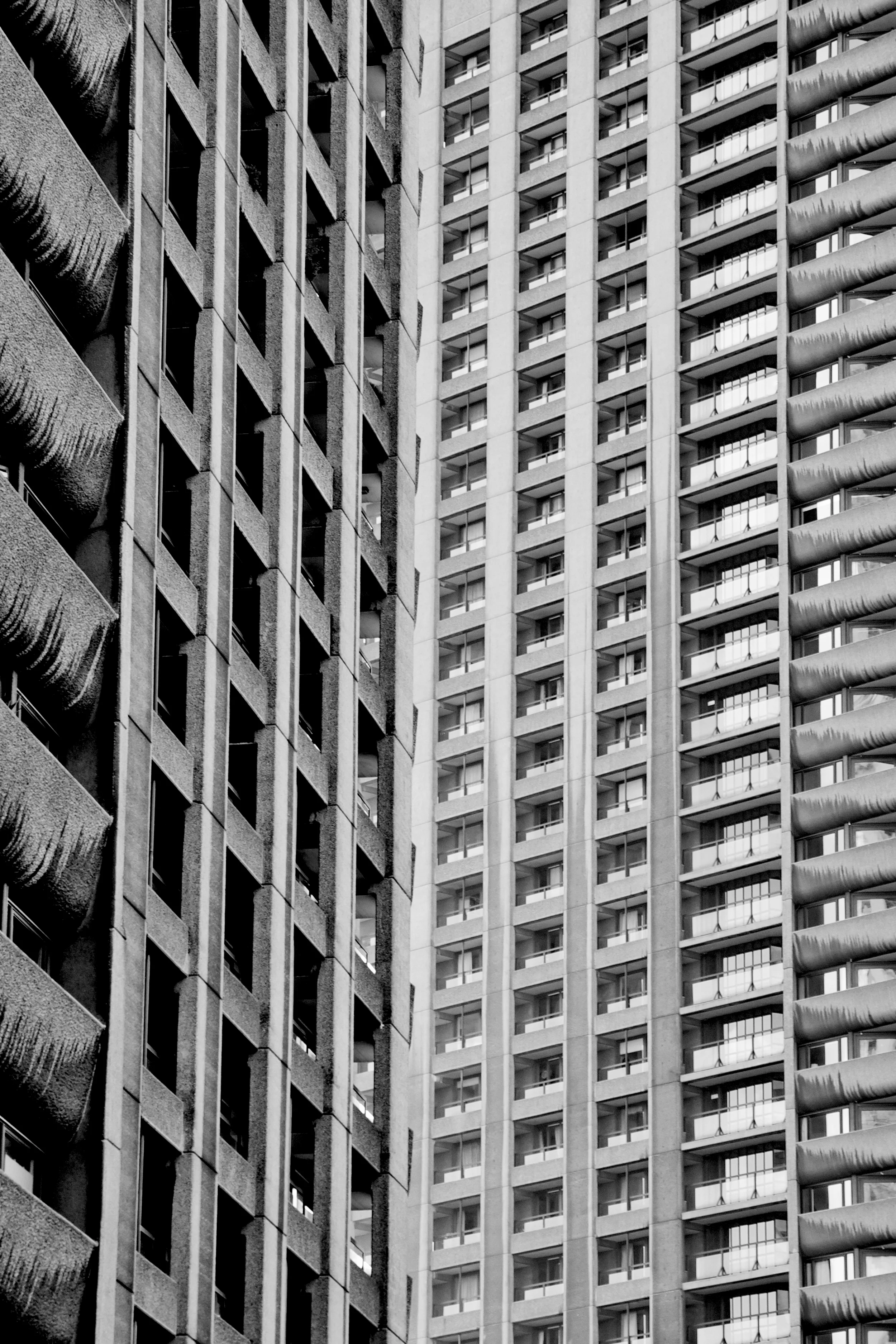
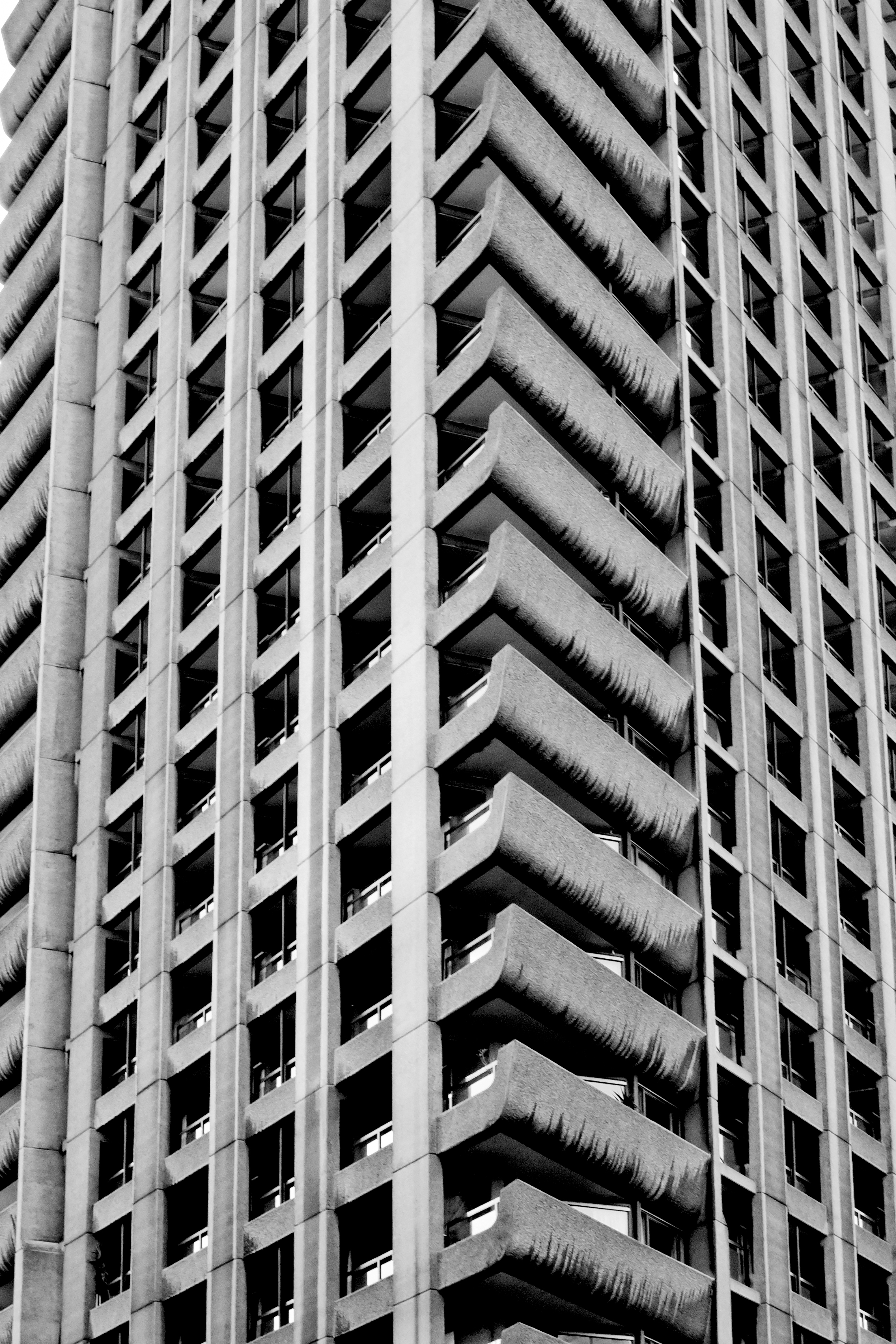
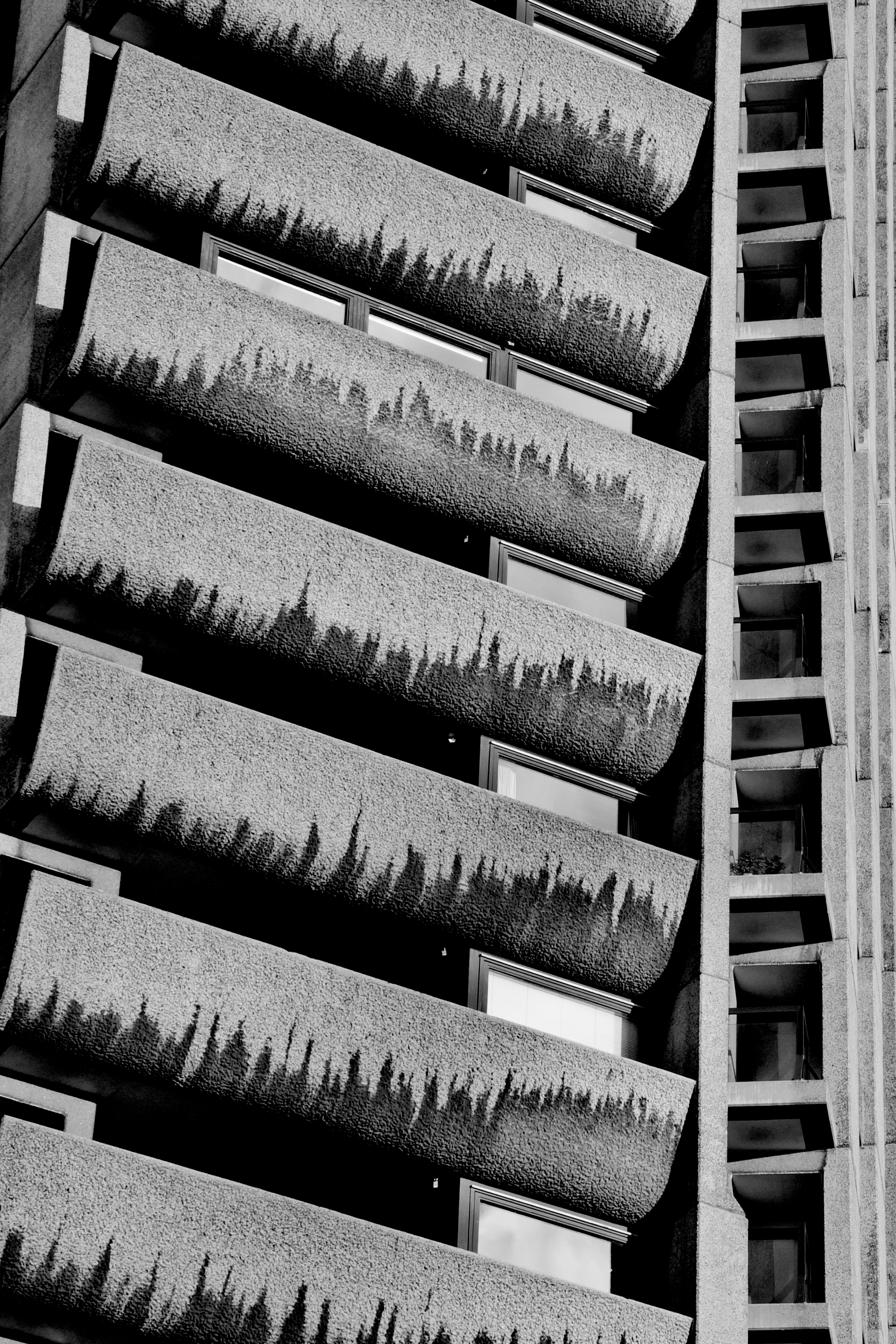
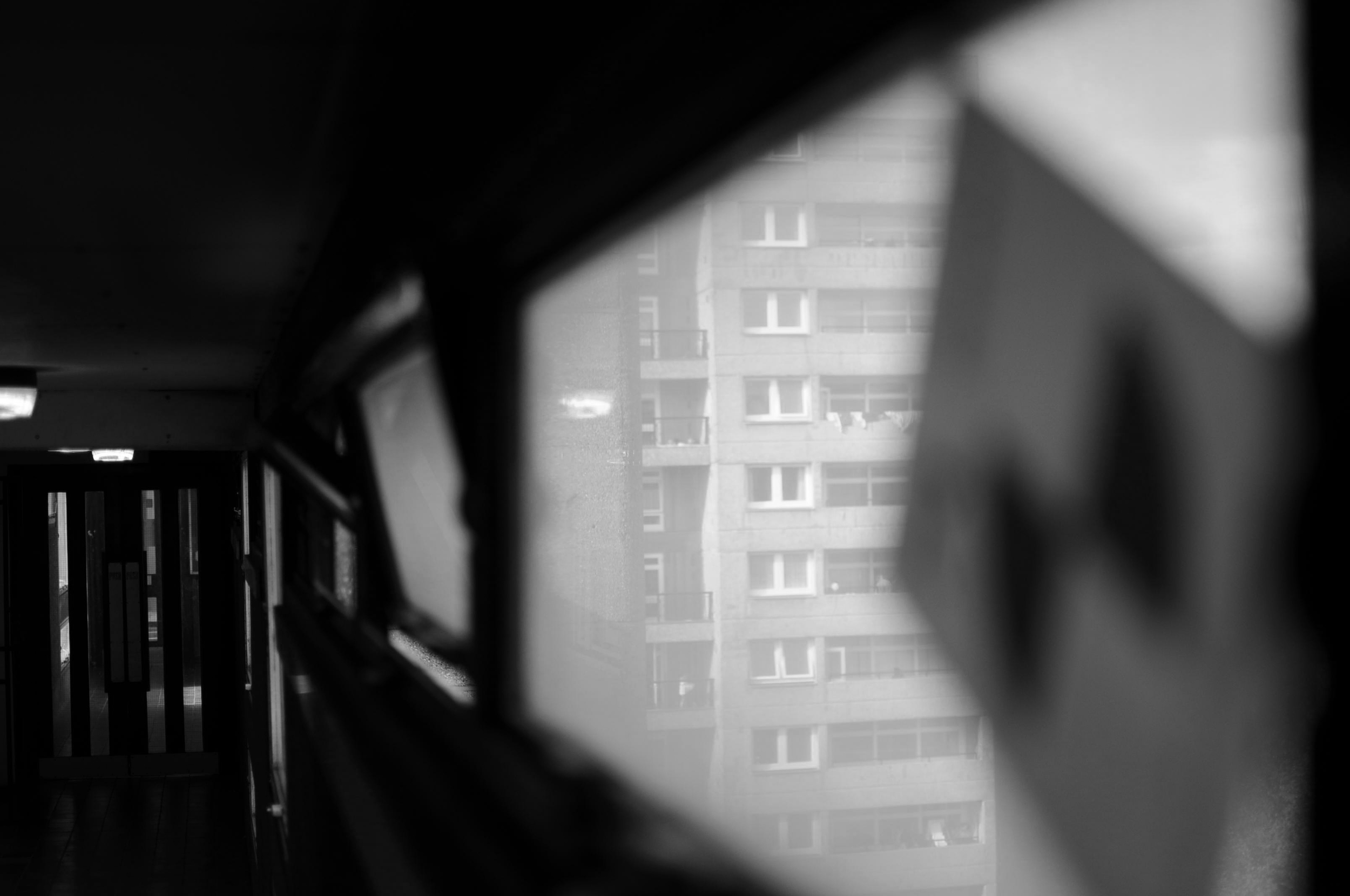
Last week I took off down to Balfron to take some photos. Although slightly smaller than its younger sister, Trellick, standing 26 storeys above East London, Balfron's harsh concrete was visible for miles. 

Walking towards the base of the building, the facade overshadowed me like the sheer of a cliff face. But as the building caught glimmers of the morning sunlight through the patchy clouds above, I became very aware of the elegant sophistication of Goldfinger’s design.

Stood taking photos of the towering monolith above, a man yelled, “what’s the intrigue!?” Sensing he was a pissed off resident, I gave him a simple answer, hoping he would move on. Staunchly walking towards me, he asked again, “what is the intrigue?”

Realising that this guy wasn’t about to just walk away I decided to open up explain to him exactly why I was there. I told him of my interest in Erno Goldfinger’s architecture and why I wanted to take photos of this building in particular.

It didn’t take long before the man’s tone of voice lifted, and his demeanor calmed. Suddenly all he wanted to do was tell me of his love for Balfron. As it turns out, he’d lived in the building for 25 years and was now the last social tenant before its sale to the private sector

He told me about the ensuing court case for his eviction, which was bound to come to close in the following weeks. The volume of his words increase as he explained his frustration at the powers and processes above him, this clearly wasn't the first time he'd told someone his story. 

For over 50 years Balfron had housed hundreds of families across 146 affordable housing flats. Now, 145 homes sat empty, and he was the last man standing.

“You wanna come check it out from the inside?” he asked.

Minutes later we were sneaking behind security and shuffling into the building’s stainless steel elevator. Creaking up to level 26, and stepping out onto the grey, concrete flooring, I was immediately overwhelmed by smells of booze and urine. Fortunately for us the breeze from the awning-hinged windows helped to disperse the smell through the corridors.

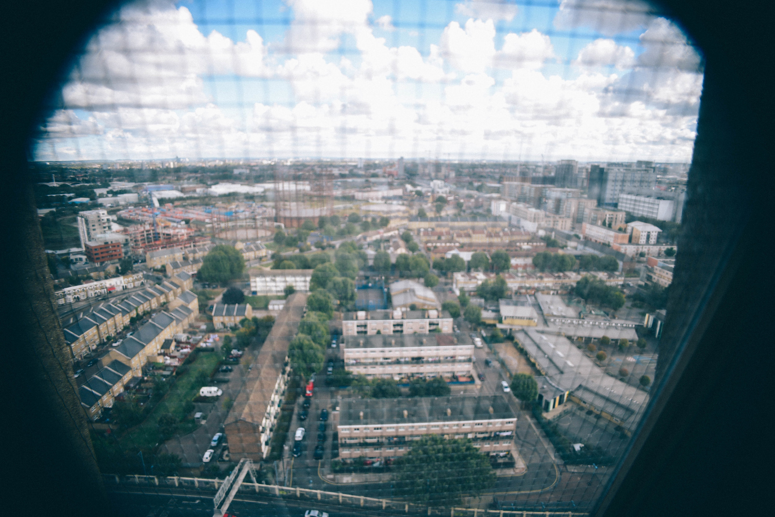
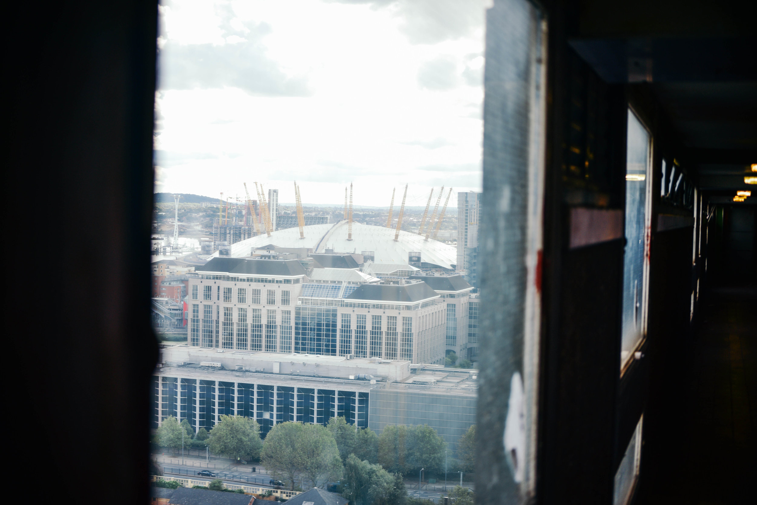
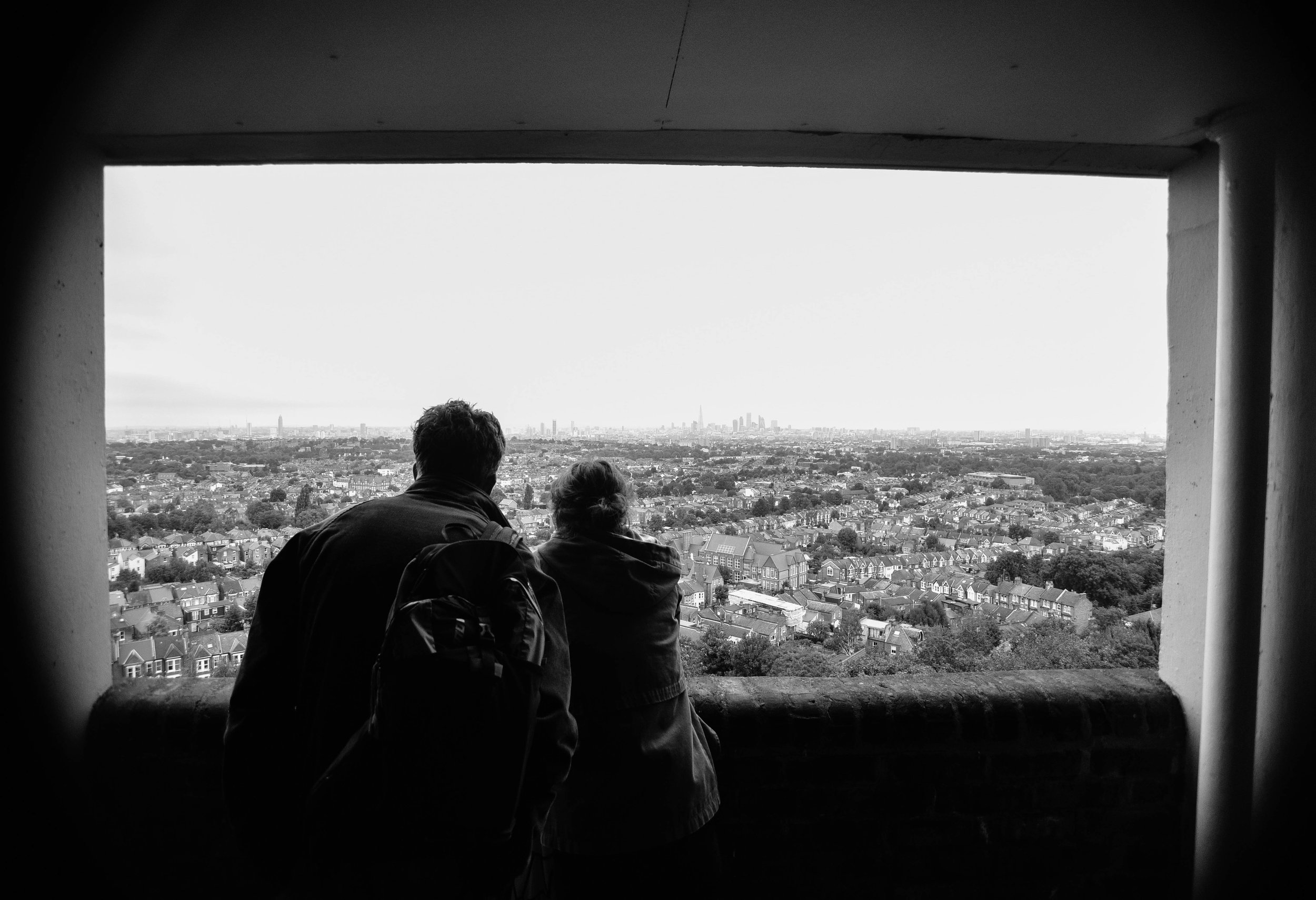
Peering through the horizontal pattern of windows, the view from the top was incredible: Poplar sat quietly below, the city skyline loomed in distance.

As I walked down the long corridors I imagined Erno’s ambition for ‘streets in the sky’, where working class neighbours would socialise and kids would play games. It was too bad, bottles of half drunken bottles of beer and empty NOS canisters now lined the passageways. 

After sometime upstairs, it was a relief to break back into the autumn sunlight. I wondered if I could ever live in a dark, concrete tower like this one. For while I could understand Erno’s ambitions, I could also appreciate where his design concepts had failed

In fact, when I first arrived in the UK, I thought brutalist buildings were disgusting. Having grown up in sunny Australia where there's an abundance of low-rise bungalow-style architecture and spacious streetscapes, I often wondered why London’s huge concrete 'ghettos' hadn’t been ripped down and replaced with something more attractive. But over the years, and after some reading, I began to appreciate the ethos behind their design.

Mainly a reaction to the housing crisis following World War II, this form of architecture attempted to help London’s homelessness by creating large, affordable buildings within accessible inner city areas.  While in reality these concepts didn't always work, the ethos - at least - was admirable. 

Balfron's last remaining social tenant is likely to be removed by force in the coming weeks. With few places to go, he told me he will likely be pushed outside of London altogether.

In cities across the world, a lack of affordable housing is forcing young people and those on low incomes to look for housing alternatives. Many are moving out of the cities that they love, whilst others are feeling the impacts of living in a 'rental trap'. 

As the last social tenant is forced-out of one of the world's most famous brutalist buildings, I wonder what Erno Goldfinger thinks of his building, and architecture, today? Would he be ashamed that we now completely ignore the socialist principles of the brutalist era?

I would never suggest that contemporary designers should copy Balfron Tower, or even brutalism, as a concept. But the ambition of its developers, and their architectural boldness, would be something to emulate. 


Photographs by Dan Young & Tom Oliver Payne.
INSTAGRAM


Dawson’s Heights: architecture with social conscience by Tom Oliver Payne

Architecture today is generally about making other people big bucks. But Dawson's Heights  reminds us of a time when architecture strived to create a better society through design. 

Land development today basically works like this: an investor will buy a plot of land, they then hire a developer with a track record of maximising value who will in turn hire architect who knows how to maximise floorspace. For the sake of profit, all parties will hope construction is over and done with as quick as possible, and each bit of land will sell for maximum value. Job done. 

But before you call me a pessimist, let me iterate that I don't necessarily think this process is all a bad thing. This process is simply a reaction to our economic market and continual development profits ensures a pipeline of construction and as a result, people - from construction workers to web designers - have jobs. 

Unfortunately however, development is too often, too greedy. Due to the speed and aggression of investors and developers, new buildings and spaces often lack quality design or a social conscience. What we are commonly left with is architecture with few zero-to-no societal benefits, doing nothing more than providing the mega-wealthy some real estate to dump their cash. Property has become more concerned with international asset management rather than the provision of housing or the creation of communities. 

Clearly, we've seen a recent swing towards capitalist-dominated architecture. But it hasn’t always been this way. 

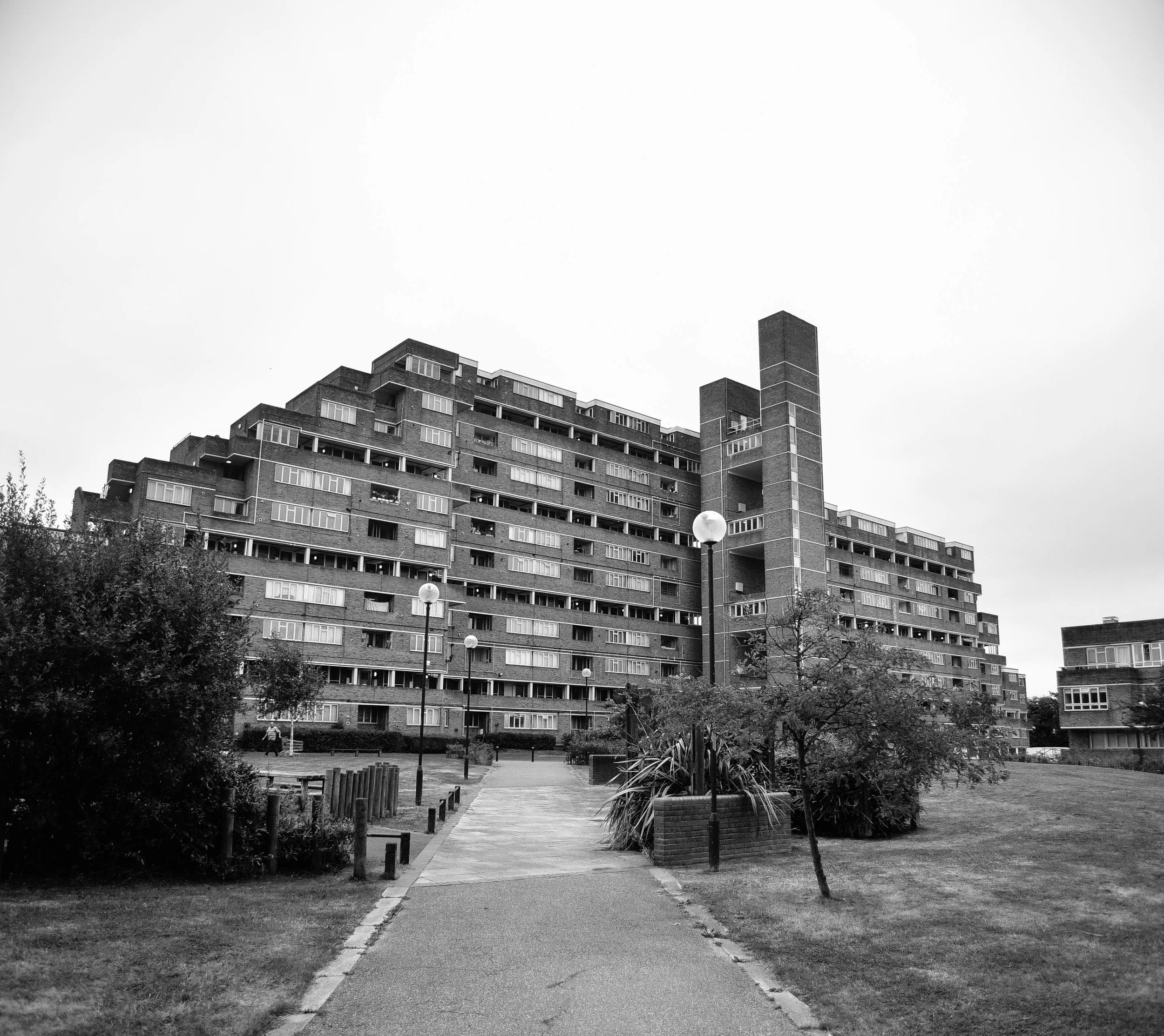
Dawson's Heights' northern block seen from its central public space.

Dawson's Heights' northern block seen from its central public space.

Back in the 60s, architecture in London operated in a very different context. Emerging from the Nazi bombings of World War II, the city was battered and bruised, and thousands were homeless or living in slums. The government took it upon itself to deliver tens of thousands of homes every year through mass redevelopment projects.

While often criticised for their top-down approach to design, no one can argue that they were’t at least ambitious, and at most, incredibly bold.

The Barbican Centre, Trellick Tower and Balfron are some of London’s most famous examples. These brutalist monuments are remnants of a past when - although they didn’t always get it right - architects could at least attempt to solve social problems through creative design. 

Not all of the examples from this time were dominating brutalist buildings. Some were smaller incisions in the existing urban fabric such as Golden Lane Estate, and others were modernist creations which boldly - but appropriately - inserted themselves into the remains of pre-war London.

Last week London opened its doors for Open House 2016 and I had the opportunity to check out one of the most impressive examples. 

A view worth millions: looking from the northern block of Dawson's Heights.

A view worth millions: looking from the northern block of Dawson's Heights.

In 1964, at just 28 years old, architect Kate Macintosh was given the job of designing Dawson's Heights in south London. 

Working for the Southwark local authority, Kate was given a job which today is almost unthinkable - the freedom to design new London housing on a large plot of vacant land. With strongly socialist parents and a clear drive to help generate social justice through architecture, Kate was given the opportunity to deliver a scheme which would stand the test of time.

Clearly, it has. 

Decades later Dawson's heights is now considered 'one of the most remarkable housing developments of the country'. 

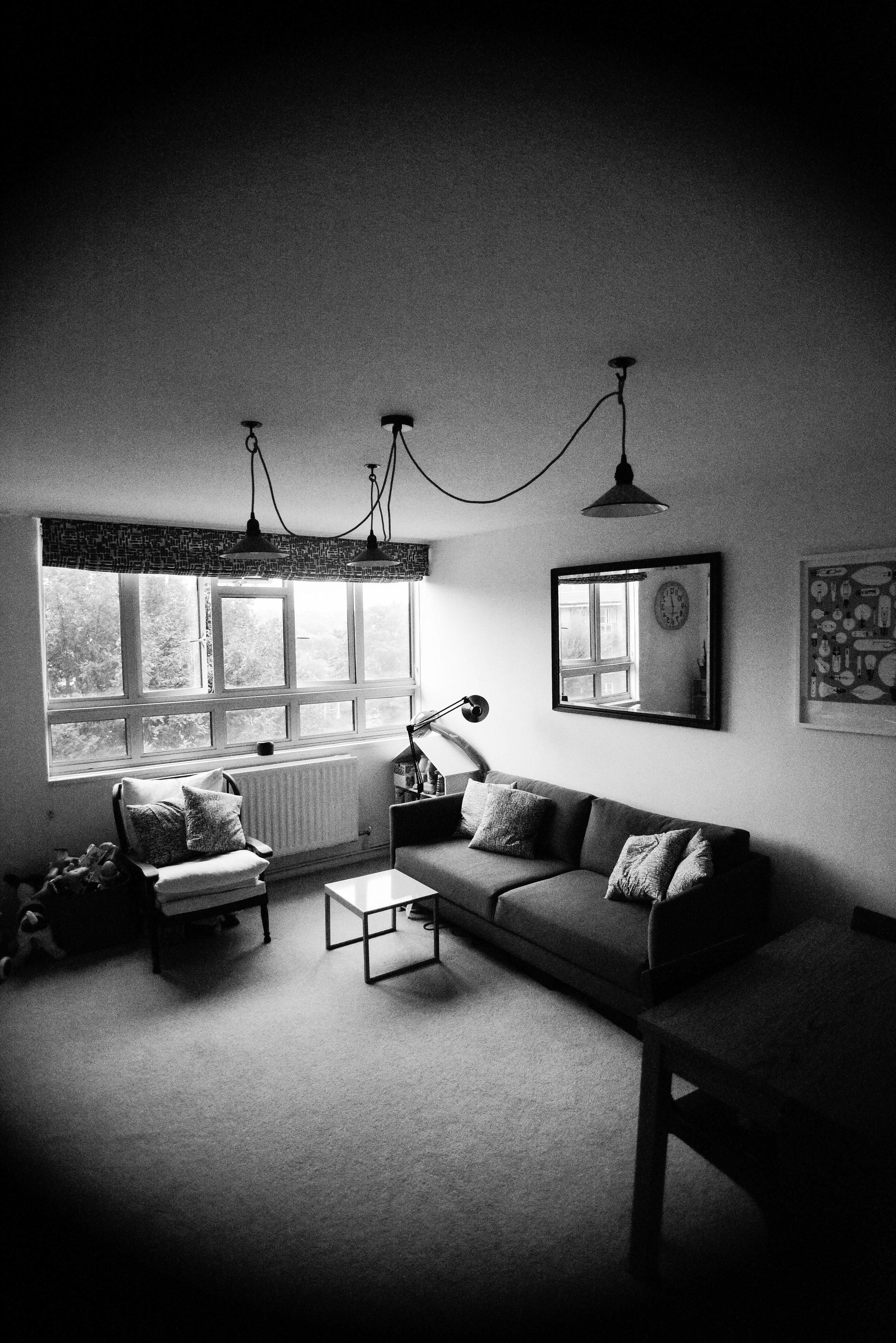
As I walked through Dawson's Heights' many street-like corridors, and entered into its beautiful modernist flats, it was clear to me that this building was designed with a different agenda compared to developments today.   

It was built with a genuine ambition to create a community, and a more just society. Every decision that Kate made had logic to it: blocks were oriented to increase sunlight to  flats, room arrangements were such that every flat had a balcony, levels were split to improve acoustics, and the building's form and massing ensured an abundance of green space and views across the city from its public corridors.

Whether through a change in political-will or a shift in the behaviour of our markets, architecture may re-emerge as a discipline which seeks to fix societal problems. 

Until then, at least we have reminders from a time when it did. 

If you're interested in exploring London's most incredible buildings, be sure to check out Open House 2017

INSTAGRAM


Why I like Brutalist architecture by Tom Oliver Payne

Brutalism seems to divide opinion like no other type of architecture. Between the 50s and 70s huge, grey, concrete buildings were built across cities around the world. While a lot of people hated their ‘inhuman’ and overbearing aesthetic, the architects designing them thought they were creating a new kind of utopia.

Until a few years ago, I knew nothing about this type of architecture. But it wasn’t long before I fell in love with taking photos at The Barbican Estate, and soon learned a bit about the movement.

Whether I love or hate the look of a particular brutalist building, I now really appreciate what it was trying to achieve. Now, every time I head off to a new city, I seek out these buildings and try to learn a bit about what they were trying to achieve in each place. From scanning the internet, it looks like other people love it too.

The term ‘brutalism’ comes from the French word ‘brut’, meaning ‘raw’. That’s exactly what these buildings are. So different from elegant design and detailing in the past, their designers used rough concrete with hard textures, and showed-off elements of the building that used to be hidden, like lift shafts.

The thing that I think is cool about brutalism is not the way it looks, but that it was designed with the best, optimistic intentions.

After the World War II, Europe was trying to rebuild its cities in a way that fixed a lot of its problems from the past, and Brutalism was all about trying to make buildings as cheap, functional and equal as possible. By making sure the building’s foundations were exposed, architects hoped that the ordinary could be seen as an art form, and in doing so - make them attractive to every person in society - whether rich or poor.

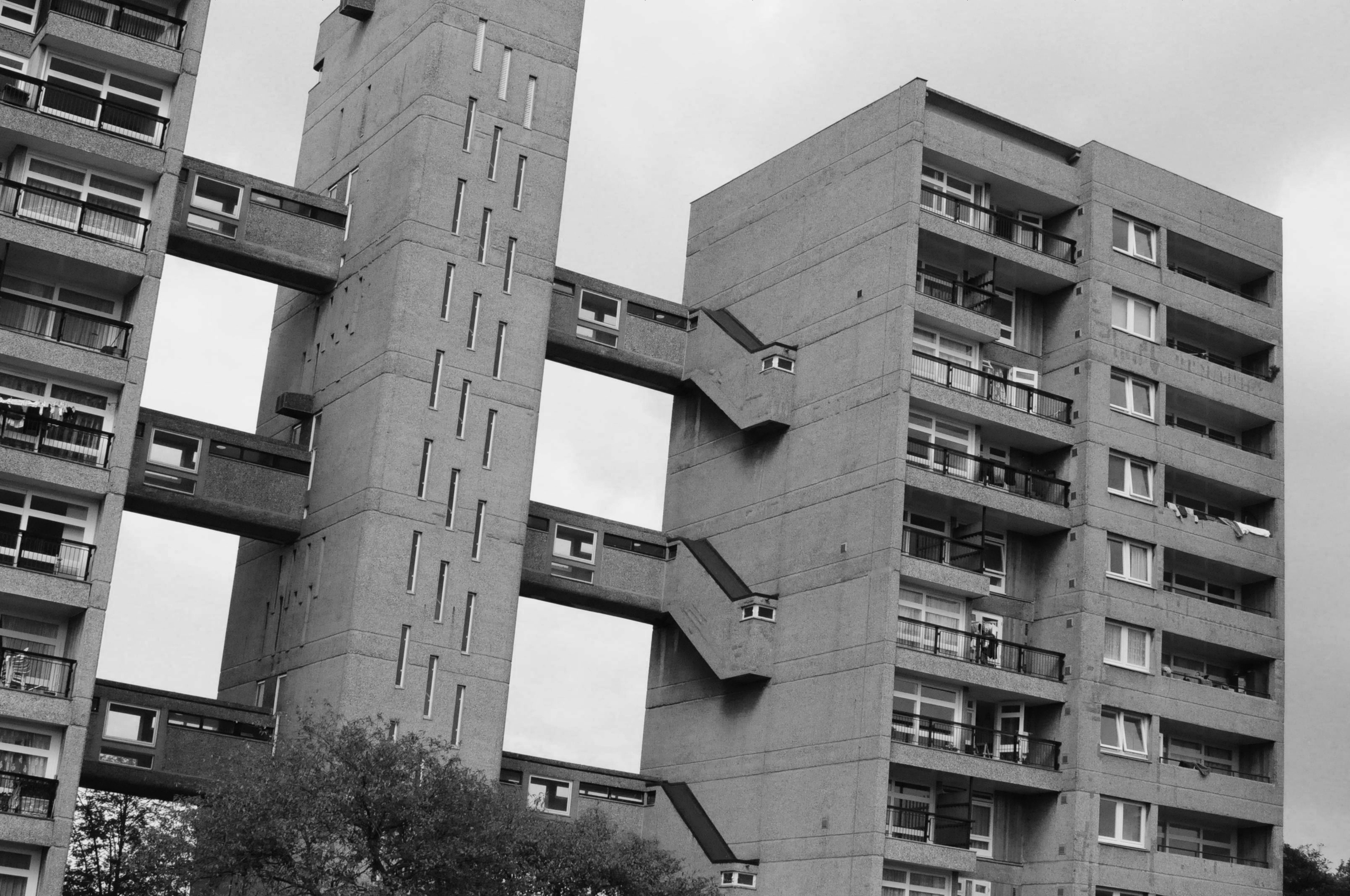
A key element of brutalism in London was the idea of creating ‘streets in the sky’, which would connect apartments blocks or offices. The idea was that neighbours could talk, kids could play and people could walk to work way above the fast-moving traffic below.

In the period of two decades, once low-lying urban areas were quickly transformed by towering concrete structures by architects and planners who envisioned a utopian city, where residents lived equally.

The ideas were cool, but in practice, it didn’t take long before the brutalism movement came to an end. It’s considered a social experiment, which didn’t really work. People soon realised that these buildings created strange ‘placeless’ spaces and restricted pedestrian movement through urban areas, which encouraged isolation and crime.

After harsh criticism for years, many of these buildings were demolished and some have been preserved. In London, my favourite surviving examples are Robin Hood Gardens, Balfron, Trellick Tower, and The Barbican.

The thing that I find super interesting about the Brutalist Movement, is how bold these planners and architects were: they saw a problem in society and they set out to find a solution for it through design. Sometimes I feel like society lacks some of that audacity these days. We have as serious housing shortage in London right now, and no one seems to be doing anything to fix it.

To me, this style of architecture represents a group of optimistic designers who were experimenting with a courageous idea - and that’s pretty cool.

Photos and film copyright Tom Oliver Payne.

INSTAGRAM