Urban Planning

Re-imagining Glebe Island Bridge by Tom Oliver Payne

1617831577576.jpeg

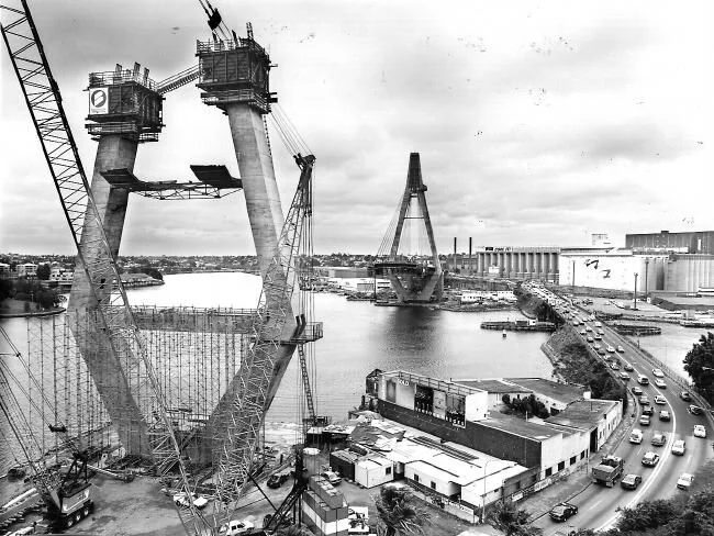
I remember as a kid, Mum’s car would sit idling in traffic as the Glebe Island Bridge sat cantilevered open for boats to pass through. I’d sit fixated on the construction of the monstrous pylons next door that would soon become the Anzac Bridge.

Anzac has since become iconic - serving in films and commercials and becoming a much-loved part of the city’s skyline. But it’s limited by its own height. Cars are suited to grade separation and steep inclines, but pedestrians and cyclists move better closer to the ground plane.

Glebe Island Bridge has sat a disused relic. But imagine it was re-instated: connecting cyclists and pedestrians across one of our harbour’s most loved Bays. One of Australia’s last swing bridges, its historical significance is physical - but it’s also deeply rooted to Sydney’s cultural identity. Particularly that of the inner west.

Excited that these two beautiful bridges could one day operate side-by-side.

(Image courtesy NewCorp)


Dawson’s Heights: architecture with social conscience by Tom Oliver Payne

Architecture today is generally about making other people big bucks. But Dawson's Heights  reminds us of a time when architecture strived to create a better society through design. 

Land development today basically works like this: an investor will buy a plot of land, they then hire a developer with a track record of maximising value who will in turn hire architect who knows how to maximise floorspace. For the sake of profit, all parties will hope construction is over and done with as quick as possible, and each bit of land will sell for maximum value. Job done. 

But before you call me a pessimist, let me iterate that I don't necessarily think this process is all a bad thing. This process is simply a reaction to our economic market and continual development profits ensures a pipeline of construction and as a result, people - from construction workers to web designers - have jobs. 

Unfortunately however, development is too often, too greedy. Due to the speed and aggression of investors and developers, new buildings and spaces often lack quality design or a social conscience. What we are commonly left with is architecture with few zero-to-no societal benefits, doing nothing more than providing the mega-wealthy some real estate to dump their cash. Property has become more concerned with international asset management rather than the provision of housing or the creation of communities. 

Clearly, we've seen a recent swing towards capitalist-dominated architecture. But it hasn’t always been this way. 

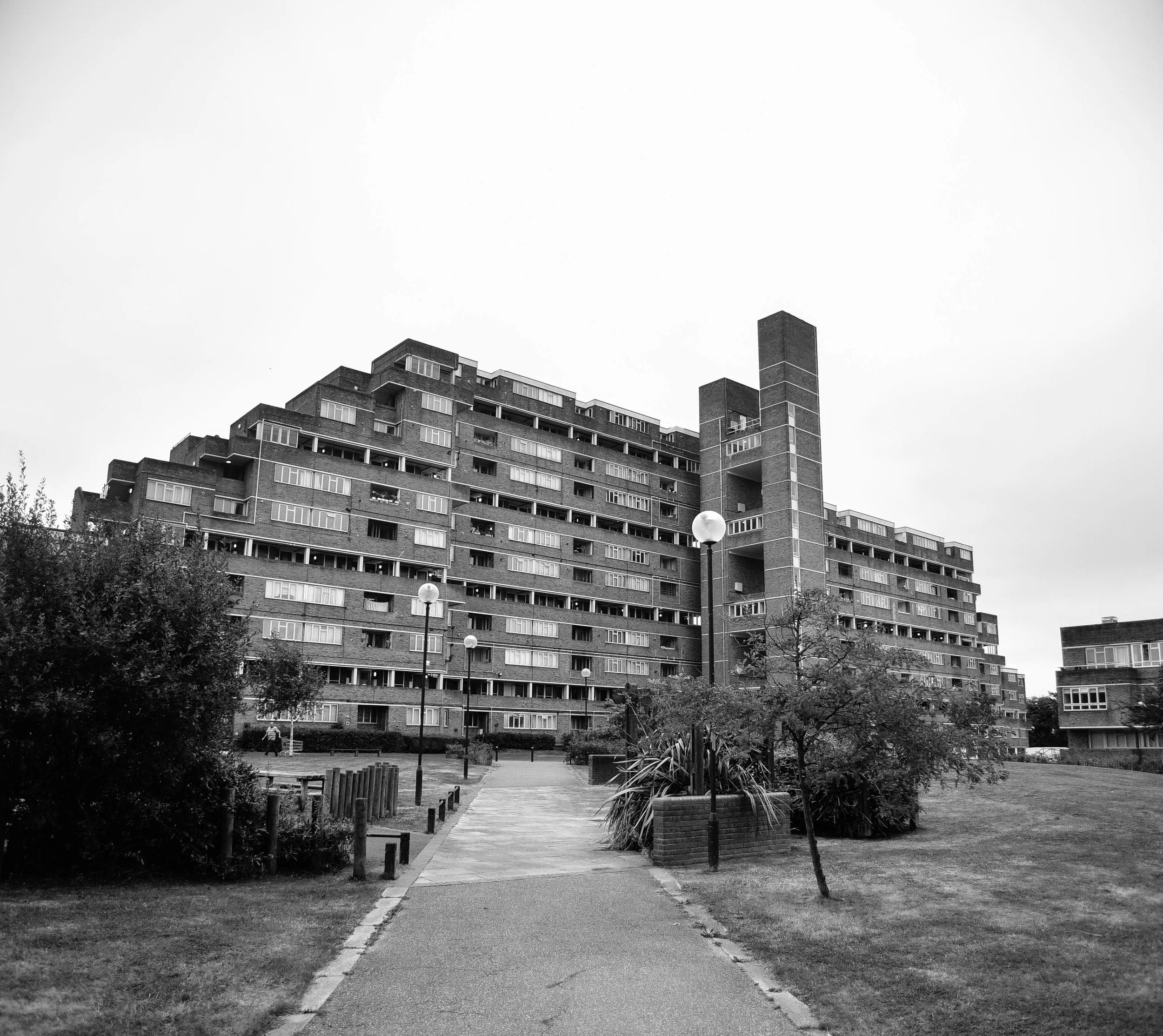
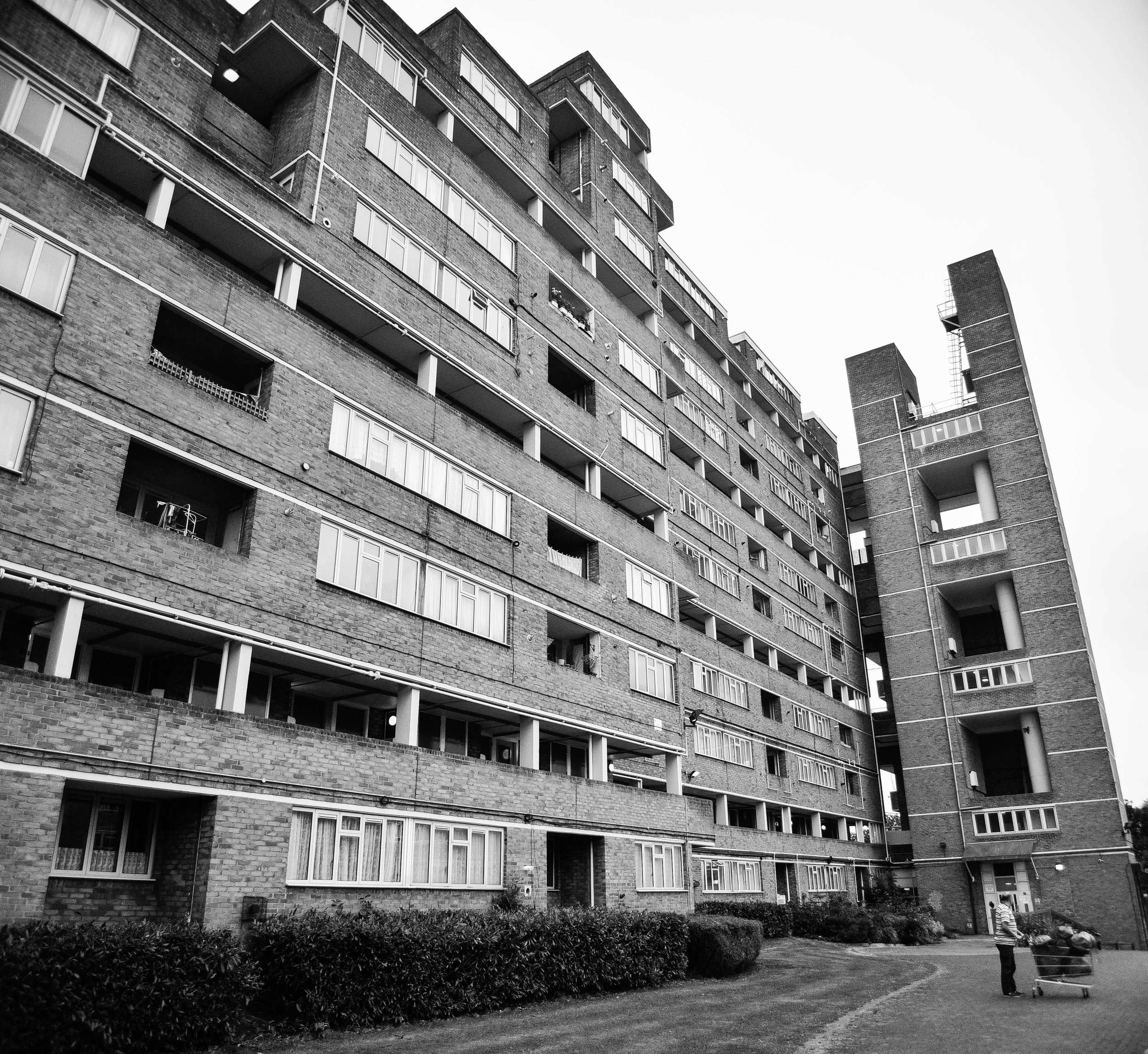
Dawson's Heights' northern block seen from its central public space.

Dawson's Heights' northern block seen from its central public space.

Back in the 60s, architecture in London operated in a very different context. Emerging from the Nazi bombings of World War II, the city was battered and bruised, and thousands were homeless or living in slums. The government took it upon itself to deliver tens of thousands of homes every year through mass redevelopment projects.

While often criticised for their top-down approach to design, no one can argue that they were’t at least ambitious, and at most, incredibly bold.

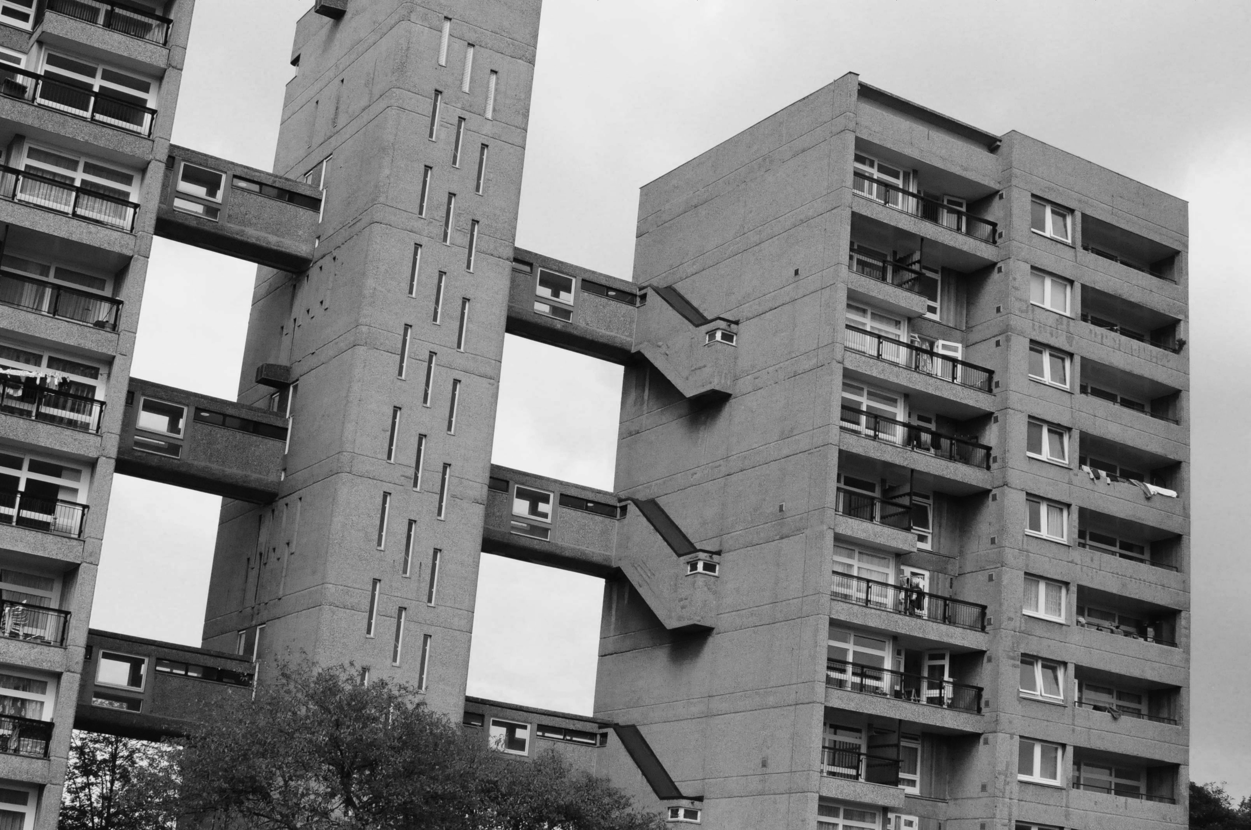
The Barbican Centre, Trellick Tower and Balfron are some of London’s most famous examples. These brutalist monuments are remnants of a past when - although they didn’t always get it right - architects could at least attempt to solve social problems through creative design. 

Not all of the examples from this time were dominating brutalist buildings. Some were smaller incisions in the existing urban fabric such as Golden Lane Estate, and others were modernist creations which boldly - but appropriately - inserted themselves into the remains of pre-war London.

Last week London opened its doors for Open House 2016 and I had the opportunity to check out one of the most impressive examples. 

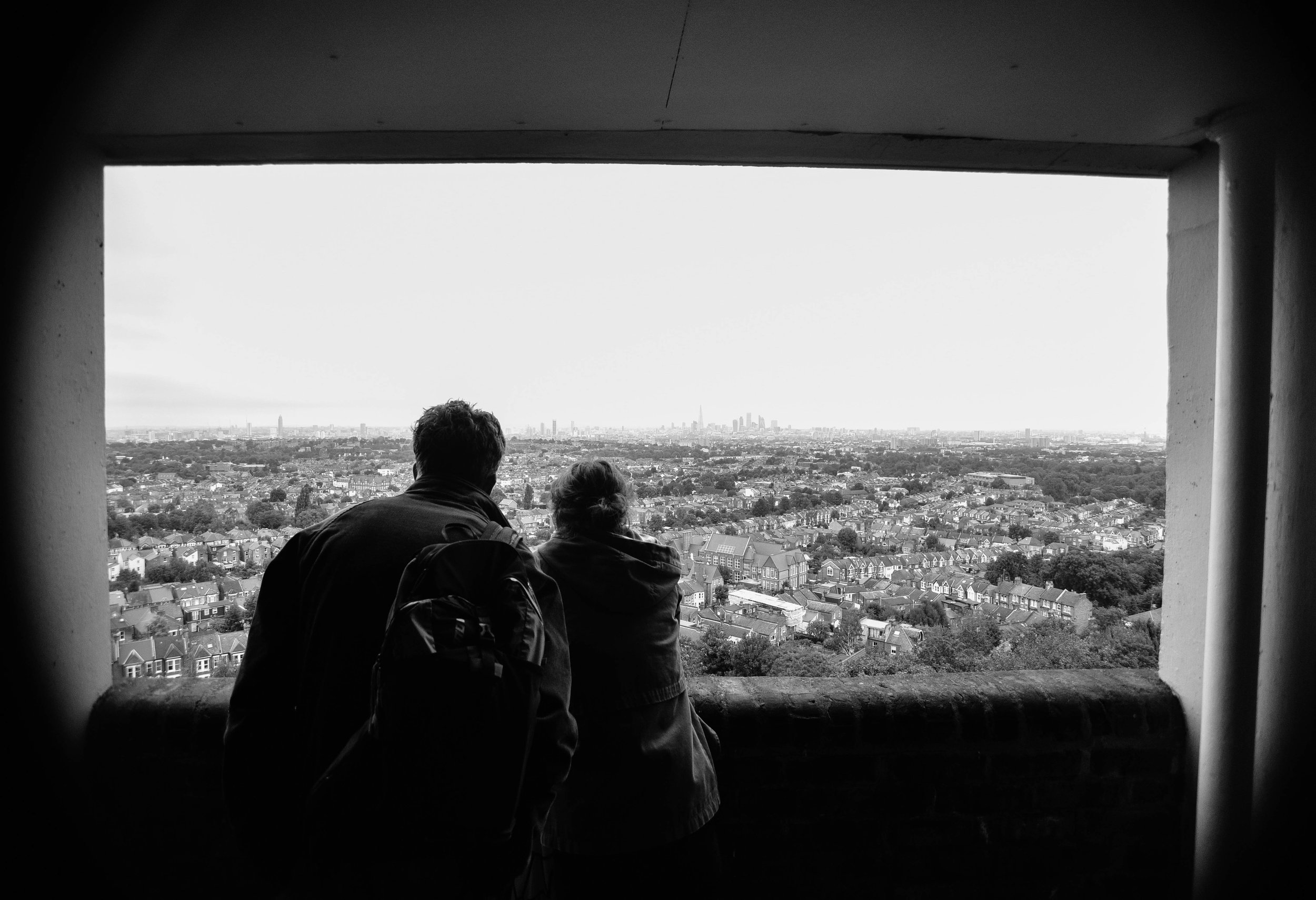
A view worth millions: looking from the northern block of Dawson's Heights.

A view worth millions: looking from the northern block of Dawson's Heights.

In 1964, at just 28 years old, architect Kate Macintosh was given the job of designing Dawson's Heights in south London. 

Working for the Southwark local authority, Kate was given a job which today is almost unthinkable - the freedom to design new London housing on a large plot of vacant land. With strongly socialist parents and a clear drive to help generate social justice through architecture, Kate was given the opportunity to deliver a scheme which would stand the test of time.

Clearly, it has. 

Decades later Dawson's heights is now considered 'one of the most remarkable housing developments of the country'. 

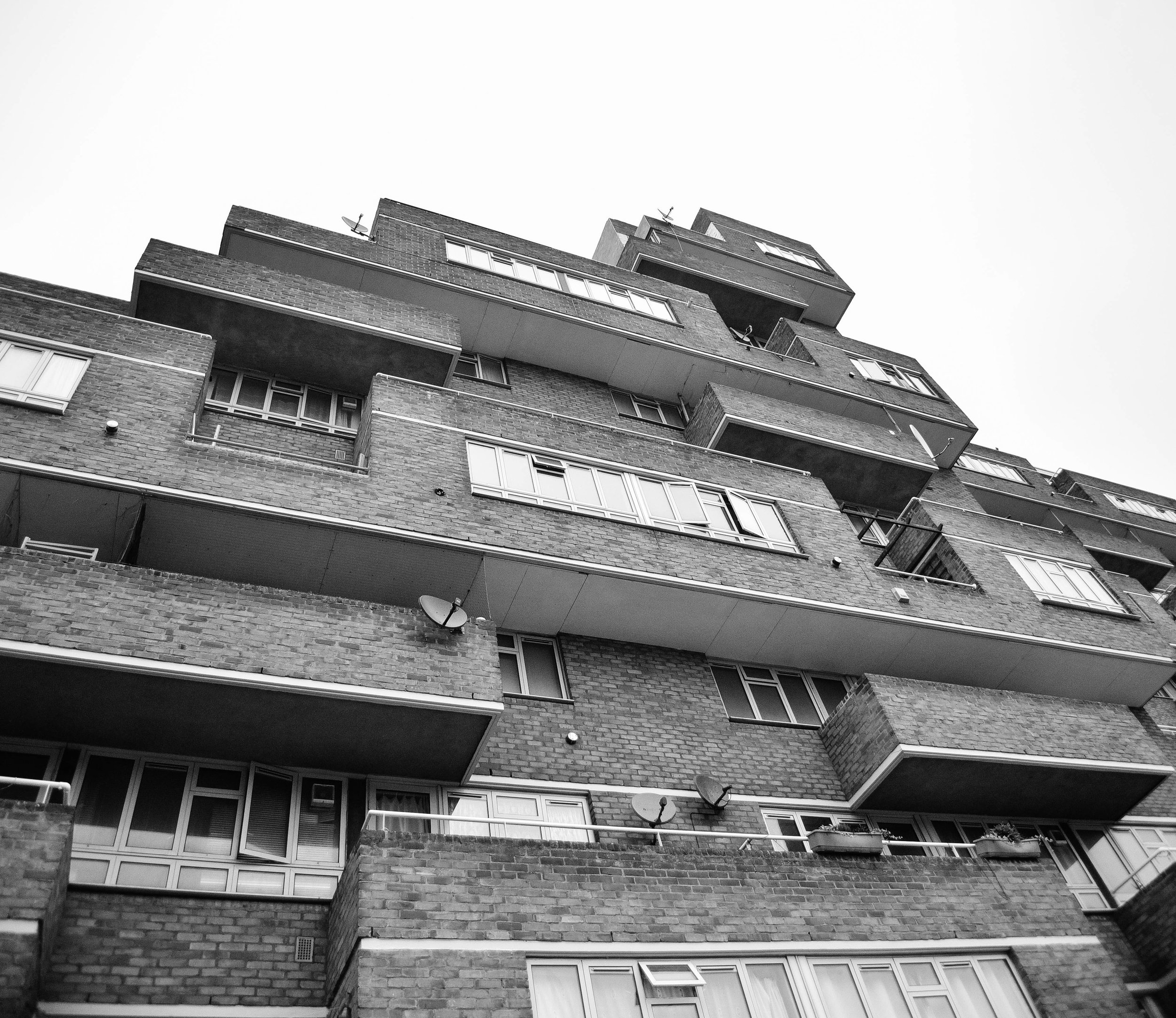
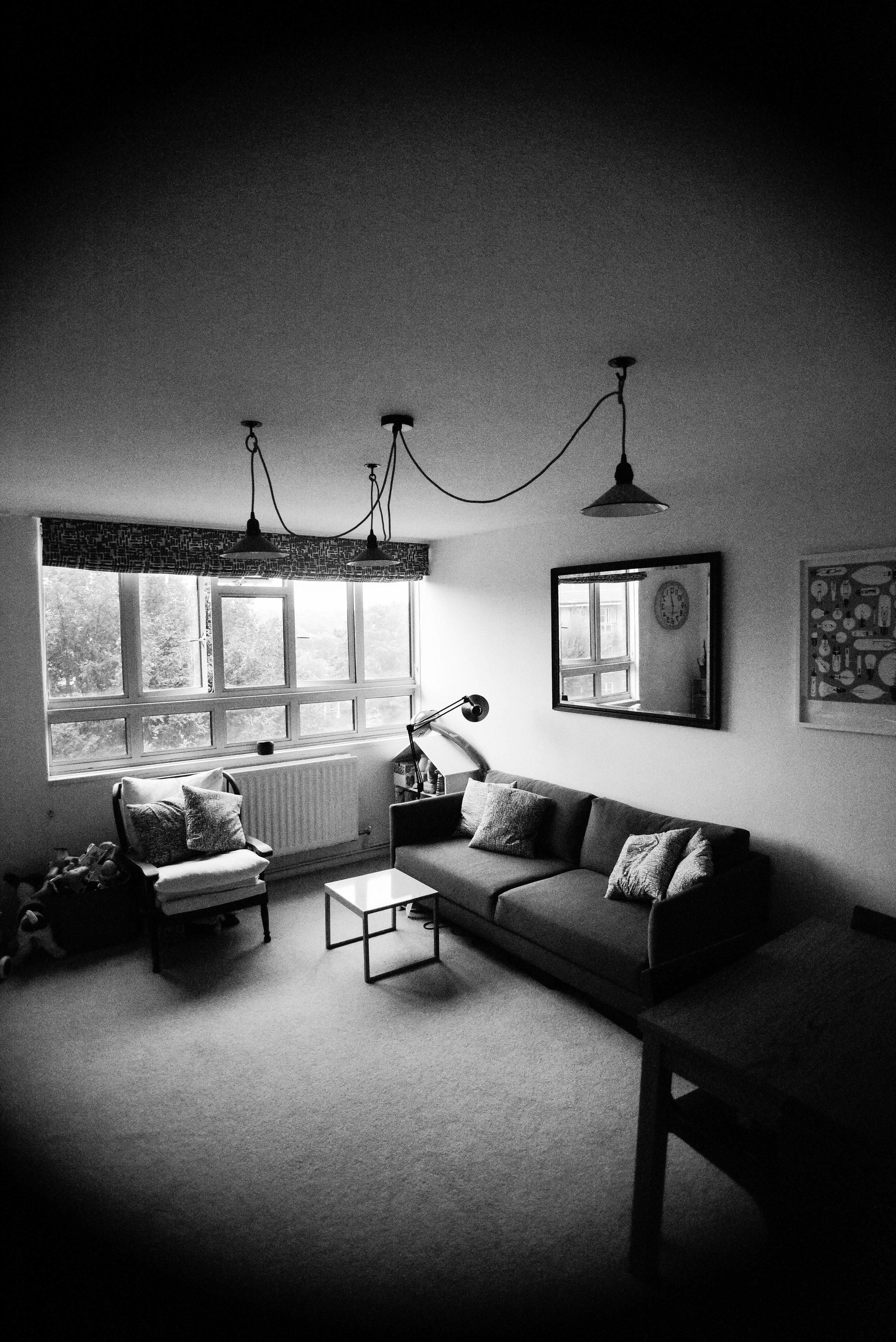
As I walked through Dawson's Heights' many street-like corridors, and entered into its beautiful modernist flats, it was clear to me that this building was designed with a different agenda compared to developments today.   

It was built with a genuine ambition to create a community, and a more just society. Every decision that Kate made had logic to it: blocks were oriented to increase sunlight to  flats, room arrangements were such that every flat had a balcony, levels were split to improve acoustics, and the building's form and massing ensured an abundance of green space and views across the city from its public corridors.

Whether through a change in political-will or a shift in the behaviour of our markets, architecture may re-emerge as a discipline which seeks to fix societal problems. 

Until then, at least we have reminders from a time when it did. 

If you're interested in exploring London's most incredible buildings, be sure to check out Open House 2017

INSTAGRAM


Inner Sydney’s best new architecture by Tom Oliver Payne

Back in January I returned to my home city of Sydney for a month. As the plane crossed the beautiful harbour, I could see dozens of new buildings now gracing the skyline. Here is - in my opinion - the best of inner Sydney’s new architecture.

1. One Central Park

When I was in my early 20s my friends and I would head to a music night on Sydney’s Broadway called Purple Sneakers... No doubt I was annoyed when the bar was to shut to make way for a bunch of new towers.

Turn the clocks forward a decade and all is ok! One Central Park is beautifully designed (by Jean Nouvel), and with a whole load of bars, shops and cafes, it’d be hard to argue that the new area isn’t an awesome addition to the city. Having now won dozens of design and sustainability awards around the world, this is the sort of development that makes Sydney's architecture a talking point around the world.

I was lucky enough to get a tour by friend of mine, and urban planner, John O’Callaghan. Check out the film below.

2. Dr Chau Chak Wing Building

Known for using unusual materials and incorporating a unique sculptural style, Frank Gehry is one of the world’s most celebrated architects.

In the past he’s been criticised for being a ‘Starchitect’ whose showey buildings overwhelm their surroundings.But in my mind, Gehry brings a sense of humanism to cities, which across the world, suffer from lifeless, boring buildings. And Sydney is no exception to this. It only takes looking at the city skyline to see that many of Sydney's existing tall building architecture is unimaginative and unambitious.

Whether you see it as ‘a beautiful paper bag’ or a ‘treehouse’, the new UTS building is a awesome new addition to the Sydney skyline.

Photo by Jason James

Photo by Jason James

3. Paramount House

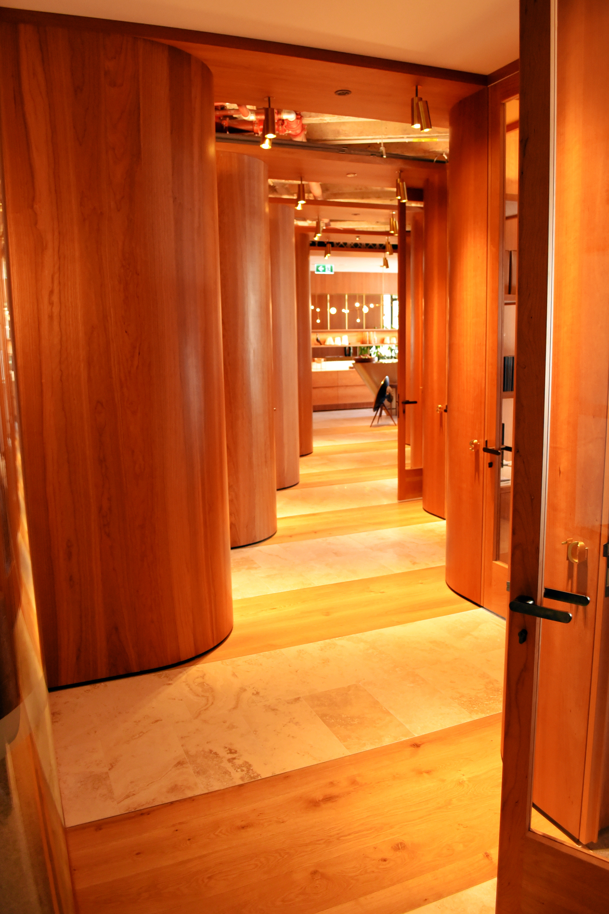
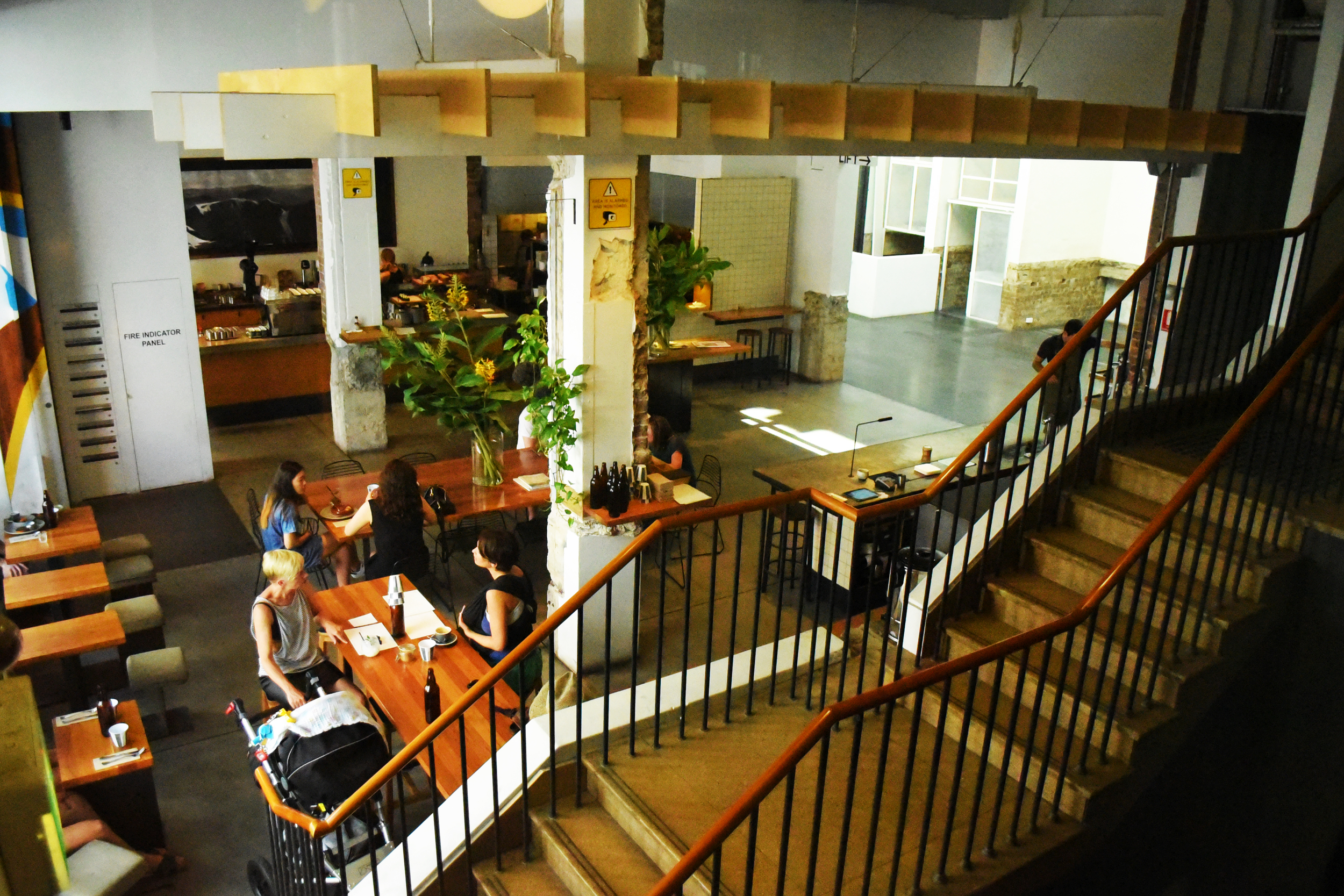
Through the enhancement of a beautiful 1940s art-deco building, the collaborative work of Woods Bagot architects, Fox Johnston Architects and Right Angle Studio, among others, has proved that Sydney's heritage buildings can be beautifully readapted into innovative and creative spaces for modern-day use.

The recent refurbishment has created a dynamic space for a mix of uses, including a cinema, café and workspaces. I was super impressed with Wood Bagot’s use of traditional joinery and artisan furnishings in its incredible shared office space.

Sydney has a strong record of destroying old buildings, so its awesome to see a project like this, which has seen the art-deco Paramount so nicely brought back to life.

I was originally going to include a section on the city's worst architecture, so that I could have a good old rant about Barangaroo. But for now... I'm keeping it positive!

Any other buildings that should be on this list?

INSTAGRAM


Why I like Brutalist architecture by Tom Oliver Payne

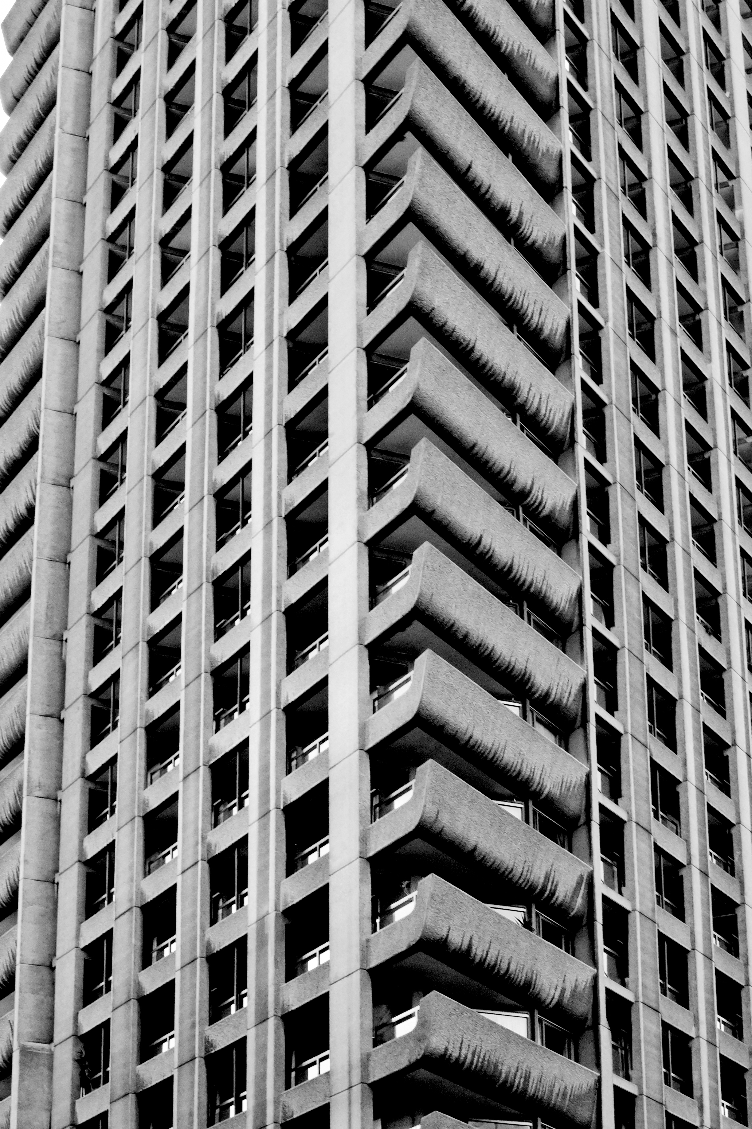
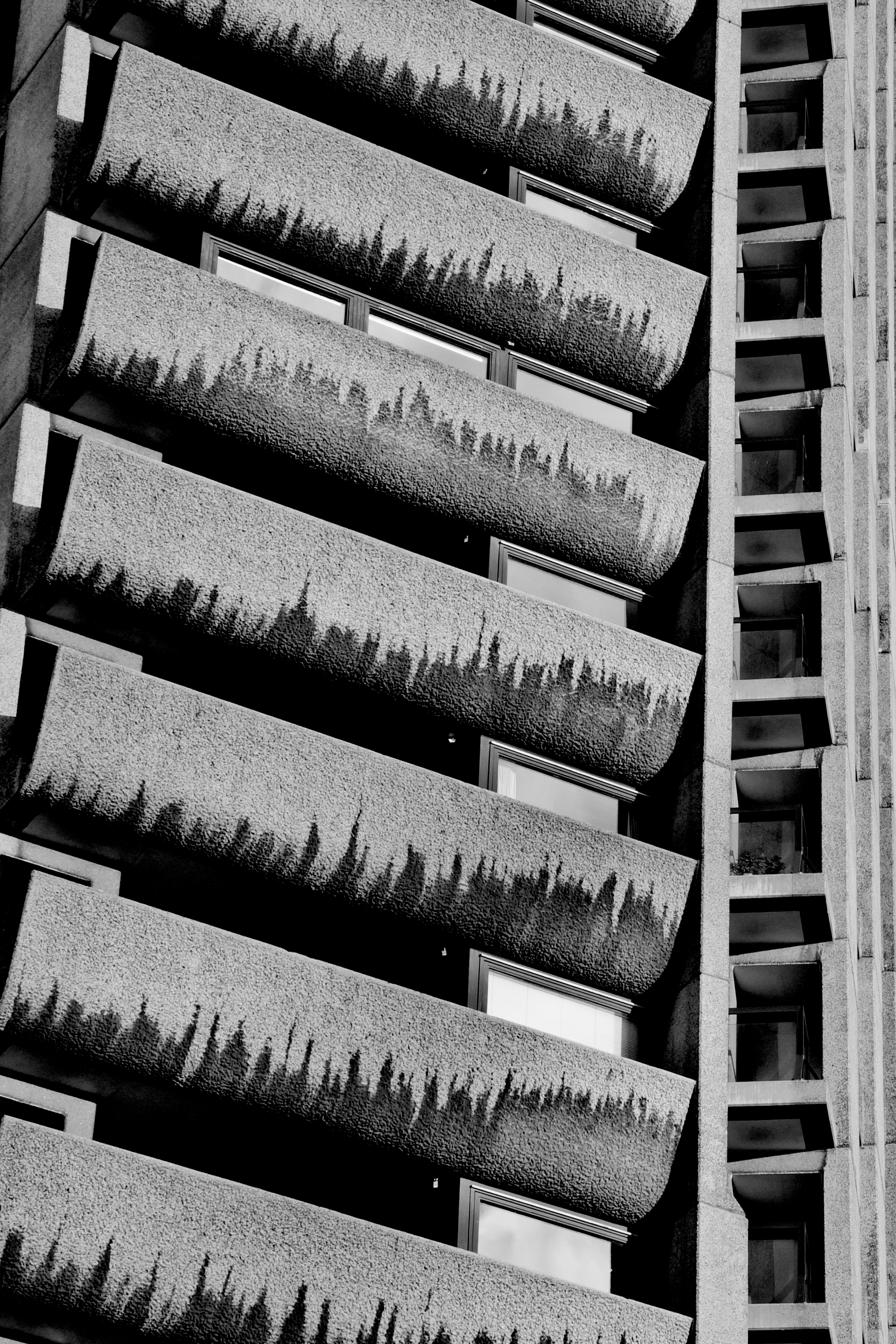
Brutalism seems to divide opinion like no other type of architecture. Between the 50s and 70s huge, grey, concrete buildings were built across cities around the world. While a lot of people hated their ‘inhuman’ and overbearing aesthetic, the architects designing them thought they were creating a new kind of utopia.

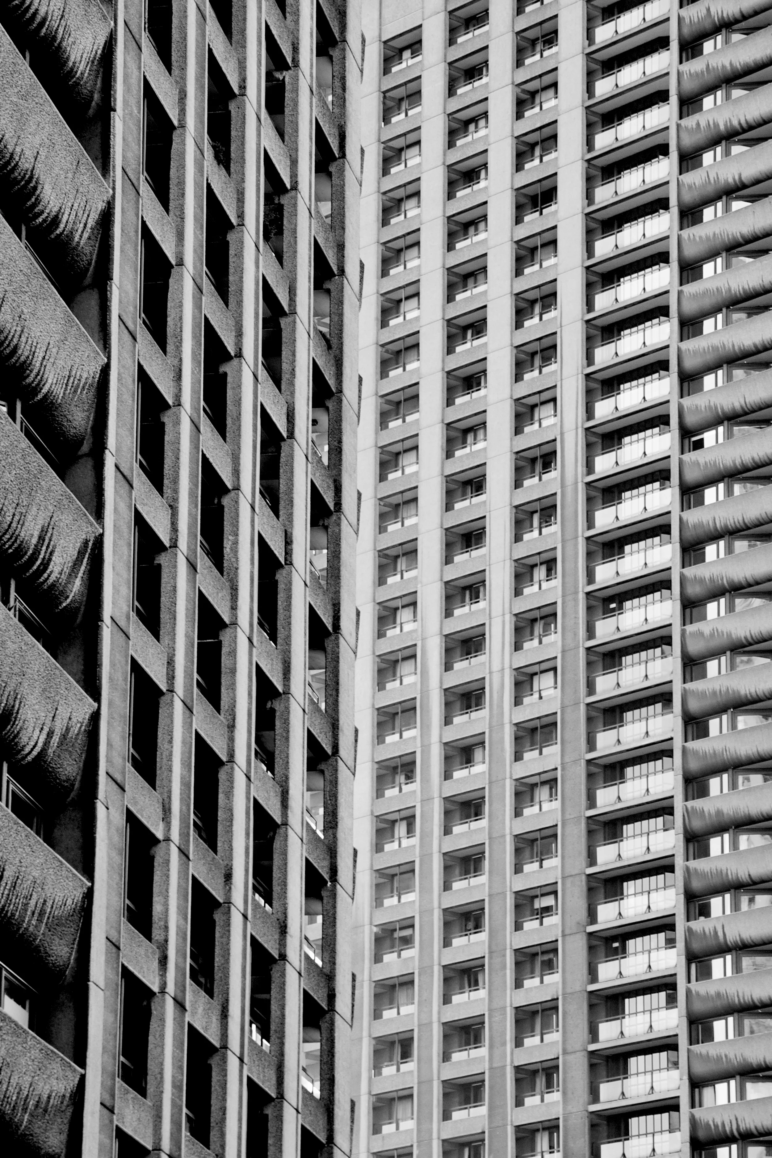
Until a few years ago, I knew nothing about this type of architecture. But it wasn’t long before I fell in love with taking photos at The Barbican Estate, and soon learned a bit about the movement.

Whether I love or hate the look of a particular brutalist building, I now really appreciate what it was trying to achieve. Now, every time I head off to a new city, I seek out these buildings and try to learn a bit about what they were trying to achieve in each place. From scanning the internet, it looks like other people love it too.

The term ‘brutalism’ comes from the French word ‘brut’, meaning ‘raw’. That’s exactly what these buildings are. So different from elegant design and detailing in the past, their designers used rough concrete with hard textures, and showed-off elements of the building that used to be hidden, like lift shafts.

The thing that I think is cool about brutalism is not the way it looks, but that it was designed with the best, optimistic intentions.

After the World War II, Europe was trying to rebuild its cities in a way that fixed a lot of its problems from the past, and Brutalism was all about trying to make buildings as cheap, functional and equal as possible. By making sure the building’s foundations were exposed, architects hoped that the ordinary could be seen as an art form, and in doing so - make them attractive to every person in society - whether rich or poor.

A key element of brutalism in London was the idea of creating ‘streets in the sky’, which would connect apartments blocks or offices. The idea was that neighbours could talk, kids could play and people could walk to work way above the fast-moving traffic below.

In the period of two decades, once low-lying urban areas were quickly transformed by towering concrete structures by architects and planners who envisioned a utopian city, where residents lived equally.

The ideas were cool, but in practice, it didn’t take long before the brutalism movement came to an end. It’s considered a social experiment, which didn’t really work. People soon realised that these buildings created strange ‘placeless’ spaces and restricted pedestrian movement through urban areas, which encouraged isolation and crime.

After harsh criticism for years, many of these buildings were demolished and some have been preserved. In London, my favourite surviving examples are Robin Hood Gardens, Balfron, Trellick Tower, and The Barbican.

The thing that I find super interesting about the Brutalist Movement, is how bold these planners and architects were: they saw a problem in society and they set out to find a solution for it through design. Sometimes I feel like society lacks some of that audacity these days. We have as serious housing shortage in London right now, and no one seems to be doing anything to fix it.

To me, this style of architecture represents a group of optimistic designers who were experimenting with a courageous idea - and that’s pretty cool.

Photos and film copyright Tom Oliver Payne.

INSTAGRAM


3 observations from Amsterdam by Tom Oliver Payne

I hadn’t been to Amsterdam for a few years, so I was pretty excited to head back there last week.

You can learn a lot about a place just by observing it. Café culture, nightlife and architecture are all indications of what a city is like. Even subtler than that is what people wear, how they travel and converse. People-watching – in my opinion - is a far better way to understand a city than reading a book or heading out on a bus tour. After a few days of cruising around the city by foot and bike, I made a couple of observations below.

1. bikes are still loved in winter

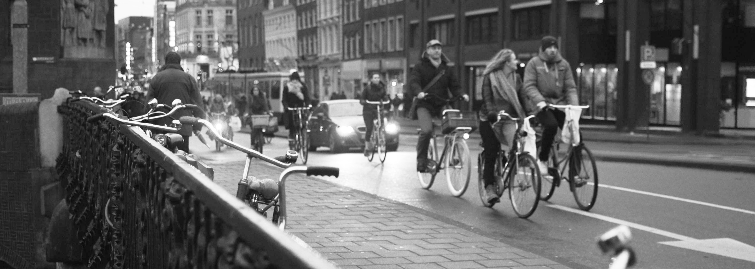
Amsterdam is a bicycle city – just about everyone knows that. Coming from the hot and sweaty landmass on the other side on the other side of the world, I’ve always wondered how Amsterdam’s cold winter temperatures and minimal daylight hours impact upon people’s desire to ride. In short, this seems to have very little effect.

Early morning before the sun is up and the air is ice cold, bike paths into the city centre are packed with bikes. While the weather may sound a little grim, people aren't deterred at all. Actually, it would be interesting to understand the happiness levels of car drivers, public transport users and bikes riders in winter in Amsterdam. I’m certain those on bikes would be far happier than the rest. As in any city, people on bikes can have random conversations, stop in and out of shops en-route and observe early morning street life. Driving a car simply doesn't give you the joy that riding a bike does.

Over and over I've been told that cities should not – or can not – adopt Dutch cycling culture because of weather and climate. Unless you're talking these temperatures, that's a load of rubbish. I’ve heard this argument in cities with far milder temperatures than Amsterdam, and with far less rain too. When you have the right infrastructure and a culture supportive of bikes, cycling works in all times of the year.

2. Too much of one type of tourism is damaging the city centre

I know this is a pretty bold statement and is based on observation only. But the city centre is absolutely packed to the brim with 'Euro-trip' Australians, English hen parties and stoned Americans. Not that I have a problem with any of this in principle, but when a beautiful historic city centre is inundated with drug and party tourism culture, it begins to look and feel a little naf. Rather than a liberal city that is accepting of liberal attitudes, a large part of its economy looks to be solely reliant on a single type of tourism. As a result it feels like the city is developing around its tourism narrative rather than evolving as an actual place. This isn't good for locals or the future of the tourism industry.

The liberal Dutch attitude is a wonderful thing. The problem however, is that other countries are not so liberal. As a result, Amsterdam city centre has become a mecca for 'lads on tour’. Tacky neon signs hanging from beautiful brick work, café signs reading “American steaks” and an abundance of English football jerseys are just a few telling signs that the city centre is in stress.

Now, I know that the internationalisation of urban centres is well-discussed problem in the age of globalised economies and broken-down borders, but I’d argue that city’s like Amsterdam need to understand how its tourism economy can be essentially self-destructing. It's becoming increasingly obvious that the commercialisation of places and products actually leads retail centres to become far less competitive in a world where distinctiveness is increasingly vital to attract and maintain a healthy tourism trade. As place branding and marketing has grown in importance, urban markets in London for example, are quickly trying to rediscover what made them unique in the first place.

Perhaps its time for Amsterdam to recognise and enhance what makes the city a great place for locals. This will naturally translate into a strength for tourism.

3. People are amazing

The best part about going to a new city is meeting new people, and generally when you step put into a new place you get a vibe straight away. Are people smiley, polite, and do they have a warm aura? Although I'd been to Amsterdam before, I was immediately overwhelmed with how amazing people were. There is so much warmth and love in that city - it's incredible.... Maybe it's just a Dutch thing!

How well do you know Amsterdam? Any thoughts on these observations?

Photos by Tom Oliver Payne. 

Mikael Colville-Andersen: teaching us the fundamentals of good urbanism by Tom Oliver Payne

img_5685.jpg

Jane Jacobs reminded us of the city's most important element and inspired a generation of urbanists. Through a single photograph, Colville-Andersen has sparked a new movement that is helping to solve the greatest urban challenge of our time.

Jane Jacobs was revolutionary. By critiquing the modernist approach of twentieth century urban thinking, she taught us that traditional planning policies oppressed and rejected the single most important element of cities: people. Her ideas sparked decades of urban social movements, resulting in the preservation of inner city neighbourhoods across the globe. In the age of rationalism, she reminded us that cities are complex and chaotic. She reminded us that cities are human. Jane Jacobs (aka “The Crazy Dame”) inspired a generation of urbanists.

She reminded us that cities are human.

While Jacobs’ words continue to reverberate through history, this century we are faced with a new set of challenges. One in particular, dictates the way we govern, design and build urban spaces; it burdens our health care and kills our planet. Today’s greatest urban challenge is the car.

Our addiction to the car has made us crazy. We teach our children to fear the street and we fight wars to ensure we have reliable access to oil. Our obsession with the car controls just about every aspect of our urban lives. Like a drug however, it is destroying us from the inside out, not only is our atmosphere polluted and our streets congested, but every new road, car park and set of traffic lights makes our cities a little less livable. We have once again forgotten that cities are human.

Change however, is beginning to take place. We’re realising that there is a cleaner, more efficient and more human alternative to the car. Slowly but surely, we are now seeing the emergence of a global bicycle renaissance. This global movement can be traced back to a single photograph.

I started taking more photos of elegantly dressed commuters on bikes, and people kept reacting to them… after 6 months I thought I’d start a blog. It just exploded.

Back in 2006 Mikael Colville-Andersen was a film director. “I took a photo on my morning commute, which naturally involved bicycles… It wasn’t a great photo,” he told me, “it was just nice morning light”. A short time after uploading to Flickr, the photograph had received hundreds of hits and dozens of comments from around the world. “These comments started to appear from America like, ‘Dude! How does she ride a bike in a skirt?!’ So, I started taking more photos of elegantly dressed commuters on bikes, and people kept reacting to them,” he said, “after 6 months I thought I’d start a blog. It just exploded.”

At the time Mikael had no idea that Cycle Chic – as he later coined it – would become a global phenomenon. Nor did he know that it would spark an entire movement in new urban thinking. Just like Jacobs, Mikael was not trained in urban planning, but has become one of the most influential urbanists of our time.

It just so happens it was all by accident. “I didn’t realise these photos would be interesting to people,” he told me, “regular people, in regular clothes, using bikes as transport in the city… An entire generation of people all around the world had been told that cycling is sport and recreation. I was just a Copenhagener”.

Bicycles were once a common form of mobility in cities and towns around the world. Riding a bike wasn’t necessarily a sport or a sub-culture – it was simply a part of everyday life. The mass production of vehicles saw all of this change. The rise of the car after World War II completely transformed cities – first across the USA, and then across the world. Dense urban districts centred on transit hubs and commercial districts, spread into vast, car-dependant landscapes.

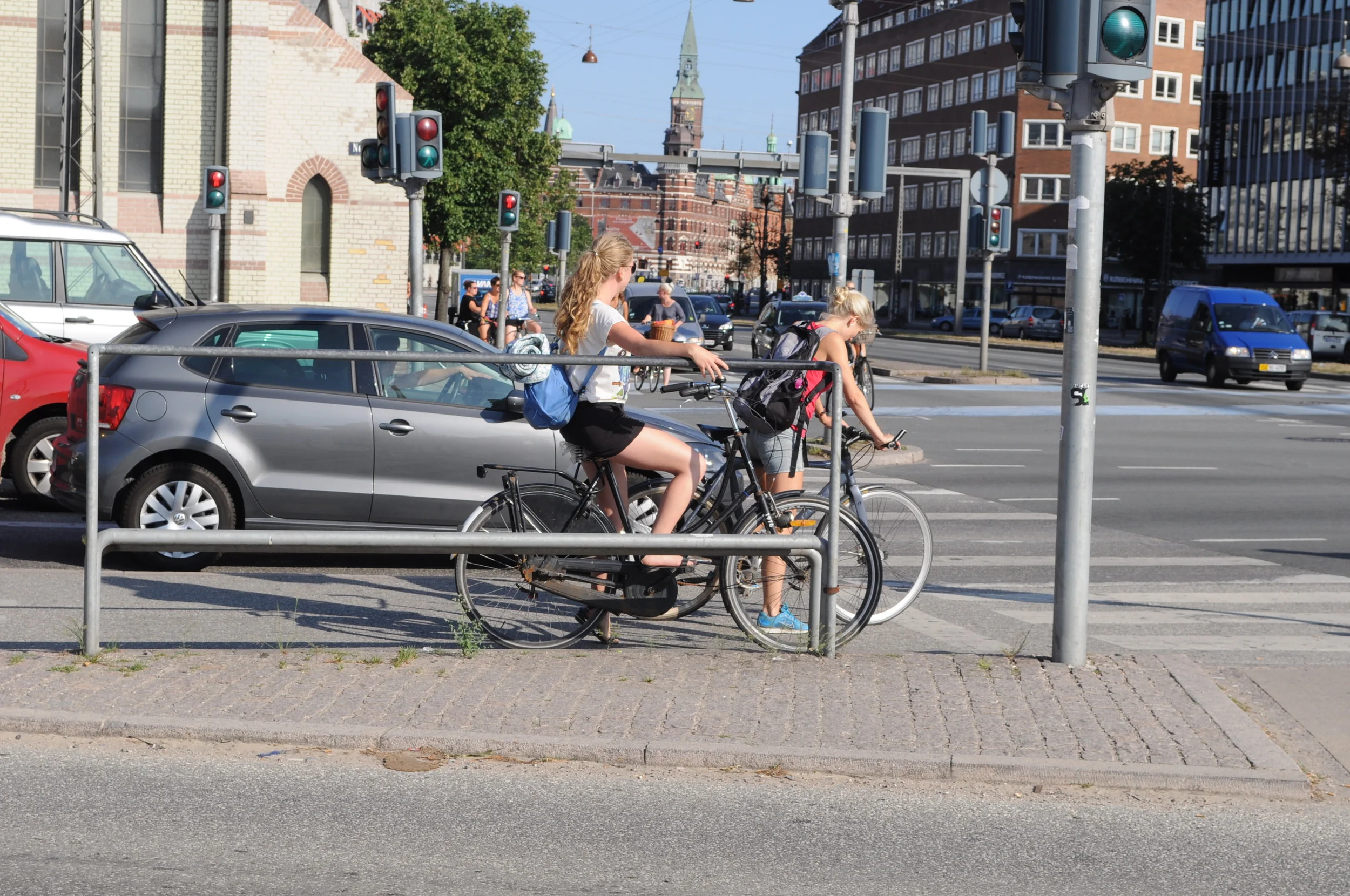
Unlike most of the world however, the rise of the car was short-lived in Denmark. As streets congested, air quality deteriorated and pedestrian fatalities mounted throughout the 60s and 70s, people took to the streets to demand equality for cyclists and pedestrians. In response, an extensive network of cycle paths was developed, traffic calming measures were implemented and people were encouraged to cycle. Today, riding a bike is once again part of everyday life: 37% of Copenhageners cycle to school or work. This figure stands at just 2% in Britain and 1% in North America.

After Cycle Chic and then Copenhagenize.com burst with internet traffic, Mikael decided to “give up film directing to see where this bike stuff was going”. His photographs had already sparked a bicycle buzz, and fashion labels were quickly jumping on the bandwagon. Fortunately however, the fad didn’t end there. In addition to online media, Mikael began promoting Copenhagen’s bicycle culture to urban planners and policy makers. The rest, it seems, is history.

Mikael could never have imagined that his 2006 Flickr image would become known as ‘the photo that launched a million bicycles

Just about every city in the world is now talking bikes. New York has recently rolled-out a massive bike share scheme to complement it’s new cycle paths, Hangzhou has launched the world’s largest bike share programme and the UK central government just commenced a multi-million pound cycling infrastructure scheme. The New York Times has even reported that we’re experiencing the “End of Car Culture”. Mikael could never have imagined that his 2006 Flickr image would become known as ‘the photo that launched a million bicycles’, as one journalist put it.

'Conversation lanes' on the world's busiest bicycle thoroughfare

'Conversation lanes' on the world's busiest bicycle thoroughfare

Sitting with Mikael at a café in central Copenhagen, we watched dozens of people passing on their bikes. Smiling at us as they passed, or stopping to chat with friends on the street, it became obvious to me that Mikael could envision cities of the future because he already lived in one. As Mary Embry from Copenhagenize Design Co. once said, “People work hard to make sure their cities are as user-friendly as Copenhagen… World-class cities want in on the cycling infrastructure and they look to Copenhagen for inspiration and guidance.” Copenhagen truly has become the model for livable cities.

At the café Mikael soon asked me, “you up for a ride on the Bullit?” as he looked over at his cargo bike parked on the street (#parkwhereyouwant). Standing at 6’2”, I awkwardly clambered into the front carrier. Conscious of the fact that my lanky legs were up by my ears, it didn’t take long before I was reminded where I was. In Copenhagen, you’re not judged on what bike you have, what ‘style’ you have, or how ridiculous you may look, as long as you’re on two wheels – anything goes.

Mikael took me around the city to show off some its most innovative bicycle infrastructure initiatives. First up was Dronning Louises Bro: the world’s busiest bicycle thoroughfare. Now, if someone took you to the busiest car thoroughfare in the world, you probably wouldn’t want to stay for long. It’s quite the opposite when people are riding bikes: this place had some serious energy.

A bridge where over 30,000 people come through on bikes each day makes for pretty great socialising and people-watching. So much so that the City even decided to widen the cycle paths to make ‘conversation lanes’. Bikes aren’t just great for transport: they’re also a brilliant place making tool. Unlike cars – Mikael reminded me – you can actually make eye contact with, and talk to people when they’re riding a bike.

Cruising around the city to check out Copenhagen’s bicycle footstands, commuter counters, and of course, the new Cycle Superhighways, I was then shown where the City had installed cycle paths to complement commuter’s desire lines. First promoted by William H Whyte back in the 60s, the team at Copenhagenize is now at the forefront of utilising observational techniquesfor pedestrian and cycle planning. Just like Jane Jacobs, Mikael is working hard to make cities less rational and more organic.

Working closely with media, architects, planners and policy makers around the world, Mikael is continually exposed to the ideas and projects that are reshaping cities. But to him, there’s only one city that is really doing it right. Copenhagen has not become complacent as the world’s greatest cycling city, it’s continually striving to increase bicycle modal share and improve the experience of cyclists. Mikael’s goal is to communicate this culture to the rest of us… I guess ‘Copenhagenize’ says it all.

Through a single photo back in 2006 Mikael has showcased a place where cars no longer dominate. And now, city-by-city, a new urban social movement is taking shape. We are beginning to mend the urban fabric that the car has torn to shreds. Just like “The Crazy Dame”, Colville-Andersen has reminded us that cities are human. By inspiring a generation of urbanists, he’s also helping to solve the greatest urban challenge of our time.

Check out this article posted on the Urban Times here.

All photos/text by Tom Oliver Payne.

I just went to Paris: I loved its boulevards by Tom Oliver Payne

19488_10152015943211777_290678586_n.jpeg

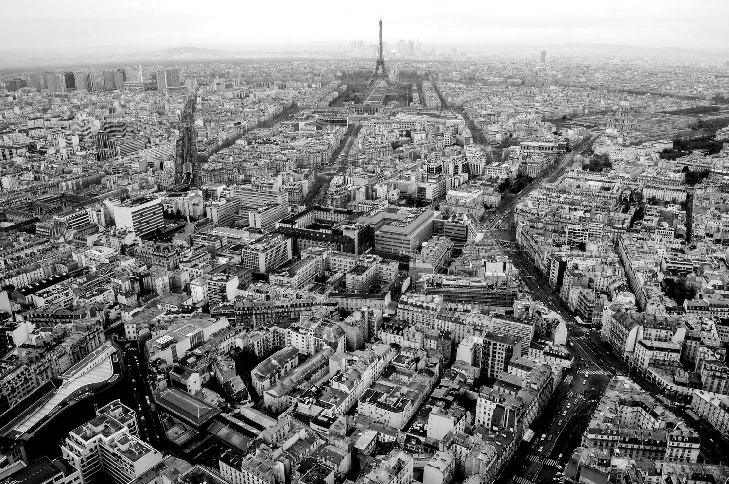
I just got back from a few days in Paris. Perhaps the most recognisable features of the its urban landscape are its huge boulevards and symmetrical road networks.

Its large avenues, boulevard rings and urban squares are not a historical accident, but were part of a major plan to modernise the city in the 18th and 19th century with the radical plans of Baron Georges-Eugène Haussmann. Funded by Napoléon III, The Haussmann Plan completely restructured Paris, giving it its present day form. Cutting through traditional alleyways, new rationally-designed boulevards and avenues and new open spaces established the foundation of what is now one of the most popular and highly regarded urbanist features of Paris.

Haussmann took a highly militarised approach to planning and has been criticised for the demographic and social effects of his urbanism operations. Even today, he is still seen as both a 'hero' and 'destroyer of Paris'. Looking back however, it seems to me that these major changes just 150 years ago have brought significant benefits to Paris -  changes that would be virtually impossible to implement and fund today. In addition to their obvious function to create public spaces and increase pedestrian, bicycle and vehicle mobility, the boulevards create a beauty that few other cities in the world possess. These shots I took over the last two days illustrate the perfect uniformity created by the Haussmann Plan.

Photos by Tom Payne.
All photos by Tom Oliver Payne

All photos by Tom Oliver Payne