London

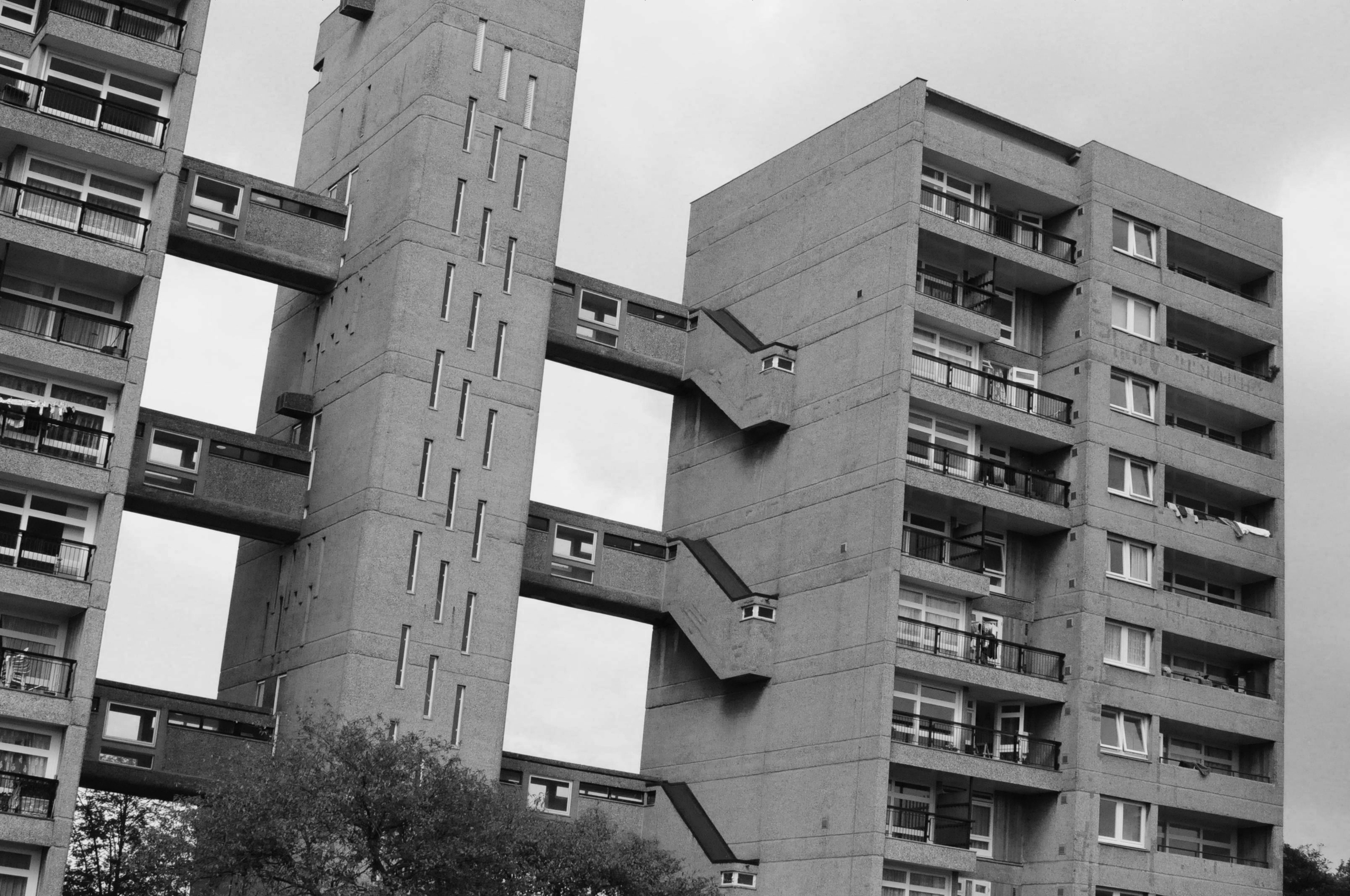
East London's Fredd Wigg and John Walsh Towers by Tom Oliver Payne

Often a city's ugliest buildings are its most controversial.

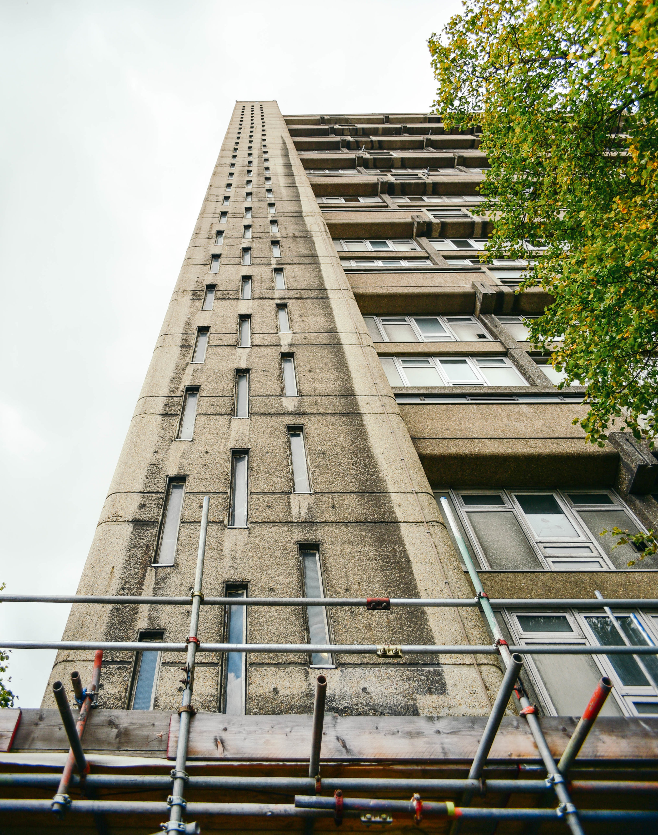
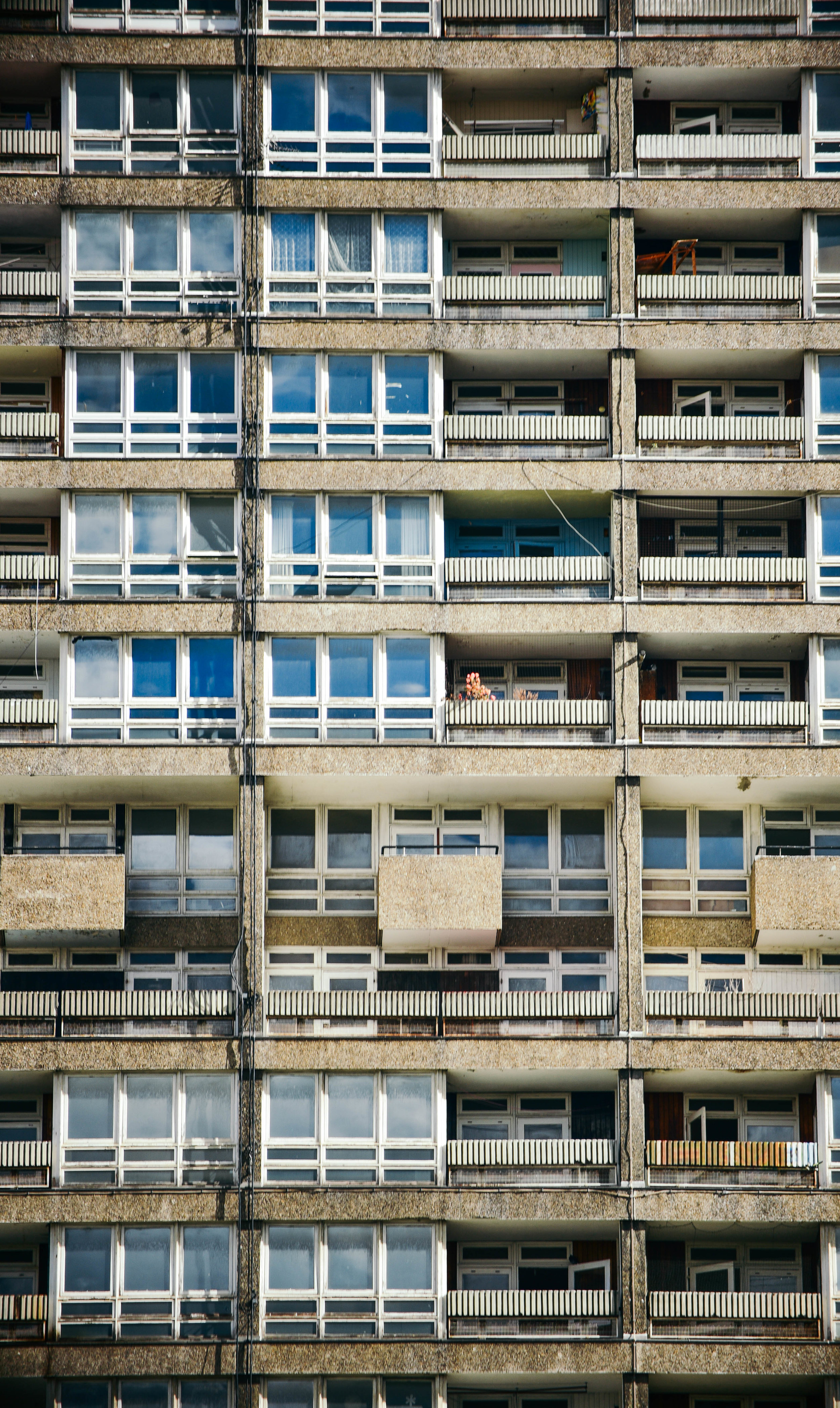
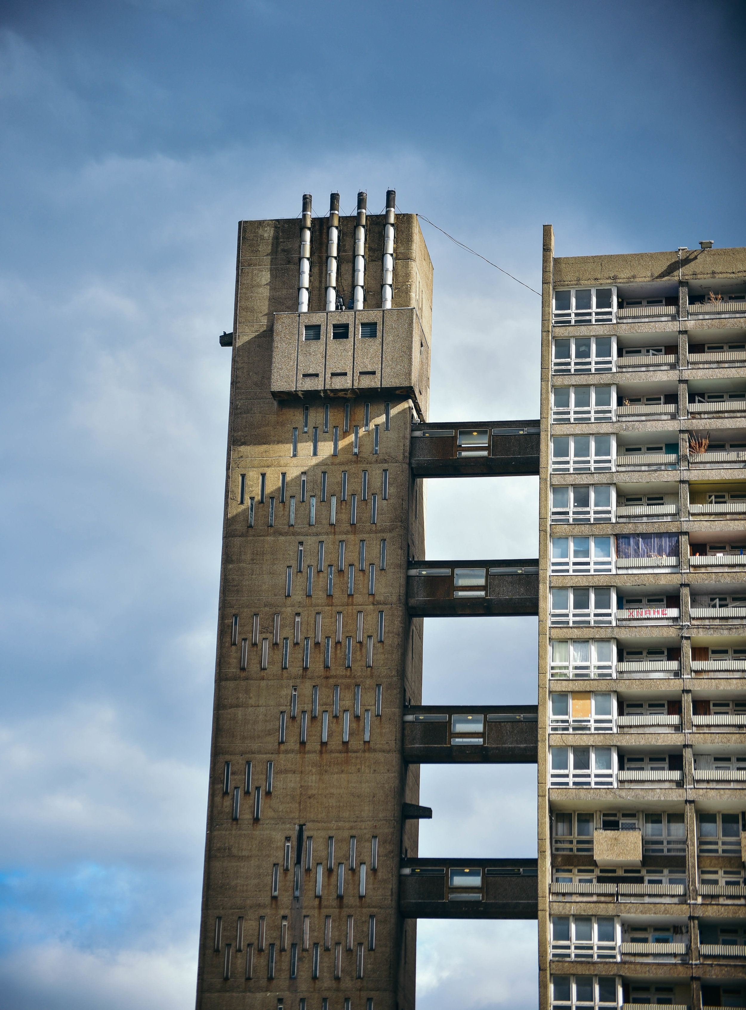
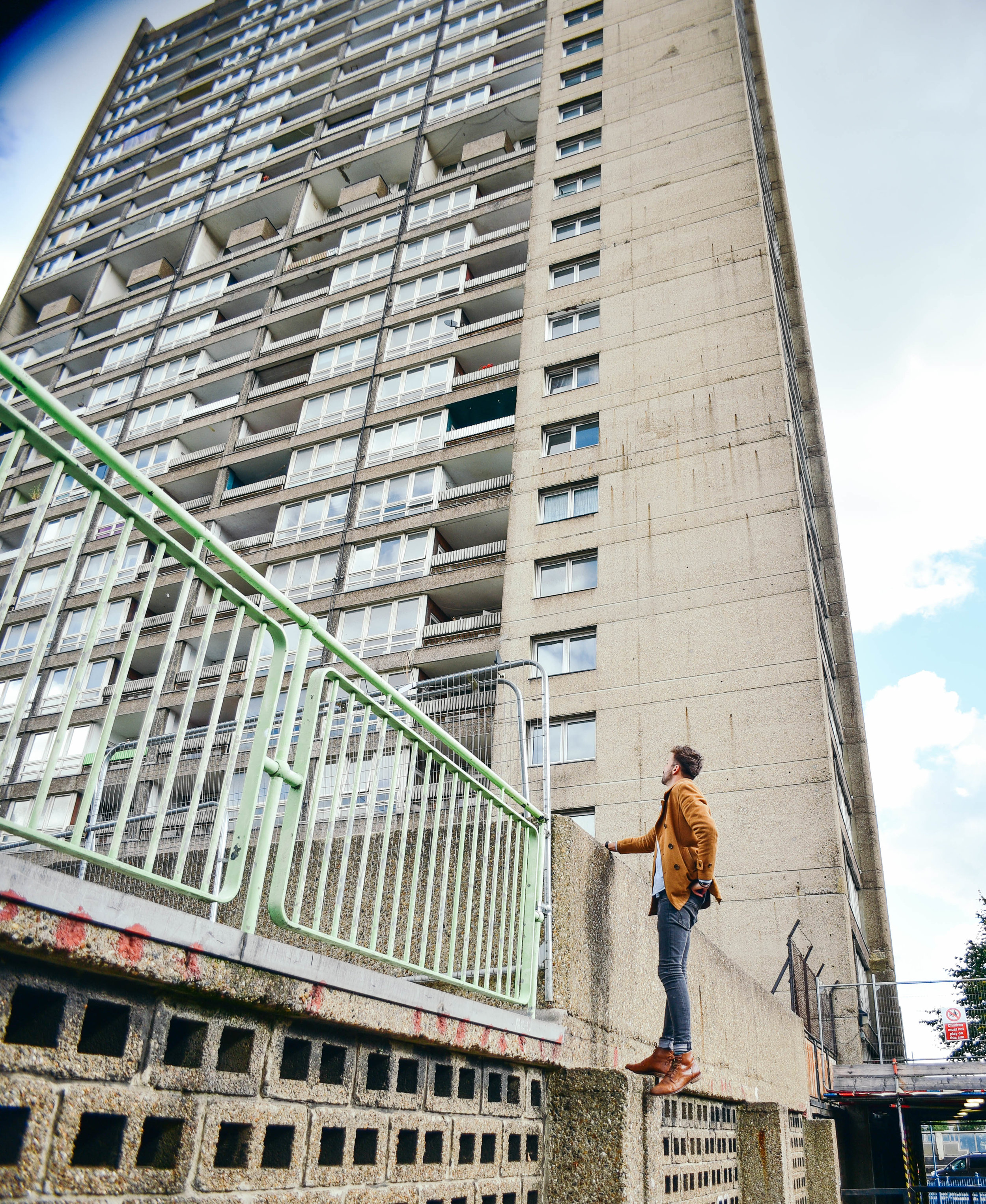
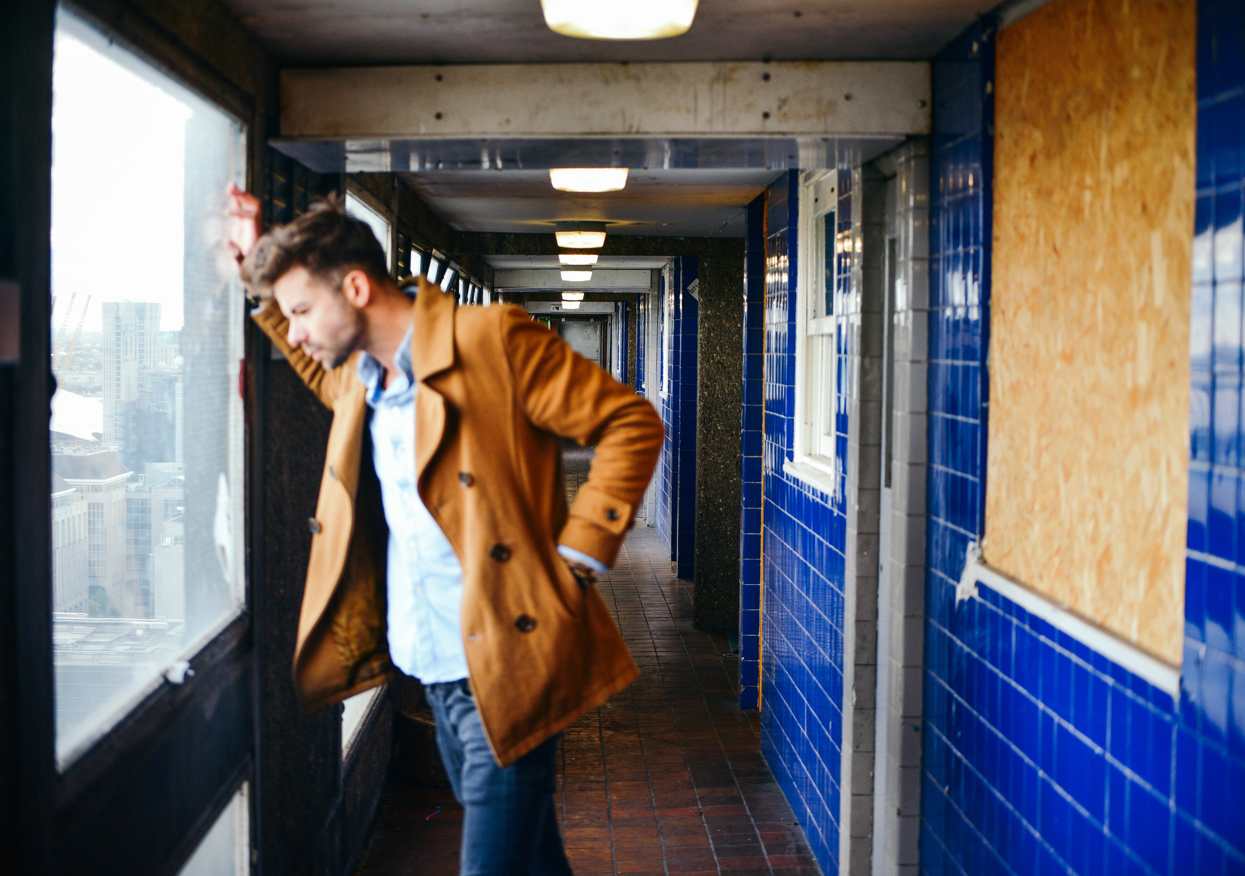
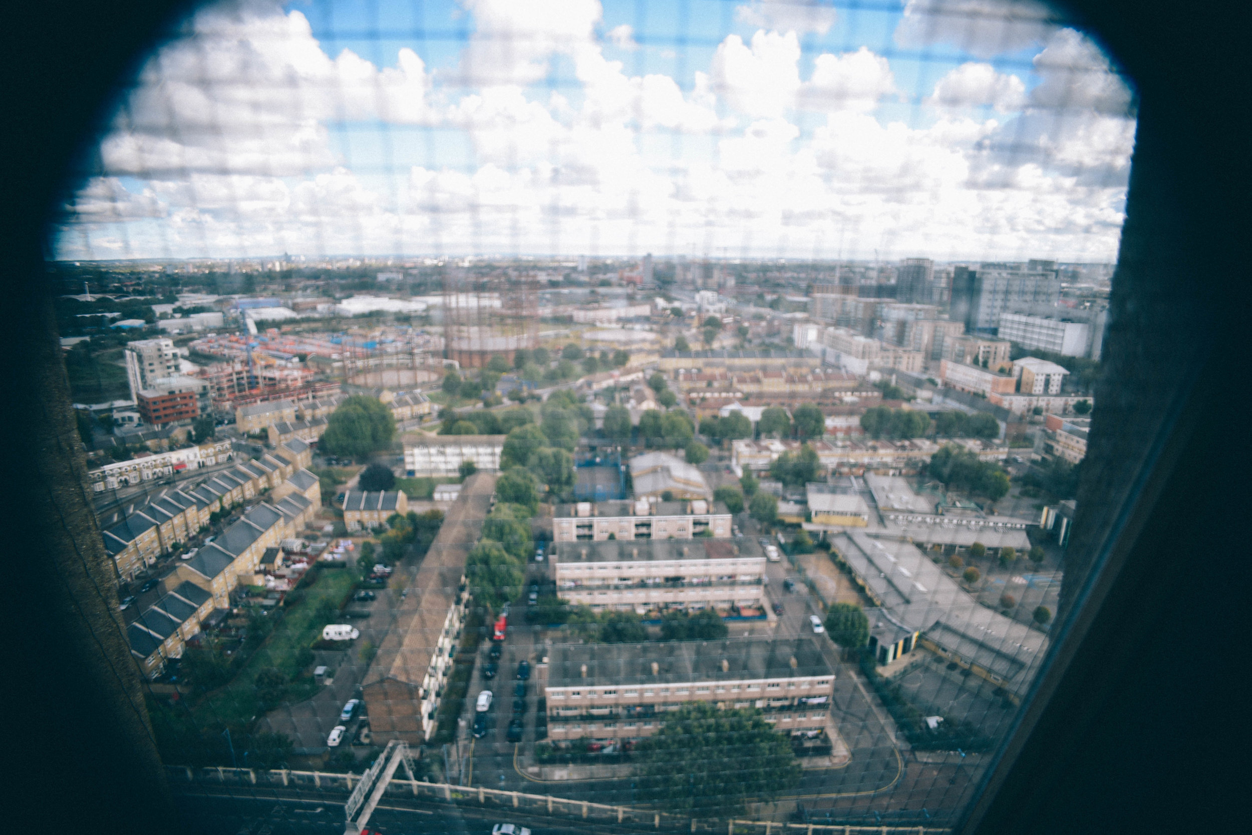
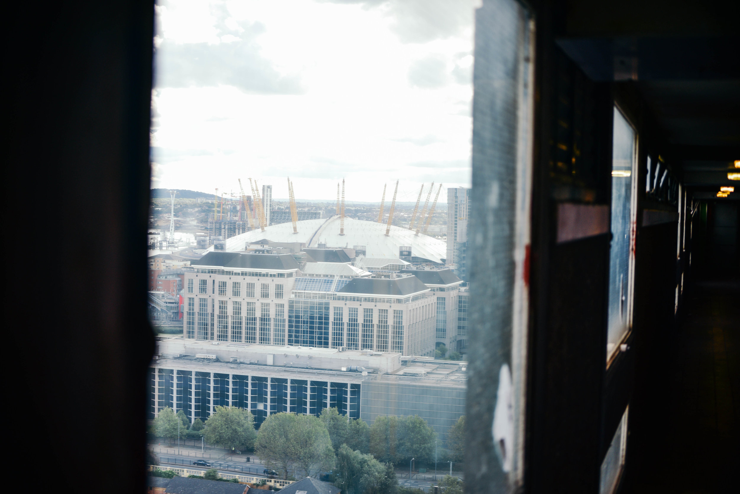
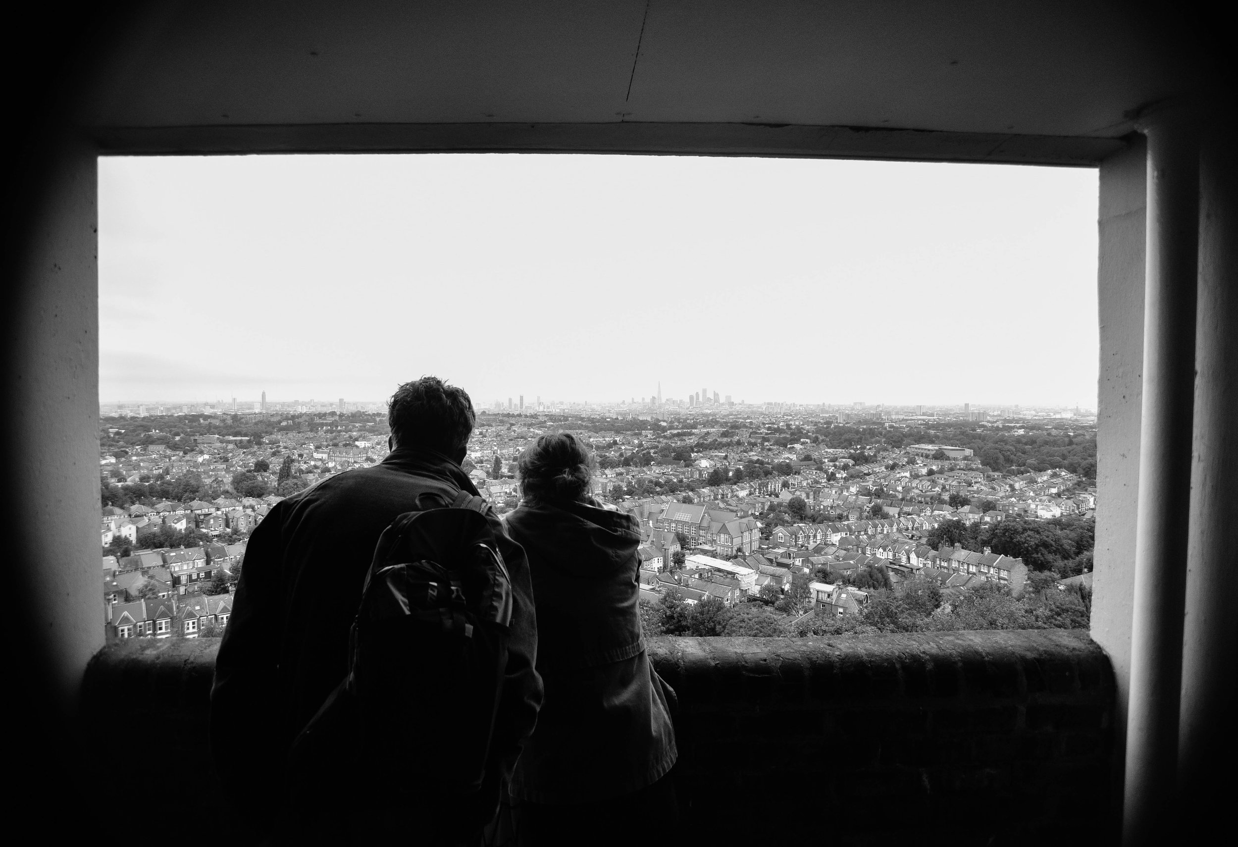
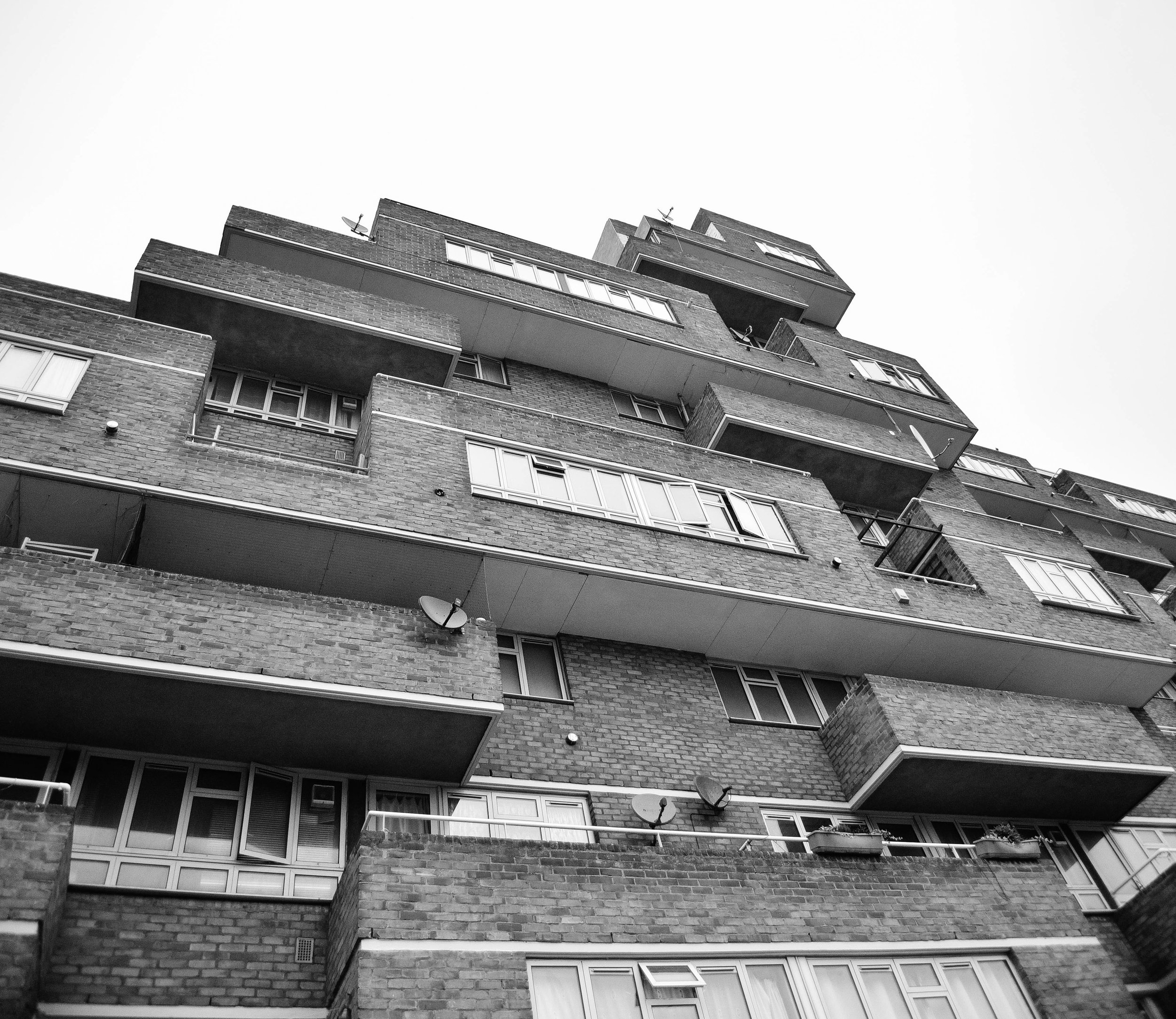
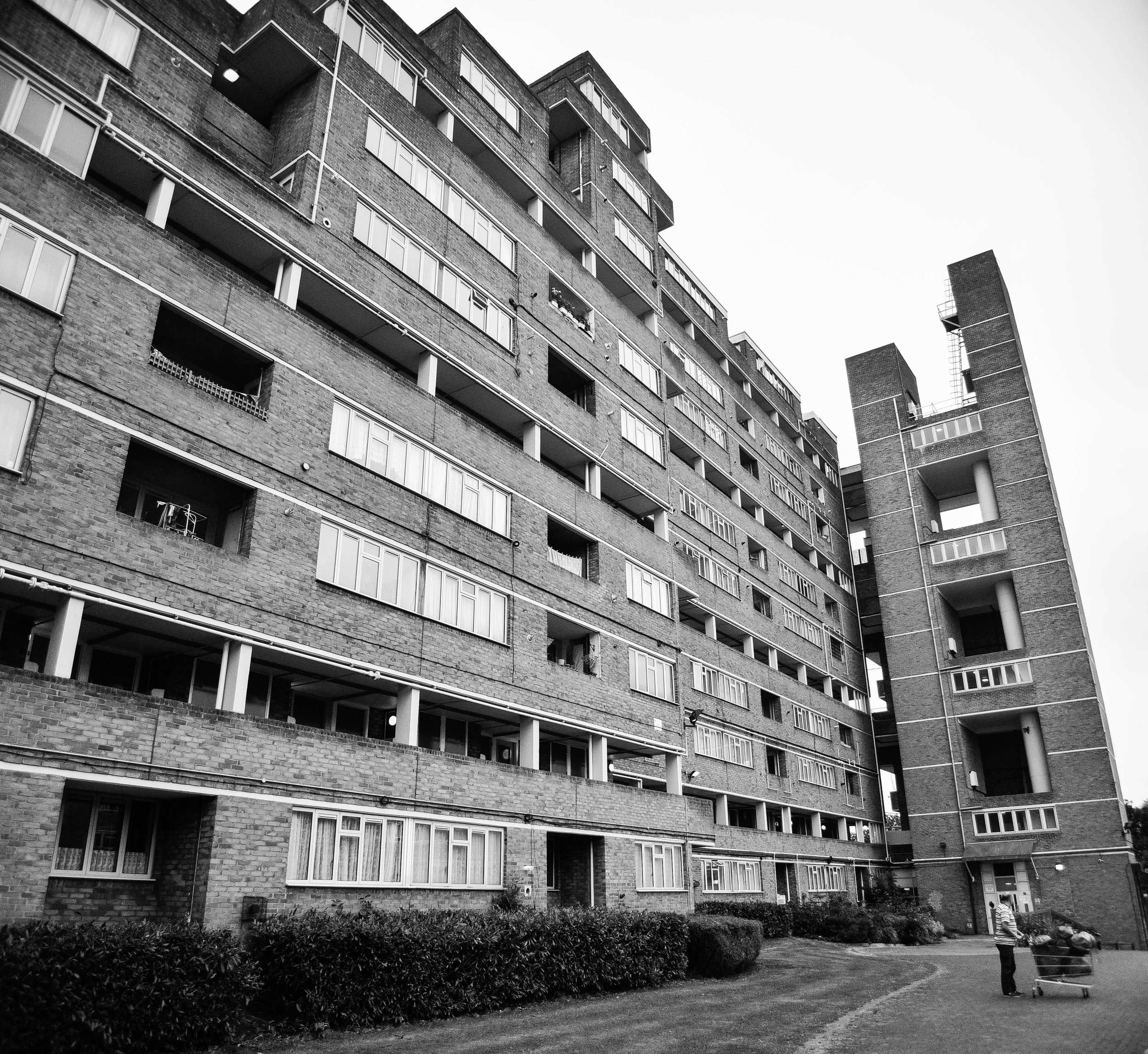
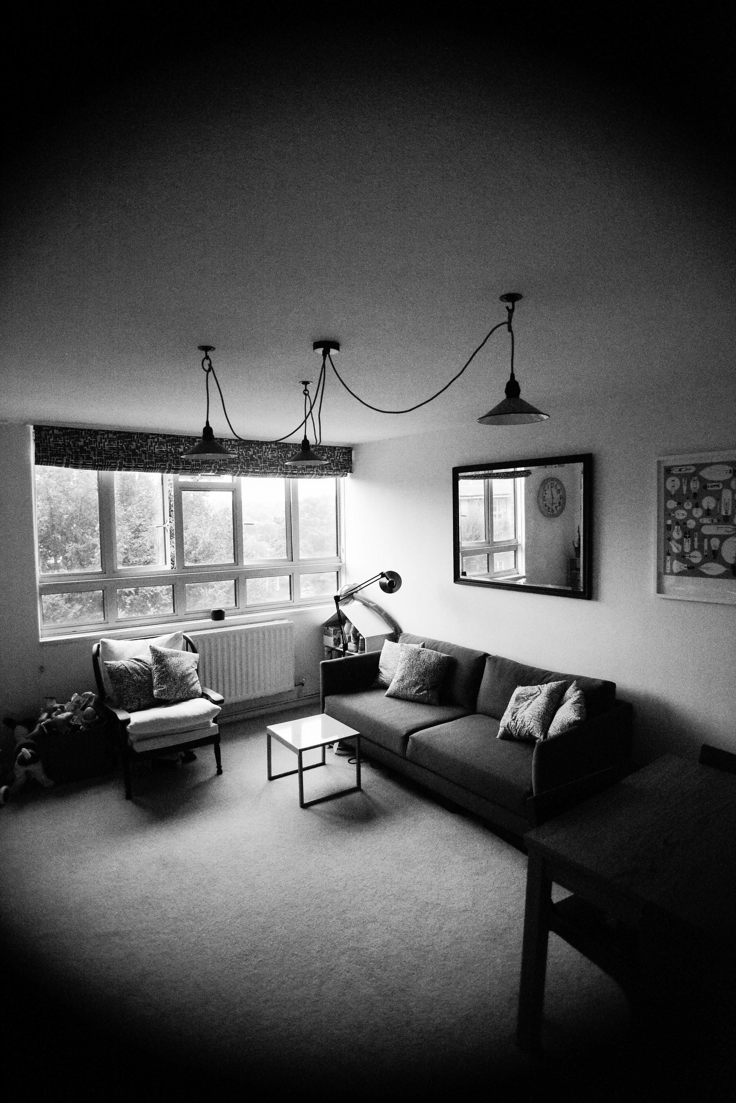
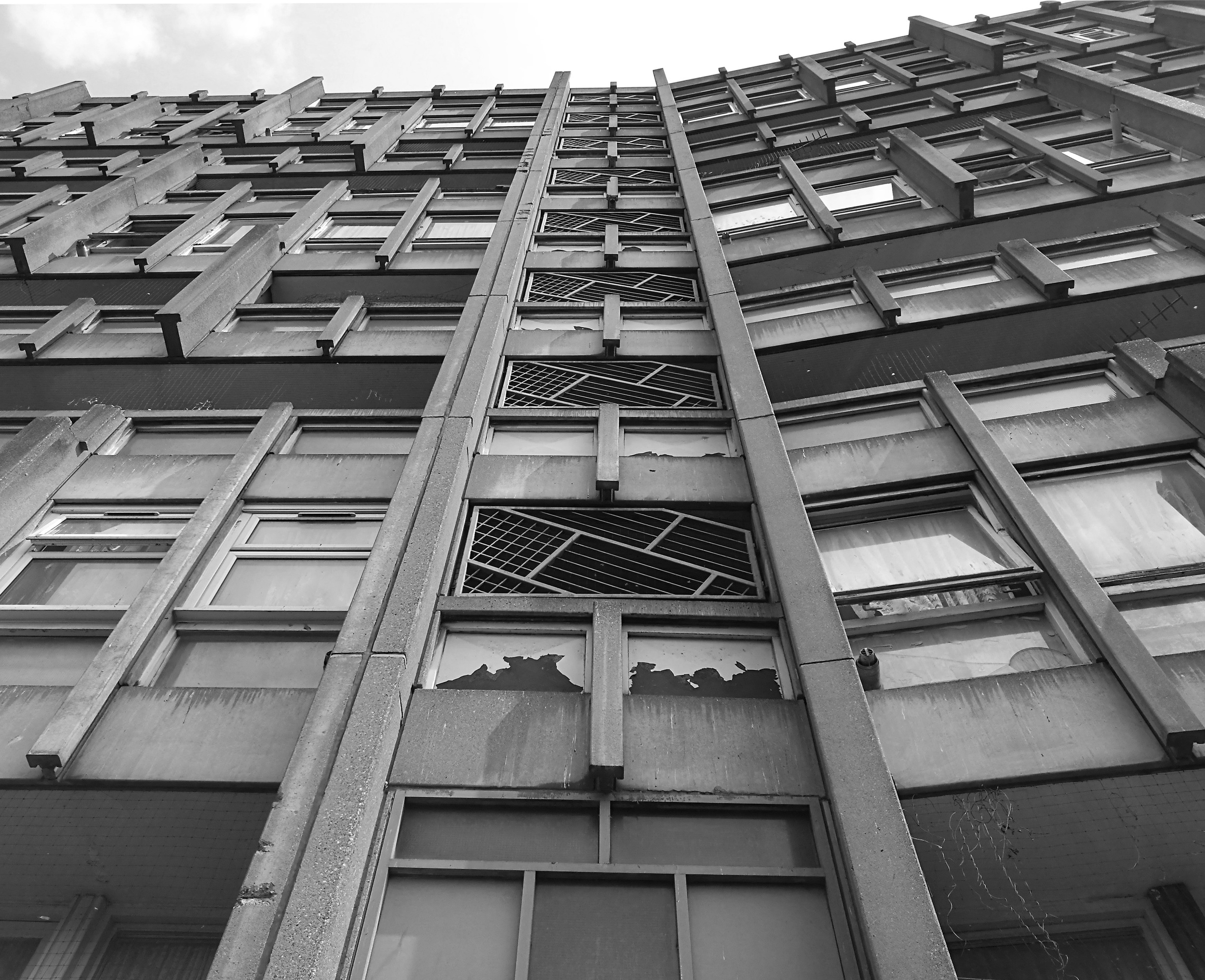
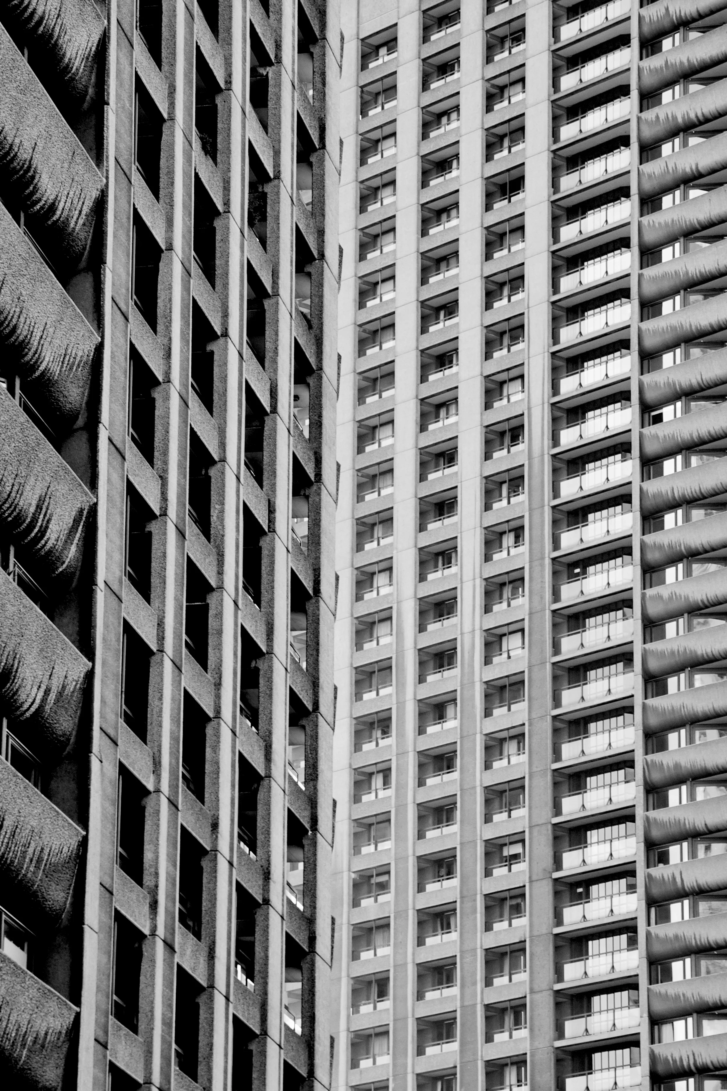
The Fred Wigg and John Walsh Towers in London’s were loaded up with missile launchers during the London olympics - making the tenants inside a potential target. Now, at the forefront of the gentrifying east end, it’s likely that the towers will soon be demolished and redeveloped. The tenants, however, still don't know how long until they will be 'decanted'.

The speed at which this city changes constantly amazes me - but unfortunately - affordable housing tenants are too often left in limbo during the development process. I'd love to see these buildings recreated into something beautiful. I'd also love to see space made for existing tenants who have spent decades building a life within the community.

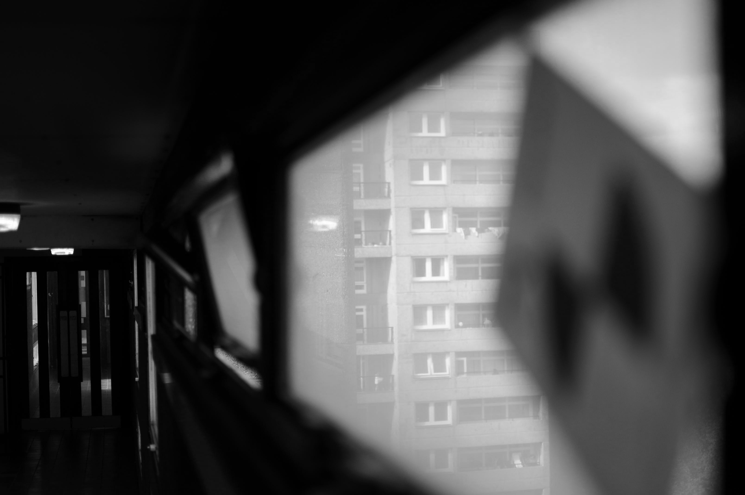
Either way, it looks like these buildings will soon be cleared from London's landscape, or - at least - remade into something new. I made the images below to document their place within amongst the skyline before they're no more.

Tom_Oliver_Payne_FWJW-1.jpg
Tom_Oliver_Payne_FWJW-4.jpg
Tom_Oliver_Payne_FWJW-3.jpg
Tom_Oliver_Payne_FWJW-2.jpg

INSTAGRAM

Demolition has begun: photos from Robin Hood Gardens by Tom Oliver Payne

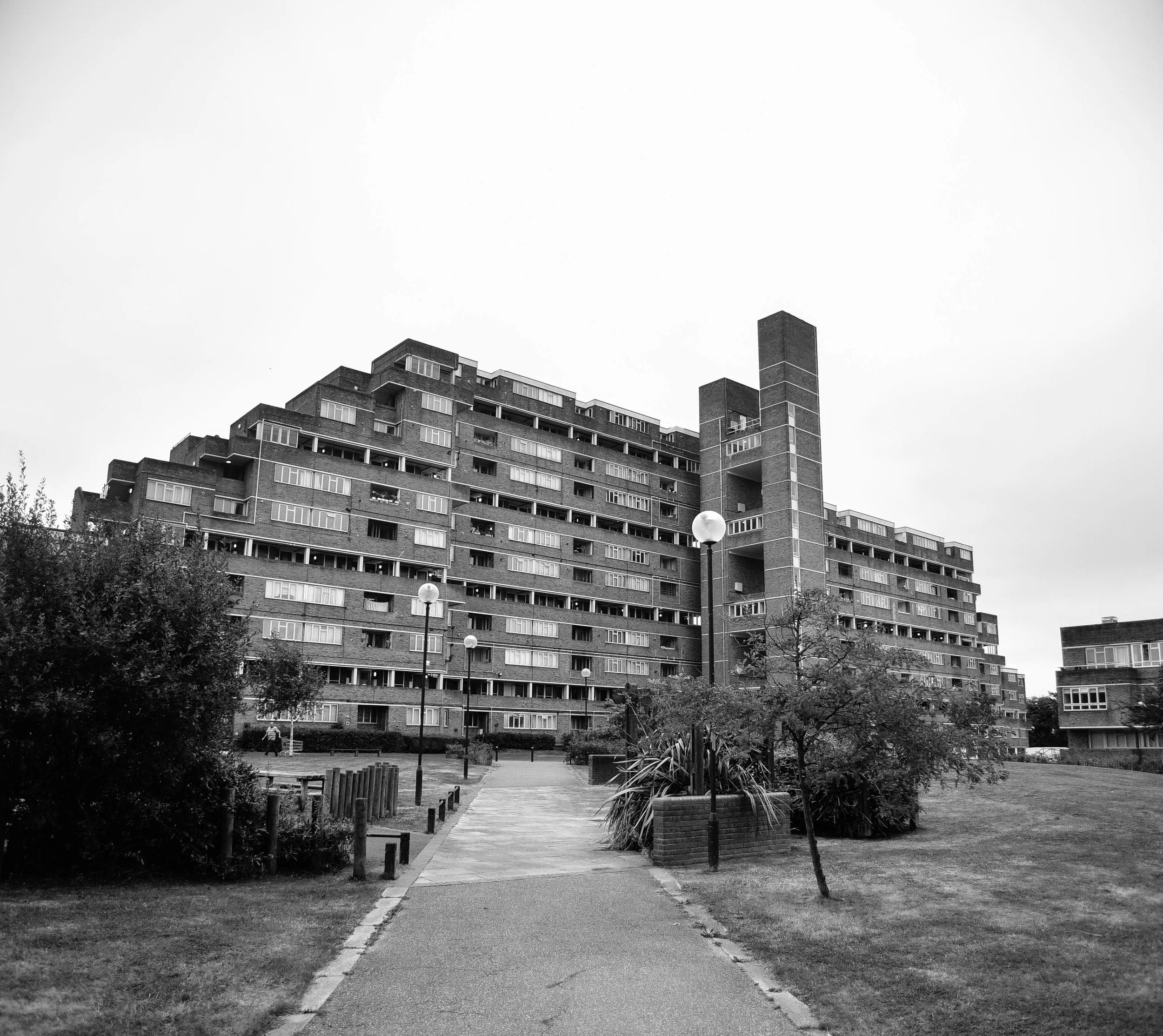
Despite years of campaigning from heritage groups and architects, the bulldozers have moved in. The demolition of Robin Hood Gardens is now well underway. The western block is in partial ruins. The eastern block is still occupied and is set to be razed in the new year. 

Completed in 1972 Robin Hood Gardens features rows of elevated walkways, famously known as 'streets in the sky'. The only housing estate designed by husband-and-wife duo Peter Smithson (1923-2003) and Alison Smithson (1928-1993), it's protection was supported by some of the world's most prominent architects including Richard Rogers, the late Zaha Hadid and Toyo Ito. Many, however, including the head of heritage listings and Historic England, considered it 'bleak'.

Tom_Oliver_Payne_Robin_Hood_Gardens_Brutalism-4.jpg
Tom_Oliver_Payne_Robin_Hood_Gardens_Brutalism-3.jpg
Tom_Oliver_Payne_Robin_Hood_Gardens_Brutalism-6.jpg
Tom_Oliver_Payne_Robin_Hood_Gardens_Brutalism-7.jpg
Tom_Oliver_Payne_Robin_Hood_Gardens_Brutalism-8.jpg

INSTAGRAM

Kensington and Chelsea: a microcosm of divided London by Tom Oliver Payne

Camera in hand, I recently explored London's Kensington and Chelsea - home of Grenfell Tower. A distinct socio-economic divide between the north and south, the Borough epitomises the inequality that exists across wider London.

On the 14th of June 2017, West London watched as a 24-storey public housing block was engulfed in flames. Fear and panic gripped the streets below as hundreds screamed for help from inside. 

Tom_Oliver_Payne_Grenfell-2.jpg

At least 71 people have been confirmed dead. A a 2015 study showed that the neighbourhood surrounding Grenfell was among the top 10% most deprived areas in England - those who perished were some of the London’s poorest and most vulnerable.

Just two kilometres south-east of Grenfell sits Victoria Road - Britain’s most expensive street - where house prices average at £8 million ($14,000,000). As I walked past the rows of immaculate terrace houses, security lights clicked on, a tell tale sign that the owners live abroad. Nearby shopping districts epitomise glitzy consumerism - Mercedes Benz cars, shopping bags and botox. With so much money pouring into the local council, it’s no wonder it holds a reserve in excess of £274 million ($466 million).

Kensington and Chelsea is a microcosm of divided London, and unfortunately, the local authority has been a representative of only its most elite residents. Although those in Grenfell had complained about fire safety issues for years, their voices had fallen on deaf ears. It’s recently been argued that had fire extinguishers been installed, 99% of those in the building would have survived. 

Kensington and Chelsea's North

Tom_Oliver_Payne_Grenfell-7.jpg
Tom_Oliver_Payne_Grenfell-5.jpg
Tom_Oliver_Payne_Grenfell-8.jpg
Tom_Oliver_Payne_Grenfell-13.jpg

Kensington and Chelsea's South

Tom_Oliver_Payne_Grenfell-9.jpg
Tom_Oliver_Payne_Grenfell-11.jpg
Tom_Oliver_Payne_Grenfell-10.jpg
Tom_Oliver_Payne_Grenfell-12.jpg

The tragic events of the 14th of June have shocked this beautiful city to its core, yet early indications suggest that it hasn’t been in vain: the council leader soon resigned and an investigation has begun to determine if corporate manslaughter has been committed; we’ve seen conversations regarding deprivation and inequality rise to the forefront of political discussion, Jeremy Corbyn has called the disaster a product of the ‘brutal’ system of inequality; and the city’s Mayor, Sadie Khan, has proposed that the Prime Minister appoint a social housing Tsar.

In the wake of Grenfell commentators have pointed to the resonance of contemporary London with the one Dickens describes in ‘A Tale of Two Cities’. The echoes are hard to ignore, and the city’s wealthy are being warned of a social uprising from classes below. It seems London’s eyes have turned their focused on the government’s response to Grenfell. If systemic housing policy changes are not initiated, social discontent will surely intensify.


INSTAGRAM

SMH Article: What Sydney can learn from London's approach to brutalist architecture by Tom Oliver Payne

"The late 20th century was a unique period in architectural history in which buildings where designed to serve a social purpose. Brutalist buildings used the most basic material to keep costs down, and were most commonly built to house low-income residents or institutions.

Unlike 18th-century houses, their importance is about historic interest, rather than an aesthetic interest. Sirius, just like Trellick, Balfron and the Barbican in London, illustrates important aspects of the nation's social and cultural history."

Last week I had an opinion piece published in the Sydney Morning Herald on brutalist architecture in Sydney and London. You can read the full article here. 

Brutal_Sirius_Tom_Oliver_Payne_blog.jpg
Photo by Jessica Hromas via SMH

Photo by Jessica Hromas via SMH


INSTAGRAM

Cycling from London to Paris by Tom Oliver Payne

My friend James and I decided that we were going to cycle to Paris... Wasting little time um-ming and ah-hing, we decided to plan for the fastest route (London-Newhaven-Dieppe-Forges-Les-Eaux-Pontiose-Paris) and a couple of weeks later we were off. A quick run down below with some few black and white shots taken en-route ...

Read More

'Rom': Europe's first heritage listed skatepark by Tom Oliver Payne

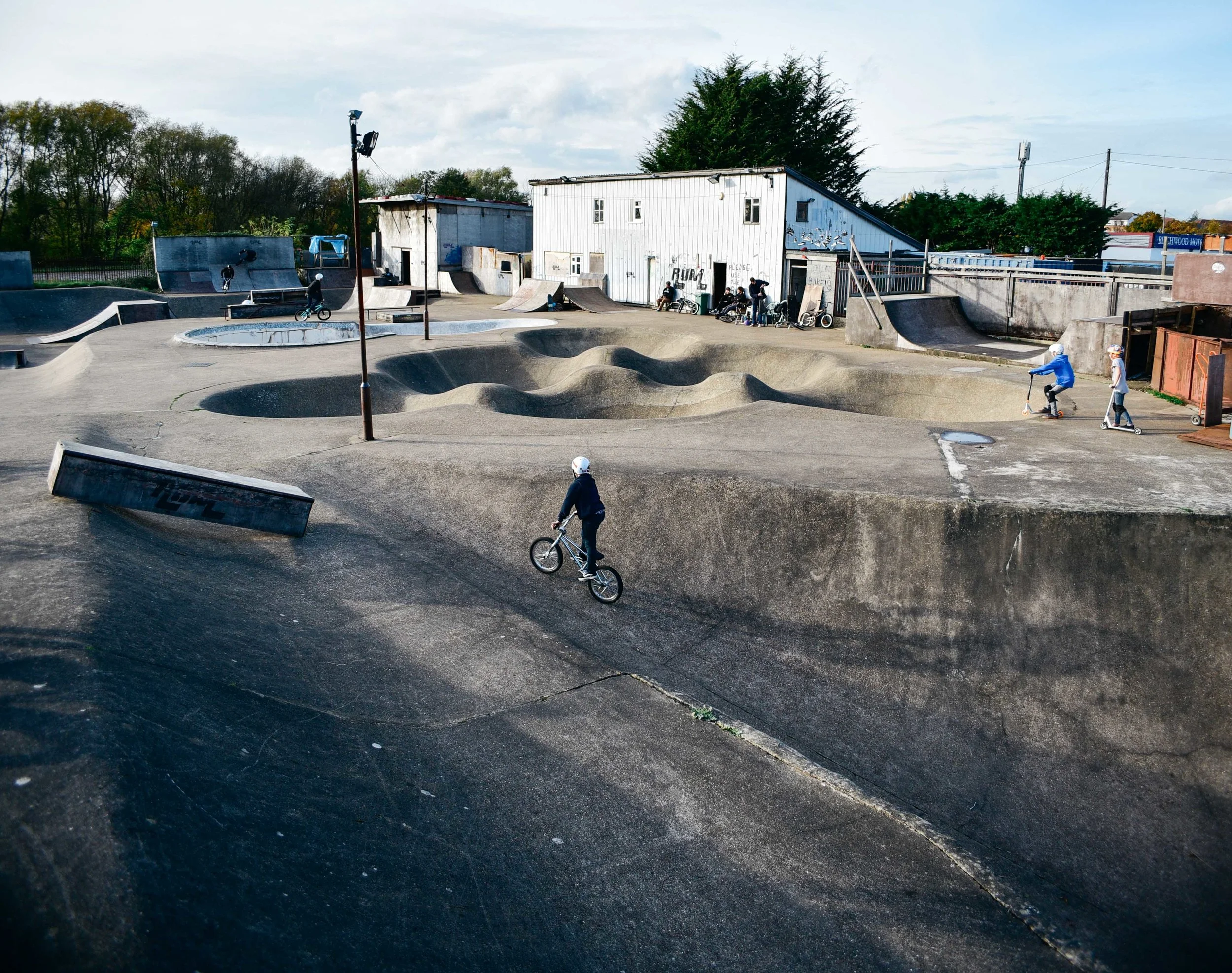
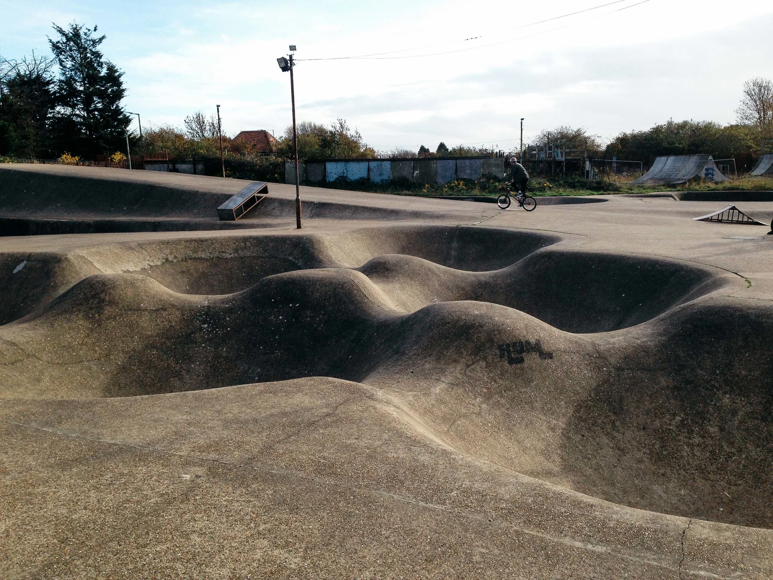
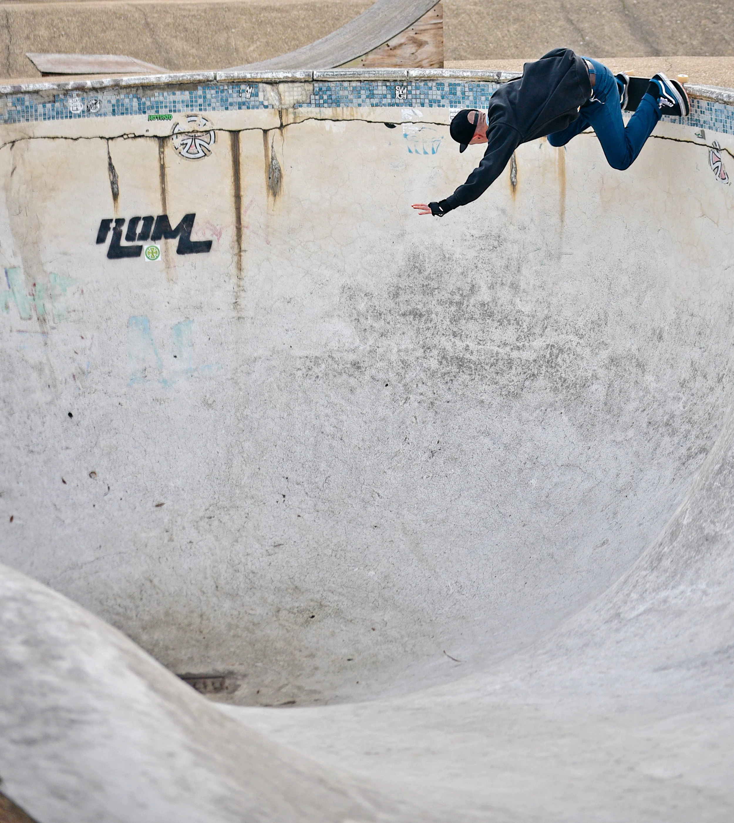
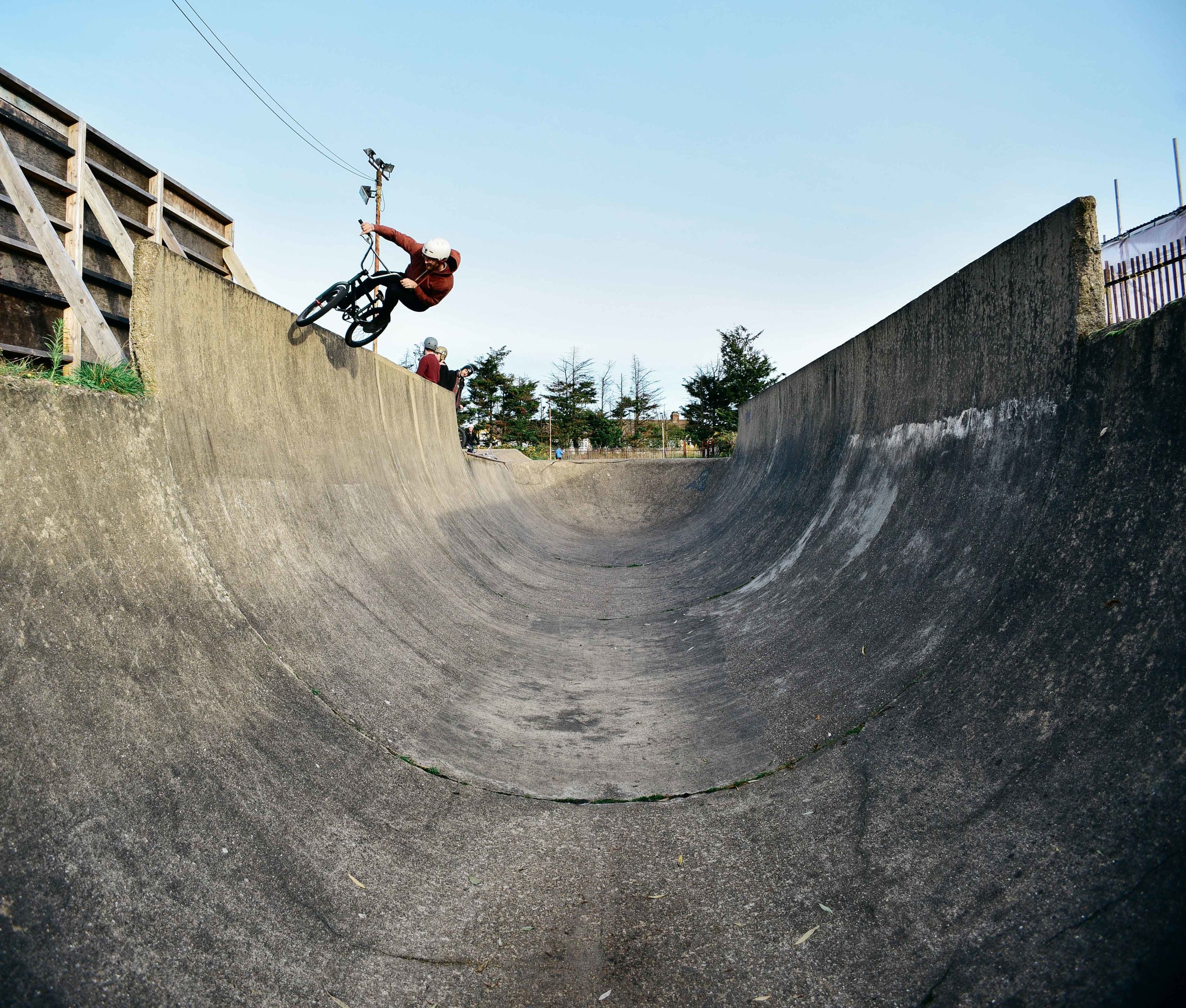
'Rom' is iconic in British skate and Bmx culture. It represents a time when skating was a little more raw – much like its roughness of its own surface.

When I first started sessioning skateparks in the late 90s, it was common to see wooden indoor and pre-fabricated outdoor skateparks in videos and magazines. But every so often an image would pop up of this huge outdoor concrete skatepark in London made up of mogul bowls, pools and downhill snake runs. 

Far from the smoothed surface skateparks being built in the 1990s and 2000s, Rom from back in the '70s was bumpy, rough and raw. I couldn’t wait to one day check it out.

Built in 1977, Romford skatepark has for decades attracted Bmx and skate talent from across the world. 

Built in 1977, Romford skatepark has for decades attracted Bmx and skate talent from across the world. 

Fast-forward 15 years, and I’d still never visited... 

That was, until a text came through last week, “who's up for a Romford session?” A couple of days later a group of us were jammed into the back of a van, heading east towards 4,000 square metres of pure concrete.

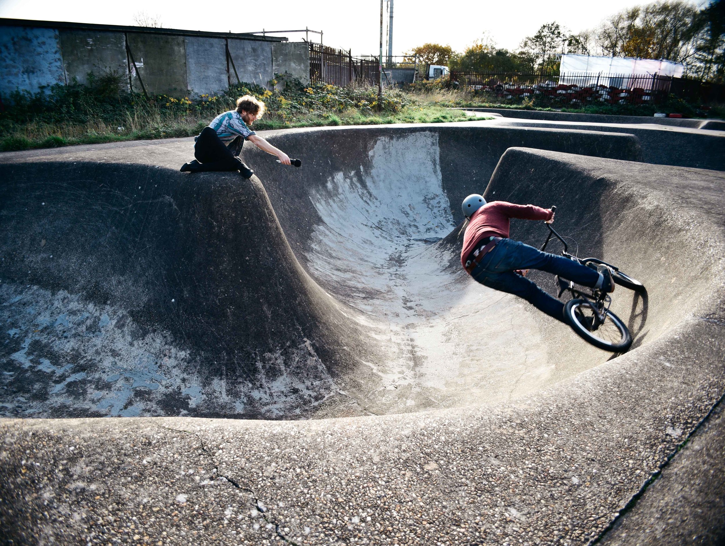
It seems the excitement of Bmx and skating hasn't worn off in our older age. Exploding out of the van, we spent hours carving seemingly endless lines over humps, bumps and massive transitions. 

Everything about this place characterised - to me - the early years of skate and Bmx culture. 

Originating from the surf lifestyle of Southern California in the 50s and 60s, early skaters explored swimming pools and concrete drains to surf. Over time, they began creating purpose built parks, which still gave the sensation of carving a wave. Rom – England’s oldest surviving skatepark – is the perfect example of this.

The bowls and snakeruns weren’t created for the modern, tech kid. But they represented the old-school style of skaters who preferred high speed carving lines.

It was no surprise to me when I heard last year that Historic England would give Rom a Grade II heritage listing. The park has become an icon of the British skate and Bmx culture. Although both sports have blown-up into the mainstream in recent years, the park represents a time when skating felt more alternative and raw .

As we hopped back into the van and drove back towards London, I was so psyched to have finally check out this piece of history. With the threat of destruction of loads of amazing parks in recent years, it's awesome to know that at least place is immune. I can't wait for some solid afternoons here in summer 2017. 

For a complete rundown on other incredible places to visit in England, be sure to check out the Your RV Lifestyle's comprehensive list.

Tom

INSTAGRAM


What would Ernő Goldfinger think of Balfron Tower today? by Tom Oliver Payne

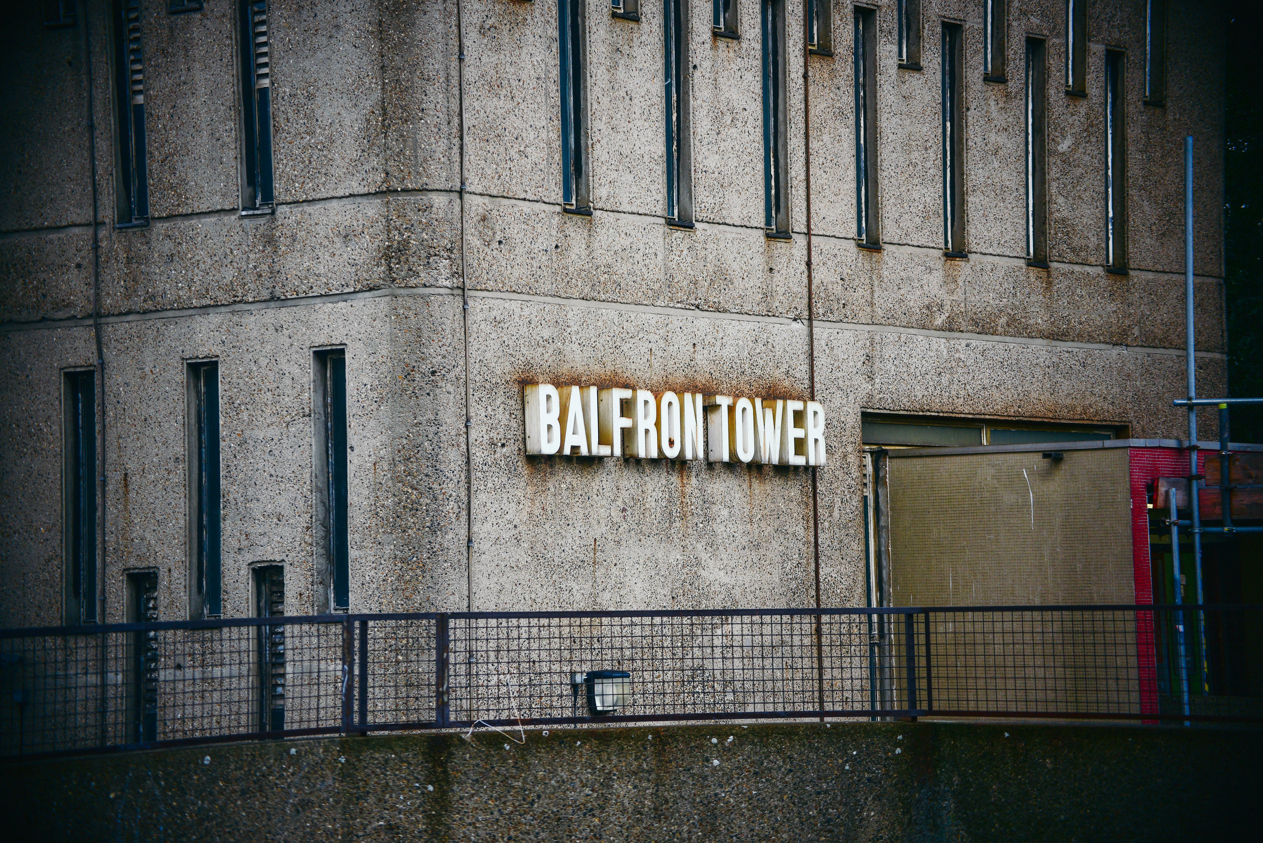
Designed by Hungarian-born architect Erno Goldfinger in 1963, Balfron Tower has become a global icon of brutalist architecture.  

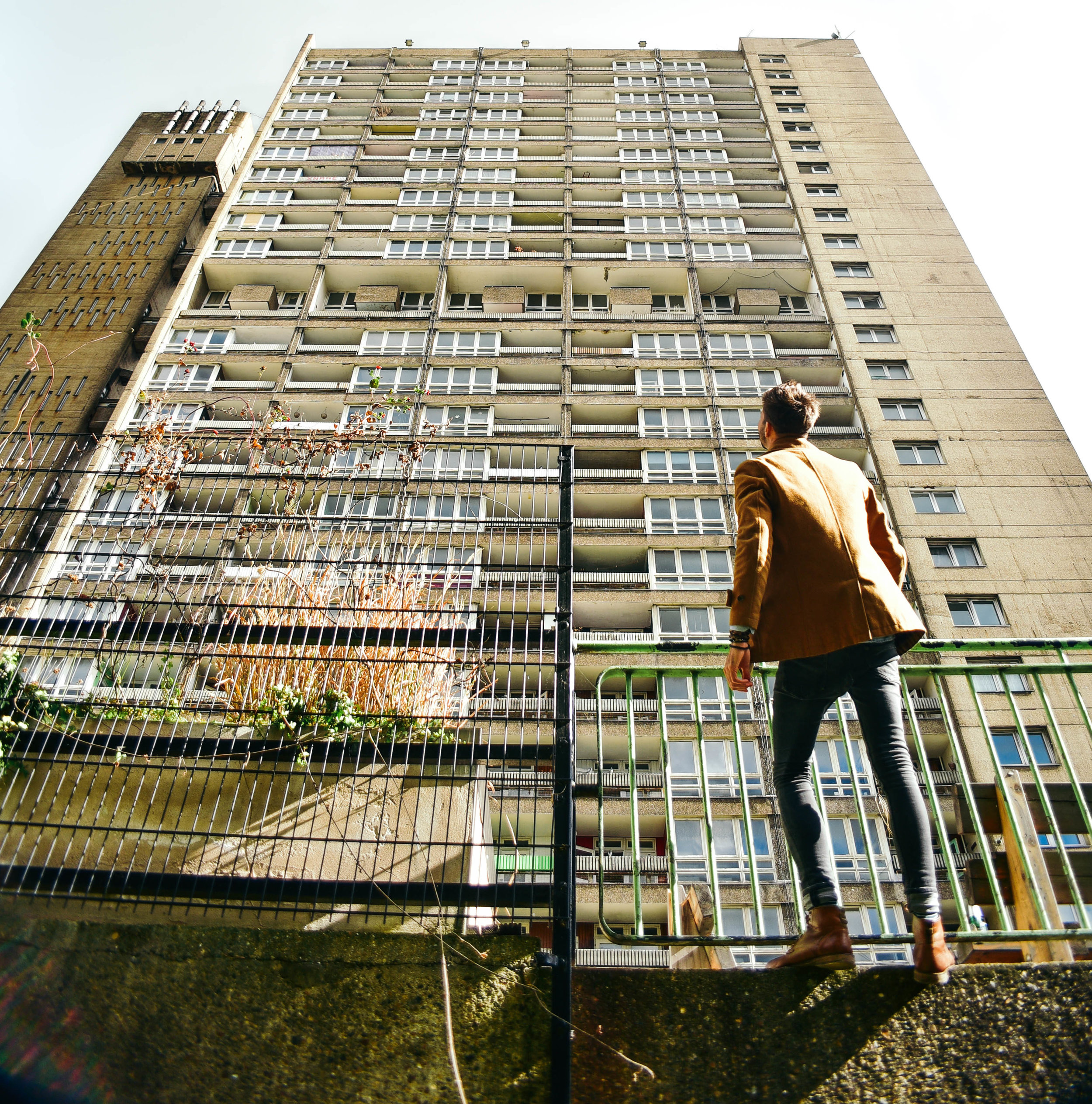
Last week I took off down to Balfron to take some photos. Although slightly smaller than its younger sister, Trellick, standing 26 storeys above East London, Balfron's harsh concrete was visible for miles. 

Walking towards the base of the building, the facade overshadowed me like the sheer of a cliff face. But as the building caught glimmers of the morning sunlight through the patchy clouds above, I became very aware of the elegant sophistication of Goldfinger’s design.

Stood taking photos of the towering monolith above, a man yelled, “what’s the intrigue!?” Sensing he was a pissed off resident, I gave him a simple answer, hoping he would move on. Staunchly walking towards me, he asked again, “what is the intrigue?”

Realising that this guy wasn’t about to just walk away I decided to open up explain to him exactly why I was there. I told him of my interest in Erno Goldfinger’s architecture and why I wanted to take photos of this building in particular.

It didn’t take long before the man’s tone of voice lifted, and his demeanor calmed. Suddenly all he wanted to do was tell me of his love for Balfron. As it turns out, he’d lived in the building for 25 years and was now the last social tenant before its sale to the private sector

He told me about the ensuing court case for his eviction, which was bound to come to close in the following weeks. The volume of his words increase as he explained his frustration at the powers and processes above him, this clearly wasn't the first time he'd told someone his story. 

For over 50 years Balfron had housed hundreds of families across 146 affordable housing flats. Now, 145 homes sat empty, and he was the last man standing.

“You wanna come check it out from the inside?” he asked.

Minutes later we were sneaking behind security and shuffling into the building’s stainless steel elevator. Creaking up to level 26, and stepping out onto the grey, concrete flooring, I was immediately overwhelmed by smells of booze and urine. Fortunately for us the breeze from the awning-hinged windows helped to disperse the smell through the corridors.

Peering through the horizontal pattern of windows, the view from the top was incredible: Poplar sat quietly below, the city skyline loomed in distance.

As I walked down the long corridors I imagined Erno’s ambition for ‘streets in the sky’, where working class neighbours would socialise and kids would play games. It was too bad, bottles of half drunken bottles of beer and empty NOS canisters now lined the passageways. 

After sometime upstairs, it was a relief to break back into the autumn sunlight. I wondered if I could ever live in a dark, concrete tower like this one. For while I could understand Erno’s ambitions, I could also appreciate where his design concepts had failed

In fact, when I first arrived in the UK, I thought brutalist buildings were disgusting. Having grown up in sunny Australia where there's an abundance of low-rise bungalow-style architecture and spacious streetscapes, I often wondered why London’s huge concrete 'ghettos' hadn’t been ripped down and replaced with something more attractive. But over the years, and after some reading, I began to appreciate the ethos behind their design.

Mainly a reaction to the housing crisis following World War II, this form of architecture attempted to help London’s homelessness by creating large, affordable buildings within accessible inner city areas.  While in reality these concepts didn't always work, the ethos - at least - was admirable. 

Balfron's last remaining social tenant is likely to be removed by force in the coming weeks. With few places to go, he told me he will likely be pushed outside of London altogether.

In cities across the world, a lack of affordable housing is forcing young people and those on low incomes to look for housing alternatives. Many are moving out of the cities that they love, whilst others are feeling the impacts of living in a 'rental trap'. 

As the last social tenant is forced-out of one of the world's most famous brutalist buildings, I wonder what Erno Goldfinger thinks of his building, and architecture, today? Would he be ashamed that we now completely ignore the socialist principles of the brutalist era?

I would never suggest that contemporary designers should copy Balfron Tower, or even brutalism, as a concept. But the ambition of its developers, and their architectural boldness, would be something to emulate. 


Photographs by Dan Young & Tom Oliver Payne.

INSTAGRAM


Dawson’s Heights: architecture with social conscience by Tom Oliver Payne

Architecture today is generally about making other people big bucks. But Dawson's Heights  reminds us of a time when architecture strived to create a better society through design. 

Land development today basically works like this: an investor will buy a plot of land, they then hire a developer with a track record of maximising value who will in turn hire architect who knows how to maximise floorspace. For the sake of profit, all parties will hope construction is over and done with as quick as possible, and each bit of land will sell for maximum value. Job done. 

But before you call me a pessimist, let me iterate that I don't necessarily think this process is all a bad thing. This process is simply a reaction to our economic market and continual development profits ensures a pipeline of construction and as a result, people - from construction workers to web designers - have jobs. 

Unfortunately however, development is too often, too greedy. Due to the speed and aggression of investors and developers, new buildings and spaces often lack quality design or a social conscience. What we are commonly left with is architecture with few zero-to-no societal benefits, doing nothing more than providing the mega-wealthy some real estate to dump their cash. Property has become more concerned with international asset management rather than the provision of housing or the creation of communities. 

Clearly, we've seen a recent swing towards capitalist-dominated architecture. But it hasn’t always been this way. 

Dawson's Heights' northern block seen from its central public space.

Dawson's Heights' northern block seen from its central public space.

Back in the 60s, architecture in London operated in a very different context. Emerging from the Nazi bombings of World War II, the city was battered and bruised, and thousands were homeless or living in slums. The government took it upon itself to deliver tens of thousands of homes every year through mass redevelopment projects.

While often criticised for their top-down approach to design, no one can argue that they were’t at least ambitious, and at most, incredibly bold.

The Barbican Centre, Trellick Tower and Balfron are some of London’s most famous examples. These brutalist monuments are remnants of a past when - although they didn’t always get it right - architects could at least attempt to solve social problems through creative design. 

Not all of the examples from this time were dominating brutalist buildings. Some were smaller incisions in the existing urban fabric such as Golden Lane Estate, and others were modernist creations which boldly - but appropriately - inserted themselves into the remains of pre-war London.

Last week London opened its doors for Open House 2016 and I had the opportunity to check out one of the most impressive examples. 

A view worth millions: looking from the northern block of Dawson's Heights.

A view worth millions: looking from the northern block of Dawson's Heights.

In 1964, at just 28 years old, architect Kate Macintosh was given the job of designing Dawson's Heights in south London. 

Working for the Southwark local authority, Kate was given a job which today is almost unthinkable - the freedom to design new London housing on a large plot of vacant land. With strongly socialist parents and a clear drive to help generate social justice through architecture, Kate was given the opportunity to deliver a scheme which would stand the test of time.

Clearly, it has. 

Decades later Dawson's heights is now considered 'one of the most remarkable housing developments of the country'. 

As I walked through Dawson's Heights' many street-like corridors, and entered into its beautiful modernist flats, it was clear to me that this building was designed with a different agenda compared to developments today.   

It was built with a genuine ambition to create a community, and a more just society. Every decision that Kate made had logic to it: blocks were oriented to increase sunlight to  flats, room arrangements were such that every flat had a balcony, levels were split to improve acoustics, and the building's form and massing ensured an abundance of green space and views across the city from its public corridors.

Whether through a change in political-will or a shift in the behaviour of our markets, architecture may re-emerge as a discipline which seeks to fix societal problems. 

Until then, at least we have reminders from a time when it did. 

If you're interested in exploring London's most incredible buildings, be sure to check out Open House 2017

INSTAGRAM


4 insights into the future shape of cities by Tom Oliver Payne

Since I was a kid I’ve been fascinated with futurism, and in particular, the future of cities. Naturally, I was super-excited when MINI invited me along to the ‘Future Shapers’ event.

Heading to London’s Roundhouse last Monday, I had a little think back to how the world has changed in just my lifetime. City skylines were smaller, the internet had hardly been invented, and Walkman’s were still high tech, portable technology. How could anyone back then have ever imagined the world we live in today?

As I entered the bright and beautiful auditorium, I grabbed a beer and had a chat with a friend about the innovative technology we were probably about to see. I guessed intelligent, self-driving cars. He guessed new car to mobile app technologies.

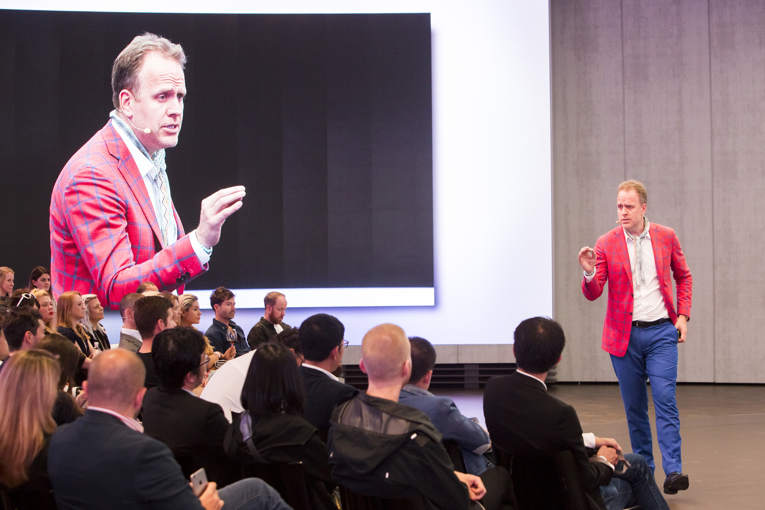
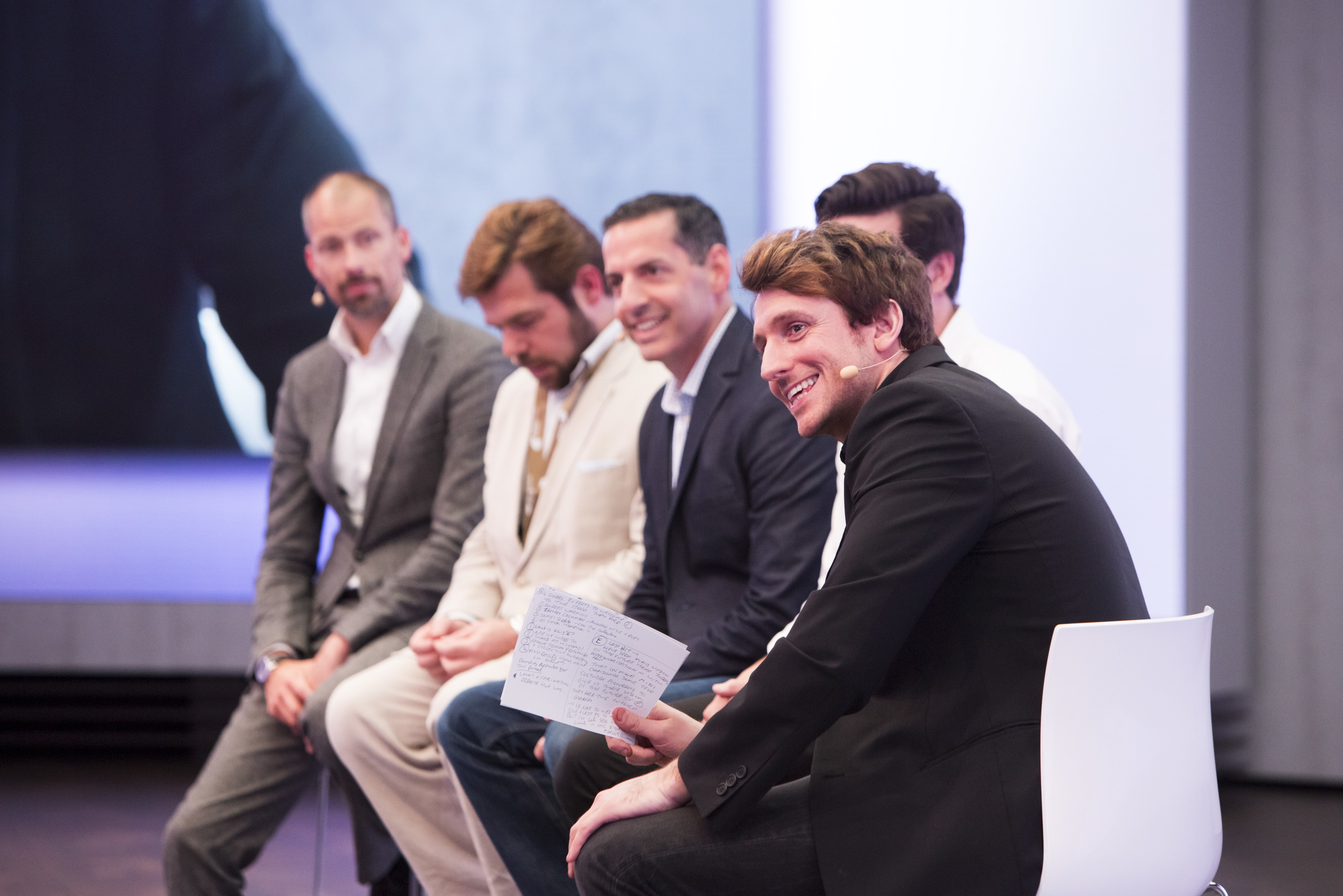
But as Mark Adams, Head of Innovation at Vice, took to the stage, we quickly realised that the future that we were about to vision, was not just about creating the newest and best technology, but was also about innovating our ways of thinking.

Here are 3 of my favourite insights into the future of cities from the event.

1. Cities will be collaborative

Speakers with expertise in psychology, property and design took to the platform to speak about the importance of ‘collaborative consumption’ and the need to address global problems by evolving into a society which shares.

It only takes looking around a city to realise that the way we eat, live, and travel is unsustainable. And with the world’s population growing so quickly, it's easy to see that at our current rate, it won’t be long before we all run out of clean air, clean water, or simply, space to live and move.

But by sharing buildings, cars, bikes and services (made possible with apps), we’re quickly evolving into a society which can better reuse, rather than waste. It won’t really matter who owns what, because at the end of the day, by sharing, we all save time and money. It just makes sense, right?

2. Less will be more

Gone are the days of mass consumption, sterile shopping malls, huge cars and unnecessary gadgets. The future of cities will be about minimising everything from the space that we use on streets, to the time that we spend getting to and from work to maximise time with hanging with friends and doing the things we love.

Already in the past decade or two, young people have opted for smaller, shared housing in urban areas to cut down on travel times. In places like Japan, we’re seeing young people completely cut down on possessions altogether.

Our parent’s generation was the era of consumption, but this century’s urban generations are more satisfied with experiences over things.  Sharing a car and flat won’t be a problem when your possessions comprise just a couple of digital tablets and maybe a bike and book or two.

mini100-273.jpg

3. ‘Mobility’ will replace ‘cars’

Once only a possession for the wealthy classes, the 1950s saw cars become a product for the masses: people were given freedom to move where they wanted – whether in a city, or between cities. They became a symbol of adulthood, freedom and independence.

But it wasn’t long before the car began to dominate. Roads and car parks ripped through city centres as we became unhealthy dependant on the machine with four wheels. But by recognising problems with congestion and pollution, brands like BMW are now part of the solution to quickly improve urban transport, and help the natural environment.

Explaining that car parks now comprise 30% of our cities, futurist Magnus Lindkvist, told us how cities of the future will improve by swinging back the pendulum away from car dominance.

Instead of simply talking about ‘cars’, we will talk about ‘mobility’ – an integrated urban system of bikes, cars and public transport. We will choose our transport options based on efficiency, comfort and style, depending on what we feel like, and when.

The cars we do choose to use will be compact, energy efficient, beautifully designed, and constructed from high quality materials, such as the brass and copper comprising the inside of the MINI Vision Vehicle.

Lasting decades rather than years, and carrying dozens of people across cities each day, cars of the future will be a beautiful and efficient addition to our cityscapes. Just like a good watch, they will be cherished and maintained.

mini100-218.jpg

4. Our world will be personalised

Every one of the 7 billion humans on this planet is unique. So why not make objects and environments just as unique as we are?

Last month I met designer Ross Atkin, who is using digital technology to personalise our streets for the blind or less abled. I was super impressed with his work – which is both inspiring and practical. By using technology and data which already exists, Ross’ work can improve the lives of millions.

But as artists Margot Bowman and Marcus Lyall took to the stage on Monday night, I realised that the future of personalisation won’t just stop there. These artists work at the intersection of art and technology, creating bespoke environments which respond to our needs, wants and emotions. Not only can technology help to solve problems, but it can also enhance our day-to-day experiences and pleasure.

As Anders Warming, Head of Design, MINI, showed us how the MINI Vision Vehicle will respond to our emotions through lighting, I started to foresee an urban future which only a few years ago was completely unfathomable.

Objects will no longer just be objects. But just like my smart phone rather than my chunky old Walkman, future belongings will become completely integrated into just about every aspect of my life.

Helping us to move, plan, manage and organise, we create more time to do the all things we love.

Heading along to Monday’s event, I thought I would be checking out some cool technology and design ideas. But I had no idea that the conversation around the future would open my mind to so many interesting insights into the way we might behave, and perceive the world around us in the future.

It made me super excited to see the shape of things to come. I’d love to know your thoughts – what is your ideal future city?

The BMW Group Future Experience, showcasing MINI’s Vision Vehicle is taking place at the Roundhouse in London until Sunday 26th of June. Visit www.mininext100.co.uk or @MINIUK for more information.  #MINI #NEXT100

Feature photo: Mark Fischer

Urban photography needs snap judgement by Tom Oliver Payne

Taking good urban and architectural photos requires snap judgment to capture spontaneous city moments.

I usually find I get the best shots when I’m least expecting it – the light may looks particularly nice when I’m out to meet friends, or the roads may be emptier than normal on my way to work. But because carrying a big DSLR camera around can be pretty damn awkward, I’ve been waiting for the day that a camera phone is just as good in quality.

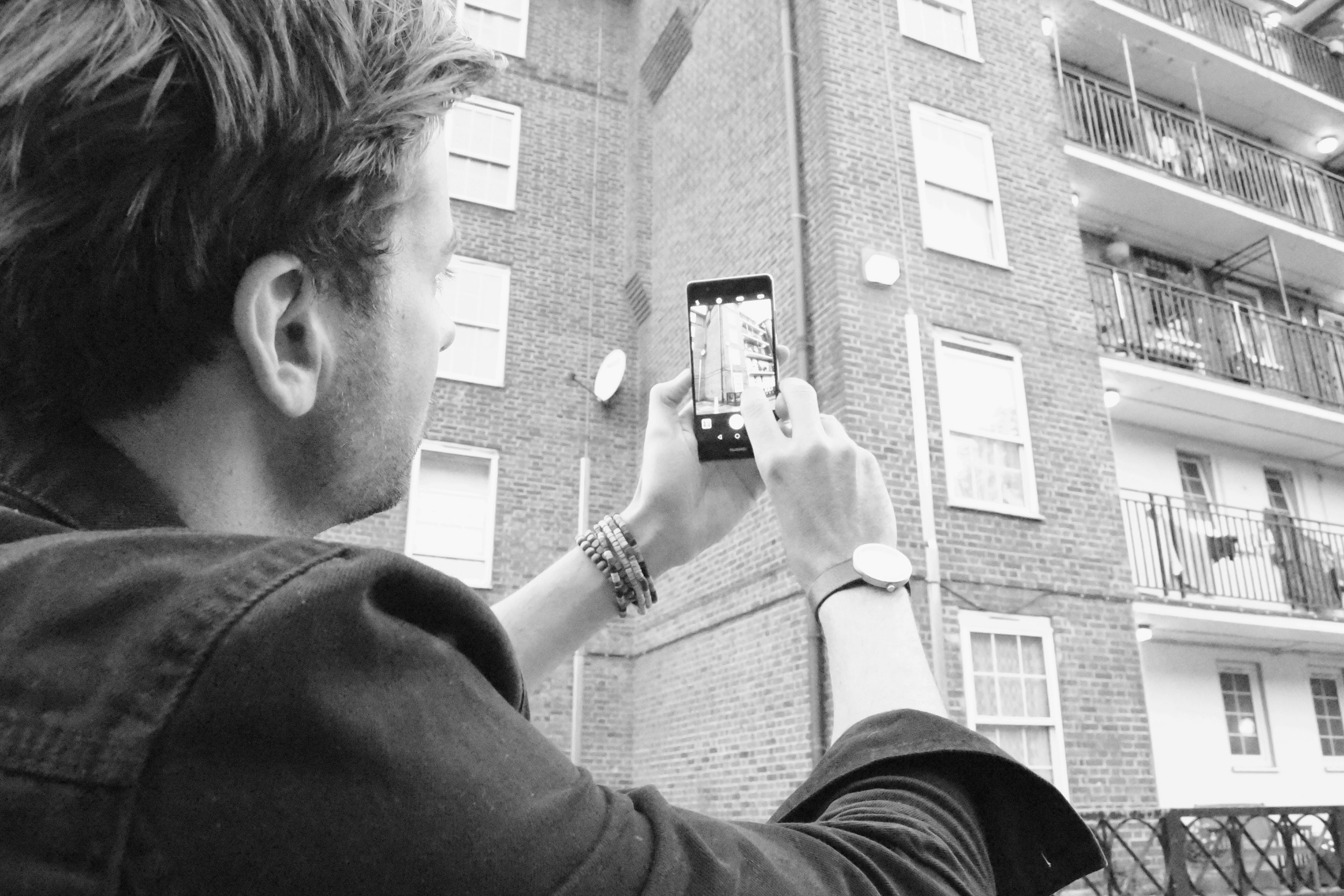
After hearing that EE was bringing out the Huawei P9 co-engineered with one of my favourite camera companies, Leica, I was super keen to try it out. Thanks to EE, it wasn’t long before I had one in my hands on one and was heading out for a day on my bike in London.

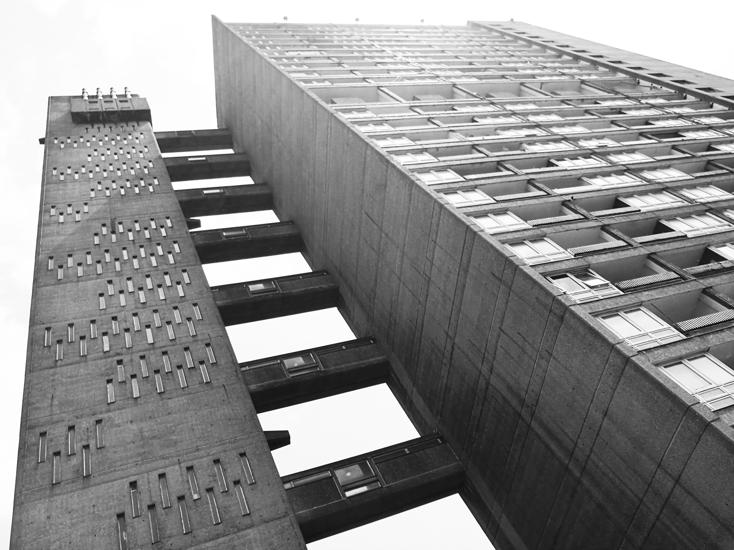
Riding towards Canary Wharf, I checked out some Brutalist architecture in London’s east end. From Balfron Tower to the Isle of Dogs, I meandered my way through dozens of estates, capturing the shapes of the concrete buildings around me.

Lying awkwardly in the grass, trying to get a photo of famous 1970s, Robin Hood Gardens, I was approached by an elderly man who told me that the buildings would soon to be demolished. I suddenly appreciated the ability to capture these buildings at this moment in time, right before the neighbourhood was to vanish… And who knows, the photos might even be worth money some day.

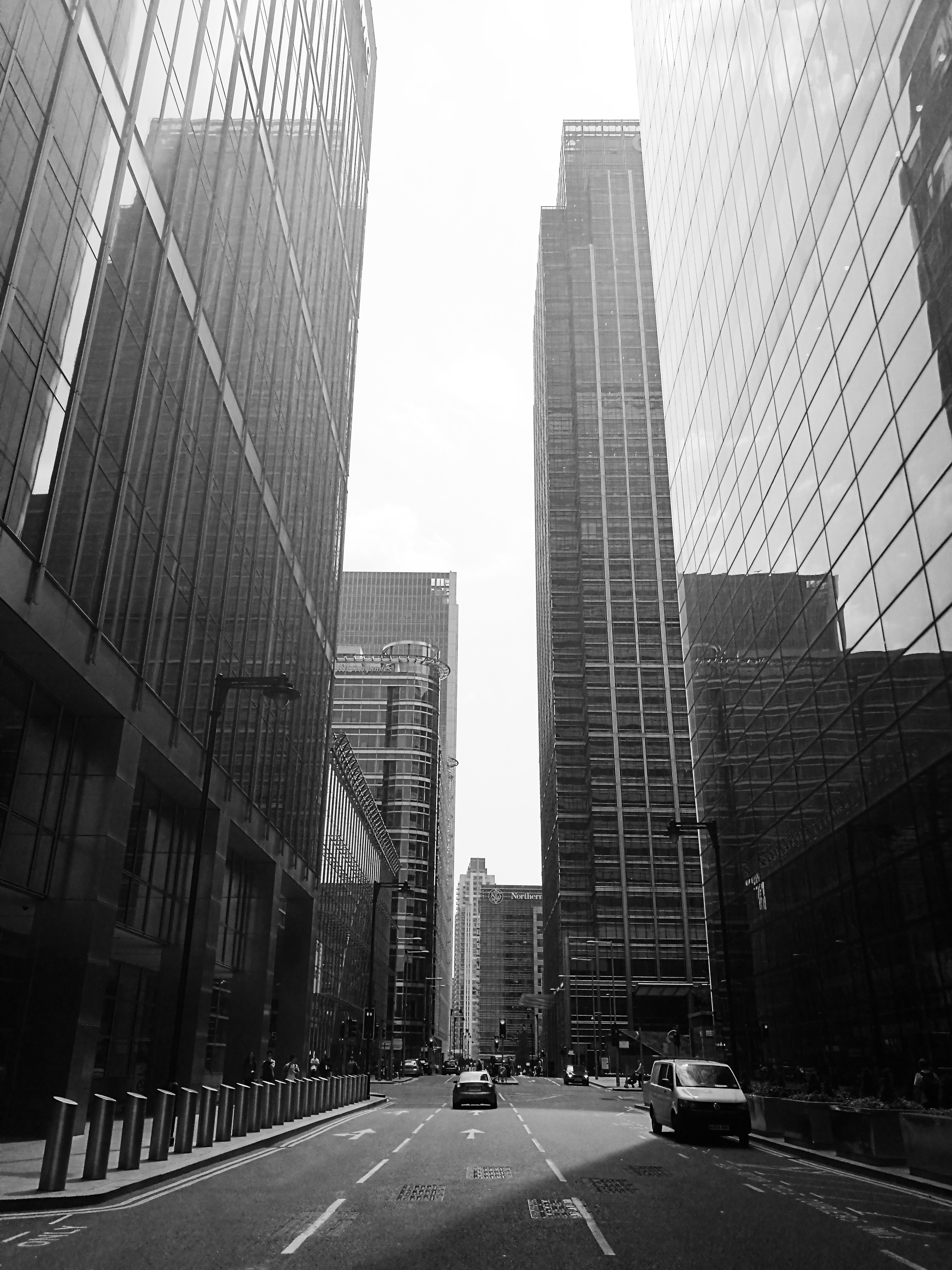
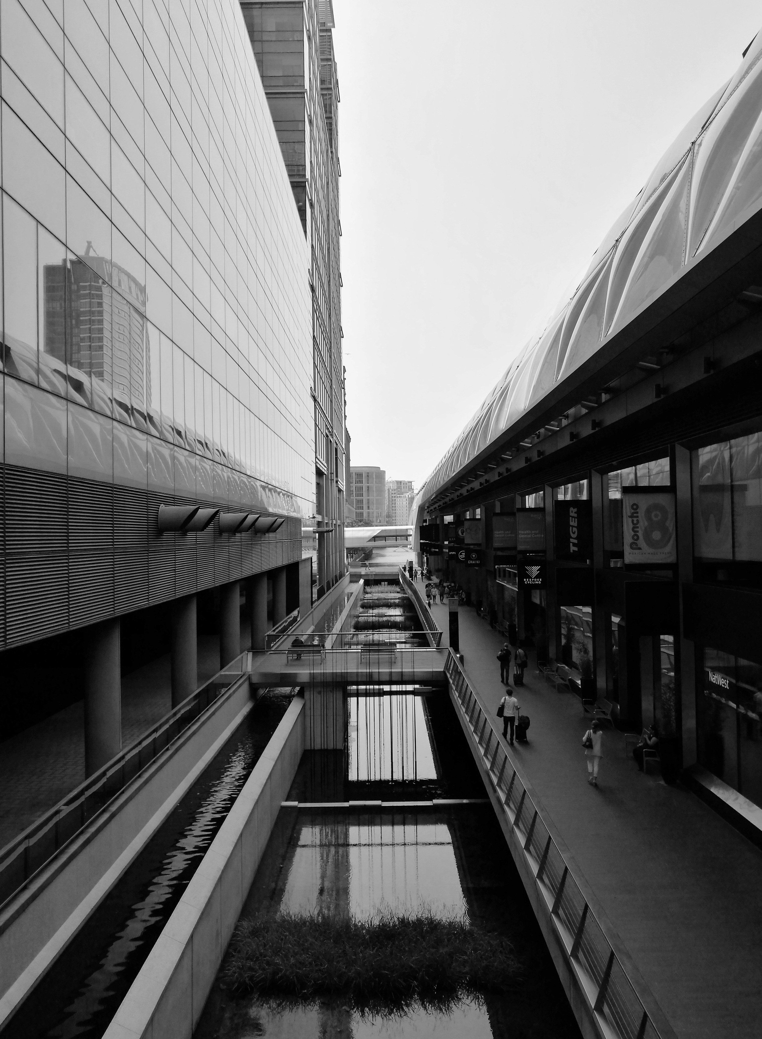
As I crossed into Canary Wharf, I was amazed by the sudden contrast from the 1970s concrete buildings I had just left to glass and steel now towering above me. I was now looking at some of Europe’s tallest skyscrapers - all mirroring the beautiful blue sky and fluffy clouds above. While I would never want to live or work in this financial district, I knew that when the sun was out – like it was today - it was an awesome place to photograph.

As I pointed the Huawei P9 towards the towering office blocks above, I appreciated the camera’s wide lens, which helped me to fit the enormous buildings in frame. This is something I’ve always used on my DSLR, but have never had the benefit of on a camera phone. And just like my camera, the P9 also comes with manual features like shutter speed and ISO, which enabled me to make the most of the heavy shadows over me when converting to black and white.

I soon found myself riding through London’s city centre, photographing the strange triangular shape of the Leadenhall Building, the dome-like roof of The Gherkin and the rugged rawness of the Barbican Estate. After a week of rain, I couldn't have asked for better weather to shoot in.
Towards Tower Bridge, I was confronted by a bottleneck of traffic, and soon realised that the bridge had risen to let a boat pass through. After years of living in this city, I’d never seen this old bridge open its gates.
6.jpg

Just as a cyclist rode ahead of me, the road over the bridge ahead lifted itself vertically. I quickly took out my phone and grabbed a shot of the man on his bike in front of the vertical road. As I looked at the photo I’d just taken, I realized how few people would have had the opportunity to capture such a moment. Standing in the middle of one of the world’s most famous bridges, I snapped a view that few others had seen. A spontaneous moment forever recorded - I was quickly falling in love with having a high quality camera phone.

As much as I love my DSLR, taking the P9 out for the day showed me that the concept of the camera phone has now been reinvented and can almost compete with even the best digital cameras. Unlike DSLRs however, it fits straight in my pocket, ready to capture any moment, at anytime. The marriage of EE’s super fast network and dual lens camera makes the Huawei P9 the perfect smart phone when I’m on the road and want to capture spontaneous moments.

All photos taken on the Huawei P9. In collaboration with EE, the 4G Network that’s 50% faster than O2, Vodafone and Three. 

INSTAGRAM


Creating digital cities: Interview with Ross Atkin by Tom Oliver Payne

Time is flying, and the world is developing at a rate of knots. Blink and we’re onto the next iteration of iPhone. The world is changing, and quickly. I mean, who knew that it’s been 100 years since the first BMW went into production. To mark its centennial year, the BMW Group and its four brands – MINI, BMW, Rolls Royce and BMW Motorrad, are exploring groundbreaking technology that will affect how we live over the next 100 years.

MINI particularly has always been recognised for its personalisation in design so it’s fitting that as part of the centenary year it has created the ‘Future Shapers’ project. Bringing together cutting edge designers Marcus Lyall, an audio-visual director, Margot Bowman, a multi-media artist, and Julia Koerner a fashion designer, to explore the future of personalisation in design, technology, fashion, and mobility.
MINI’s project inspired me to find other pioneers doing great things to improve our future. I’ve often wondered why technology isn’t more widely used to improve cities. It seems kind of stupid that we can chat face to face with friends on the other side of the world at any given moment, yet I have no idea when a free black cab is going to pass or when the traffic lights will change.
This is when I discovered Ross Atkin. I interviewed Ross - maker of Sight Lines - about his own vision for the future of mass personalisation.

As a designer who integrates technology into public spaces, and gives talks around the world on how we can better use technology in the city, Ross’s work is both inspiring and practical. Focusing his ideas on improving cities for the elderly and disabled, it’s clear his heart is in it for the right reasons.

Trained as an engineer, Atkin worked in design before getting involved in technology for cities. From this experience, his focus has always been on the small-scale – creating specific items for specific purposes, “by working from the ground up”, he told me “we’ll end up shaping an amazing future.”

Most of Ross’s work focuses on street design and using technology to help disabled people to navigate the city. He does things like create street lights which brighten for pedestrians with poor vision and has created an app which tells its user whether access routes are open. By following his ambition, his day-to-day work has branched out into a whole range of areas. He now creates a wide range of products, as well as advises companies and government bodies.

photo-product-21.jpg

I had never given much thought before to how difficult it must be to move about the city as an elderly or disabled person. Ross explained to me the frustrations of people bumping into a temporary sign, or walking onto the road when there’s no way of knowing the pavement will end. I soon realised that for many people, the whole idea of trying to navigate the city – which changes every day – seemed pretty damn scary. My constant complains about bad bus timetables and traffic lights suddenly seemed pretty petty.

Chatting with Ross, it became clear to me that although his interests are broad, he’s mainly passionate about improving urban environments for people who need it most, “different people experience different things in cities which are inconvenient and annoying,” he told me, “I’m very interested in working with disabled and elderly people because the level of inconvenience they experience in cities is much higher. So, there is an amazing opportunity to make a big impact.”

With over half of the world’s population now living in cities, and with an ageing population, it’s easy to see just how big an impact this will have. The race for cities across the globe to become more beautiful and more ‘liveable’ has begun, and technology will no doubt play a huge role in the way this race folds out.

In addition to creating apps and responsive street furniture, one of Ross’s coolest technology projects is called ‘Sight Line’, which enables people with bad sight to learn all the details of construction sites through a transmitter, or app. Not only will the pedestrian quickly know how wide the construction site is, but they will know how long it will be there and even how to get around it.

“Construction works on footpaths is seriously hard for the visually impaired,” Ross told me, “if somebody can’t access the path that they normally take, and they have no idea how to get around the construction works, they can get completely stuck.”

The awesome thing about Sight Lines is that it taps into existing data already recorded by contractors, so there’s no extra management work needed. By using existing technology and information, Ross’s work is able to completely transform the way people interact with their surroundings. Pretty cool.

When I asked Ross how he imagined the future of cities, he told me that it would probably look something pretty similar to today. Slightly disappointed, I asked, “no changes at all?”

Ross explained, “I just don't really buy into the idea of having a ‘grand vision’ for how the city will look in the future. Instead, I’m focused on solving the problems that exist right now, with the technology we have today.” He imagines an incredible future with amazing improvements, but he doesn't think we’ll get there by drawing big plans. Instead, he thinks, we should focus more on making practical improvements to all the little things - one at a time.

With such simple, yet useful ideas, it was awesome to meet Ross who is at the forefront of creating products that will undoubtedly help to shape the future of our cities.

As part of MINI’s Future Shapers project, in the next few weeks I’ll have the opportunity to see how MINI is exploring its own vision of the future as part of its exhibition ‘BMW Group Future Experience", at the Roundhouse 17 – 26 June 2016. The exhibition will look at groundbreaking new technology that will affect how we live in 100 years. Visitors will be able to see a future MINI, a “Vision Vehicle”, that demonstrates applications of this new design and technology in an iconic car.

Visit MINI.co.uk for free tickets.

(And make sure you check out the full interview below!)


Photos and film by Sam D Jackson.


INSTAGRAM


Why I like Brutalist architecture by Tom Oliver Payne

Brutalism seems to divide opinion like no other type of architecture. Between the 50s and 70s huge, grey, concrete buildings were built across cities around the world. While a lot of people hated their ‘inhuman’ and overbearing aesthetic, the architects designing them thought they were creating a new kind of utopia.

Until a few years ago, I knew nothing about this type of architecture. But it wasn’t long before I fell in love with taking photos at The Barbican Estate, and soon learned a bit about the movement.

Whether I love or hate the look of a particular brutalist building, I now really appreciate what it was trying to achieve. Now, every time I head off to a new city, I seek out these buildings and try to learn a bit about what they were trying to achieve in each place. From scanning the internet, it looks like other people love it too.

The term ‘brutalism’ comes from the French word ‘brut’, meaning ‘raw’. That’s exactly what these buildings are. So different from elegant design and detailing in the past, their designers used rough concrete with hard textures, and showed-off elements of the building that used to be hidden, like lift shafts.

The thing that I think is cool about brutalism is not the way it looks, but that it was designed with the best, optimistic intentions.

After the World War II, Europe was trying to rebuild its cities in a way that fixed a lot of its problems from the past, and Brutalism was all about trying to make buildings as cheap, functional and equal as possible. By making sure the building’s foundations were exposed, architects hoped that the ordinary could be seen as an art form, and in doing so - make them attractive to every person in society - whether rich or poor.

A key element of brutalism in London was the idea of creating ‘streets in the sky’, which would connect apartments blocks or offices. The idea was that neighbours could talk, kids could play and people could walk to work way above the fast-moving traffic below.

In the period of two decades, once low-lying urban areas were quickly transformed by towering concrete structures by architects and planners who envisioned a utopian city, where residents lived equally.

The ideas were cool, but in practice, it didn’t take long before the brutalism movement came to an end. It’s considered a social experiment, which didn’t really work. People soon realised that these buildings created strange ‘placeless’ spaces and restricted pedestrian movement through urban areas, which encouraged isolation and crime.

After harsh criticism for years, many of these buildings were demolished and some have been preserved. In London, my favourite surviving examples are Robin Hood Gardens, Balfron, Trellick Tower, and The Barbican.

The thing that I find super interesting about the Brutalist Movement, is how bold these planners and architects were: they saw a problem in society and they set out to find a solution for it through design. Sometimes I feel like society lacks some of that audacity these days. We have as serious housing shortage in London right now, and no one seems to be doing anything to fix it.

To me, this style of architecture represents a group of optimistic designers who were experimenting with a courageous idea - and that’s pretty cool.

Photos and film copyright Tom Oliver Payne.

INSTAGRAM


Exploring London's 3 best graffiti neighbourhoods by Tom Oliver Payne

Ever since I was a kid, I’ve been exploring. And not much has changed now that I’m in my 20s. But when I go somewhere new, I don’t just sit in a café, or see a boring landmark. Instead, I discover random parts of a city, hang with other creatives and check out exciting new ideas.

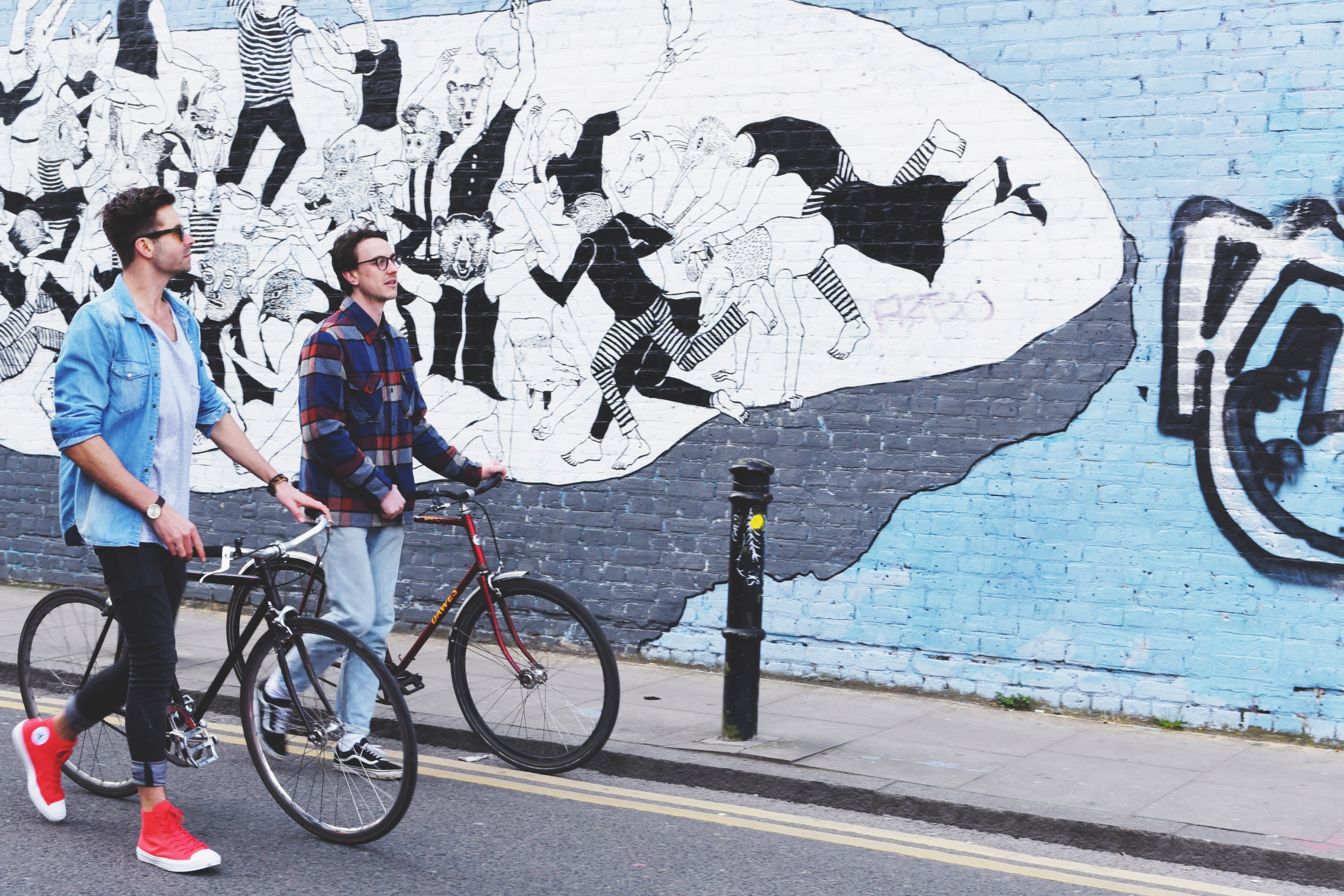
This week I teamed up with Converse to explore my own city like I haven’t before. I decided to seek out the neighbourhoods which not only attract street artists from across the world, but are at the forefront for young artists who are forging new paths.

Converse (Chuck Taylor II Neon) was the perfect partner to explore the adventure this incredible city has to offer. Chuck II is a product synonymous with pushing creative boundaries – something which is fundamental to who I am. That, together with a commitment to enabling young people to think bigger, they were a refreshing wingman on my exploration of London’s urban art.

blog-feature-image.jpg

1. Shoreditch

Shoreditch is the centre of London’s street art scene. Streets like Brick Lane may be popular with tourists, but it’s also where artists have their work recognised right across the world.

I took off up Hanbury Street, which is coated with some of the best murals I’ve ever seen. Then, heading to the Nomadic Gardens, I met some barefoot hippies and chilled in one of the most colourful public spaces in London. Huge art works spread across the railway tracks and small little throw-ups surrounded the community campfire. Awesome.

Shoreditch may be the centre of London’s street art scene, but that’s not to say leave it off your bucket list – just make sure you explore the backstreets.

2. Camden Town

Camden Town has been synonymous with music and creativity since the 60s. And today, it continues to be more inspirational than ever.

Heading past the world-renowned Camden Lock Markets, it was just a matter of seconds before I was down some laneways and surrounded by some seriously amazing shit. A super detailed artwork by Otto Schade acts as a memorial to Amy Winehouse, and a huge piece by Dan Kitchener is – in my opinion – his best addition to his ‘Liquid Lights’ series.

But there was one bit of paint that caught my attention in particular. Created by Pang, this was beautiful portrait of a recent Syrian refugee in London. Apparently the man came to the alleyway himself to help complete the piece - a cool reminder how art can influence the political world.

Camden’s creative scene has continually broken barriers, and just like the music, its street art scene seems to only get better with age.

3. Hackney Wick

Hackney Wick is a neighbourhood where young people are generally free to make noise, party, and paint walls. Not only does the cheap rent offer the perfect place for creatives to live, but its huge old warehouse spaces give plenty of room for imaginative musicians and artists to experiment with fresh ideas. Just about every wall in Hackney Wick is covered with vivid colours from an emerging new artist.

By the time I was done checking out the The Wick’s graffiti scene, it was time to indulge in some music. It’s a good thing my Chuck II’s were super comfortable for the full day out… and of course a night on the dance floor.

As a young creative in London, it’s important I’m always seeking out the next opportunity. It doesn’t matter where I am, or what time of day it is, I’ve got to be ready for whatever comes my way. Psyched to team up with Converse on this adventure, I couldn't imagine a better collaboration to explore the neighbourhoods at the forefront of the city’s street art culture.

Chuck II's are available from Converse.com.

Photos by Sam Jackson and Mali-Koa.

INSTAGRAM


Meet Mikey from Shoreditch by Tom Oliver Payne

Sometimes when I'm walking home from work I decide to take the long route so that I can walk through a rad little tunnel in Shoreditch. There are usually interesting people cruising around and some good graffiti to look at. One night last week, the light was looking particularly good so I decided to grab a few photographs.

As I lay splayed out on the ground I noticed a busker at the other end of the tunnel absolutely smashing it on his acoustic. He may not have had all the technical ability, but he had some serious passion. As I looked through the viewfinder I noticed the dude get up out of his spot and begin walking towards me. As he got closer, I popped my head up over the camera and said hello. I was greeted with a massive smile and "Hey, I'm Mikey! Can I see your shots?"

Over the next hour or two Mikey and I sat playing guitar and watching the people power-walking home from work - much the way I would've looked just a couple of hours before. An interesting little demographic contrast... there sat Mikey: high vis jacket, a can of beer, the world's loudest laugh and a song. In front of us were clean suits, Iphones, tight faces, and busy agendas. This was a good reminder to take a step back every so often to get some perspective. When you realise the simplicity of life, you suddenly realise that the stupid worries are all just... well, worries.

Sometimes what seems to be a fulfilling life, is not that that fulfilling at all. On the other hand, someone who seemingly has nothing, couldn't ask for anything more. It's important to know what makes you happy, and focus your attention on that. Anything else will just disappoint.

Sitting just around the corner from Gary and Prince, Mikey plays under Shoreditch Overground most week nights. Listen to his music, drop him a coin and say hello.