Before leaving Sydney, I did a few photography shoots for Sydney’s new 'Neighbourhood Paper'...
Read MorePhotographing for #WeLiveHere2017 /
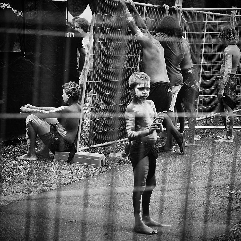
Over the last few weeks, I've been shooting a documentary photography series for the #WeLiveHere2017 campaign. Each day I've been visiting the neighbourhood of Waterloo in central Sydney to take portraits of local residents, as well as asking them a few questions about their connection with the neighbourhood.
The project aims to put a human face to public housing to encourage compassion, action and resistance to the rapid change that is taking place in this part of the city. Over the next year the state government intends to demolish and redevelop the public housing estate, displacing 4,500 of the existing residents. Unfortunately, these are some of Sydney's most vulnerable, including the elderly, disabled and those on low-incomes.
40 years ago this neighbourhood was built as a 'utopia', opened by Queen Elizabeth II and Prince Philip. By 2018, the existing buildings and community will have disappeared - replaced primarily by those on high incomes. The socially diverse, dynamic, inner city community - with an important cultural heritage - will be changed forever.
If you want to check out my photographs head to @WeLiveHere2017 on Facebook or Instagram. You can also learn more about the community light installation and upcoming documentary through the official website.
Getting ready to take some shots for the day. Thanks Georgia MacNevin for the photos.
Examples of portraits and stories below.
Feature image courtesy Georgia MacNevin.
Sydney, it's time to face your addiction /
A car-dependance analogy...
Read MoreA conversation with Jess Cook of Sydney's 107 Projects /
Jess Cook has been involved in a range of events and creative projects over the last 15 years. From running collaborative art events and helping to manage large-scale festivals, her latest endeavour is arguably the most ambitious. As Founding Member and Managing Director of Sydney’s 107 Projects, she’s been integral in creating an impressive cultural space in central Sydney. In addition to housing exhibitions, dance classes, theatre performances, artists’ in residence, horticulture, cooking and workshops spaces, 107 has become host to some of Sydney’s most prominent creative organisations and projects. Collaborations include FBI’s Ears Have Ears, Heaps Gay, Groove Therapy and The Bower, to name just a few.
Jess recently showed me around 107, talking about the space itself, as well as creative spaces, more generally.
Read MoreReminding Sydney of Seidler /
For years, my brother, sister and I would take my grandfather to the beach each Sunday. Arriving early to collect him from his eastern-Sydney flat, he would be perched on his balcony with a tea in his hand, admiring the greenery below.
Built in '66, my grandpa’s building was one of the earliest apartment blocks designed by world-renowned Austrian-Australian architect, Harry Seidler.
Like all of Seidler's buildings, my grandfather's definitely has its imperfections: dead spaces, dark corridors and steep stairwells to name a few. But I can't imagine my Paps would have been happier in any other place.
Horizon Apartments in Darlinghurst, Sydney (1990-1998).
The large open-plan living spaces, split levels and north-east facing balconies were bold innovations at the time of its design, and each aided his psychological and physical health right until his final days.
What was important about this building – and any of Seidler's for that matter – was the desire to push engineering boundaries, question planning authorities and pursue modernist design principles in the hope of improving people’s lives.
Harry followed strict architectural principles under the premise that they were egalitarian, optimised function, or would simply create a beautiful building. And while some of his schemes are, today, viewed as design failures (see Blue Point Tower), each was designed upon a set of values which tried - at least - to make Sydney a better place to live... Even if that meant frustrating his clients and local planning officers in the process.
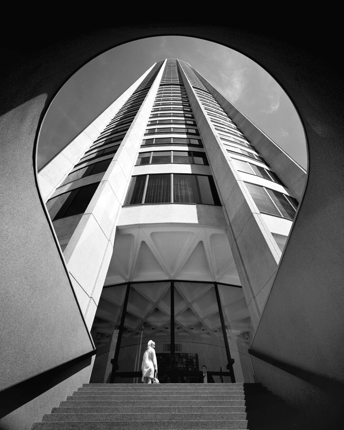
Probably the most iconic Harry Seidler building, Australia Square Tower (1961-1967). Photograph by the legendary Max Dupain.
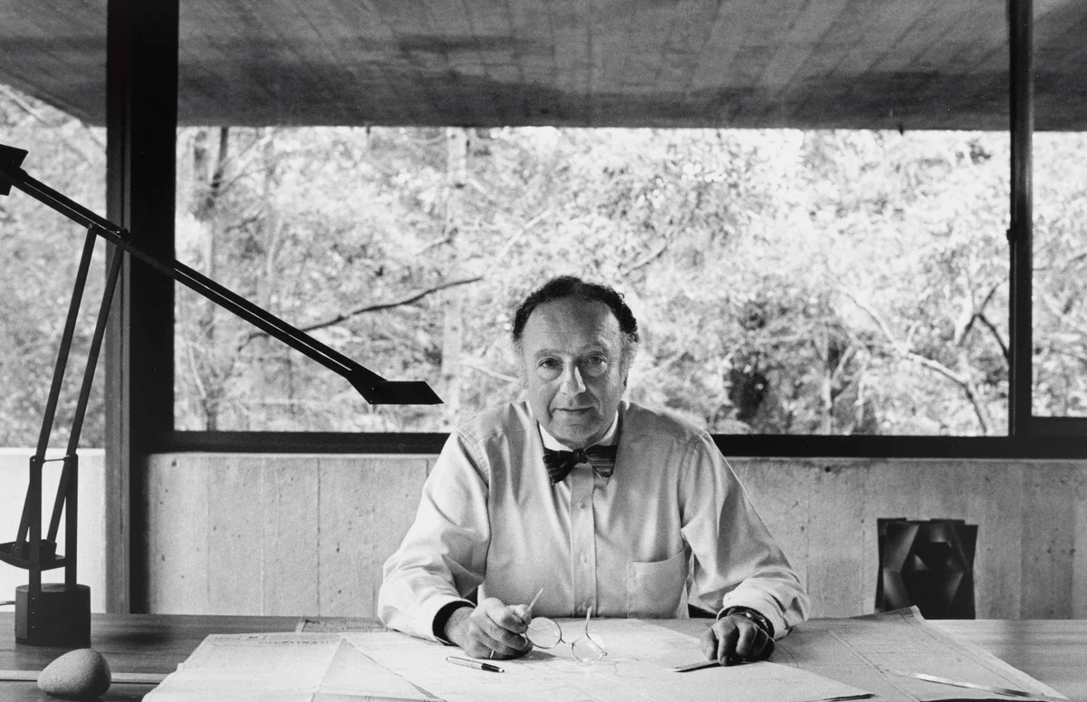
Harry Seidler in his home office. Photograph by David Moore.
Since returning to the city from London a couple of months ago, I’ve noticed dozens – or possibly hundreds – of new high-rise developments, which resemble something akin to Ikea furniture, rather than architecture. These cookie-cut designs aren’t only badly built, but very little thought has been given to their design. The core principles which were deeply rooted in Harry Seidler's architecture (as well as other great modernists of the 20th Century) have seemingly been ignored.
Aside from the use of bland materials and repetitive form, which is far from inspiring, the structures are often poorly integrated with the existing urban fabric, don't maximise nature or natural light, and contrary to their promised community benefit, their so-called ‘public spaces’ look and feel like private gardens - dissected from surrounding neighbourhoods.
I guess it was Elizabeth Farrelly who put it best, “we used to think '60s apartments were austere and badly built. Now, they appear as paragons of generosity, grace and certitude”
As large-scale residential architecture appears to have creatively stagnated (perhaps as a result of Sydney's muddled planning system), Harry Seidler’s work remains a reminder that this city's tall buildings can be creative, brave and innovative.
More importantly, his architecture is a reminder that buildings are not just a commodity, but should seek – at the very least - to improve a city, and the wellness of the people within it.
Interview with Sydney busker, Kane Muir /
Having played music on streets across the world, at 29 years old, busker and musician Kane Muir has experienced a life unique to most. Before he embarks on his next stint in Los Angeles, I caught up with him to talk cities, warehouse-living and the busking lifestyle.
Read MorePhotographing Sydney's innerwest /
Last week the awesome guys at WeAreShuffle asked me if I would take over their Instagram account for a few days. With their office way up in the the UK within the cold depths of winter, I'm sure a few photos of sunshine and was to be a warm welcome on their feed. I decided to take a series of photos over three days in area of Sydney I grew up in - an inner city collection of neighbourhoods known as the 'innerwest'.
The aim was to represent the diversity of this district. On the one hand, the inner west enjoys some of the best Sydney Harbour views. Multi-million dollar properties line wide streets parked with Mercedes of the city's most 'elite'.
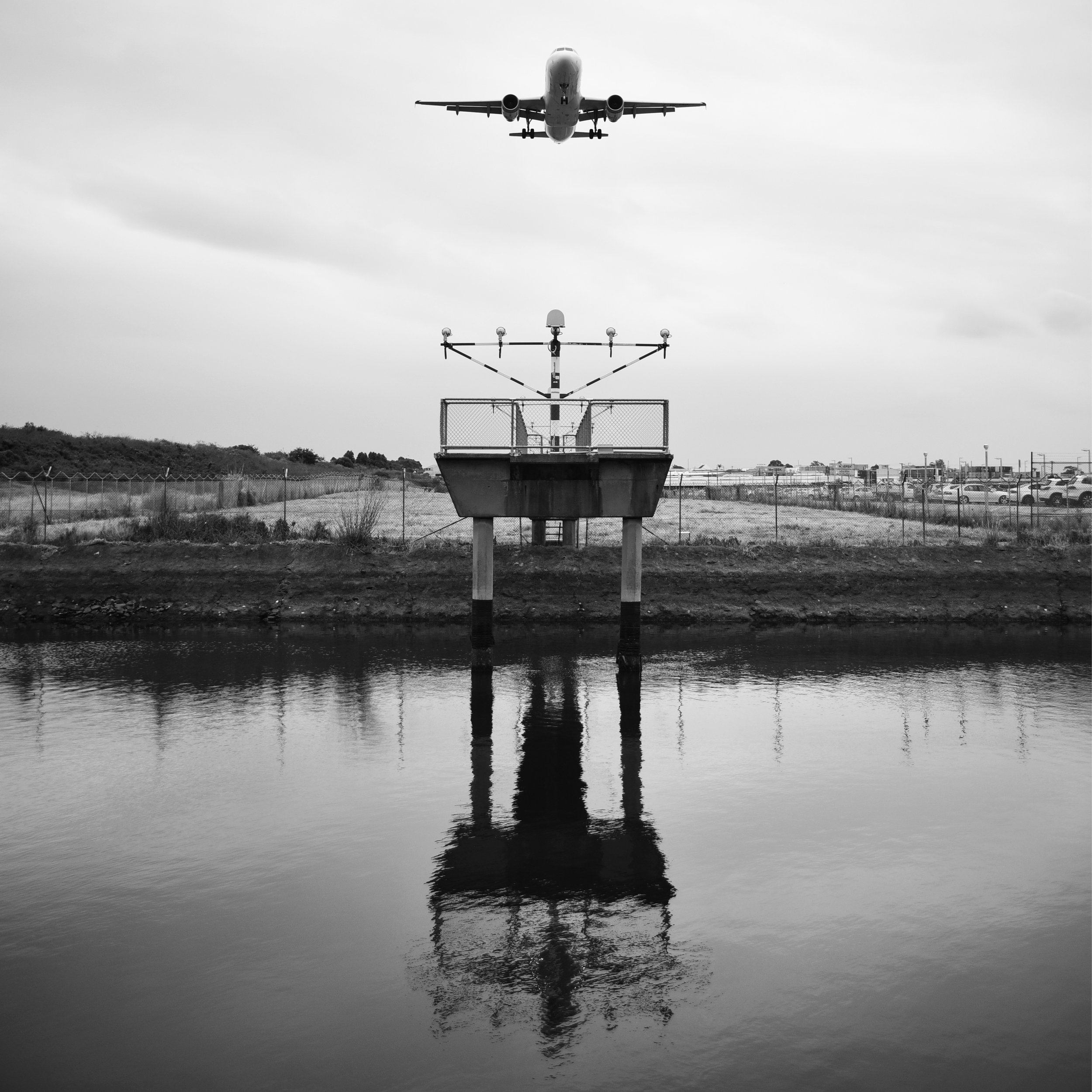
Just one or two kilometres away is the neighbourhood of Tempe, sitting directly under a major international flight path, where the descent of Boeings shakes the core of homes lying below. Perhaps the inner west's most interesting neighbourhood - Marrickville - was once a major industrial hub. Today, it's experiencing a phase of gentrification, much like that of London's Hackney Wick, or New York's Greenpoint. A wave of young people has quickly transformed the existing demographic.
No matter where I end up in this world, the innerwest is always my home... I guess there will always be something soothing about the sound of an A380 screeching above me.
Here are a bunch of the photos from the take-over.
Be sure to check out WeAreShuffle's feed, or my own for more.
'Rom': Europe's first heritage listed skatepark /
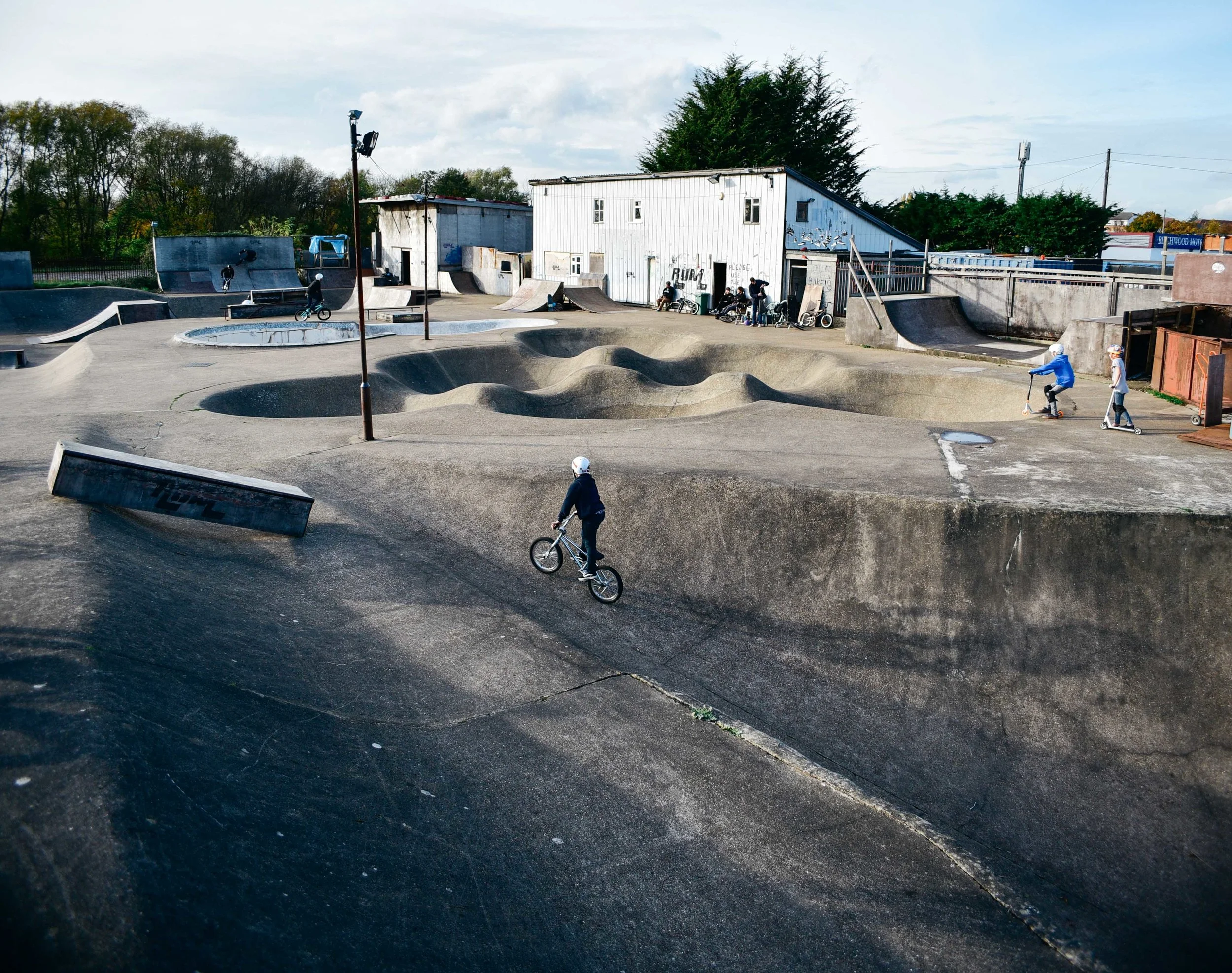
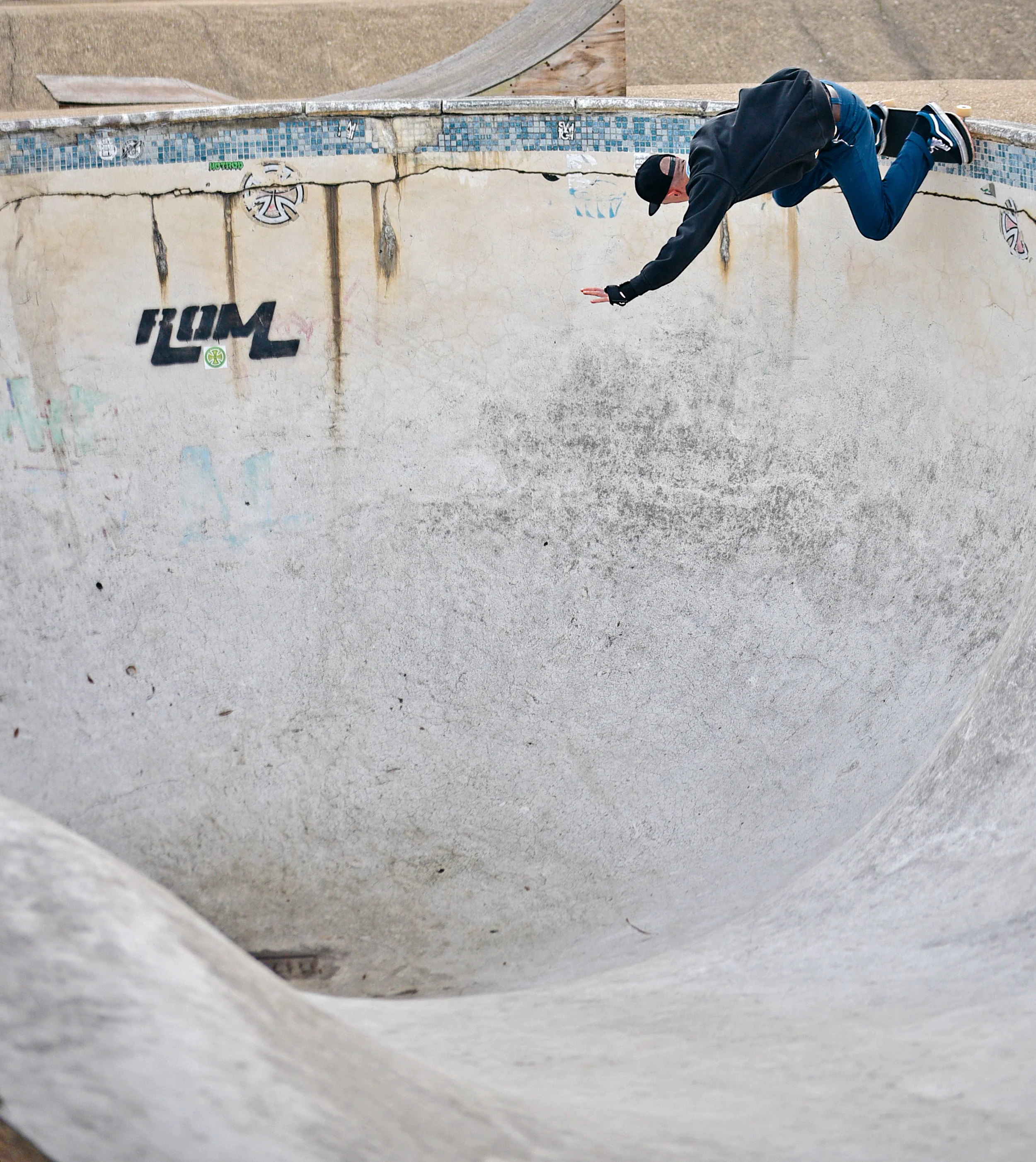
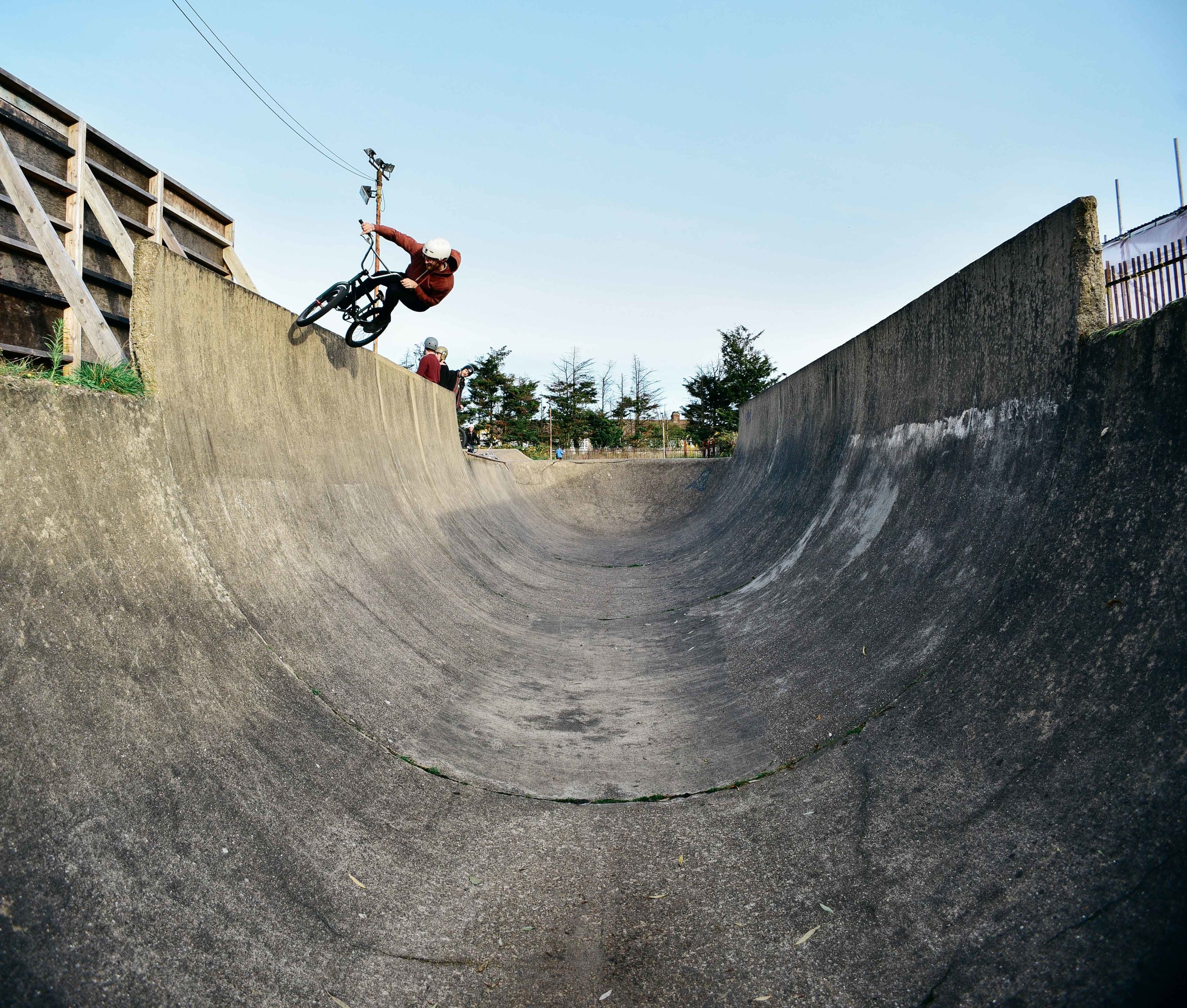
'Rom' is iconic in British skate and Bmx culture. It represents a time when skating was a little more raw – much like its roughness of its own surface.
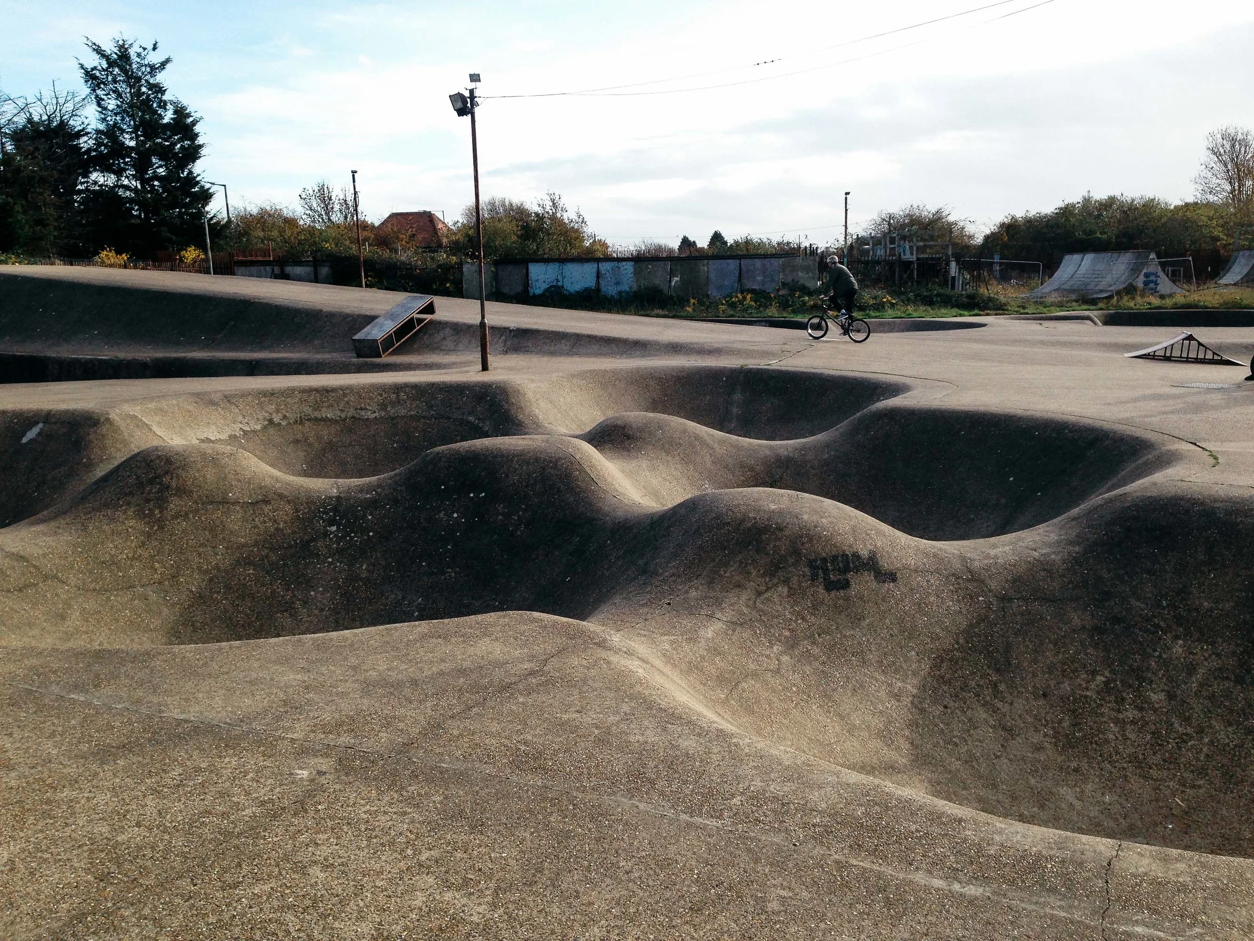
When I first started sessioning skateparks in the late 90s, it was common to see wooden indoor and pre-fabricated outdoor skateparks in videos and magazines. But every so often an image would pop up of this huge outdoor concrete skatepark in London made up of mogul bowls, pools and downhill snake runs.
Far from the smoothed surface skateparks being built in the 1990s and 2000s, Rom from back in the '70s was bumpy, rough and raw. I couldn’t wait to one day check it out.
Built in 1977, Romford skatepark has for decades attracted Bmx and skate talent from across the world.
Fast-forward 15 years, and I’d still never visited...
That was, until a text came through last week, “who's up for a Romford session?” A couple of days later a group of us were jammed into the back of a van, heading east towards 4,000 square metres of pure concrete.
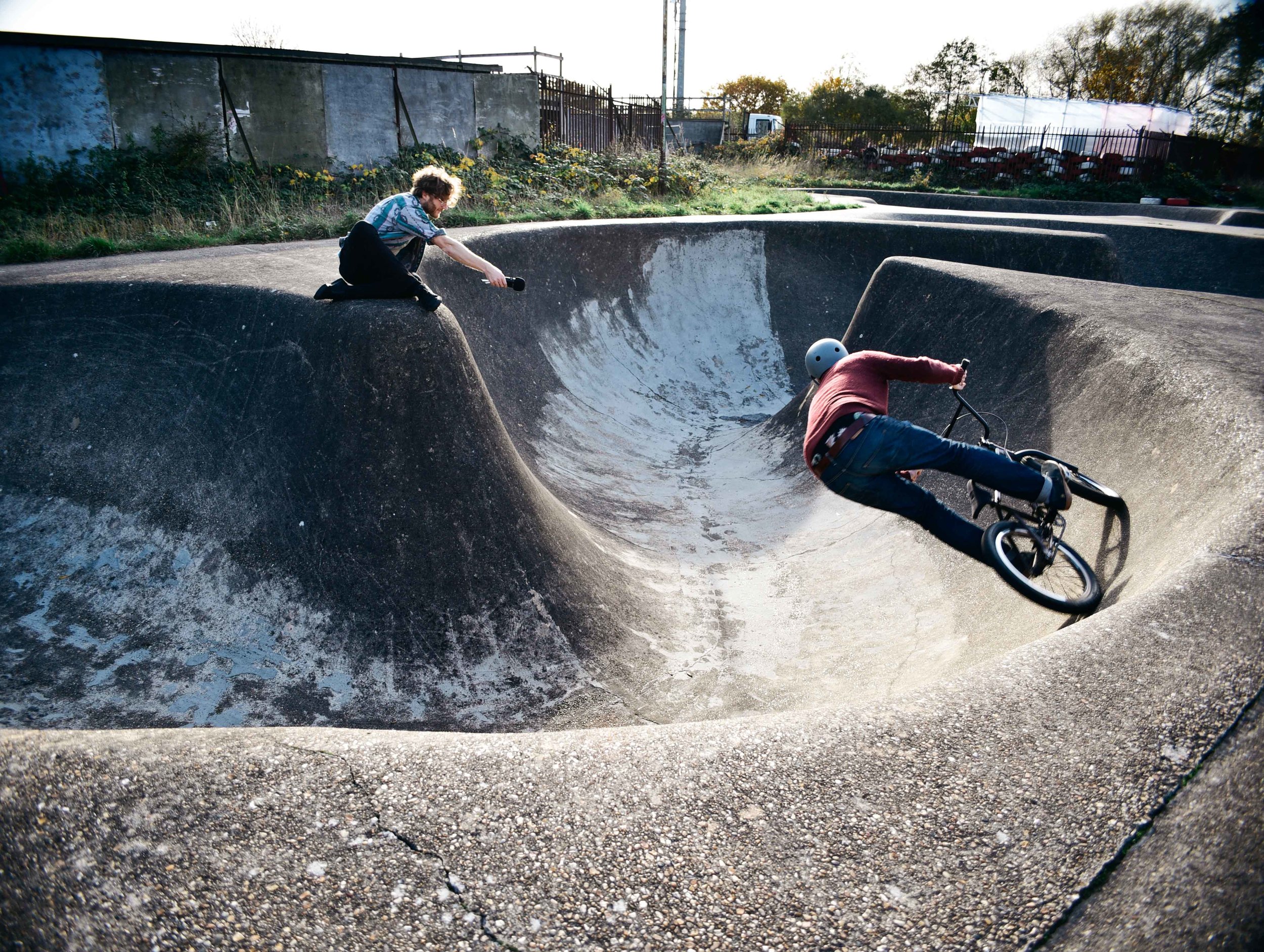
It seems the excitement of Bmx and skating hasn't worn off in our older age. Exploding out of the van, we spent hours carving seemingly endless lines over humps, bumps and massive transitions.
Everything about this place characterised - to me - the early years of skate and Bmx culture.
Originating from the surf lifestyle of Southern California in the 50s and 60s, early skaters explored swimming pools and concrete drains to surf. Over time, they began creating purpose built parks, which still gave the sensation of carving a wave. Rom – England’s oldest surviving skatepark – is the perfect example of this.
The bowls and snakeruns weren’t created for the modern, tech kid. But they represented the old-school style of skaters who preferred high speed carving lines.
It was no surprise to me when I heard last year that Historic England would give Rom a Grade II heritage listing. The park has become an icon of the British skate and Bmx culture. Although both sports have blown-up into the mainstream in recent years, the park represents a time when skating felt more alternative and raw .
As we hopped back into the van and drove back towards London, I was so psyched to have finally check out this piece of history. With the threat of destruction of loads of amazing parks in recent years, it's awesome to know that at least place is immune. I can't wait for some solid afternoons here in summer 2017.
For a complete rundown on other incredible places to visit in England, be sure to check out the Your RV Lifestyle's comprehensive list.
Tom
Toronto from above: views from the CN Tower /
I’ve been wanting to visit Toronto, Ontario for years. Not only do I have some awesome friends living there, but with one of the most striking cityscapes in the world, I've been super keen to take a wander through its downtown streets.
Two weeks ago I boarded a Westjet flight from Gatwick and a few hours later as I was touching down at the Toronto Pearson. As I peered out the train window on my way into the city, I was struck by the size of its building's. With over 2,300 high rise towers, it's now the tallest city in North American behind New York.
But it was the CN Tower which stood out in particular. Not only is the building monstrous, but it stretches out of the city cluster with a super cool 1970s, retro swag.
After an initial building boom in the late 19th century, the '60s and '70s saw Toronto undergo its second major urban transformation. As the city refocused itself from manufacturing industries to the services economy, it began tower upwards, rather than just outwards.
Completed in 1976, the CN Tower became a symbol for the rise of Toronto as an innovative, global city and marked a new era in high rise development of the downtown.
Standing at over 550 m, the CN Tower held the record of the world’s tallest freestanding structure until the completion of the Canton Tower in 2009 and Burj Khalifa in 2010. For over 34 years it set the bar for tall buildings across the world.
As my friend Jesse Darling (who also happens to be a Toronto expert) and I ate and drank our way through the city's neighbourhoods, it wasn’t long before I asked if she’d be up for doing something "really, really touristy".
In just a matter of hours, we were on our way to the CN Tower observation deck to check out the city from above.
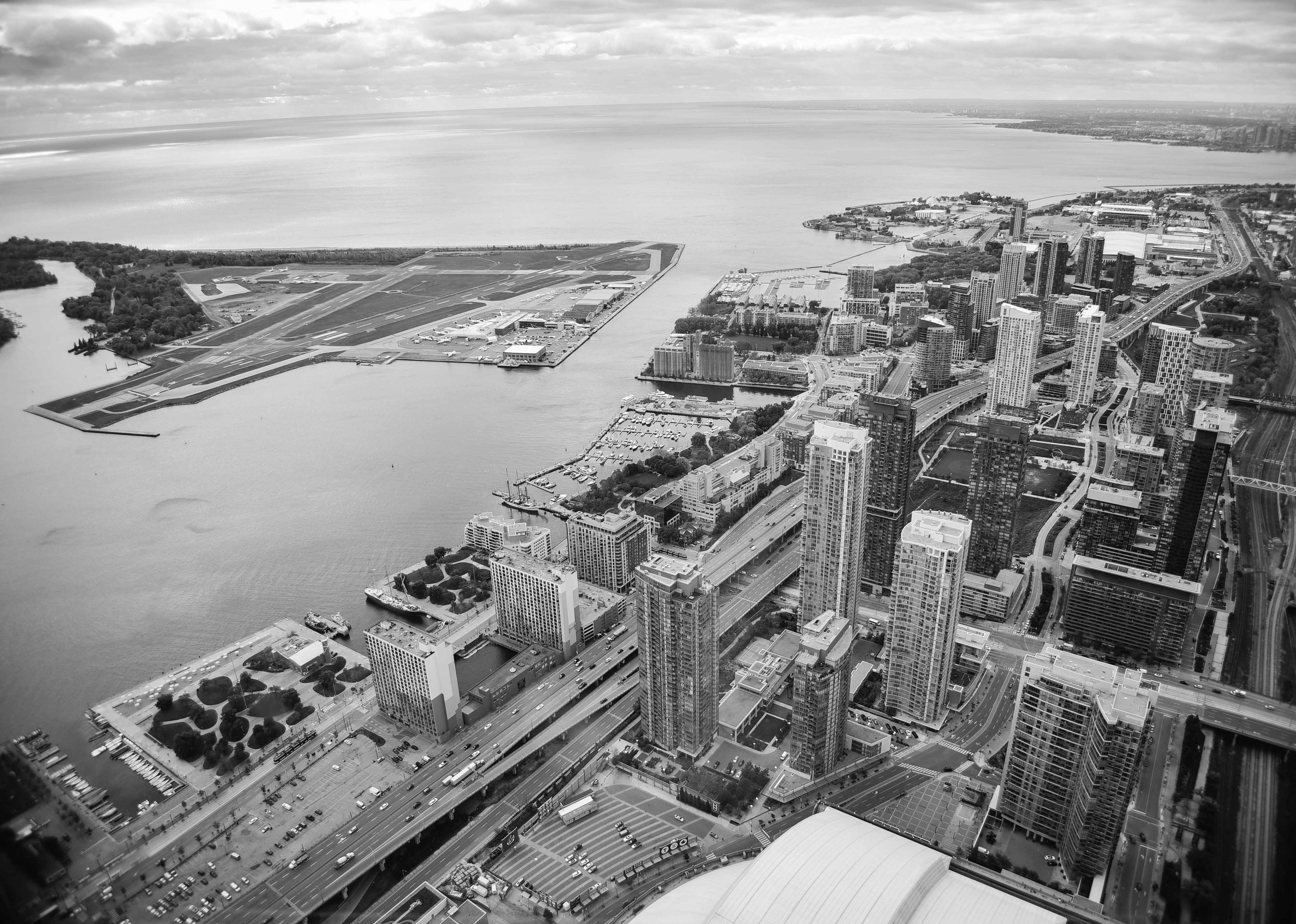
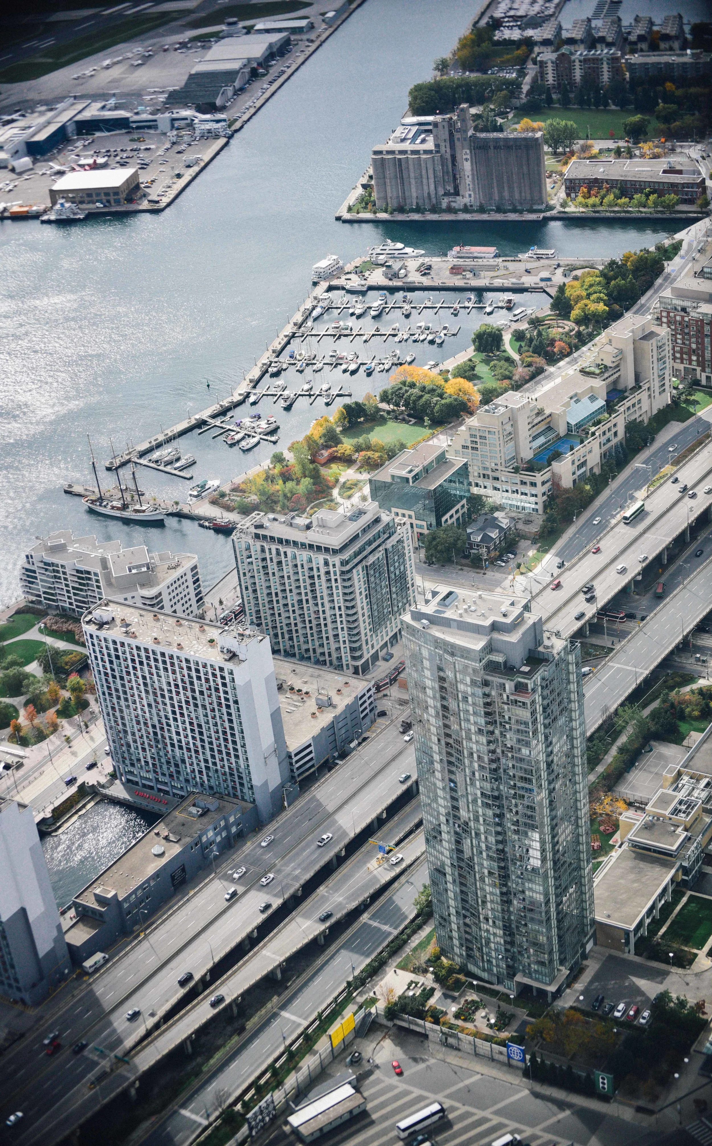
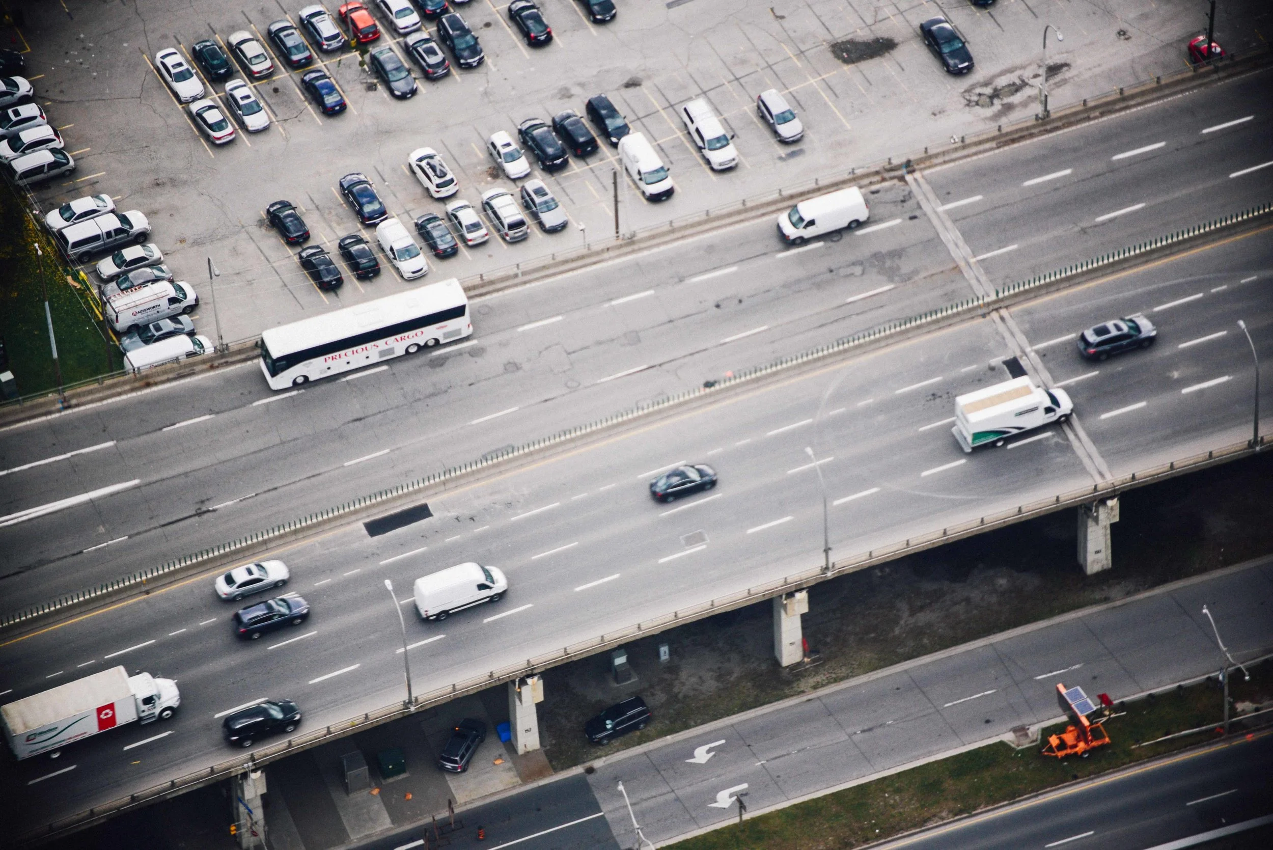
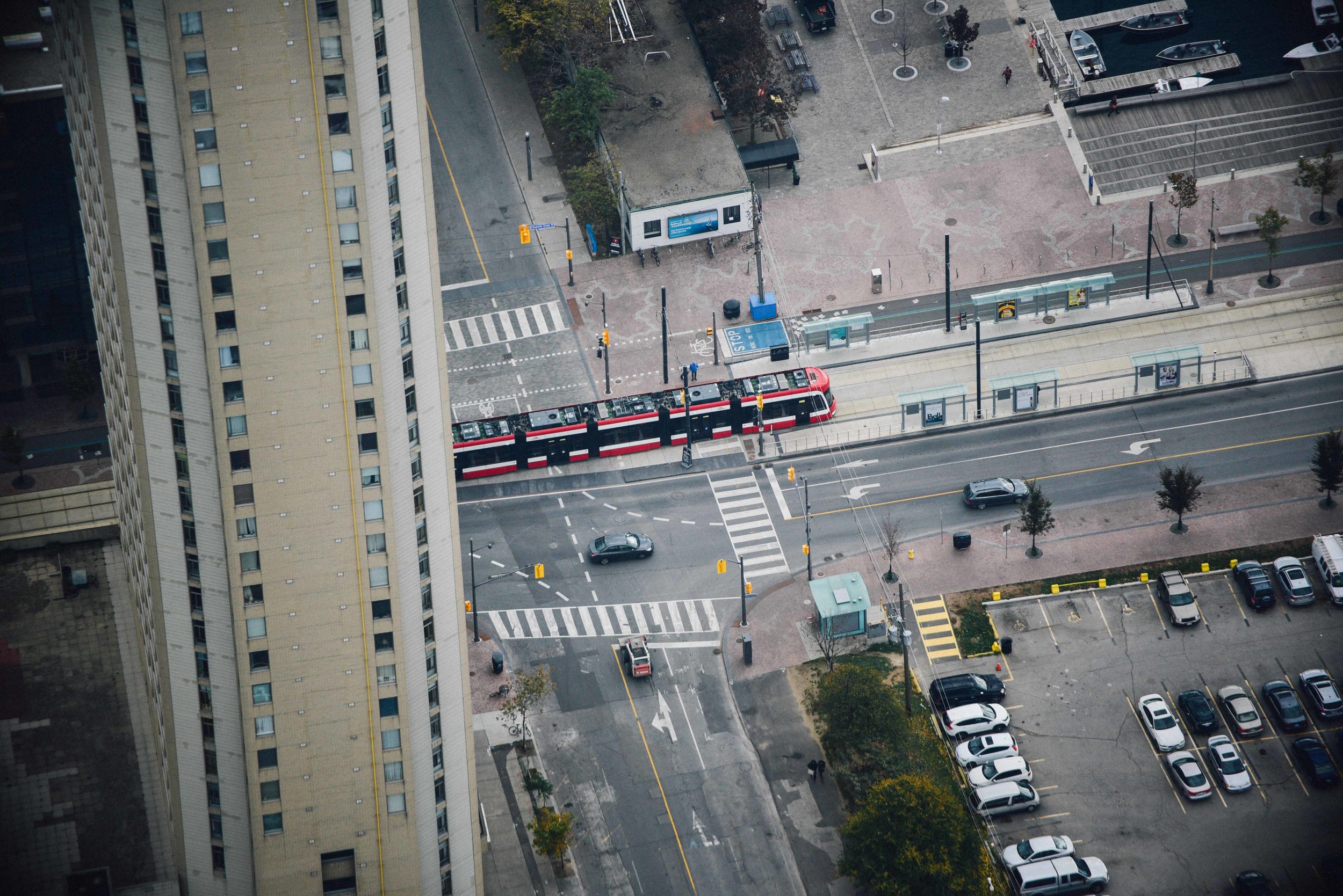
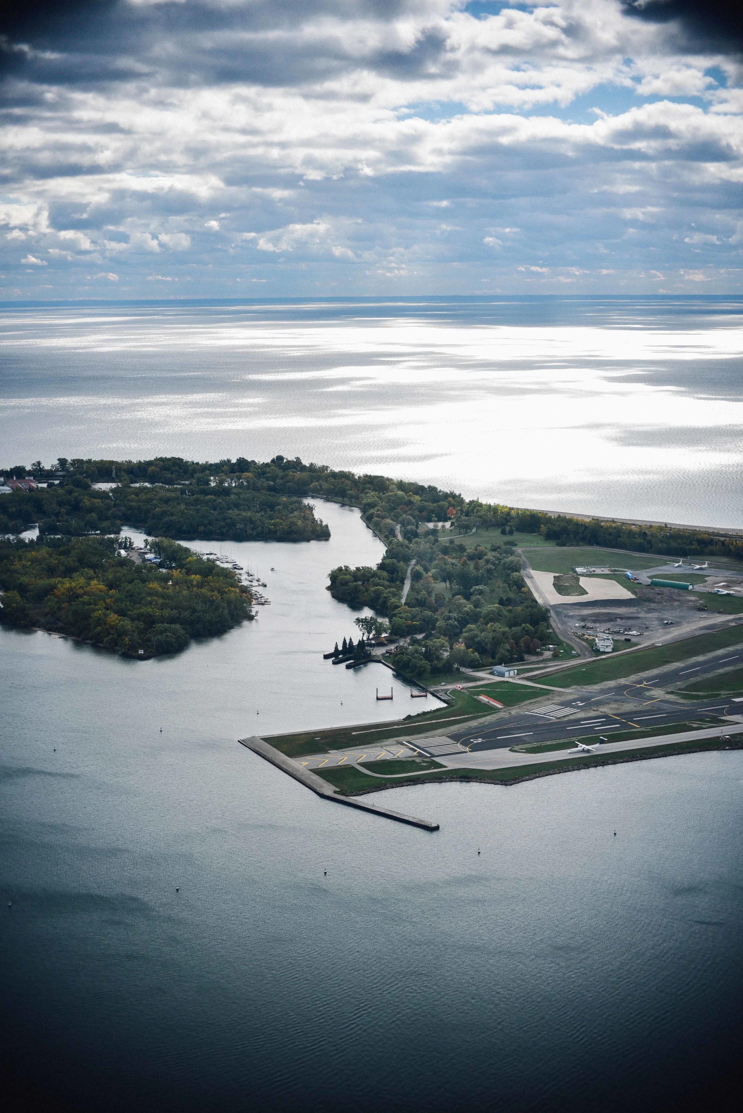
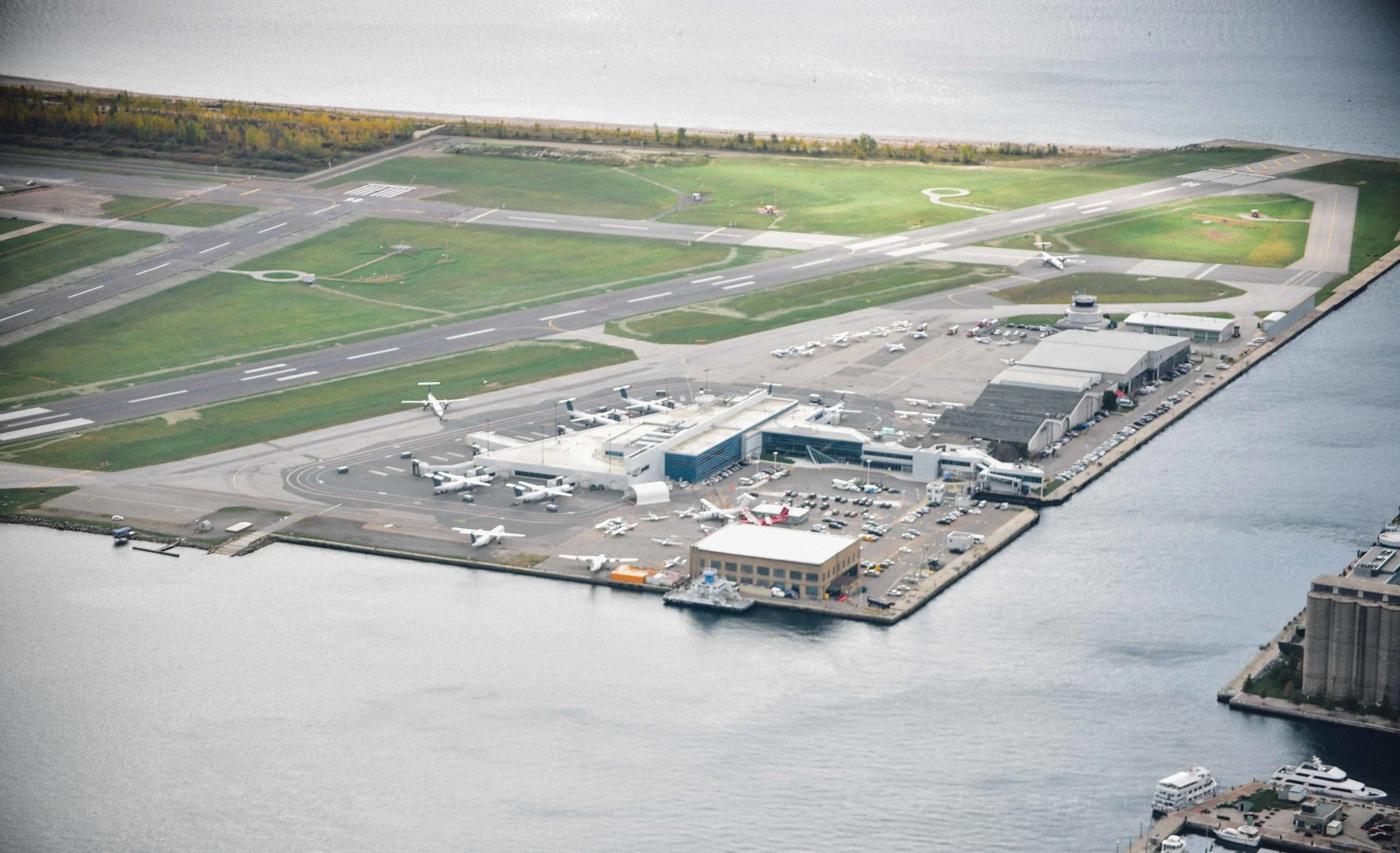
Looking down at Toronto below I could see the intricacy of the city's neighbourhoods, and the beauty of the natural landscape beyond. As towers flood the horizon and 100 more stand under construction, its clear to see the importance planning tall buildings carefully.
Not only can high-rise towers drastically change the look of a neighbourhood, but they can very quickly change the feel of one too. Characterful neighbourhoods which have evolved over many decades can suddenly take on a whole new vibe - often at stake of its old one.
At the same time however, when located carefully and designed well, tall buildings can add to the beauty and vibrancy of a a city, as well as provide people with needed homes and workspaces. As controversial as it may have been at the time, the CN Tower has - in my opinion - stood the test of time. And if anything else, gives locals a visual landmark and enables millions of visitors like me to admire the beauty of the city beyond.
Make sure you check out the YouTube video and photos below. Of course, if you love or hate the CN Tower, let me know in the comments section... Yew!
Photos, video and text all copyright Tom Oliver Payne. Music courtesy The Postal Service.
What would Ernő Goldfinger think of Balfron Tower today? /
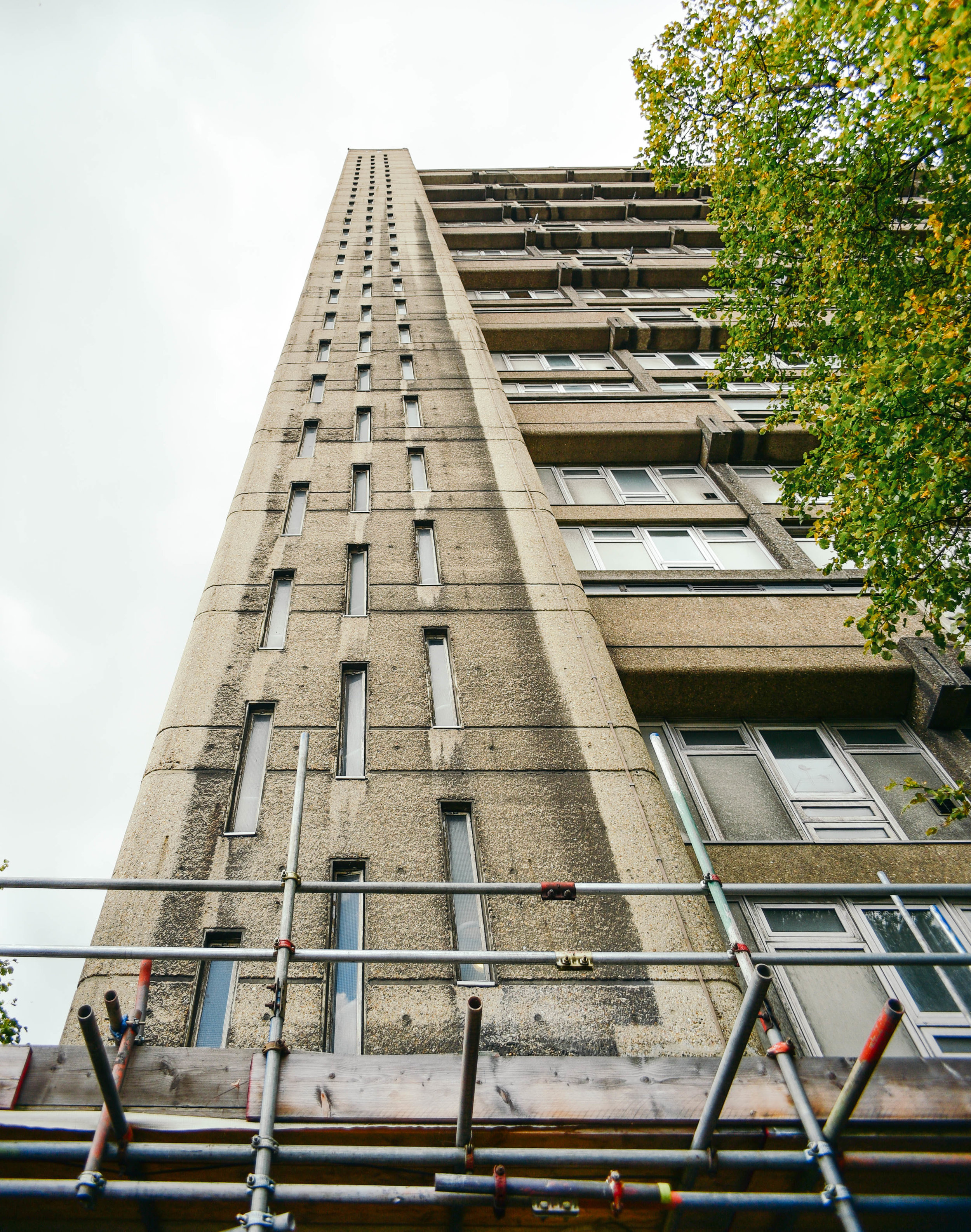
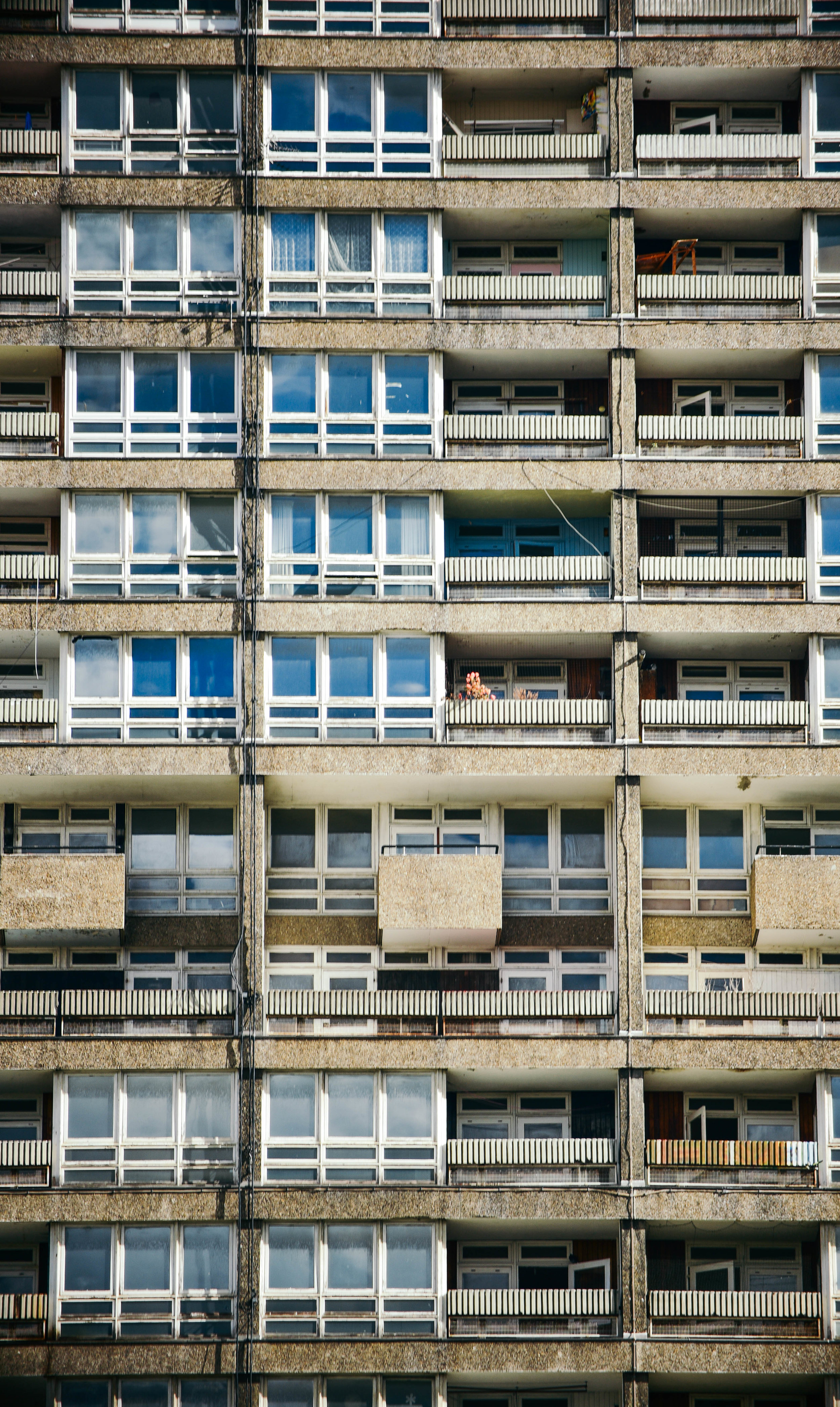
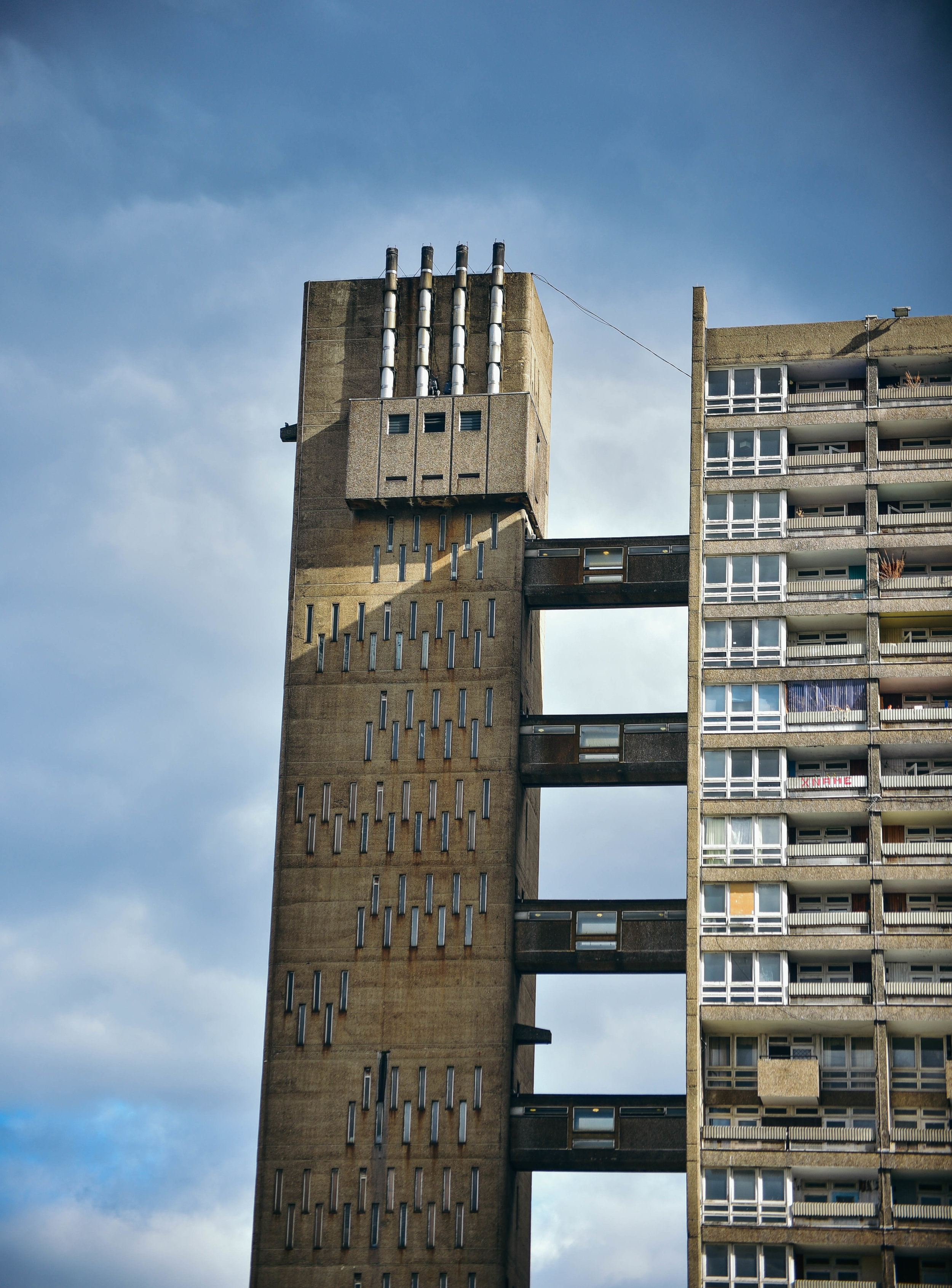
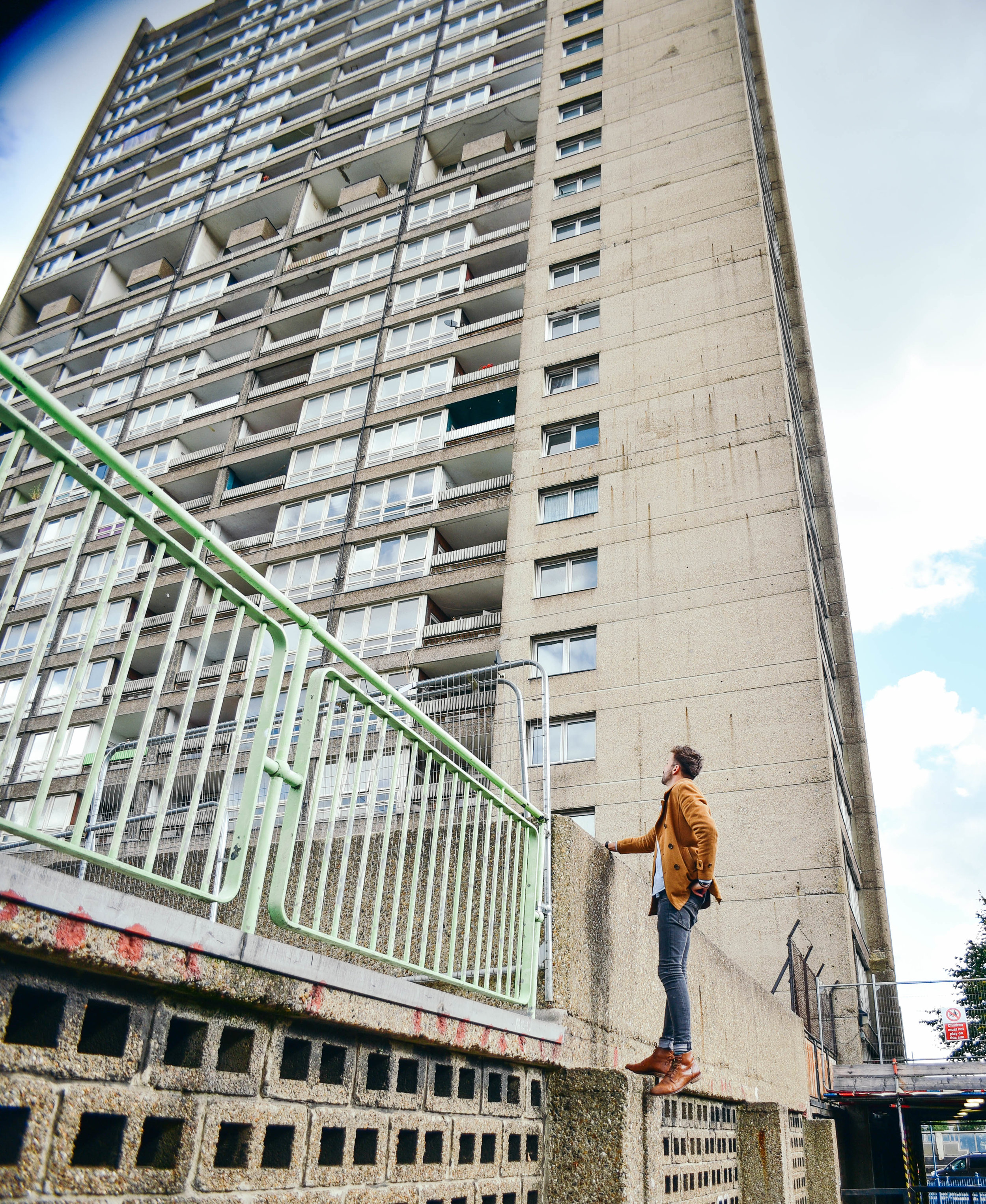
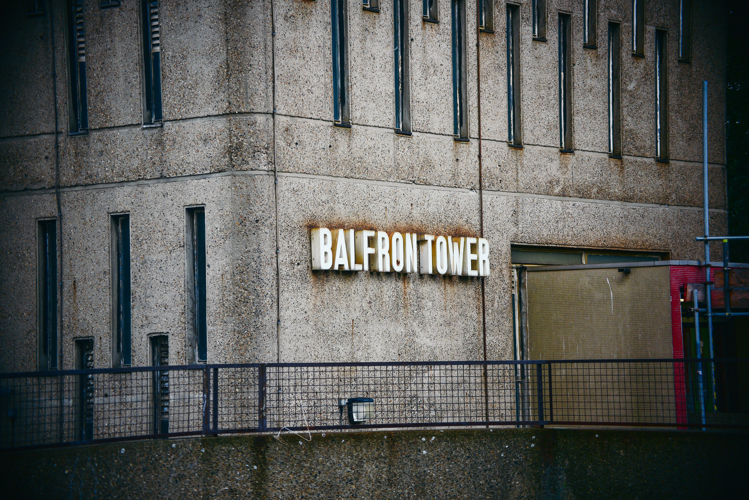
Designed by Hungarian-born architect Erno Goldfinger in 1963, Balfron Tower has become a global icon of brutalist architecture.
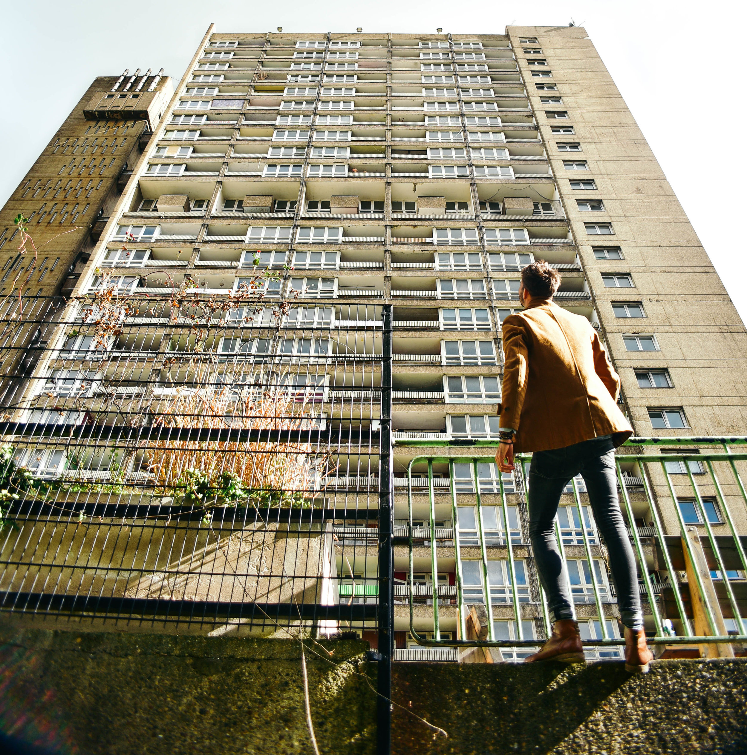
Last week I took off down to Balfron to take some photos. Although slightly smaller than its younger sister, Trellick, standing 26 storeys above East London, Balfron's harsh concrete was visible for miles.
Walking towards the base of the building, the facade overshadowed me like the sheer of a cliff face. But as the building caught glimmers of the morning sunlight through the patchy clouds above, I became very aware of the elegant sophistication of Goldfinger’s design.
Stood taking photos of the towering monolith above, a man yelled, “what’s the intrigue!?” Sensing he was a pissed off resident, I gave him a simple answer, hoping he would move on. Staunchly walking towards me, he asked again, “what is the intrigue?”
Realising that this guy wasn’t about to just walk away I decided to open up explain to him exactly why I was there. I told him of my interest in Erno Goldfinger’s architecture and why I wanted to take photos of this building in particular.
It didn’t take long before the man’s tone of voice lifted, and his demeanor calmed. Suddenly all he wanted to do was tell me of his love for Balfron. As it turns out, he’d lived in the building for 25 years and was now the last social tenant before its sale to the private sector.
He told me about the ensuing court case for his eviction, which was bound to come to close in the following weeks. The volume of his words increase as he explained his frustration at the powers and processes above him, this clearly wasn't the first time he'd told someone his story.
For over 50 years Balfron had housed hundreds of families across 146 affordable housing flats. Now, 145 homes sat empty, and he was the last man standing.
“You wanna come check it out from the inside?” he asked.
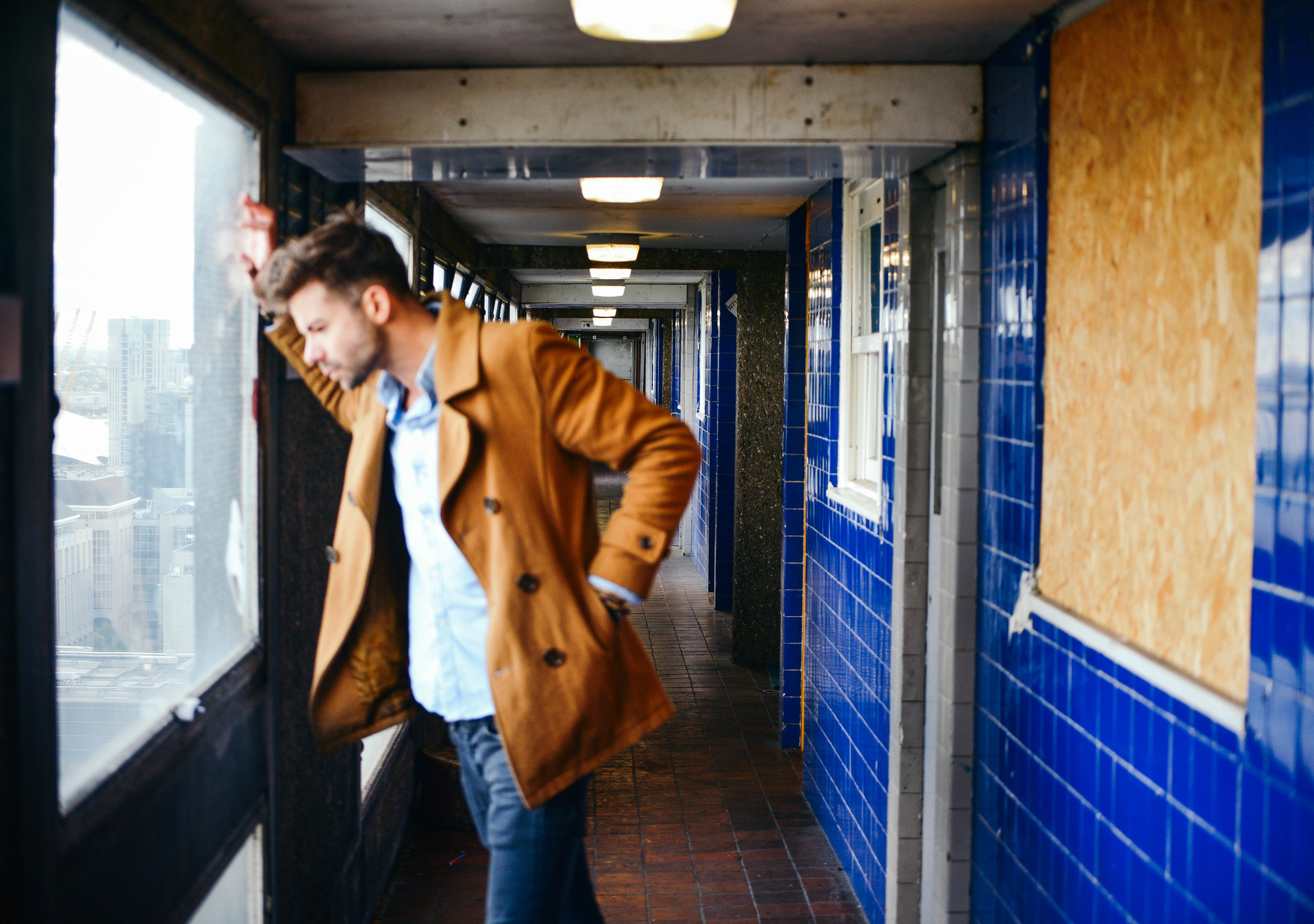
Minutes later we were sneaking behind security and shuffling into the building’s stainless steel elevator. Creaking up to level 26, and stepping out onto the grey, concrete flooring, I was immediately overwhelmed by smells of booze and urine. Fortunately for us the breeze from the awning-hinged windows helped to disperse the smell through the corridors.
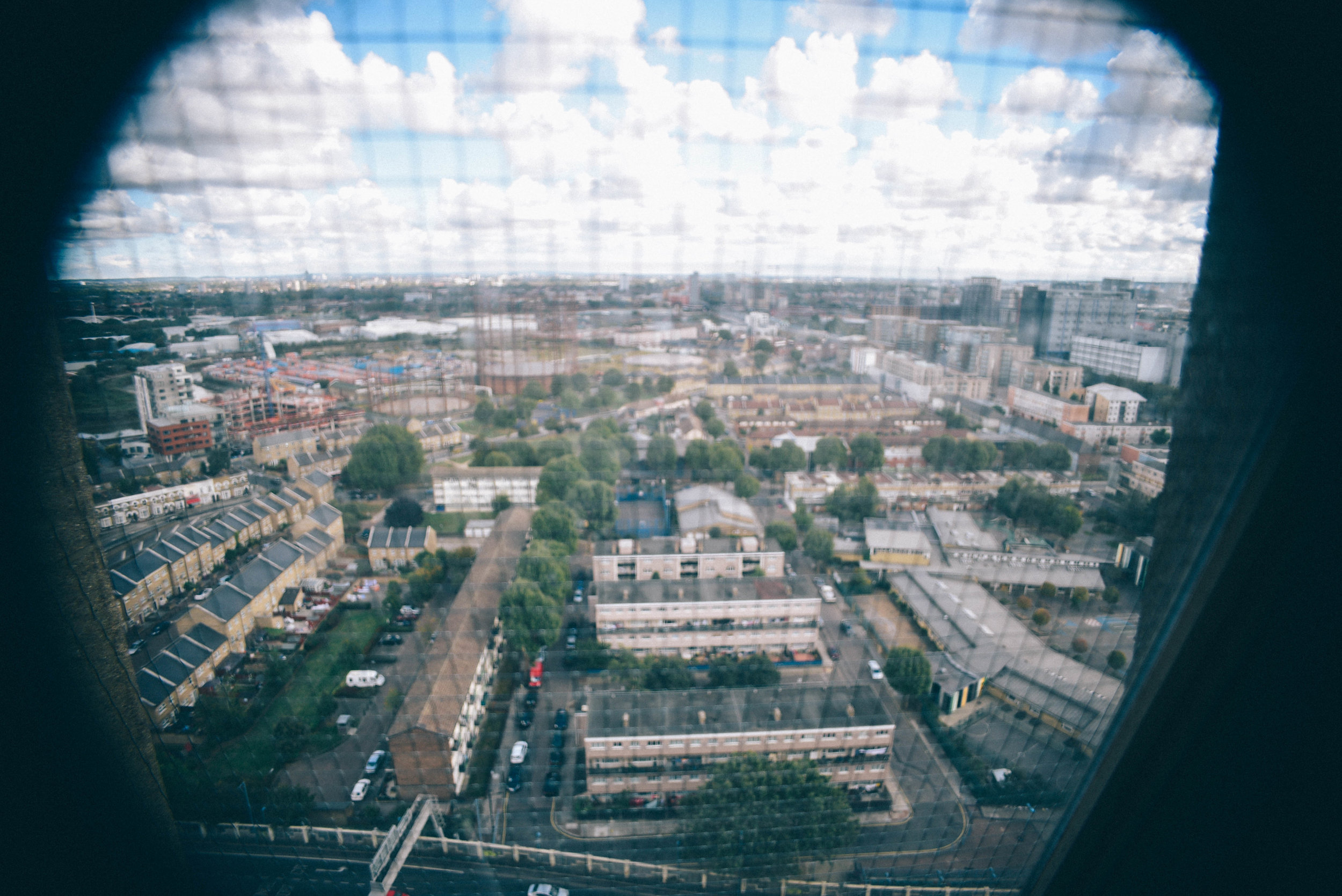
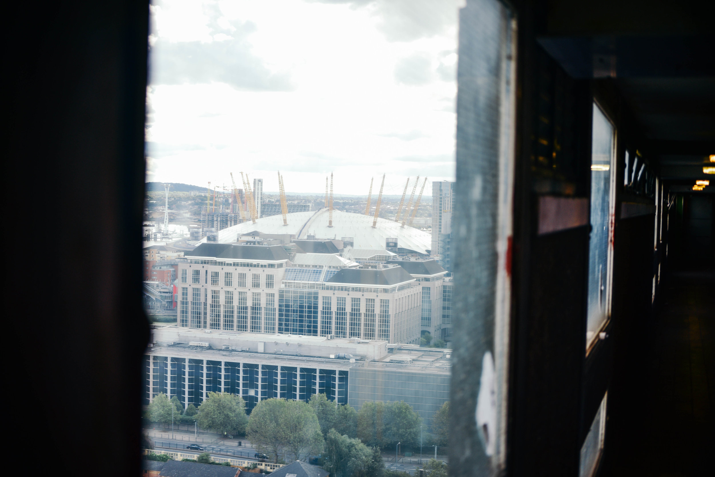
Peering through the horizontal pattern of windows, the view from the top was incredible: Poplar sat quietly below, the city skyline loomed in distance.
As I walked down the long corridors I imagined Erno’s ambition for ‘streets in the sky’, where working class neighbours would socialise and kids would play games. It was too bad, bottles of half drunken bottles of beer and empty NOS canisters now lined the passageways.
After sometime upstairs, it was a relief to break back into the autumn sunlight. I wondered if I could ever live in a dark, concrete tower like this one. For while I could understand Erno’s ambitions, I could also appreciate where his design concepts had failed.
In fact, when I first arrived in the UK, I thought brutalist buildings were disgusting. Having grown up in sunny Australia where there's an abundance of low-rise bungalow-style architecture and spacious streetscapes, I often wondered why London’s huge concrete 'ghettos' hadn’t been ripped down and replaced with something more attractive. But over the years, and after some reading, I began to appreciate the ethos behind their design.
Mainly a reaction to the housing crisis following World War II, this form of architecture attempted to help London’s homelessness by creating large, affordable buildings within accessible inner city areas. While in reality these concepts didn't always work, the ethos - at least - was admirable.
Balfron's last remaining social tenant is likely to be removed by force in the coming weeks. With few places to go, he told me he will likely be pushed outside of London altogether.
In cities across the world, a lack of affordable housing is forcing young people and those on low incomes to look for housing alternatives. Many are moving out of the cities that they love, whilst others are feeling the impacts of living in a 'rental trap'.
As the last social tenant is forced-out of one of the world's most famous brutalist buildings, I wonder what Erno Goldfinger thinks of his building, and architecture, today? Would he be ashamed that we now completely ignore the socialist principles of the brutalist era?
I would never suggest that contemporary designers should copy Balfron Tower, or even brutalism, as a concept. But the ambition of its developers, and their architectural boldness, would be something to emulate.
Photographs by Dan Young & Tom Oliver Payne.
Photographs from the British South Coast /
Last week my friend and I decided we needed a few days out of the London megatropolis. We got a good rest, jumped on a train with a our bicycles and took off down south.
Read MoreDawson’s Heights: architecture with social conscience /
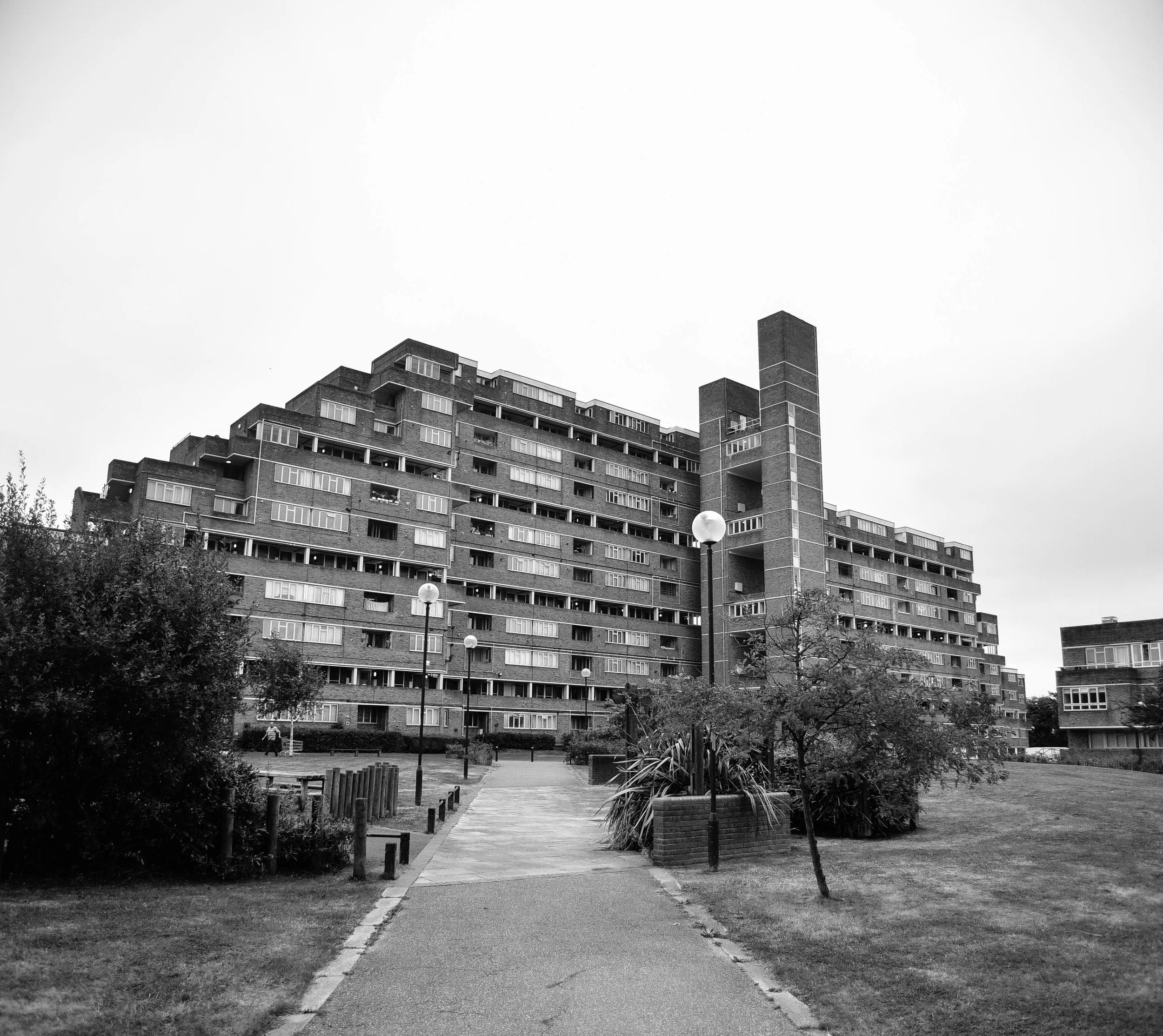
Architecture today is generally about making other people big bucks. But Dawson's Heights reminds us of a time when architecture strived to create a better society through design.
Land development today basically works like this: an investor will buy a plot of land, they then hire a developer with a track record of maximising value who will in turn hire architect who knows how to maximise floorspace. For the sake of profit, all parties will hope construction is over and done with as quick as possible, and each bit of land will sell for maximum value. Job done.
But before you call me a pessimist, let me iterate that I don't necessarily think this process is all a bad thing. This process is simply a reaction to our economic market and continual development profits ensures a pipeline of construction and as a result, people - from construction workers to web designers - have jobs.
Unfortunately however, development is too often, too greedy. Due to the speed and aggression of investors and developers, new buildings and spaces often lack quality design or a social conscience. What we are commonly left with is architecture with few zero-to-no societal benefits, doing nothing more than providing the mega-wealthy some real estate to dump their cash. Property has become more concerned with international asset management rather than the provision of housing or the creation of communities.
Clearly, we've seen a recent swing towards capitalist-dominated architecture. But it hasn’t always been this way.
Dawson's Heights' northern block seen from its central public space.
Back in the 60s, architecture in London operated in a very different context. Emerging from the Nazi bombings of World War II, the city was battered and bruised, and thousands were homeless or living in slums. The government took it upon itself to deliver tens of thousands of homes every year through mass redevelopment projects.
While often criticised for their top-down approach to design, no one can argue that they were’t at least ambitious, and at most, incredibly bold.
The Barbican Centre, Trellick Tower and Balfron are some of London’s most famous examples. These brutalist monuments are remnants of a past when - although they didn’t always get it right - architects could at least attempt to solve social problems through creative design.
Not all of the examples from this time were dominating brutalist buildings. Some were smaller incisions in the existing urban fabric such as Golden Lane Estate, and others were modernist creations which boldly - but appropriately - inserted themselves into the remains of pre-war London.
Last week London opened its doors for Open House 2016 and I had the opportunity to check out one of the most impressive examples.
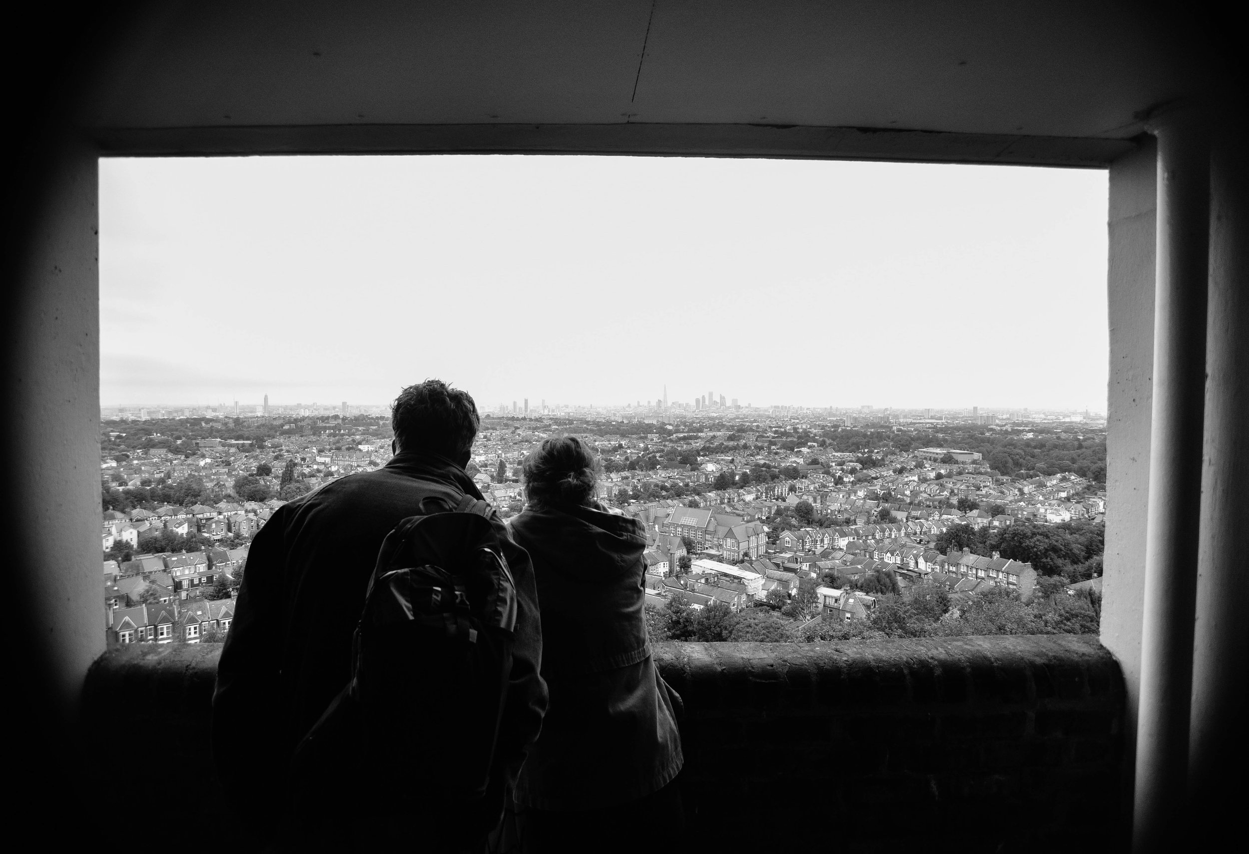
A view worth millions: looking from the northern block of Dawson's Heights.
In 1964, at just 28 years old, architect Kate Macintosh was given the job of designing Dawson's Heights in south London.
Working for the Southwark local authority, Kate was given a job which today is almost unthinkable - the freedom to design new London housing on a large plot of vacant land. With strongly socialist parents and a clear drive to help generate social justice through architecture, Kate was given the opportunity to deliver a scheme which would stand the test of time.
Clearly, it has.
Decades later Dawson's heights is now considered 'one of the most remarkable housing developments of the country'.
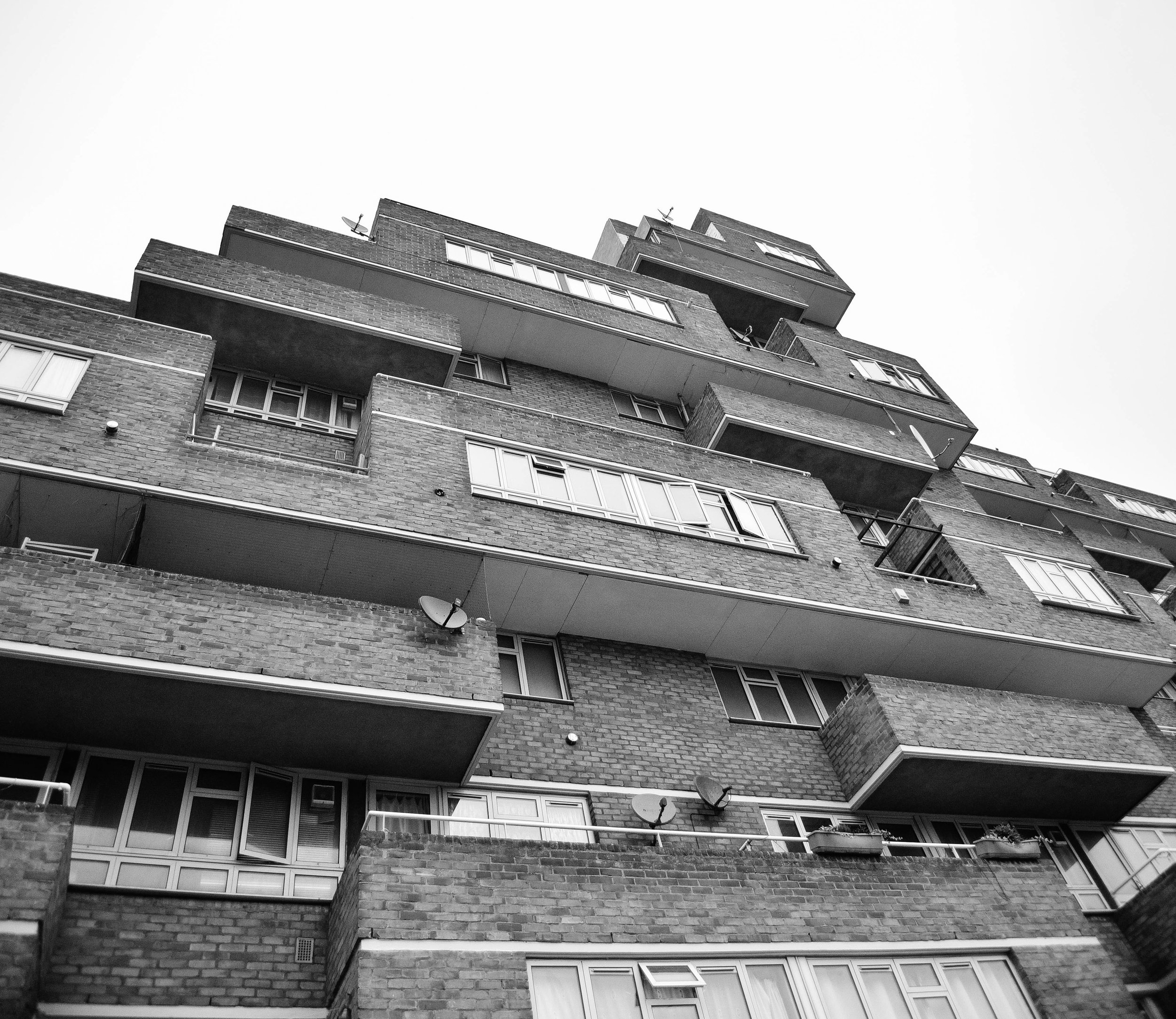
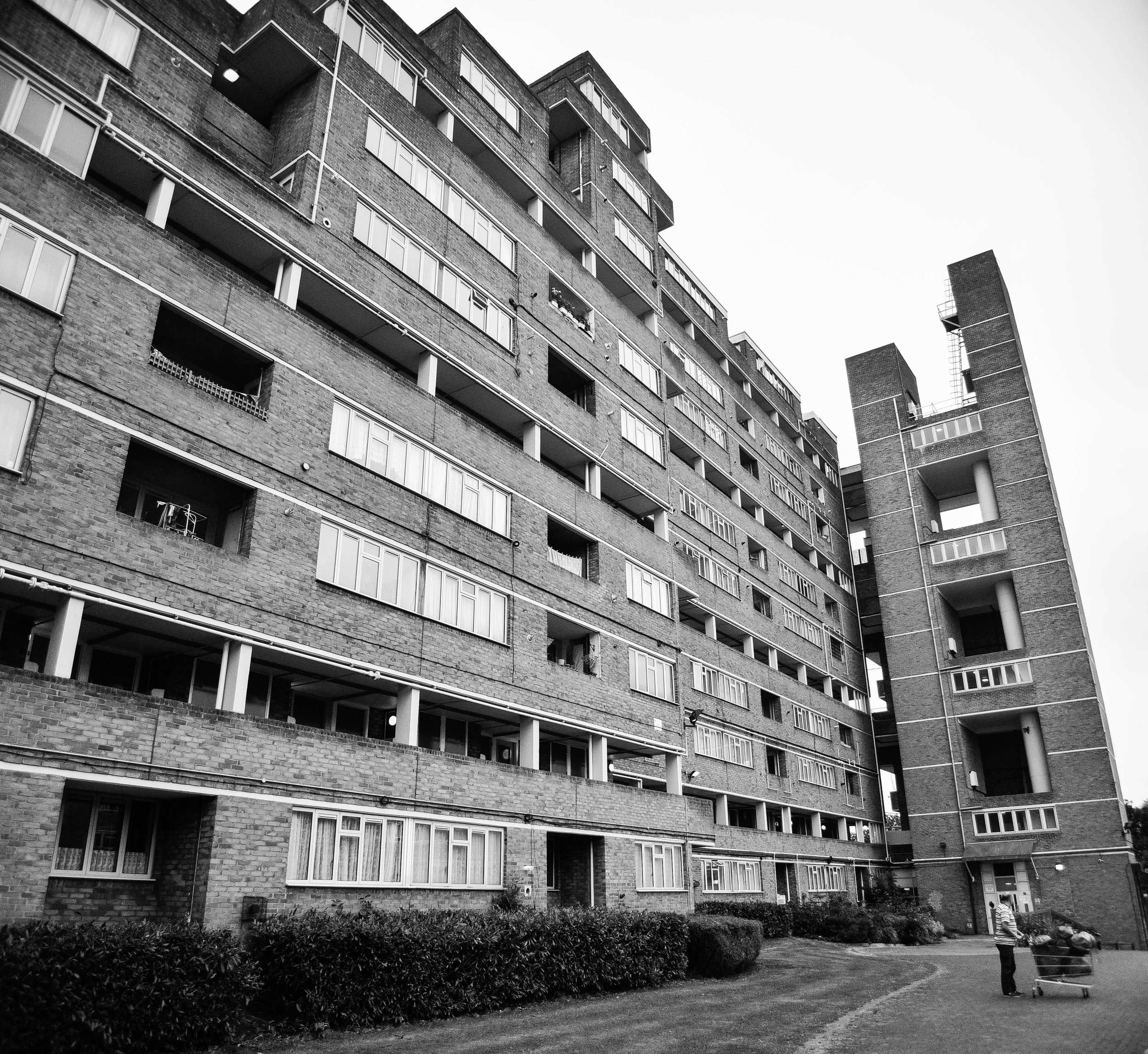
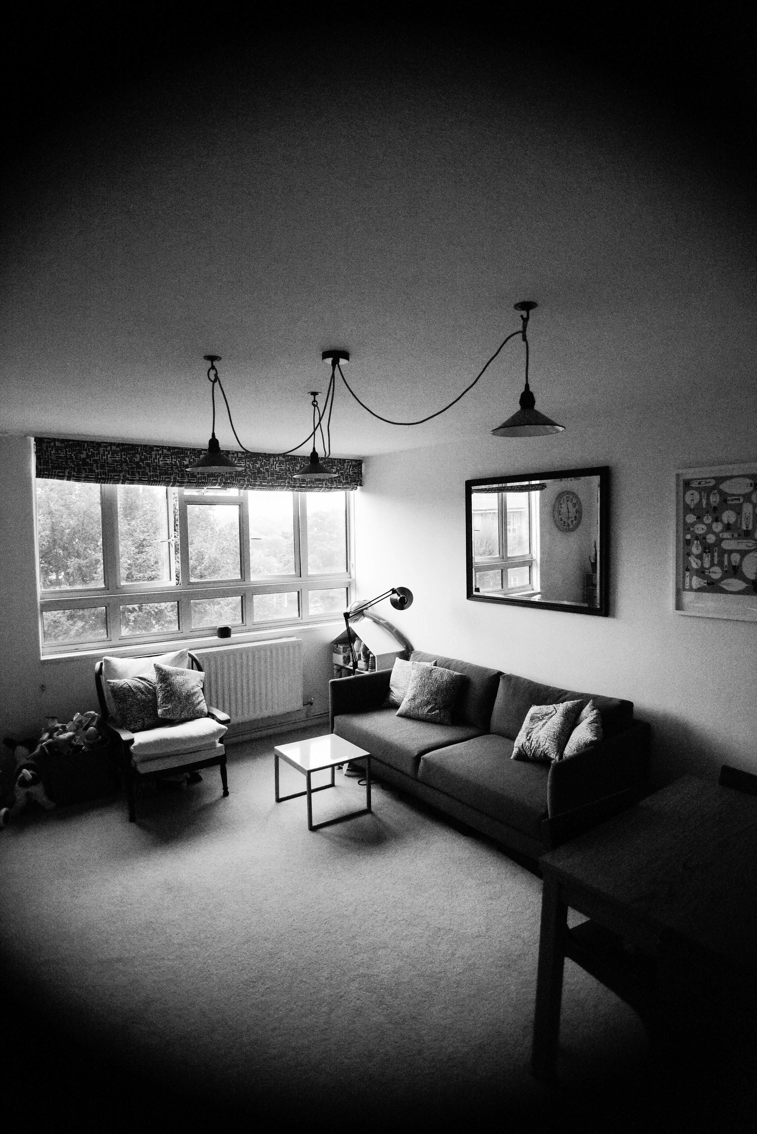
As I walked through Dawson's Heights' many street-like corridors, and entered into its beautiful modernist flats, it was clear to me that this building was designed with a different agenda compared to developments today.
It was built with a genuine ambition to create a community, and a more just society. Every decision that Kate made had logic to it: blocks were oriented to increase sunlight to flats, room arrangements were such that every flat had a balcony, levels were split to improve acoustics, and the building's form and massing ensured an abundance of green space and views across the city from its public corridors.
Whether through a change in political-will or a shift in the behaviour of our markets, architecture may re-emerge as a discipline which seeks to fix societal problems.
Until then, at least we have reminders from a time when it did.
If you're interested in exploring London's most incredible buildings, be sure to check out Open House 2017.
The best of Oslo's new architecture /
One of my favourite bars in London is called 'Oslo'. It has a super clean design and generally nice aesthetic and it's always filled with really good looking people... I guess the main reason I travelled to the real Oslo last week is because I figured it would be a bigger version of that bar.
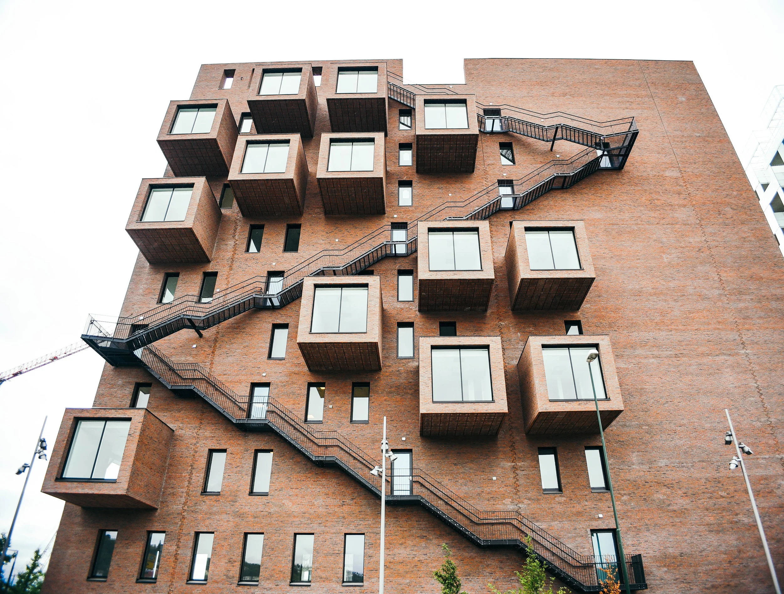
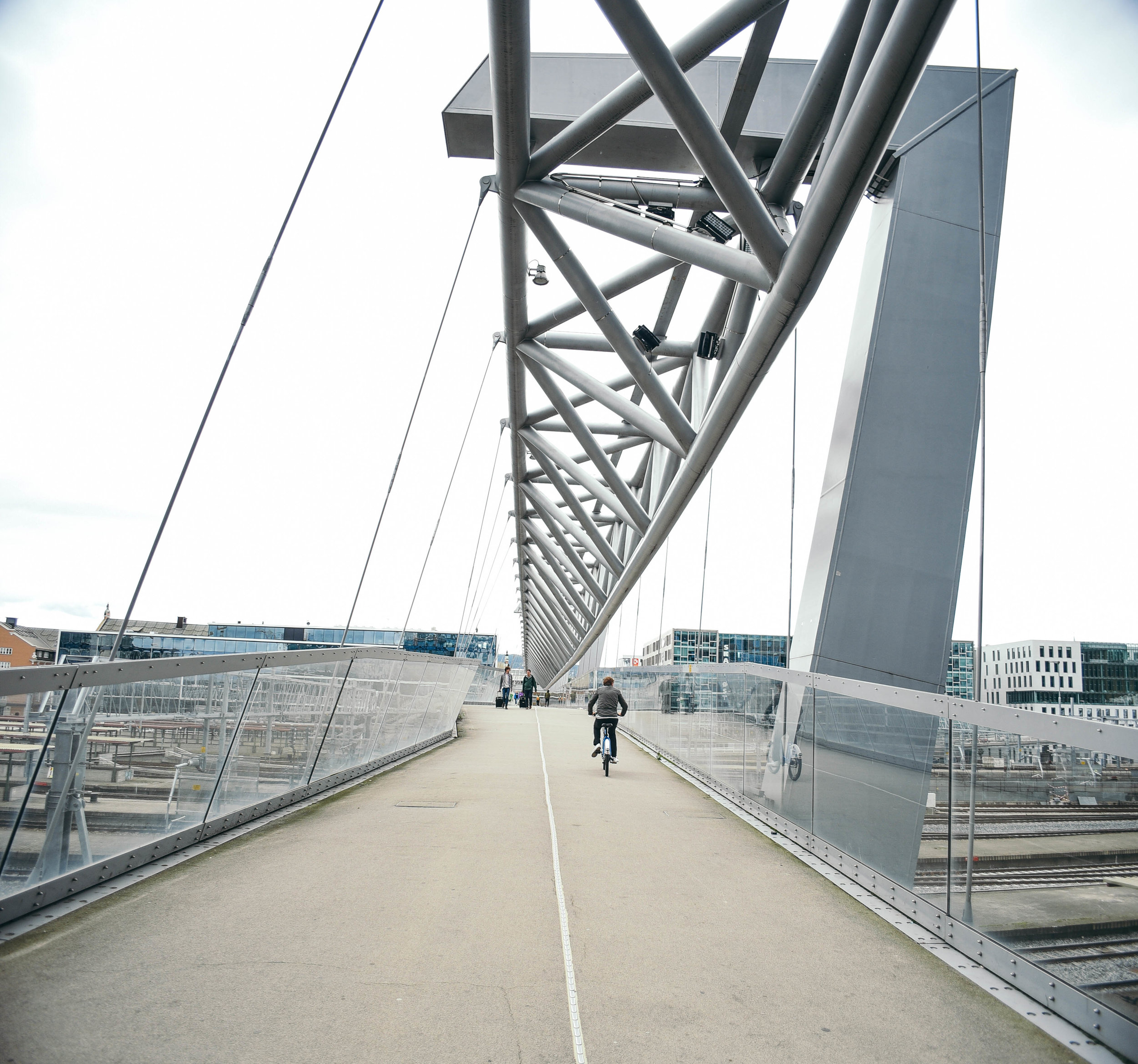
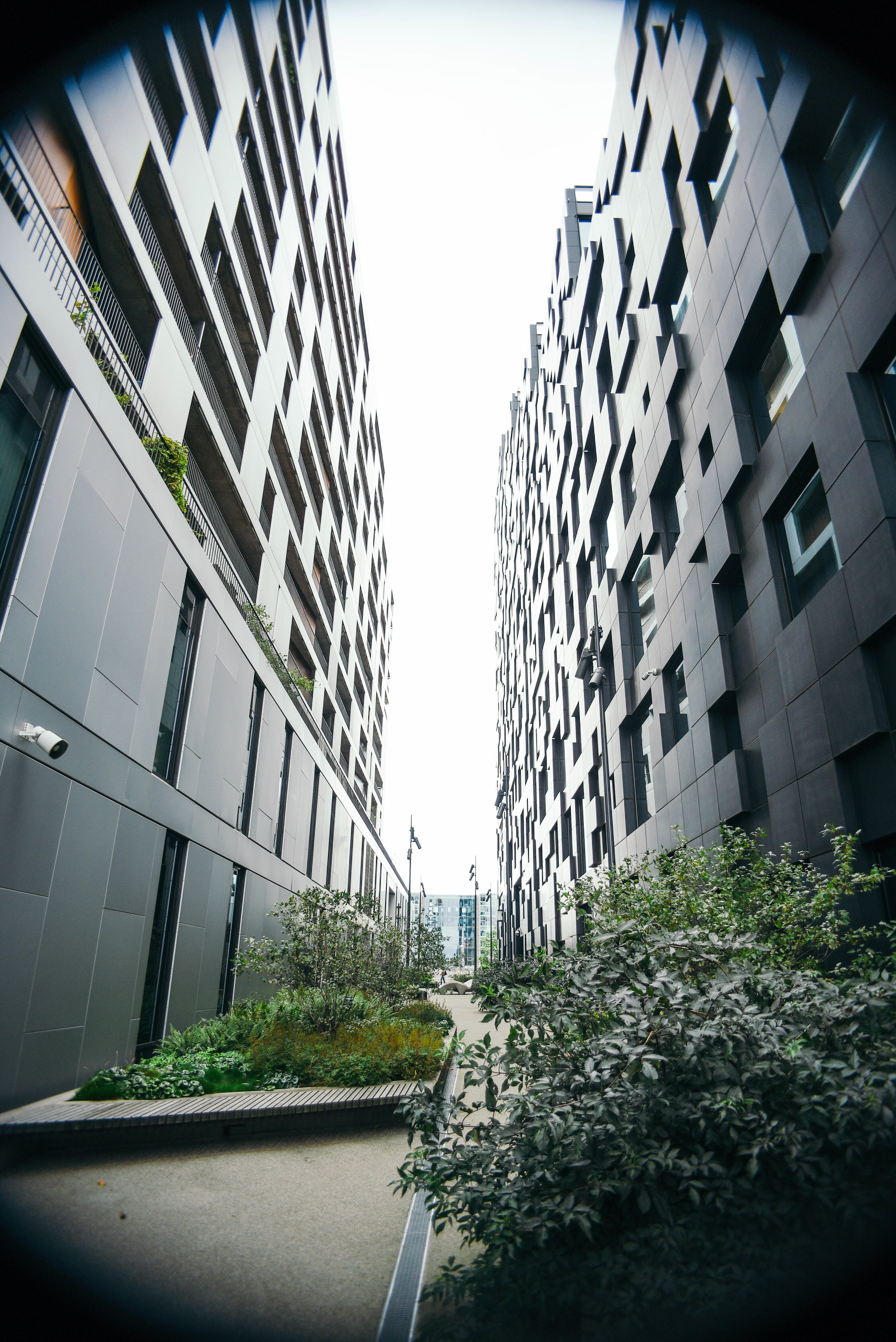
While both of these expectations were surpassed, the city's sense of design in particular, far exceeded my predictions. When I stepped out at Oslo Central Station, I found myself surrounded by incredible new buildings encompassing a mix of interesting shapes and sizes. But of course, all details finished with a subtle air of elegance. In true Nordic fashion.
After two decades of financial growth and a thriving arts and cultural scene, the city is drawing in buyers and investors from around the world. And fortunately (unlike many cities), they're working with some of the best designers to show off their ideas.
With half the waterfront still under construction, it quickly became clear to me that Oslo is experiencing an architectural explosion.
Here are my three favourite contemporary architecture projects in the city.
The Barcode Project
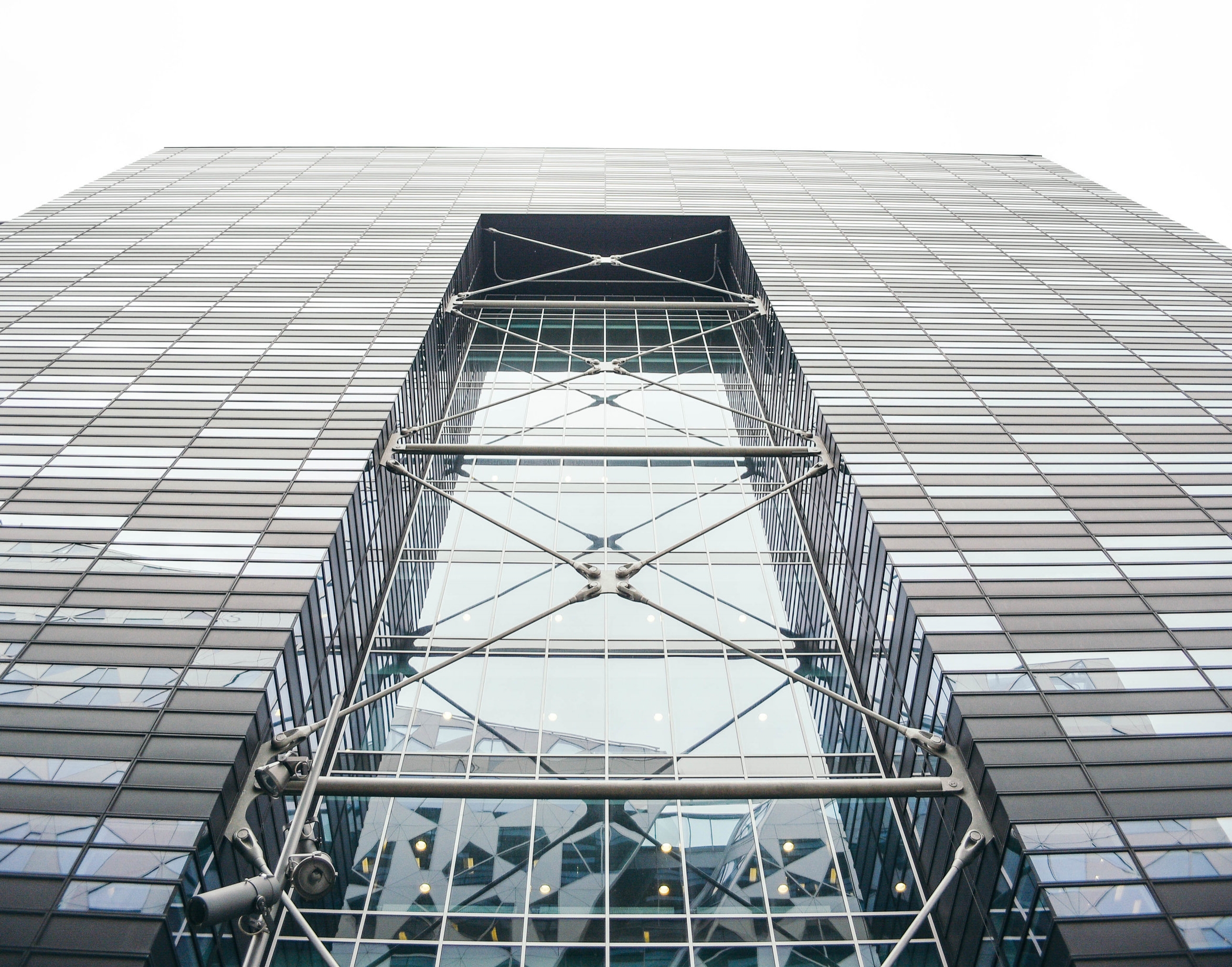
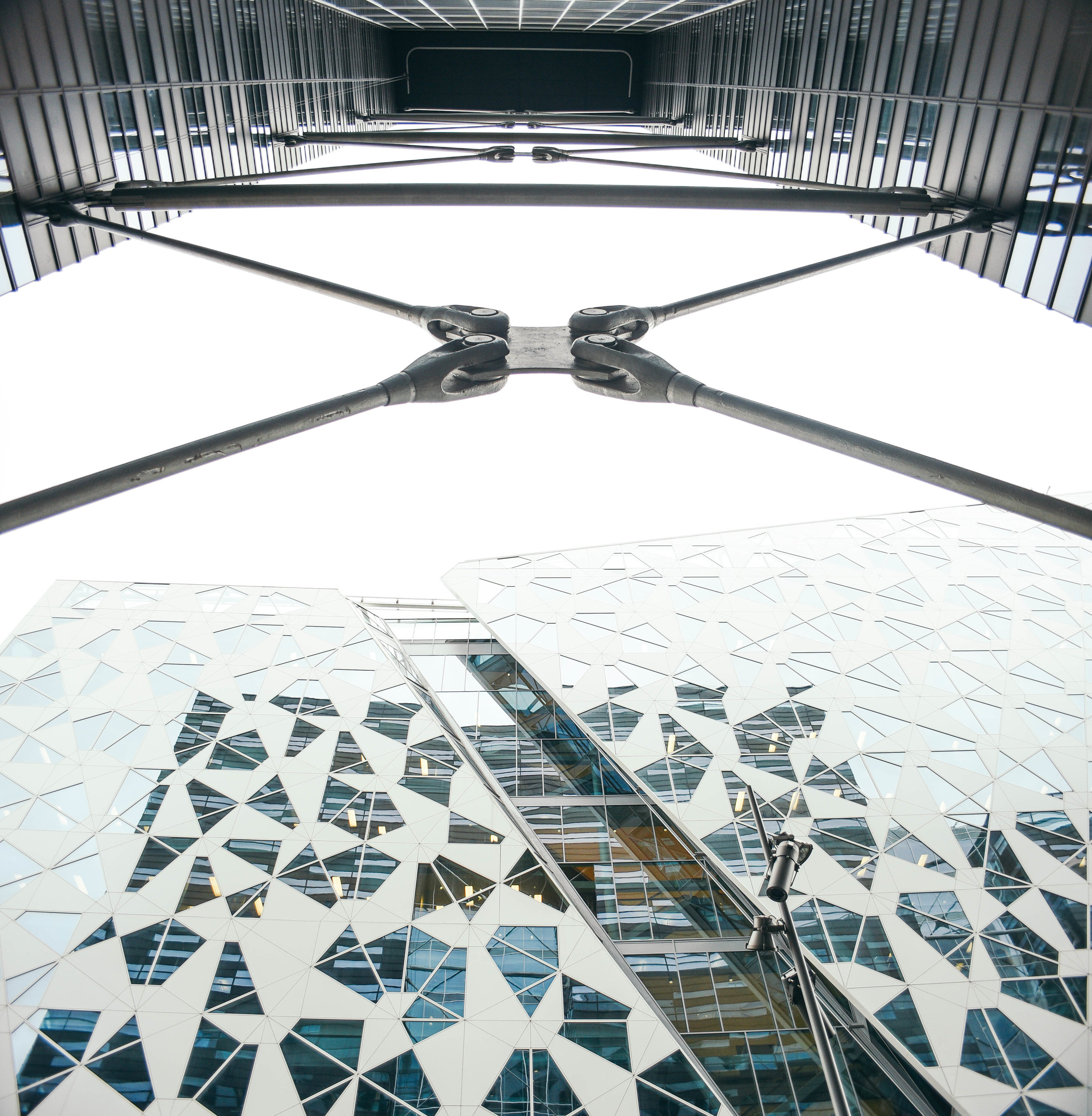
The Barcode Project is a huge area of redevelopment along the edge of Oslo's waterfront. Full of mixed-use high rise buildings, it's home to incredible designs by some of Scandinavia's best architects.
From west to east, its main buildings include PriceWaterhouseCoopers Building by A-lab Architects, the Kommunal Landspensjonskasse Building by Solheim & Jacobsen, the Deloitte Buidling Building by Snøhetta, Visma designed by Dark Arkitekter and DnB NOR from MVRDV Architects. In addition to these, Barcode includes loads of buildings and hundreds of apartments with designs that architects in many cities around the world are rarely given the creative freedom to explore.
With the tallest heights in the city and over 20,000 of development, the Project has changed the face of Oslo. Suddenly the city does not just sit flat along the water's edge, but this impressive cluster of beautiful towers is now attracting residents, visitors and businesses from around the world.
THE OSLO OPERA HOUSE (OPERAHUSET)
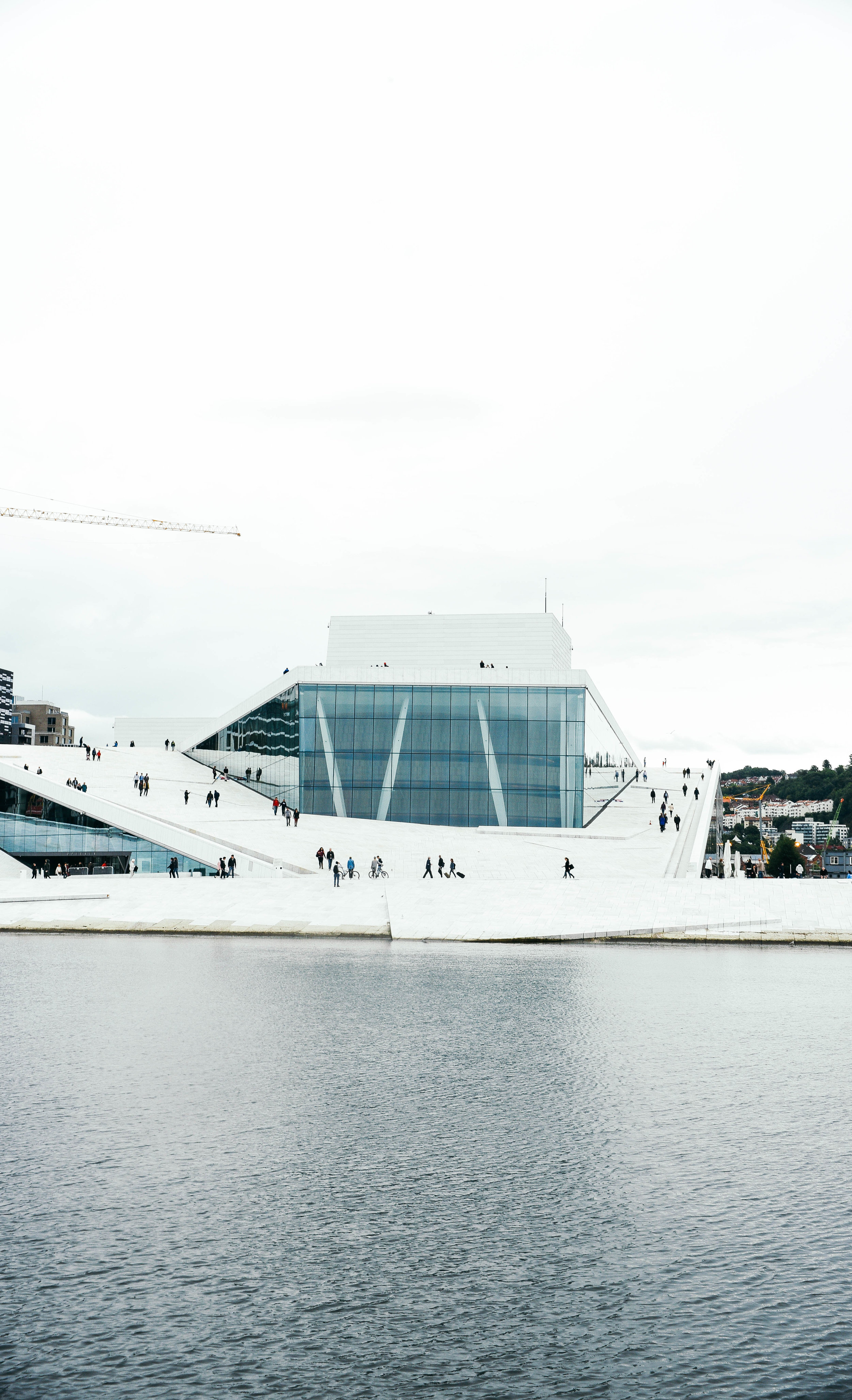
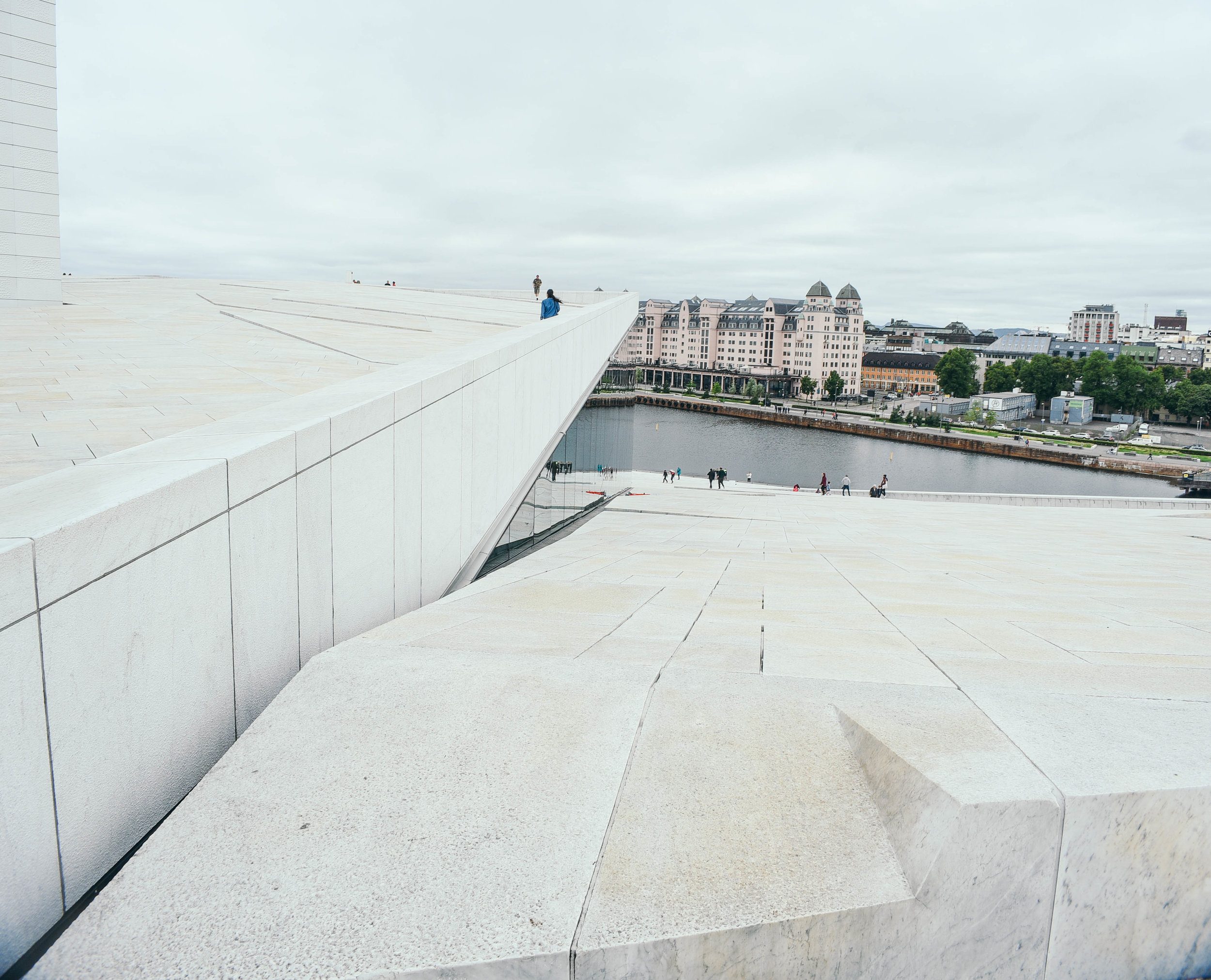
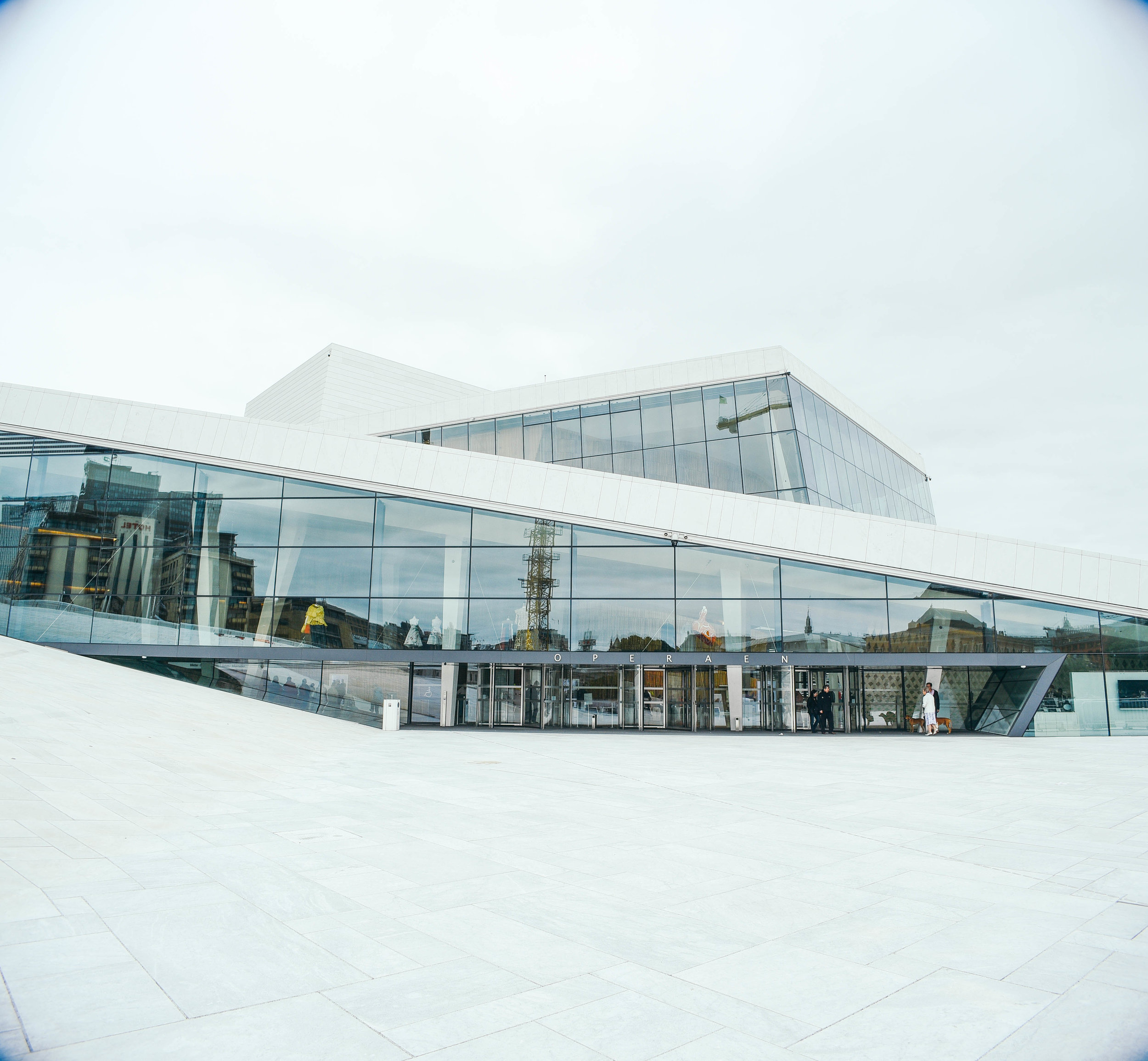
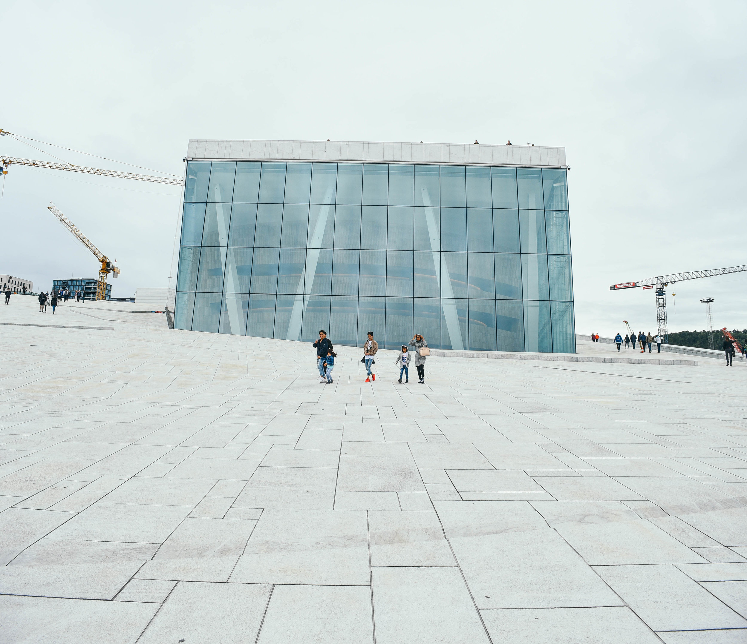
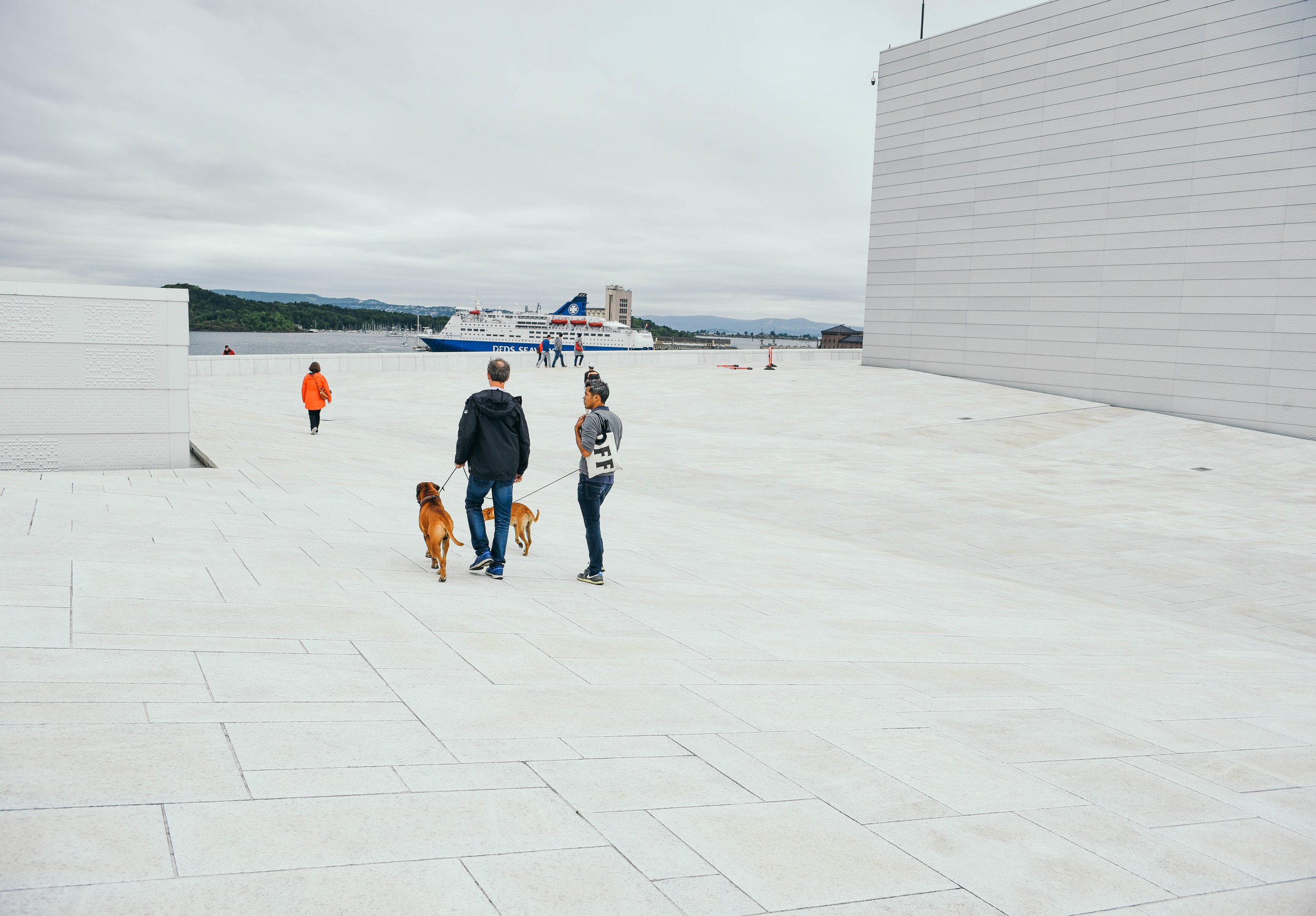
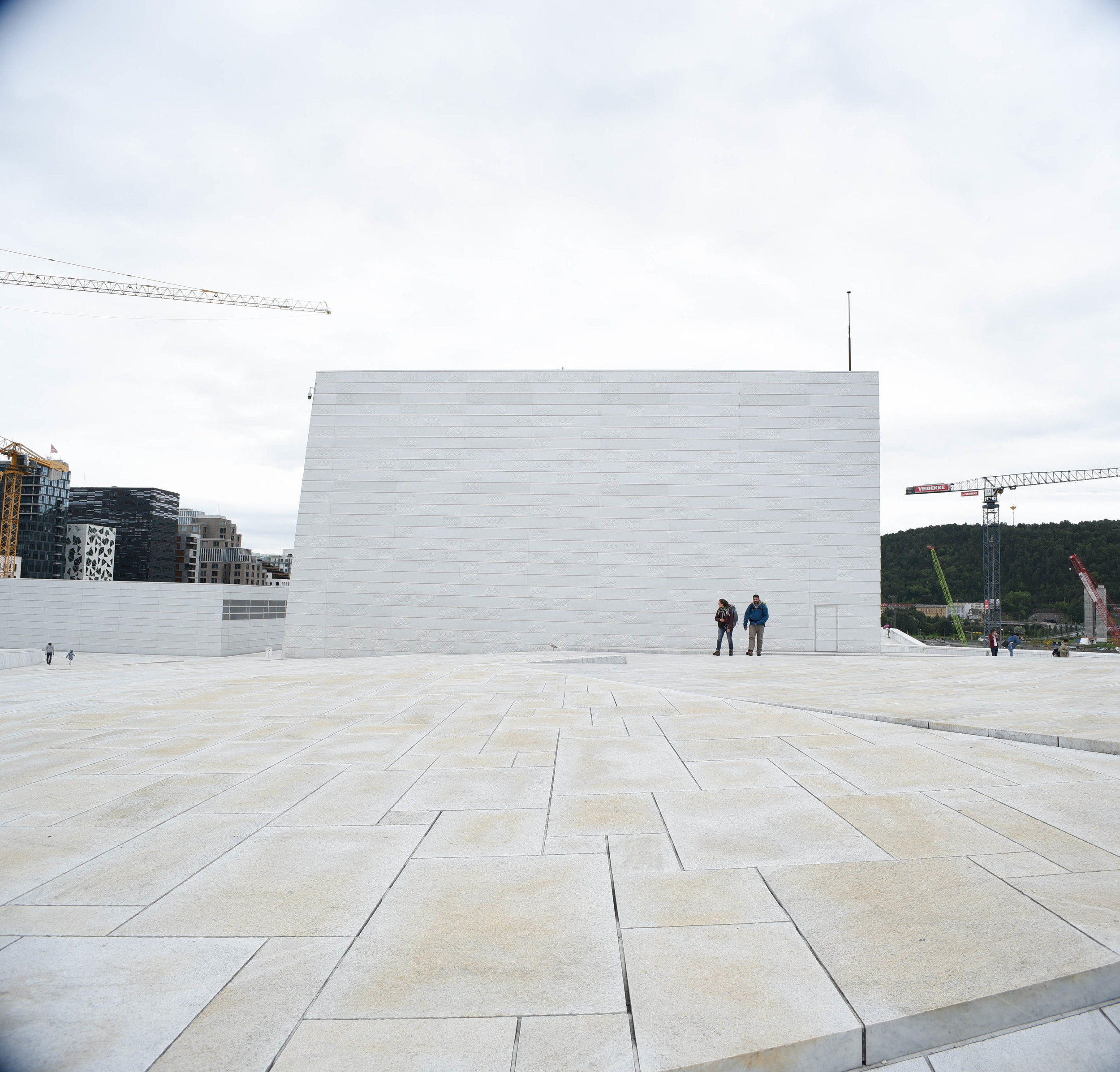
Designed by Snøhetta and opening in 2008, the Oslo Opera House is the home of Norway's National Opera and Ballet. Located just across from the Barcode Project, the building has helped to completely transform this part of the city.
Made up of 1,100 rooms and with a main stage which can seat 1,364 people, the Opera House is the largest cultural building in Norway since 1300 - finally taking out Trondheim's Nidaros Cathedra as the top-dog.
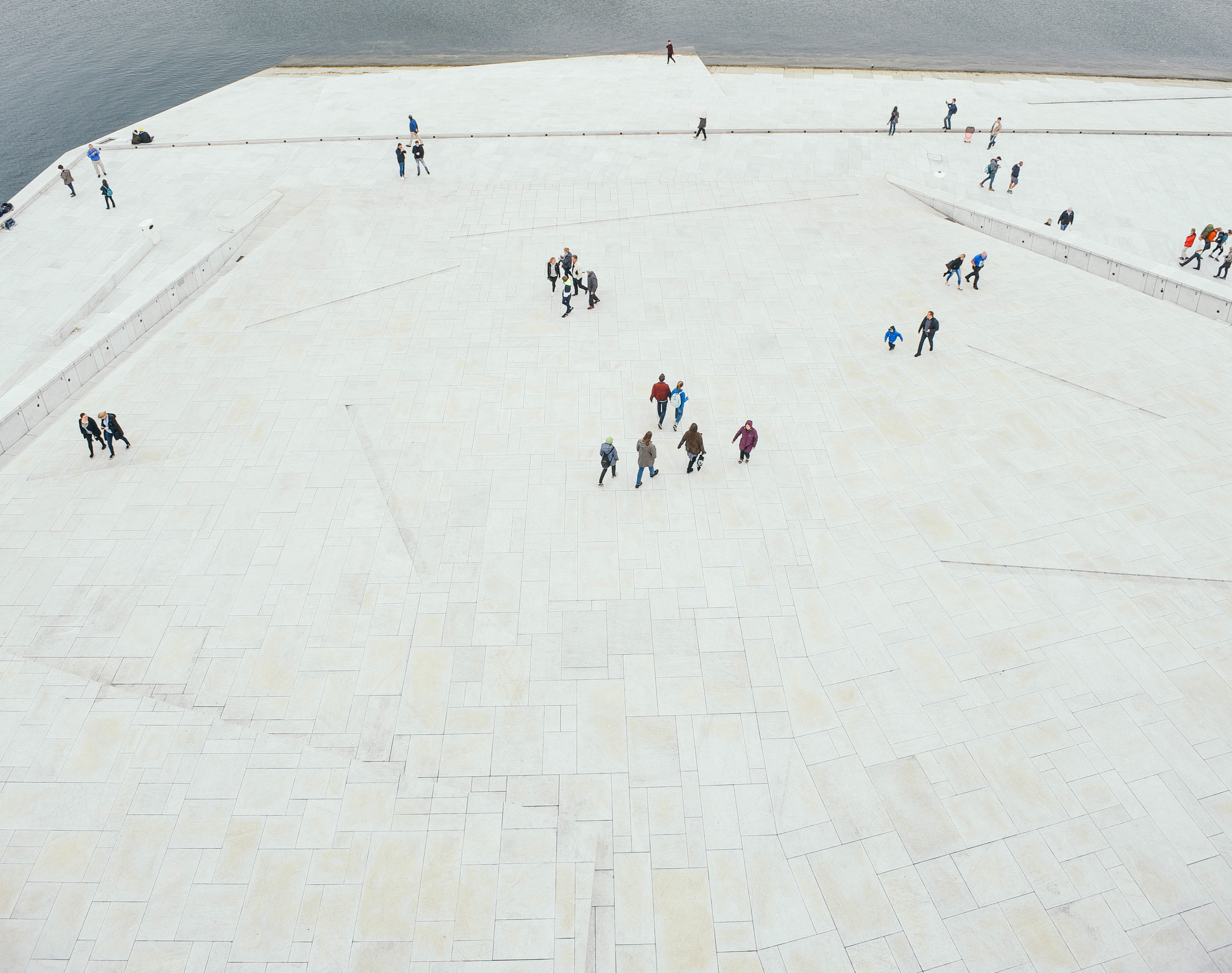
But what I found even cooler than the size or extravagance of the design, is how the building has created an entirely new public urban space for people to check our views of the city. With two sloping ramps on either side of the building, pedestrians are invited to walk onto the rooftop to make the most of this reclaimed section of the harbour.
In addition, its beautiful white materials and clean shapes make it an awesome place for film and photography. While I didn't check out any shows on my visit, I can only imagine the internal auditorium is pretty cool too.
Tjuvholmen
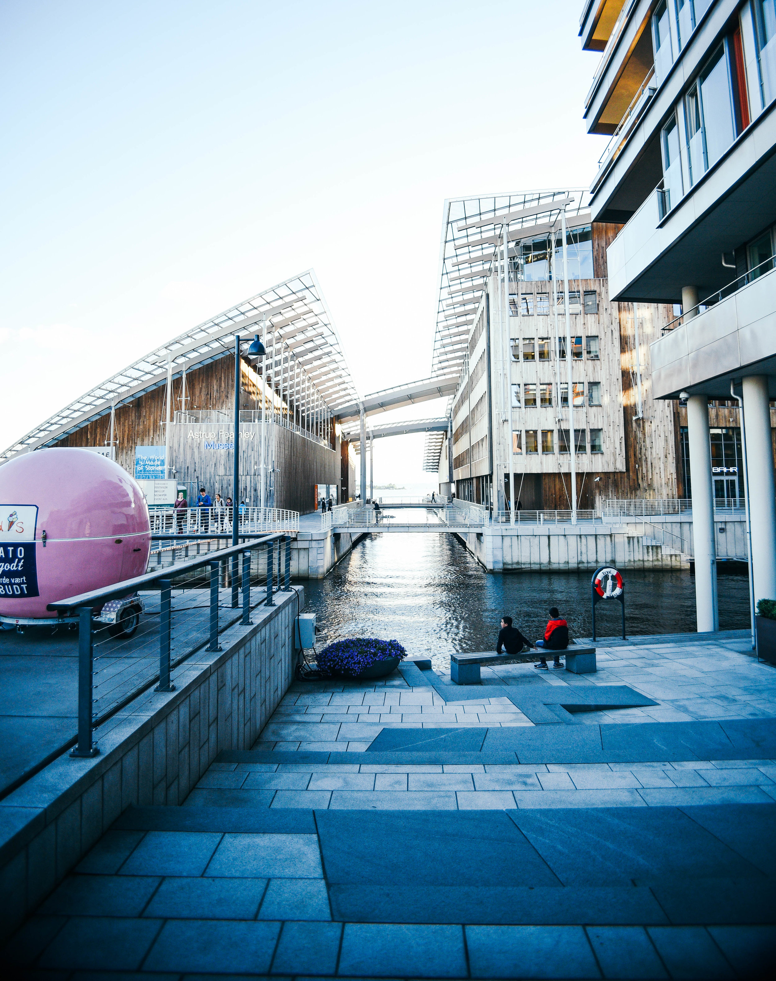
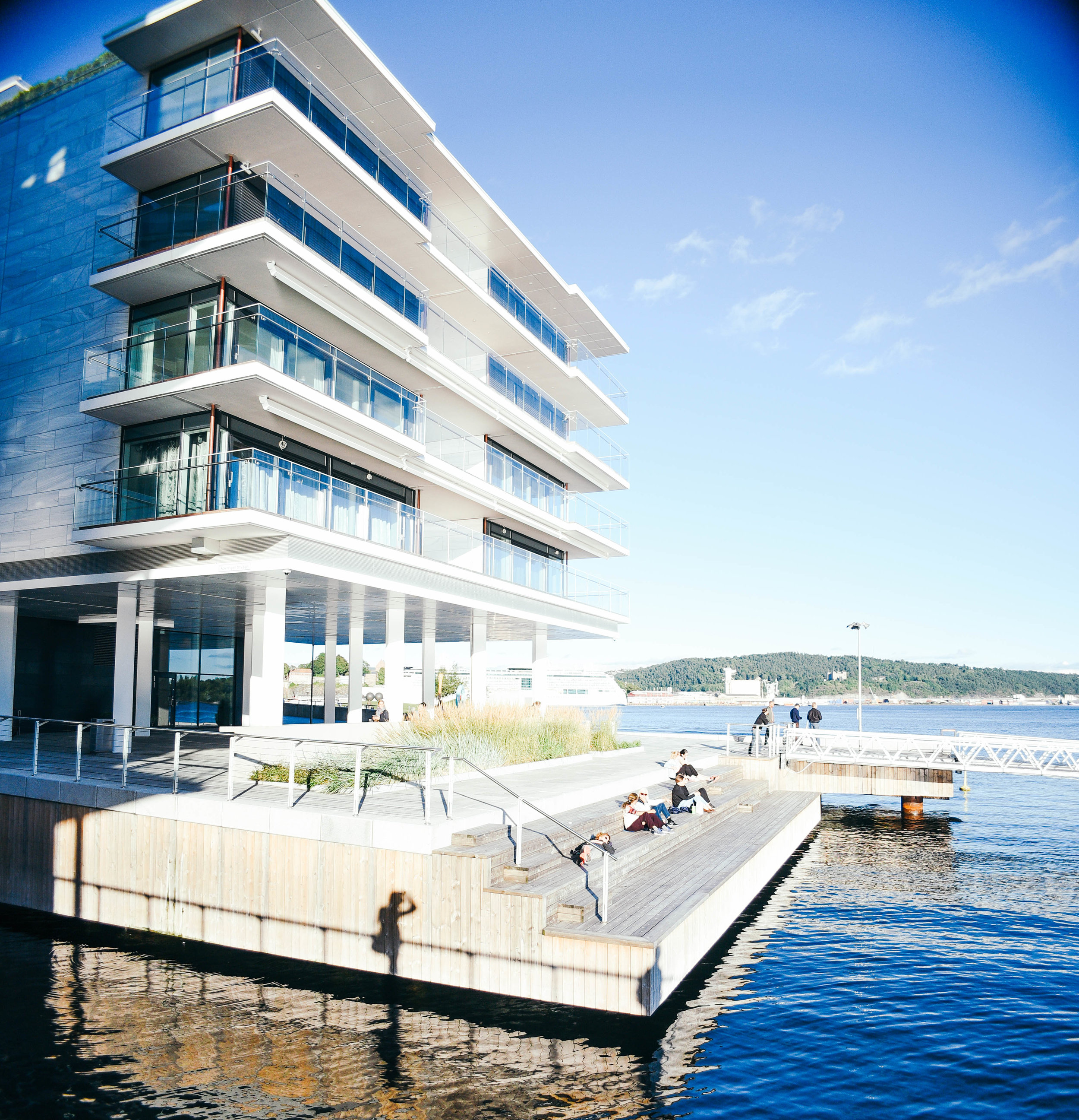
Once only 5 hectares in size, Tjuvhomen was increased to 33 hectares in the early 1900's to be used as a docking area for ships. After years of disuse the area was bought by private landowners, and since 2005 has been the centre of a huge urban renewal project.
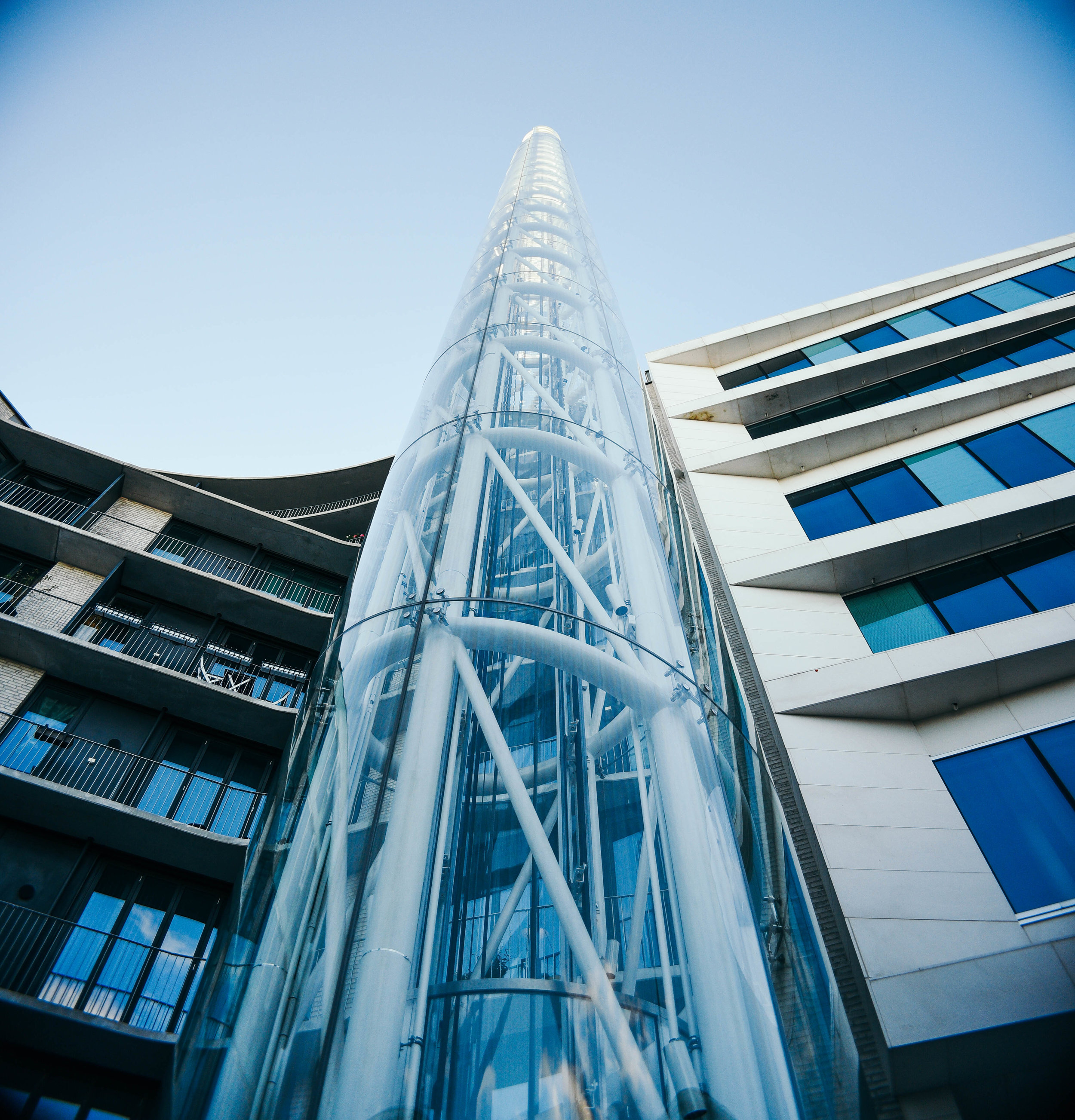
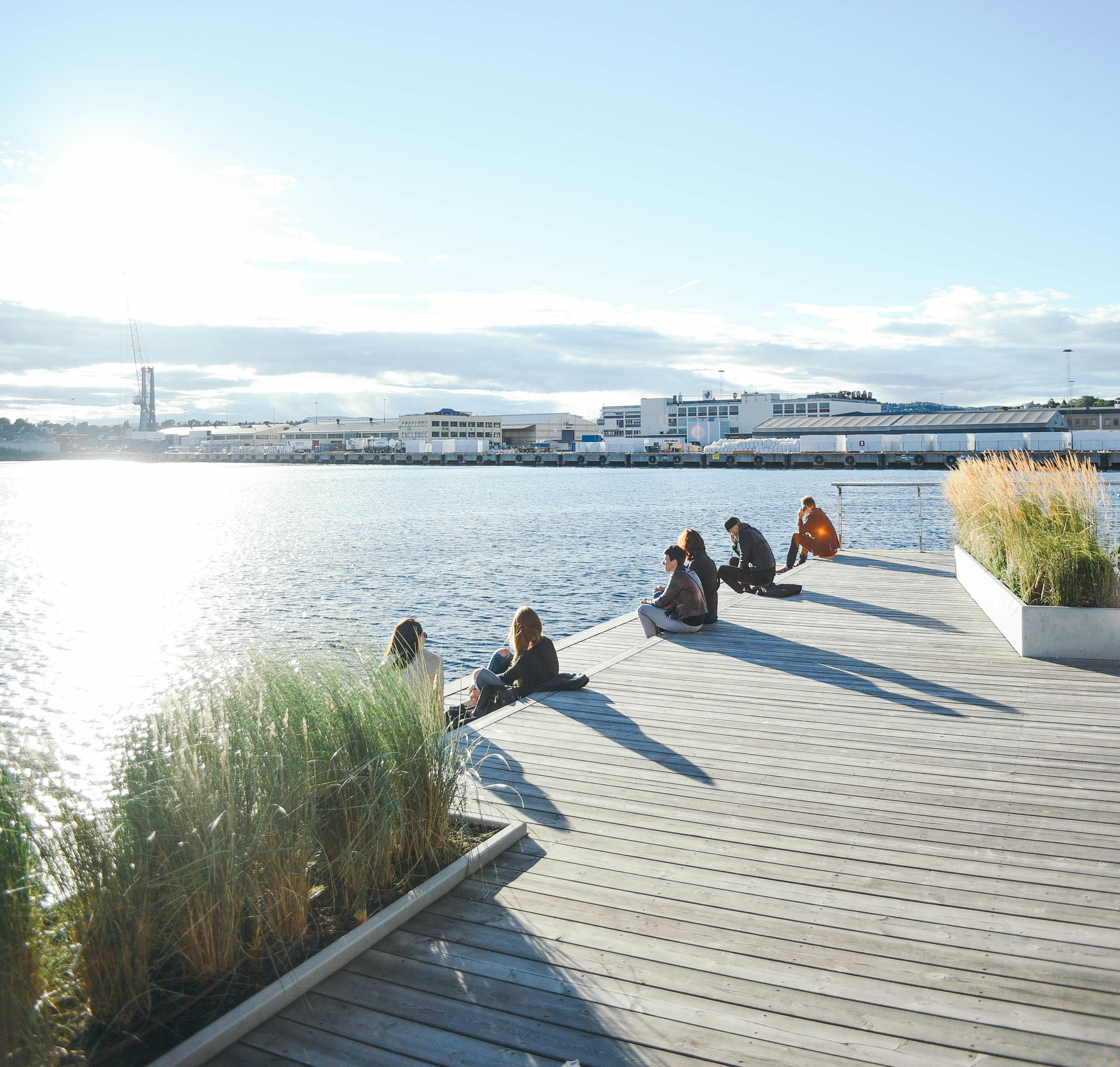
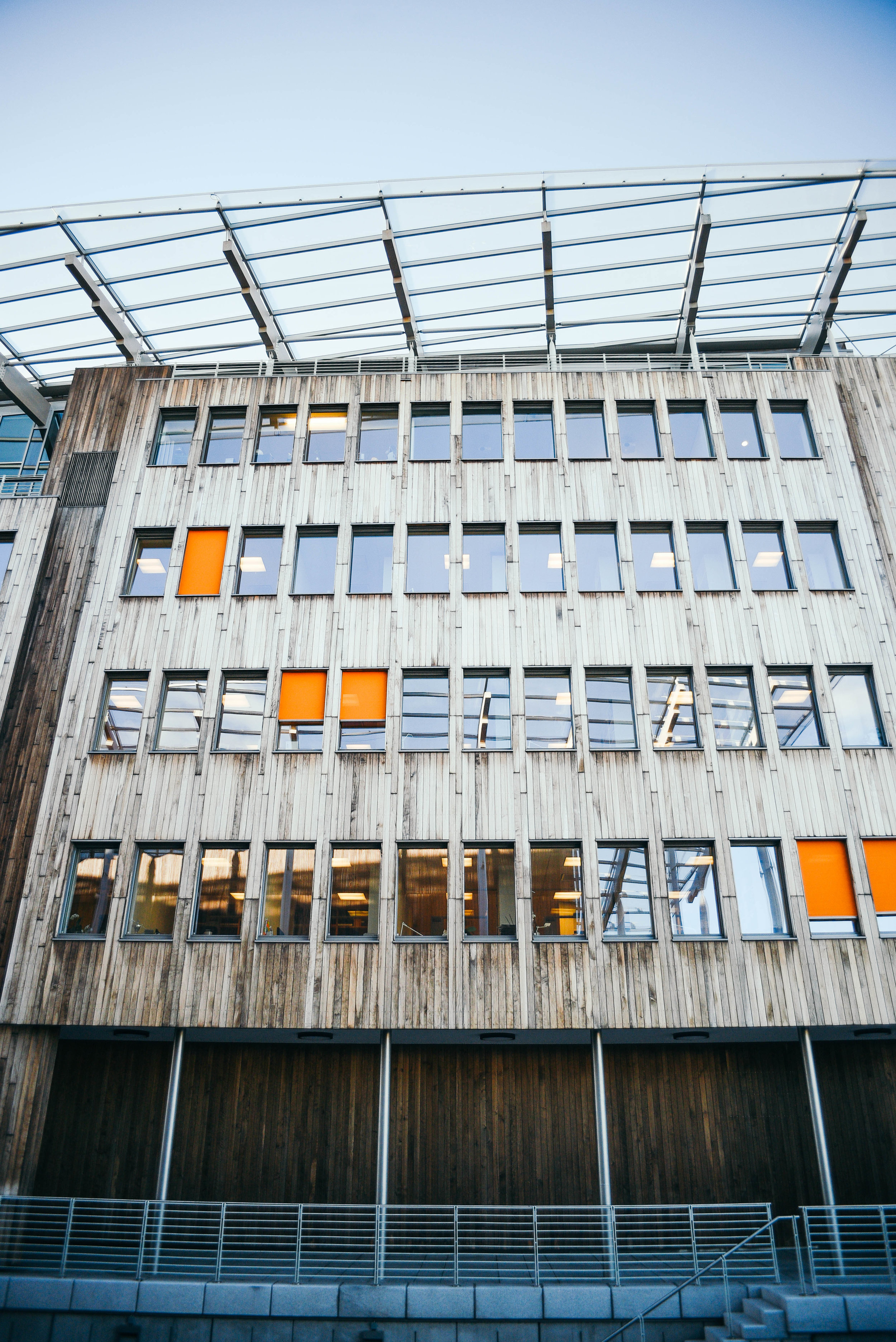
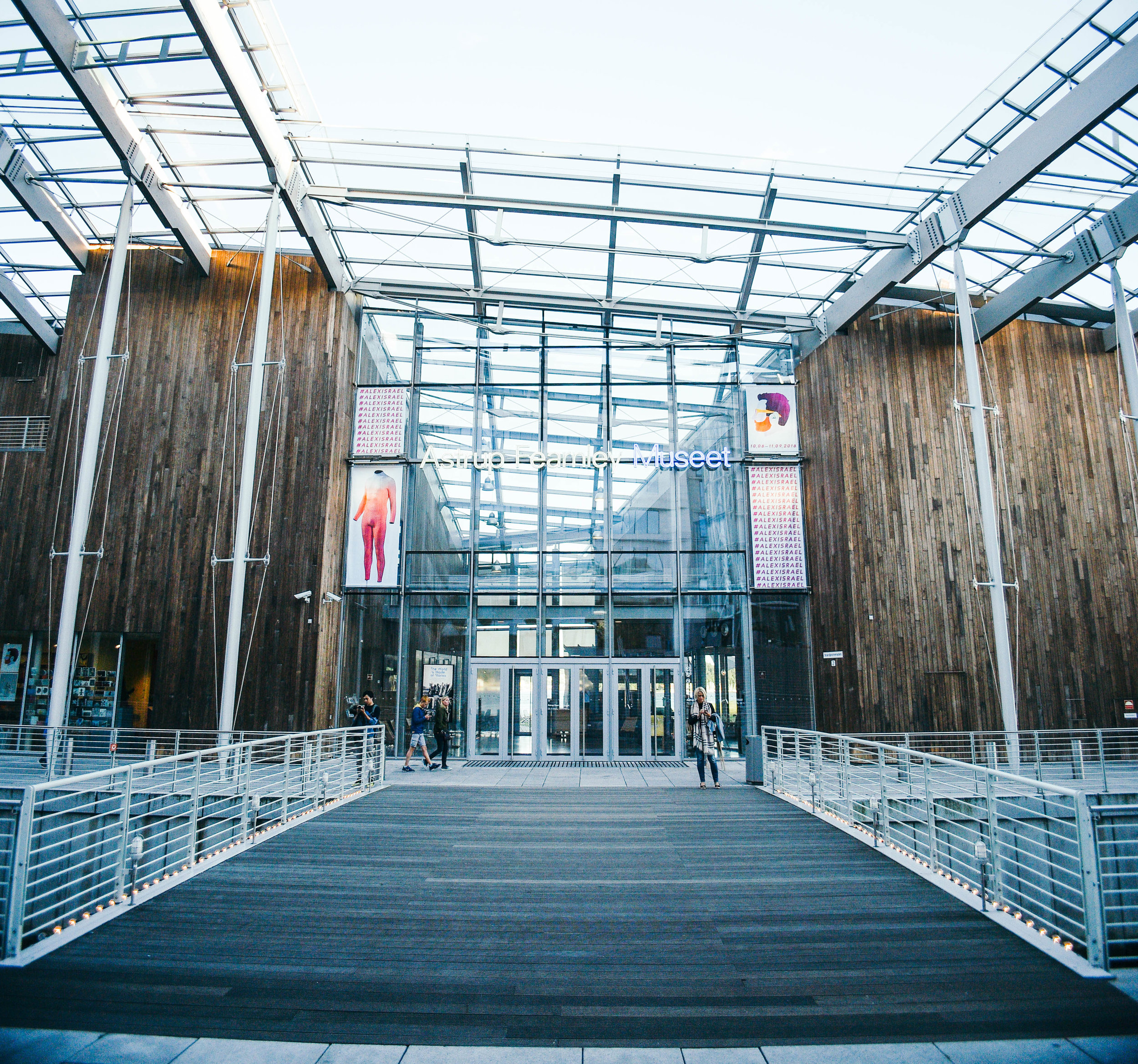
With Renzo Piano's Astrup Fearnley Museum of Modern Art and Skulpurpark being the 2 most incredible architectural pieces on the peninsula, credit should also be given to architectural practices including Kristin Jarmund and Scmidt Hammer Lassen, who've created amazing buildings and public spaces within the neighbourhood.
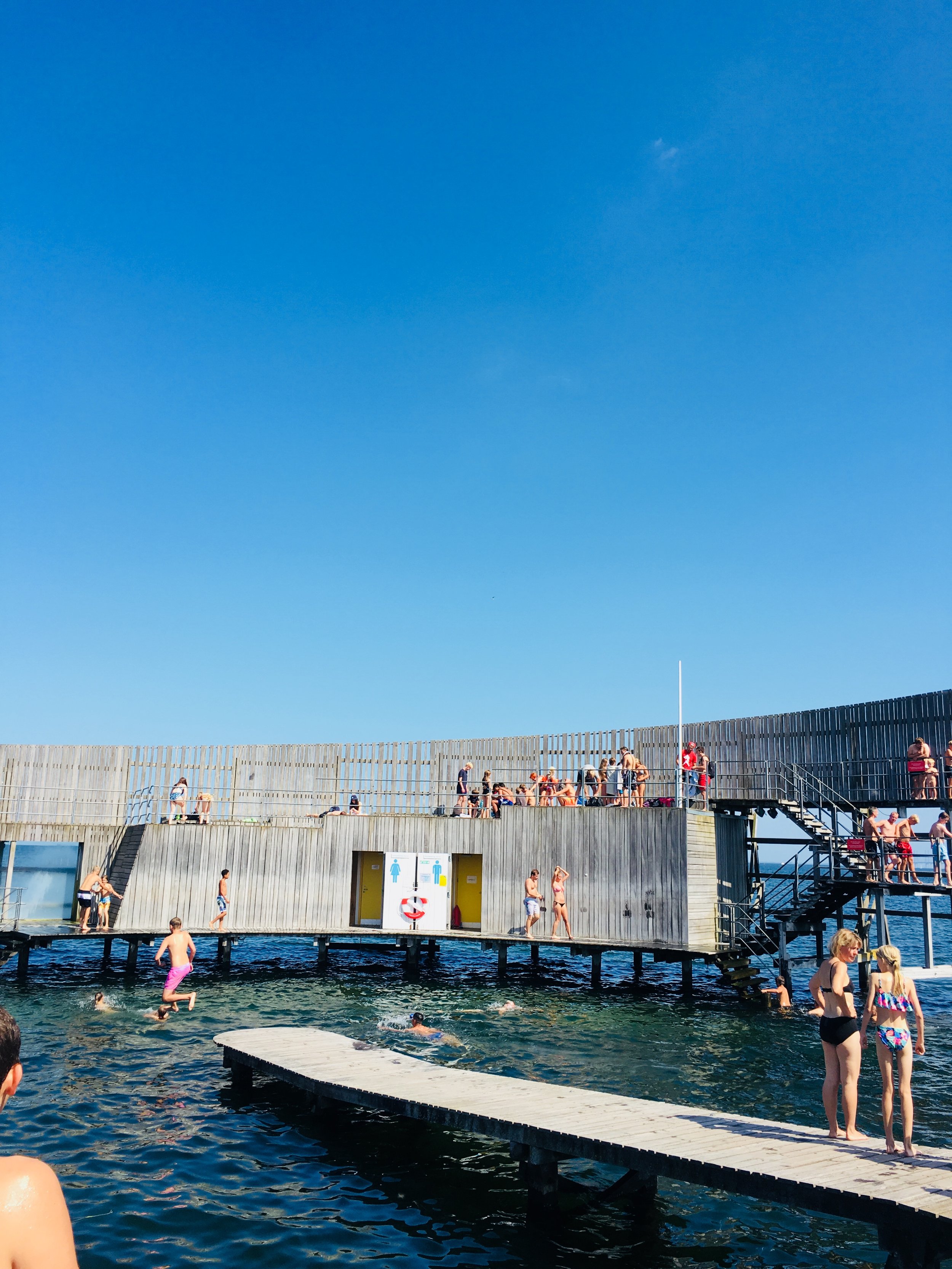
Similar to Copenhagen's Islands Brygge, as part of the development, the Tjuvholmen water's edge now also includes an amazing swimming area, making a great summer chill-spot...
If only every city did the same.
Get yourself to Oslo and take a wander.
- Tom
This is Scandinavia's Tallest Tower: The Turning Torso /
Jumping out of my train from Copenhagen, I quickly paced across the station’s dark concourse, making my way towards the bright blue sky seeping through the doors ahead of me. I pushed down on the latch and swung the door open - once again confronted by a new city. This time – Malmo, Sweden.
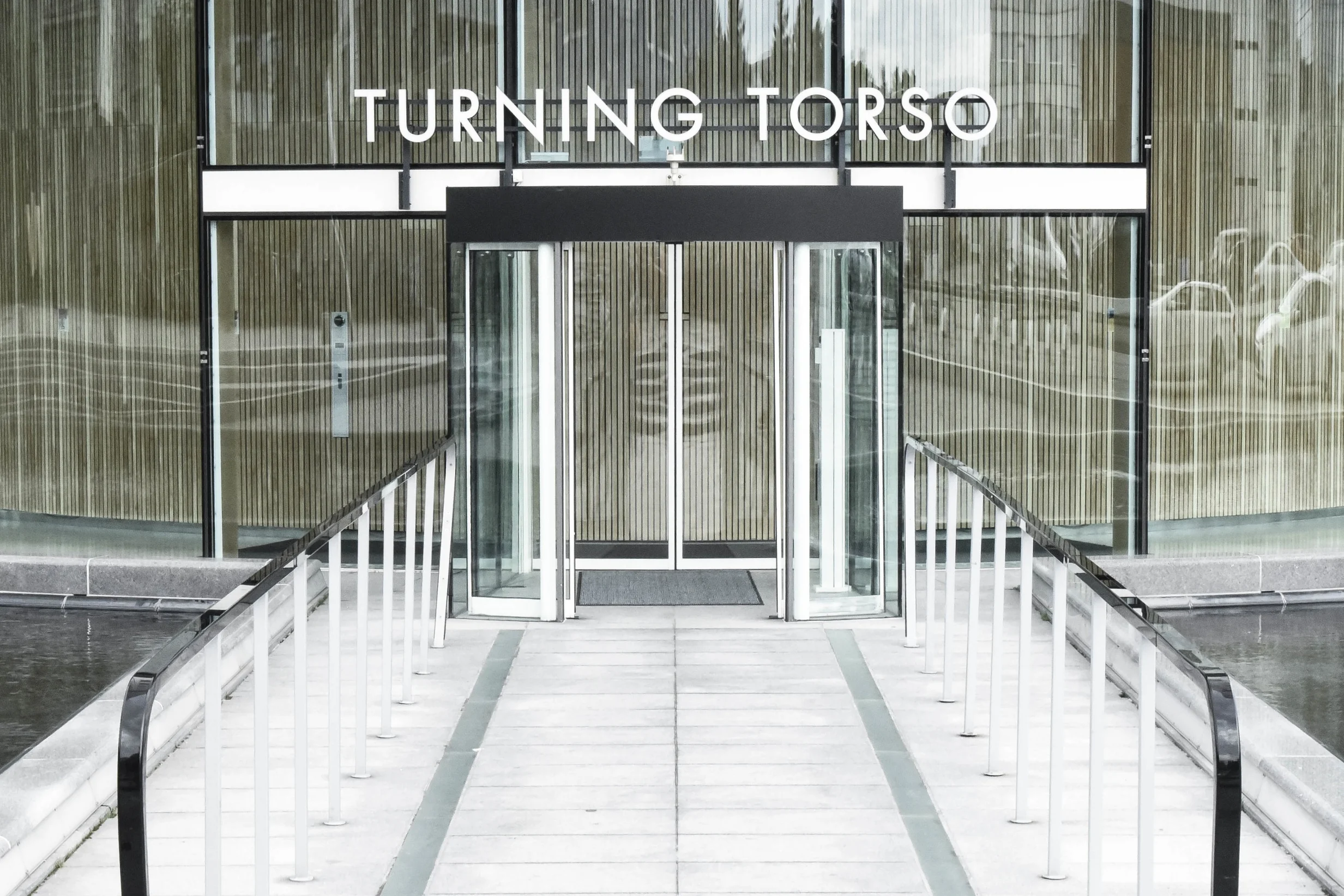
Knowing my trip would last just 24 hours, I had 2 boxes to tick: meet new people and check out the Spanish architect Santiago Calatrava’s ‘Turning Torso’.
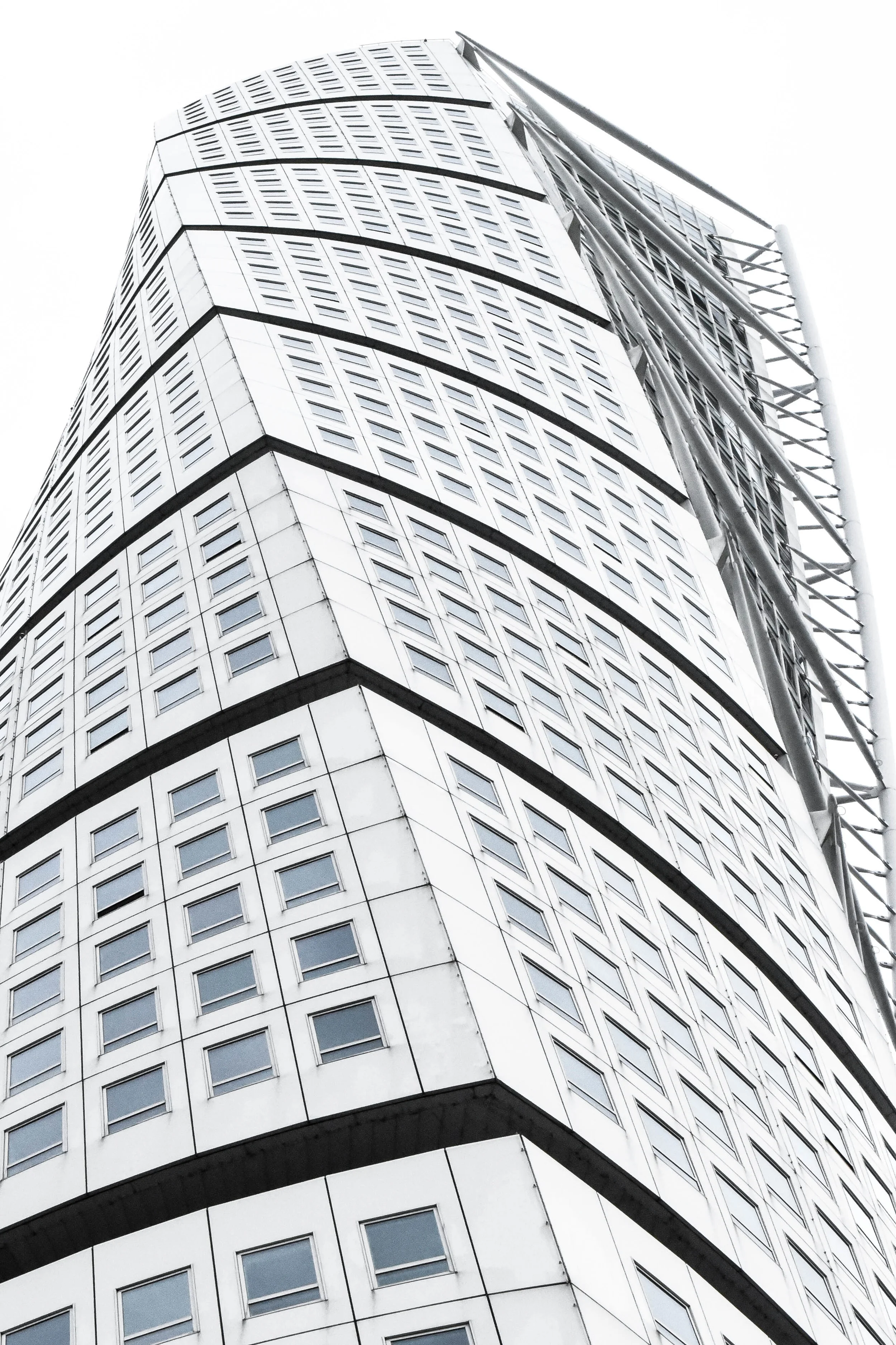
In typical Nordic fashion, the Turning Torso hasn’t been built with right angles and rigid lines, but instead embraces a much softer and more beautiful design. Spiralling towards the blue sky above me, no imagination was needed to figure out where it got its name.
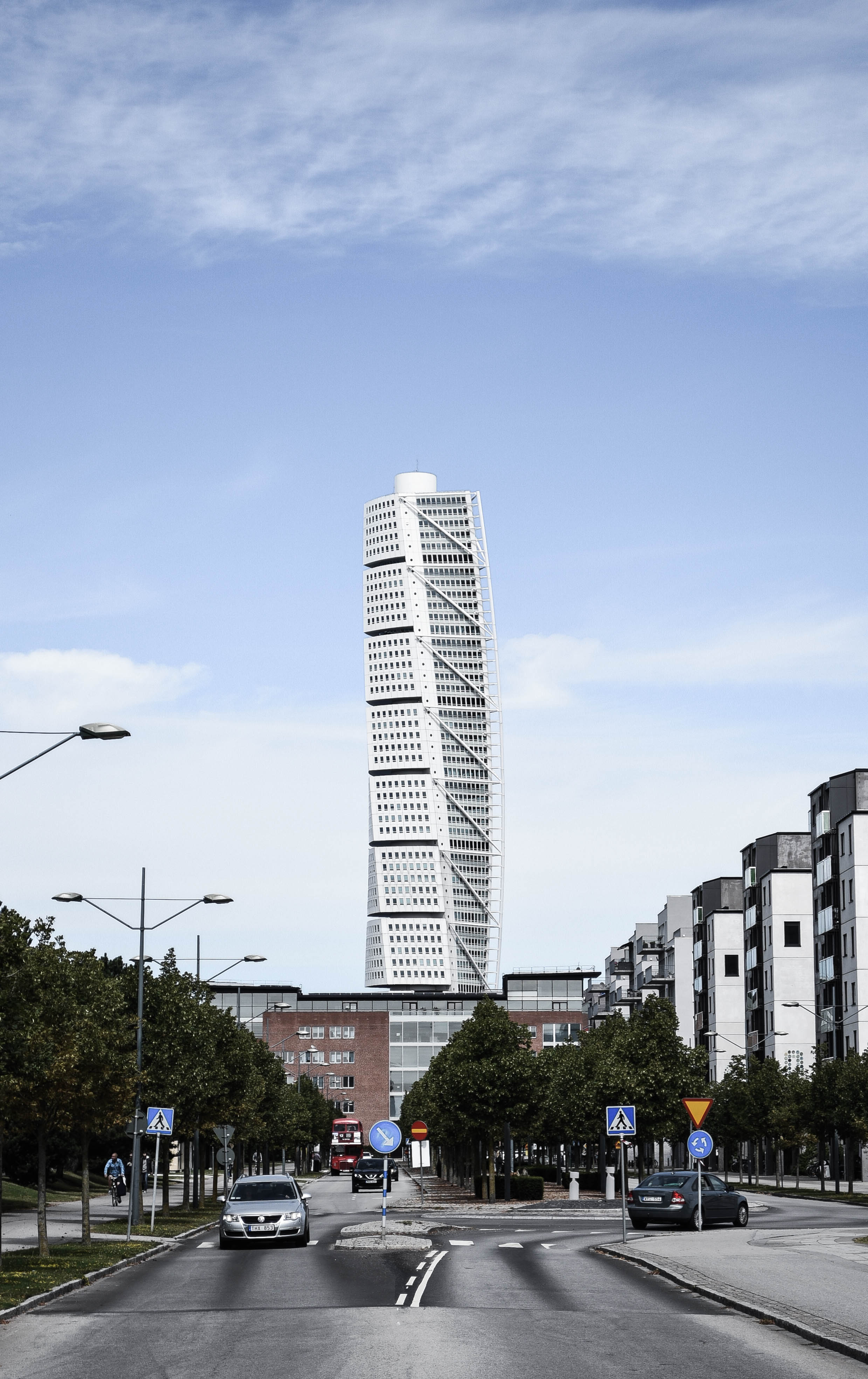
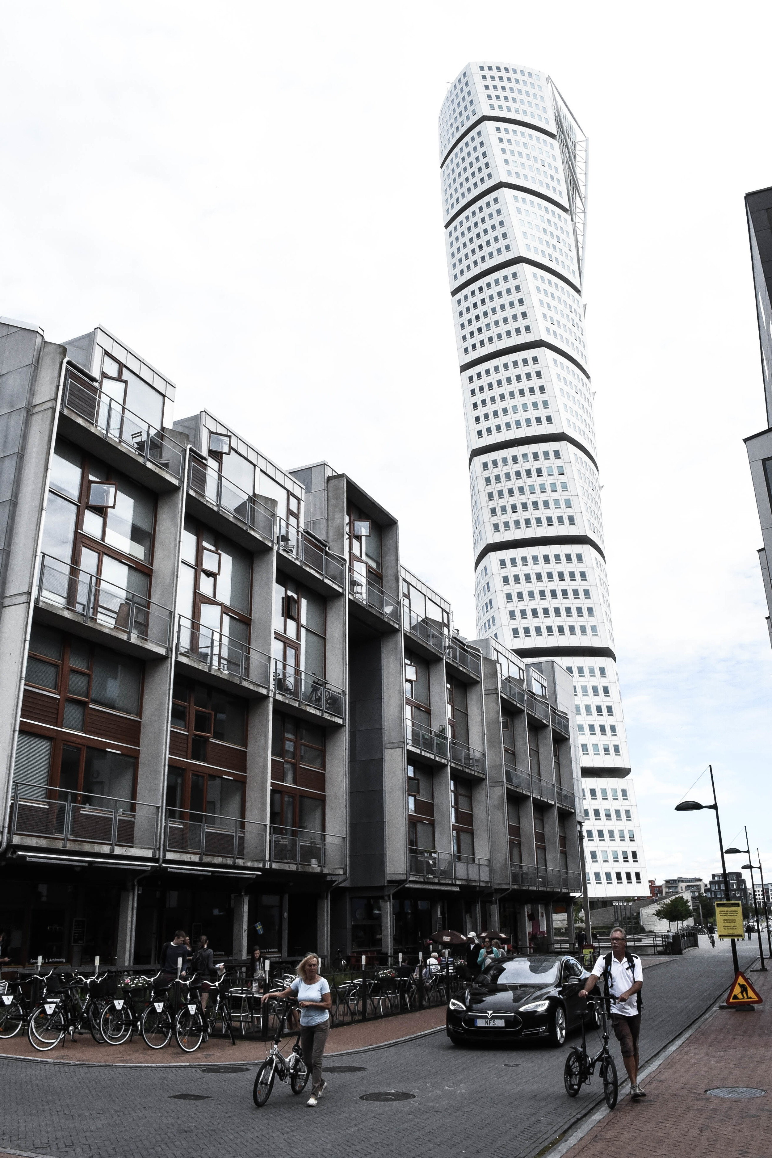
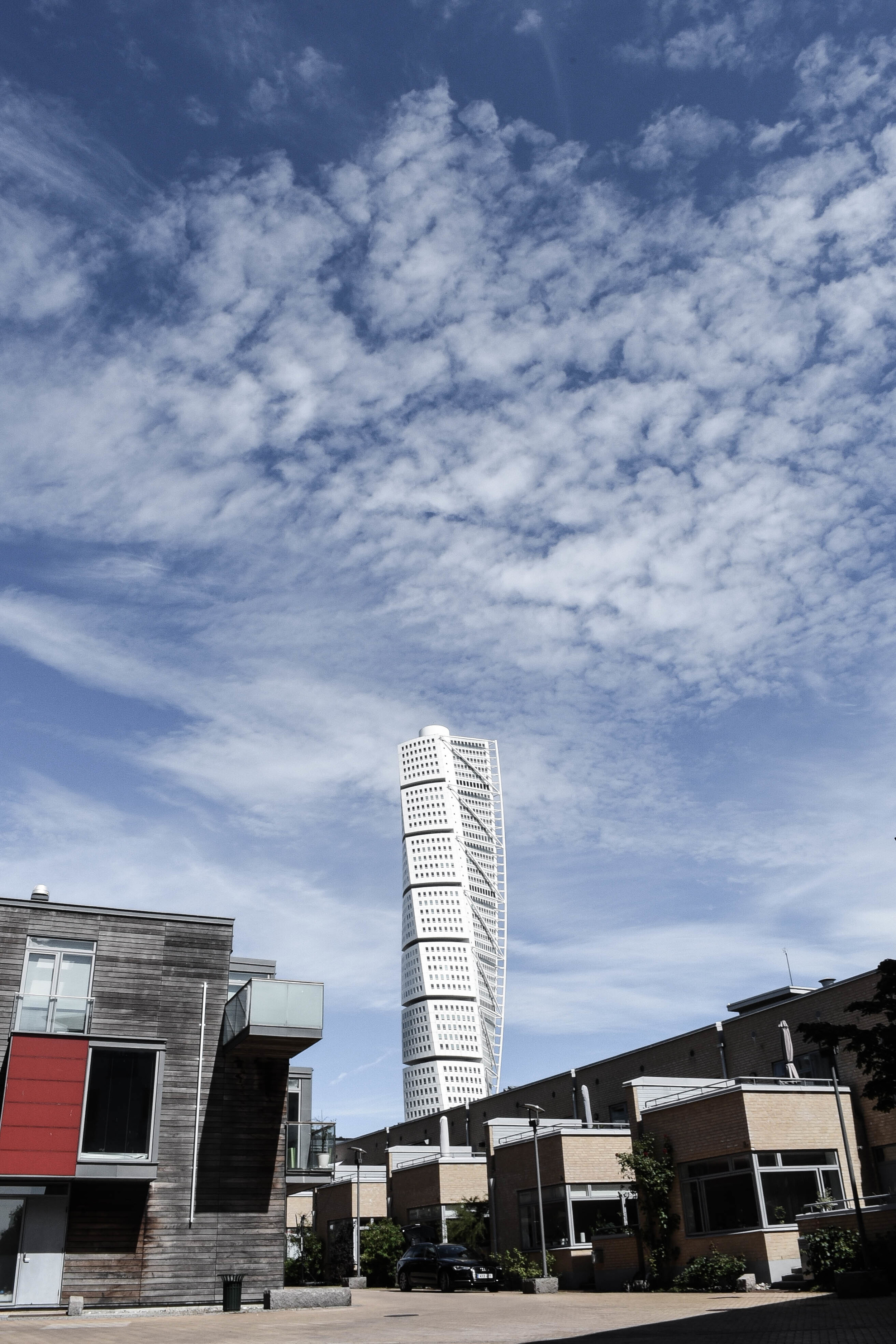
While most of the city is made up of old city streets and wide urban plazas, the district of Vastra Hamnen (Swedish for ‘Western Harbour’) –within which the tower sits - has undergone a recent rejuvenation and comprises kilometres of contemporary offices, and apartment buildings, all stretched along the beautiful Öresund waterfront.
Back in the late 1990s the City of Malmo developed a design competition to create a new tall building in the district. Zurich-based architect Santiago Calatrava submitted a sculpture that he’d created depicting a human body contorting around its spine in an upward movement. Impressed with Santiago’s piece, Calatrava was soon underway designing what would soon become Malmo’s most impressive landmark.
At 54 storeys, the building manoeuvres 90 degrees from top to bottom, and is considered to be the world’s first twisting skyscraper (the Cayan Tower in UAE has since been built with a similar twisting concept).
But in addition to its interesting design, the Torso is powered by 100% renewable energy and has been constructed with eco-friendly materials including recyclable aluminium. It also features a high degree of energy and water efficiency, helping residents to live much more sustainable lifestyles.
As I walked from Vasta Hamnen back into Malmo’s old town, I constantly looked back over my shoulder at this huge, twisting, tower behind me. It was a pretty courageous experiment from Santiago, but I guess just another testament to the fact that fortune favours the bold.
Make sure you check it out if you’re ever in Malmo.
Why Copenhagen is such an incredible city /
Everyone knows that Copenhagen is the happiest city in the world. But not as many people appreciate just how unique and interesting it is. As a regular visitor, below I've listed out my top reasons why Copenhagen is the world's coolest city.
Vibrant Neighbourhoods
Nørrebro
Norrebo is one of Copenhagen's trendiest districts: people look amazing, bars and cafes line the streets, and its energetic vibe lasts late into each night.
But this neighbourhood's vibrancy isn't simply a coincidence - Norrebro is the city's most multicultural area. With 26% of its inhabitants from outside of Denmark, it offers an incredible cultural mix of food, music, language and fashion-styles.
Islands Brygge
In contrast to the eclectic urban vibe of Norrebo, Islands Brygge is predominantly residential. But what makes this one of my favourite parts of the city, is its harbourside location and incredible stretches of open space.
Differently to most cities around the world, Copenhagen's government is liberal enough to let people swim in its harbour, and there's probably no better place to do that than Islands Brygge.
In summertime this neighbourhood is crowded with swimmers, drinkers, skaters and chillers - all checking out the beauty of the city... and probably each other. There's no doubt that this is where some of Copenhagen's most attractive people come for some time in the sun.
MeatPacking District (Kodbyen)
Much like New York City's Meatpacking District, Copenhagen's old cattle markets have seen a recent rejuvenation, as young people embrace its large open spaces and old industrial buildings.
While parts of the district are still used for the meat industry, since the early 2000s it's also emerged as a creative cluster, attracting galleries, restaurants, design firms and studios.
I recommend grabbing a coffee or beer and simply wandering around the district's streets; the mix of large, small, old and new buildings provide for a seemingly never-ending maze of beautiful hidden streetscapes.
Architecture
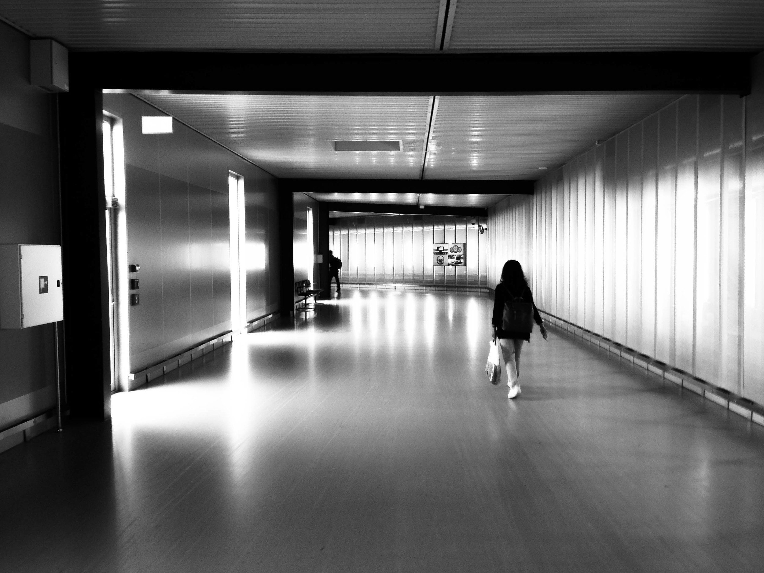
As soon as you step off the plane into Copenhagen's Kastrup Airport's beautifully designed terminals, you'll realise that this is a city that prides itself on clean, human-focused architecture.
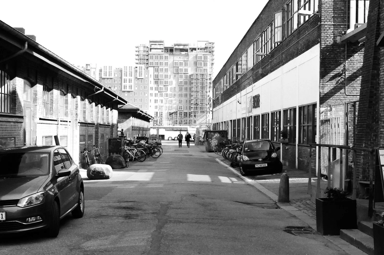
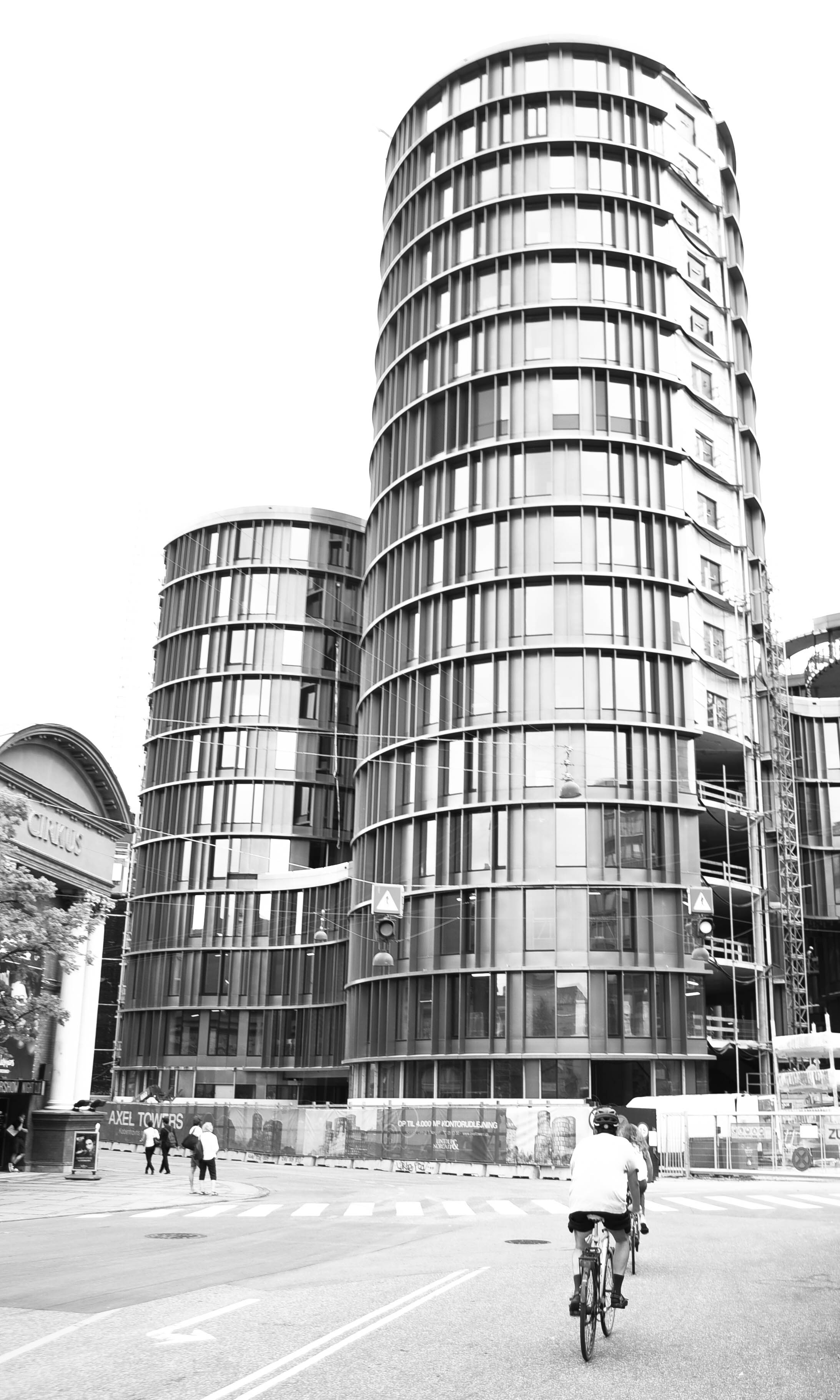
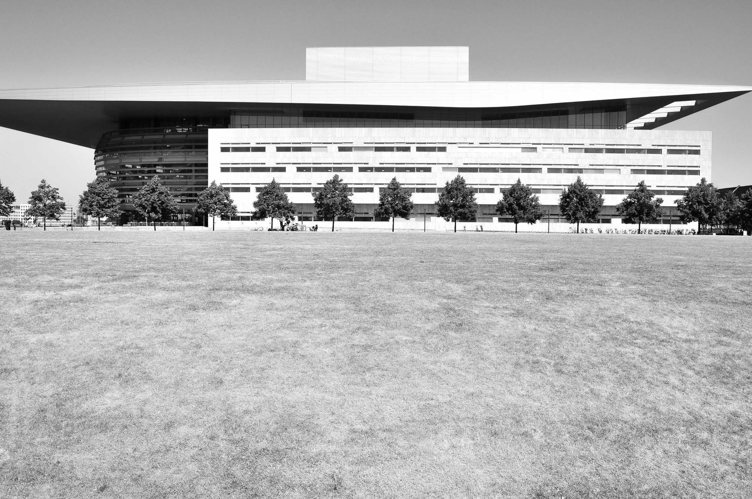
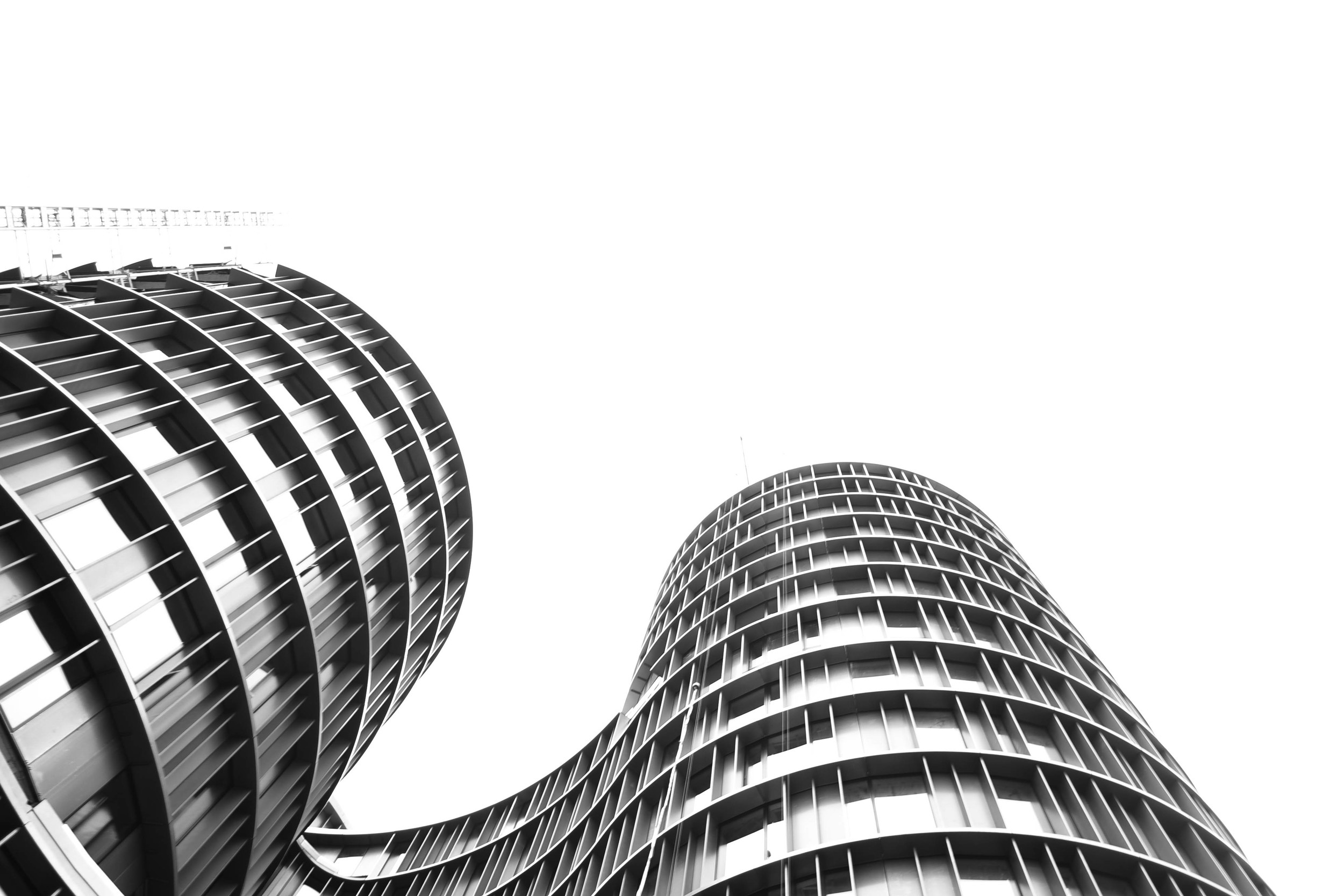
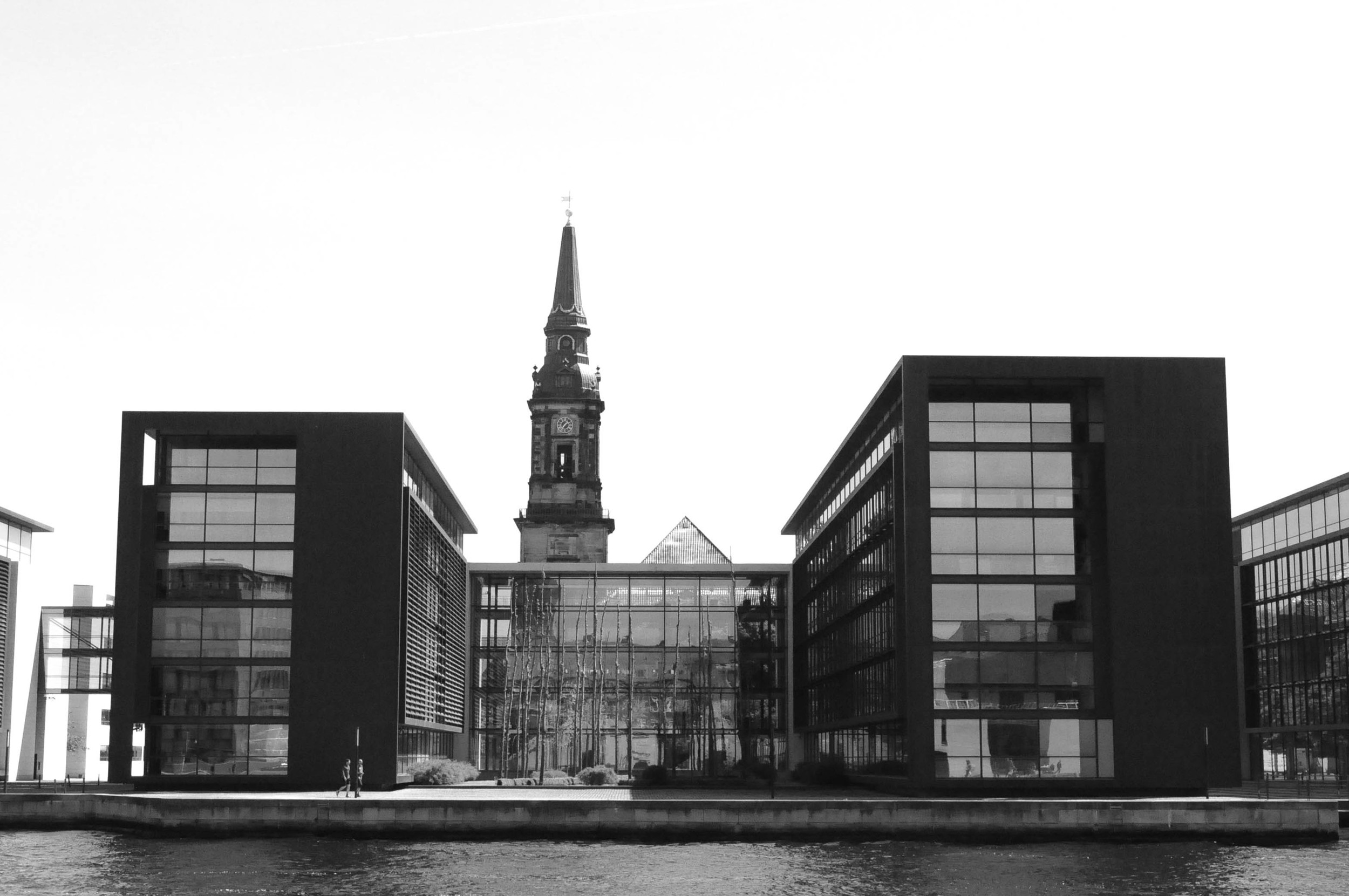
It's buildings comprise a full range of styles, all the way from the 17th century. In my opinion, however, it's the contemporary buildings which are some of the best: the Copenhagen Opera House and the Axel Towers to name just two.
Unlike the tall and bulky buildings in the US, Asia and the Middle East, Danish designers tend to focus on the details, such as fine shapes, curves and materials. As a result, the city has avery soft, and even feminine, feel to it.
But my love for Copenhagen architecture is as much about the spaces between the buildings, as it is the buildings themselves. People here are not pushed to the edge of streets to make way for cars, and public spaces are not simply an urban designer's afterthought. This is a city where buildings have been shaped around open spaces - not the other way around.
Fashion
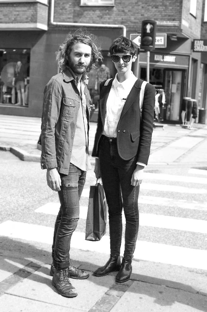
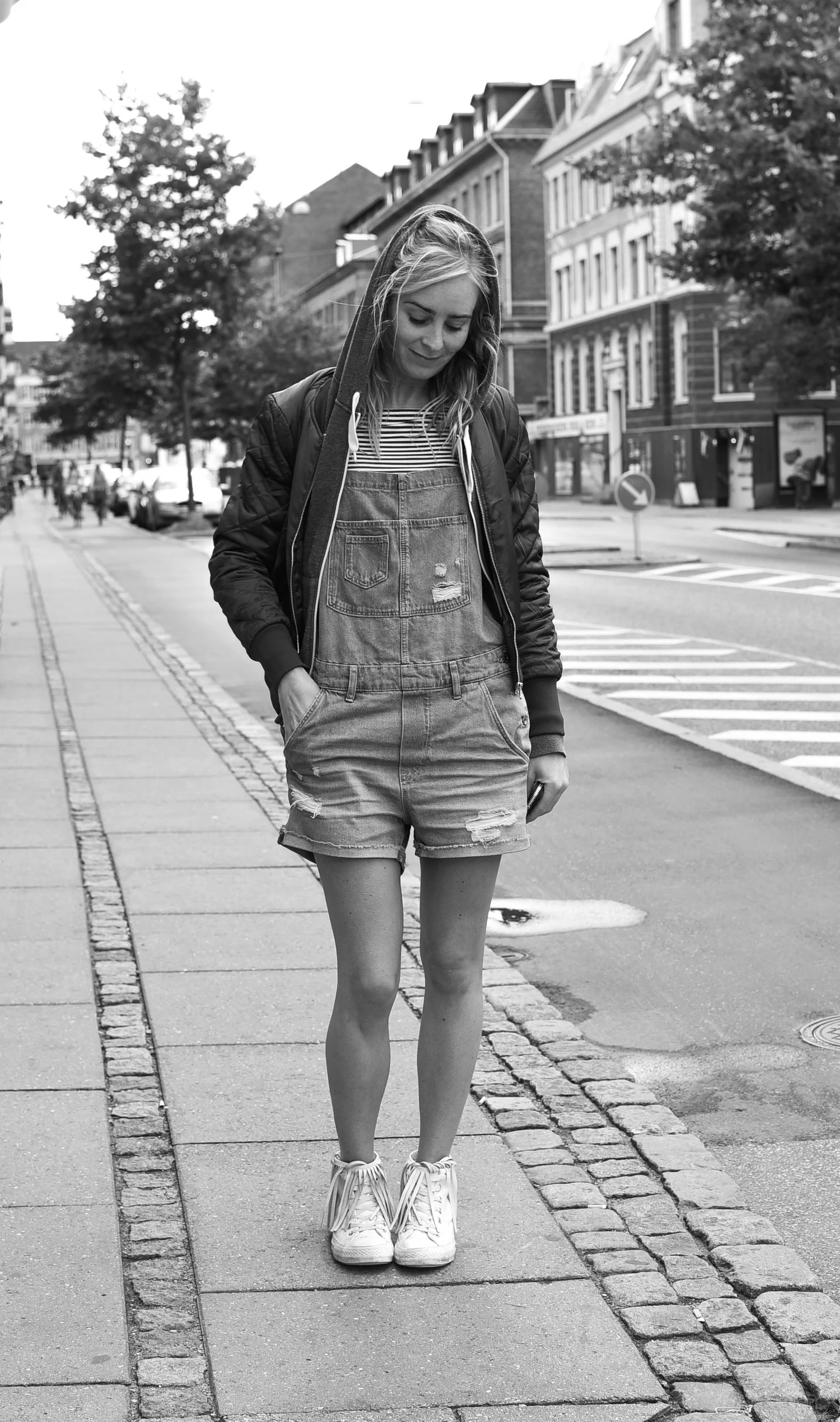
Copenhageners are a stylish bunch of people, but not in some 'edgy' up-your-own-ass-east-London kind of way. Instead, just like Copenhagen's architecture, nice design seems to be deeply embedded into Danish culture.
People on the street - young and old - have a generally distinctive Danish look: cuts are low and slouchy and logos are minimal. And even those who mix it all up and do something totally different still tend to look classy and timeless.
The love for bikes
It'd be virtually impossible to write a post on Copenhagen without a mention of bicycles.
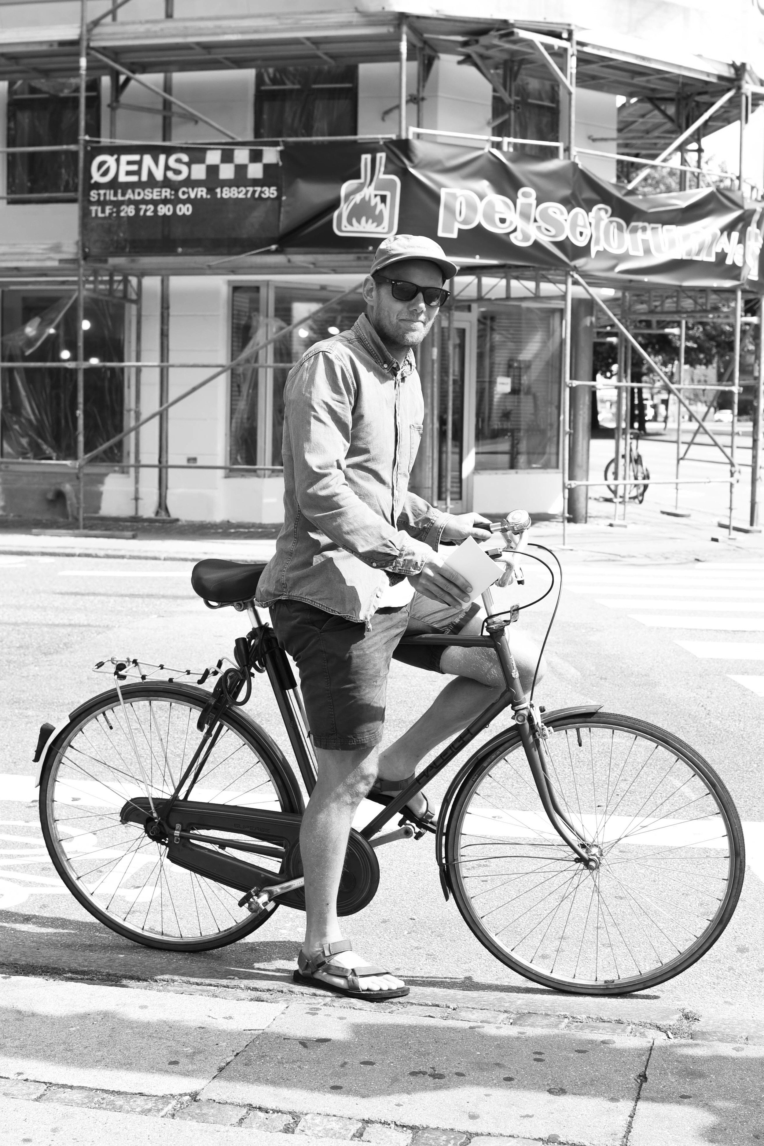
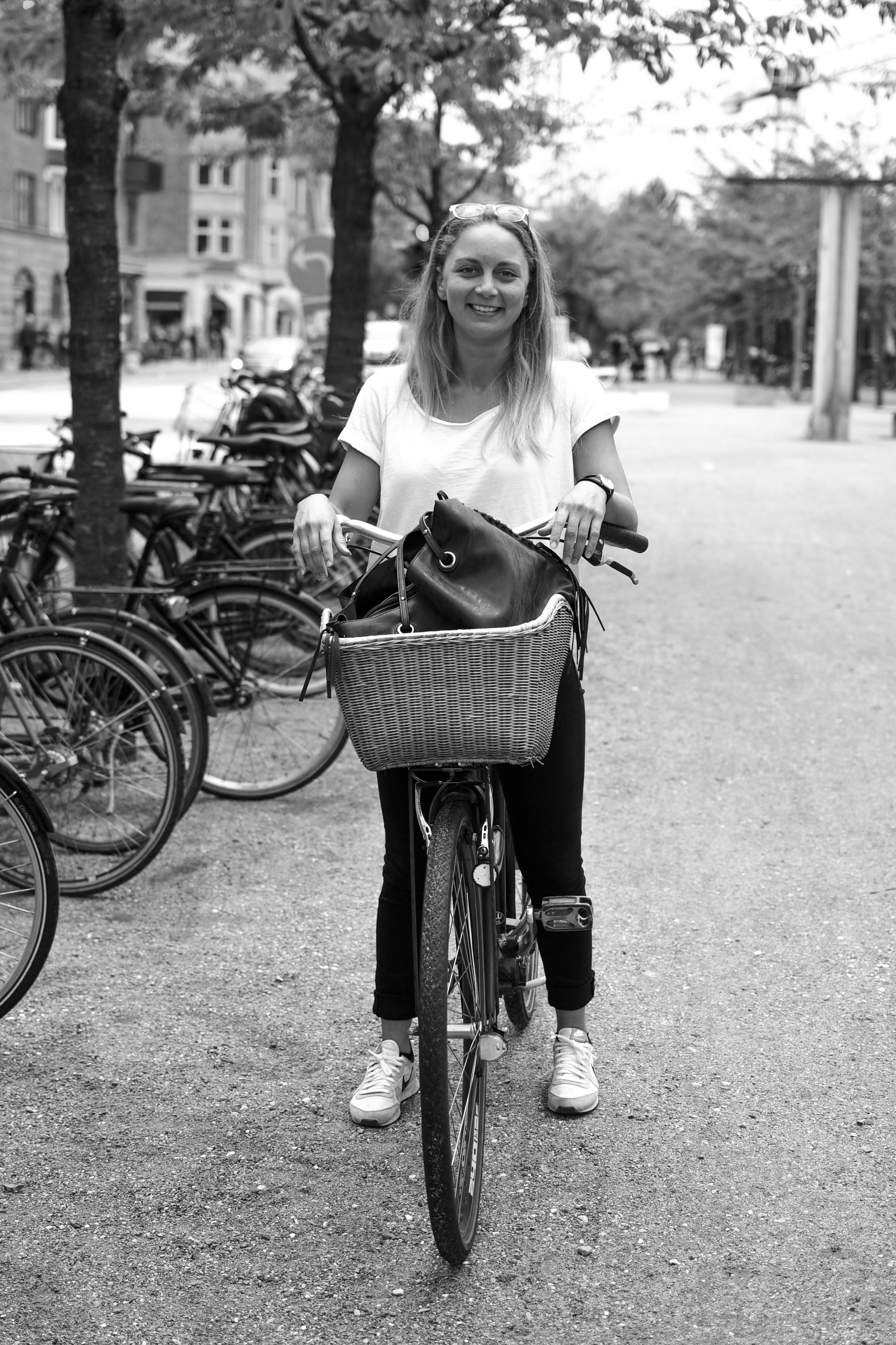
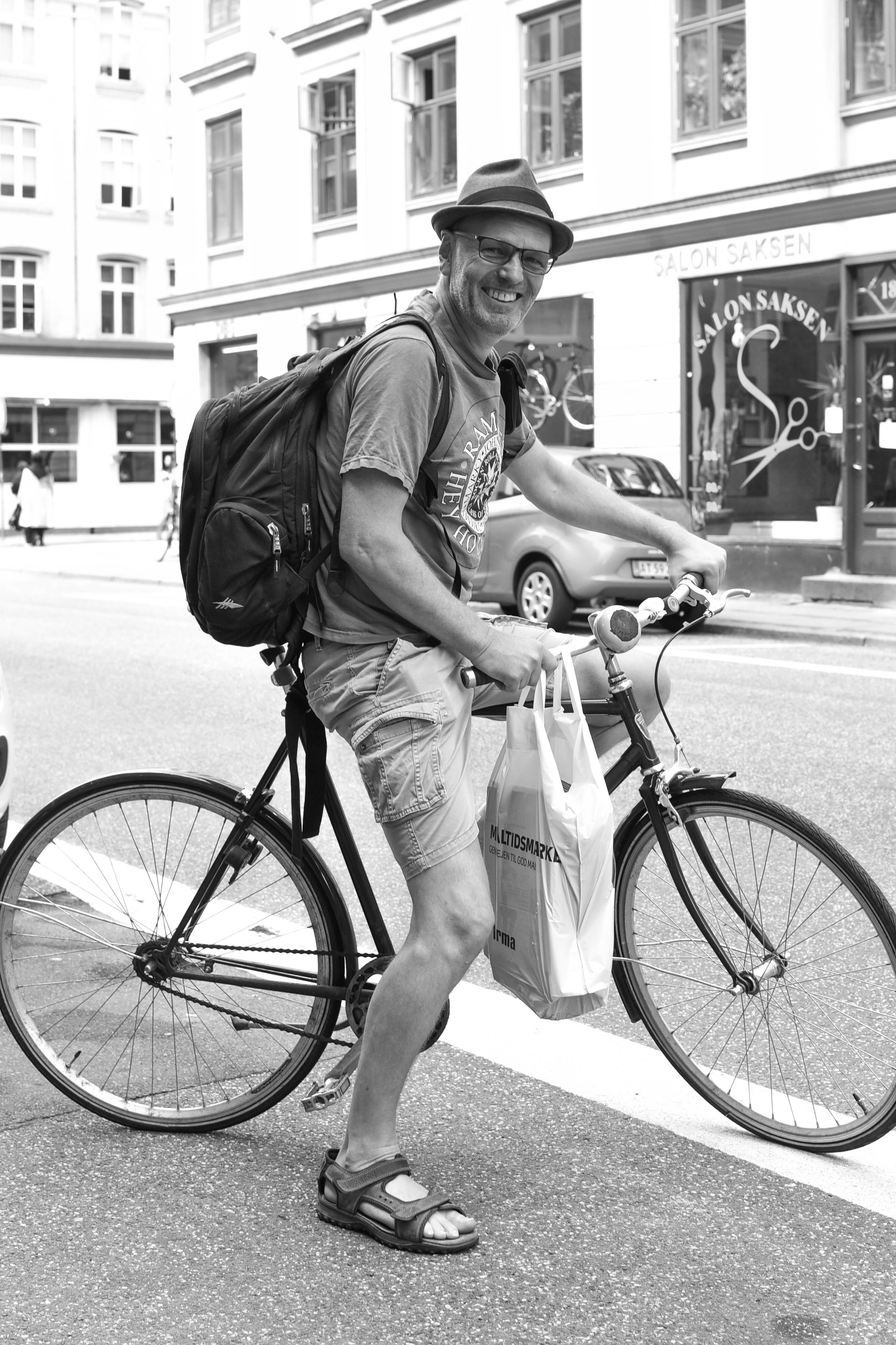
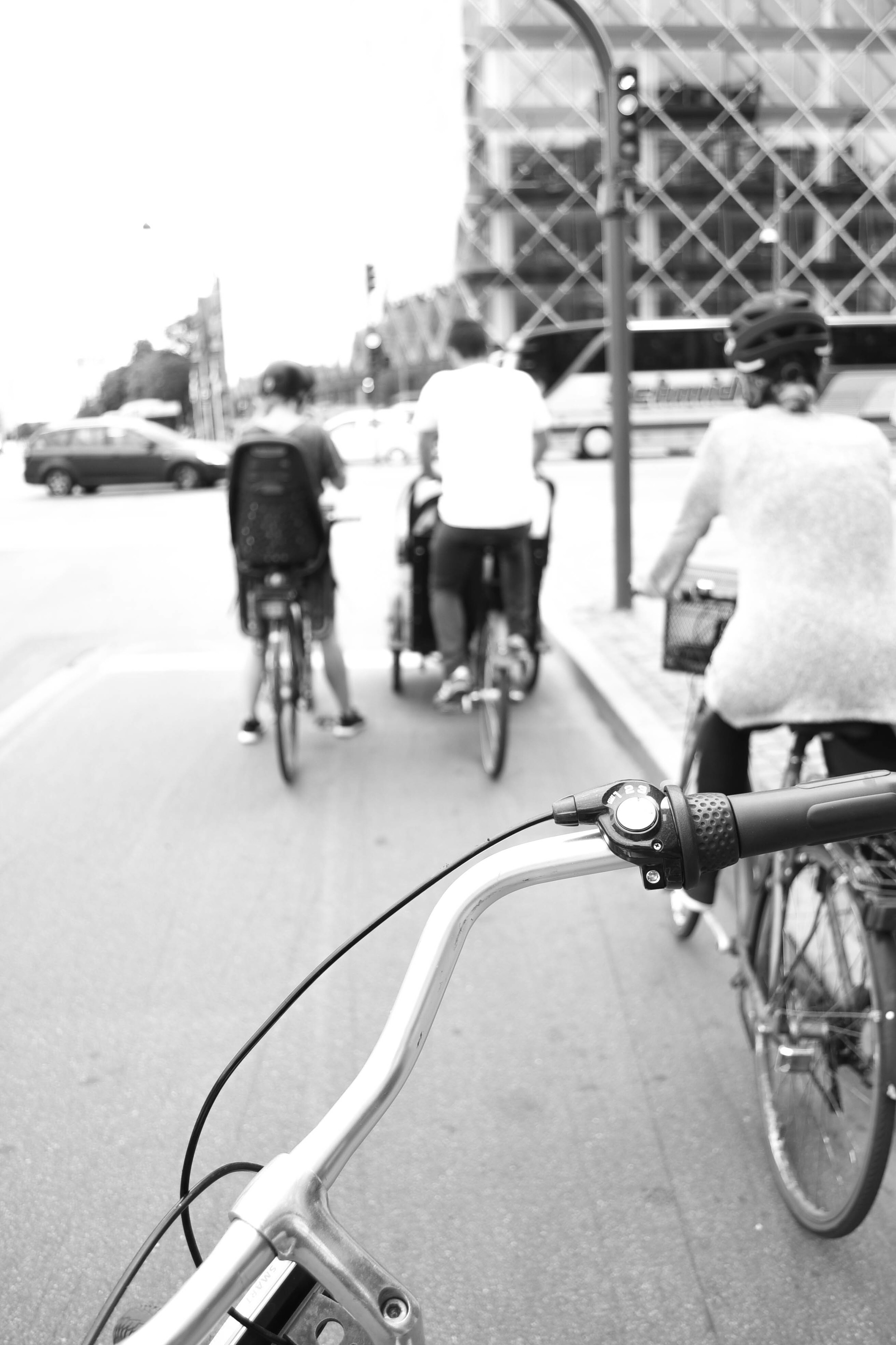
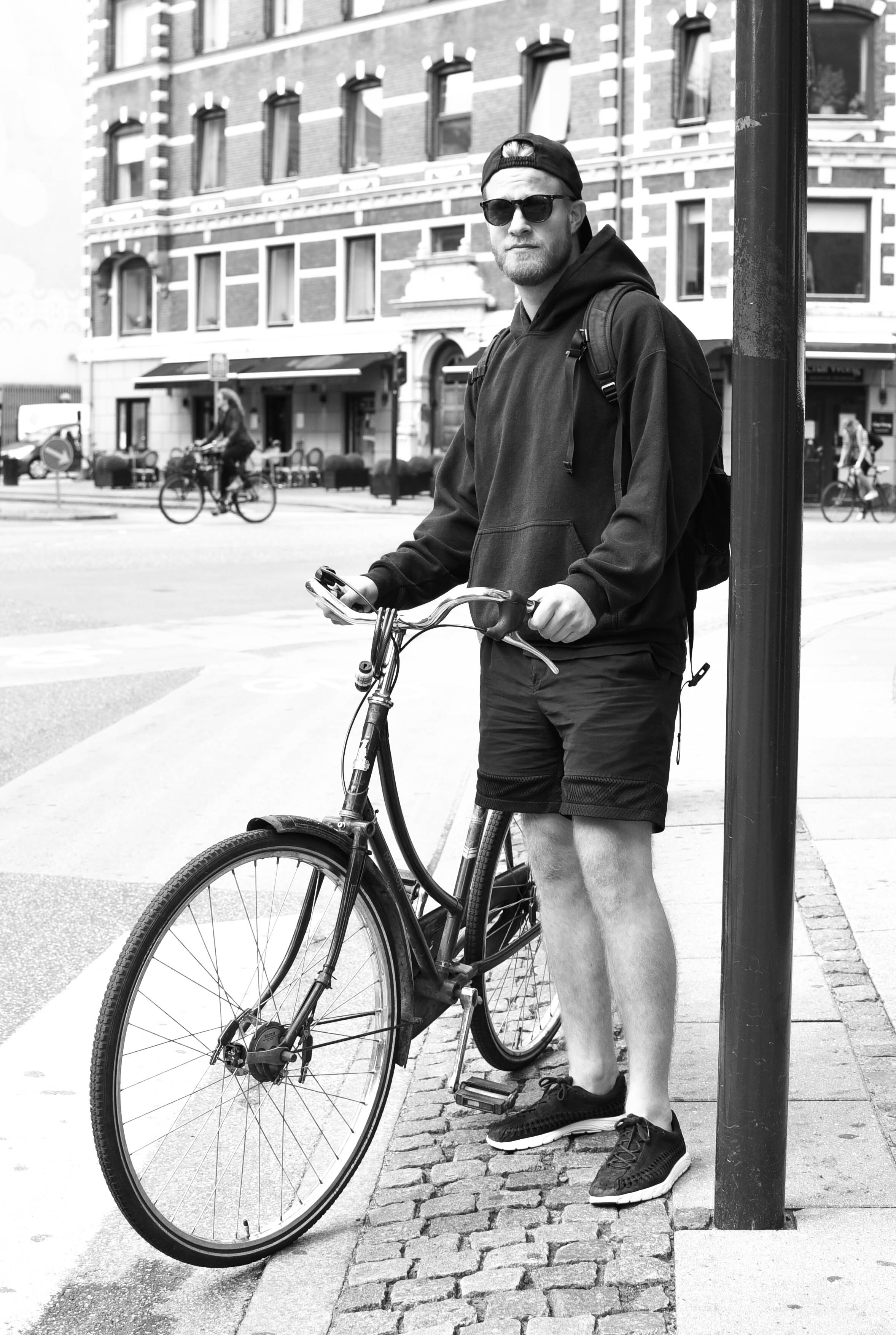
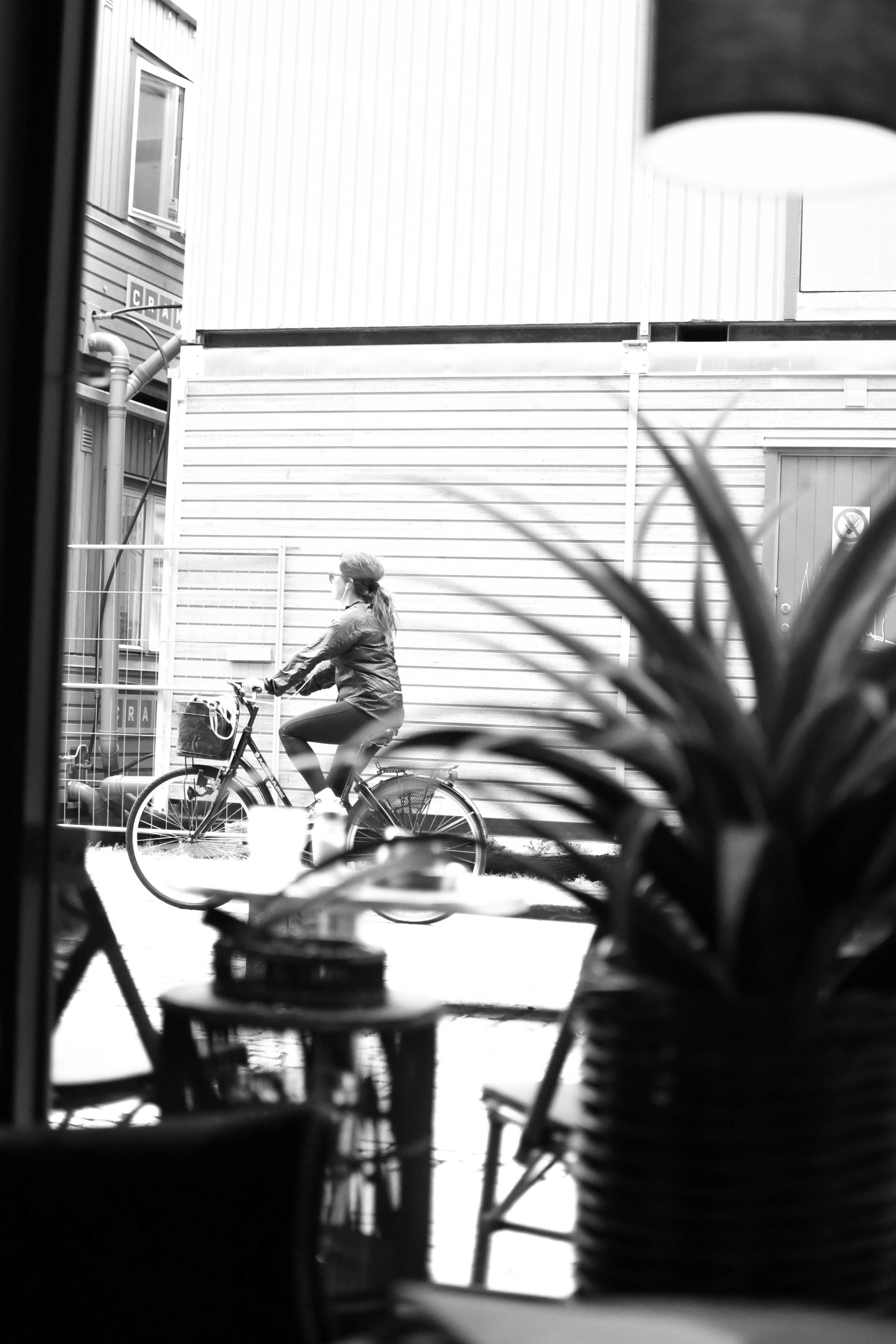
As soon as you step foot in the city, you'll notice that just about everyone is on two wheels. But riding in Copenhagen is not about being a 'cyclist': it's not about lycra, helmets, bells, or reflectors. Bike riding in Copenhagen is about function, mixed with a bit of your own personal style.
With lanes separating bikes from cars, moving through the city is a stress-free experience. It won't take you long to realise that every place in the world really should Copenhagenize.
4 insights into the future shape of cities /
Since I was a kid I’ve been fascinated with futurism, and in particular, the future of cities. Naturally, I was super-excited when MINI invited me along to the ‘Future Shapers’ event.
Heading to London’s Roundhouse last Monday, I had a little think back to how the world has changed in just my lifetime. City skylines were smaller, the internet had hardly been invented, and Walkman’s were still high tech, portable technology. How could anyone back then have ever imagined the world we live in today?
As I entered the bright and beautiful auditorium, I grabbed a beer and had a chat with a friend about the innovative technology we were probably about to see. I guessed intelligent, self-driving cars. He guessed new car to mobile app technologies.
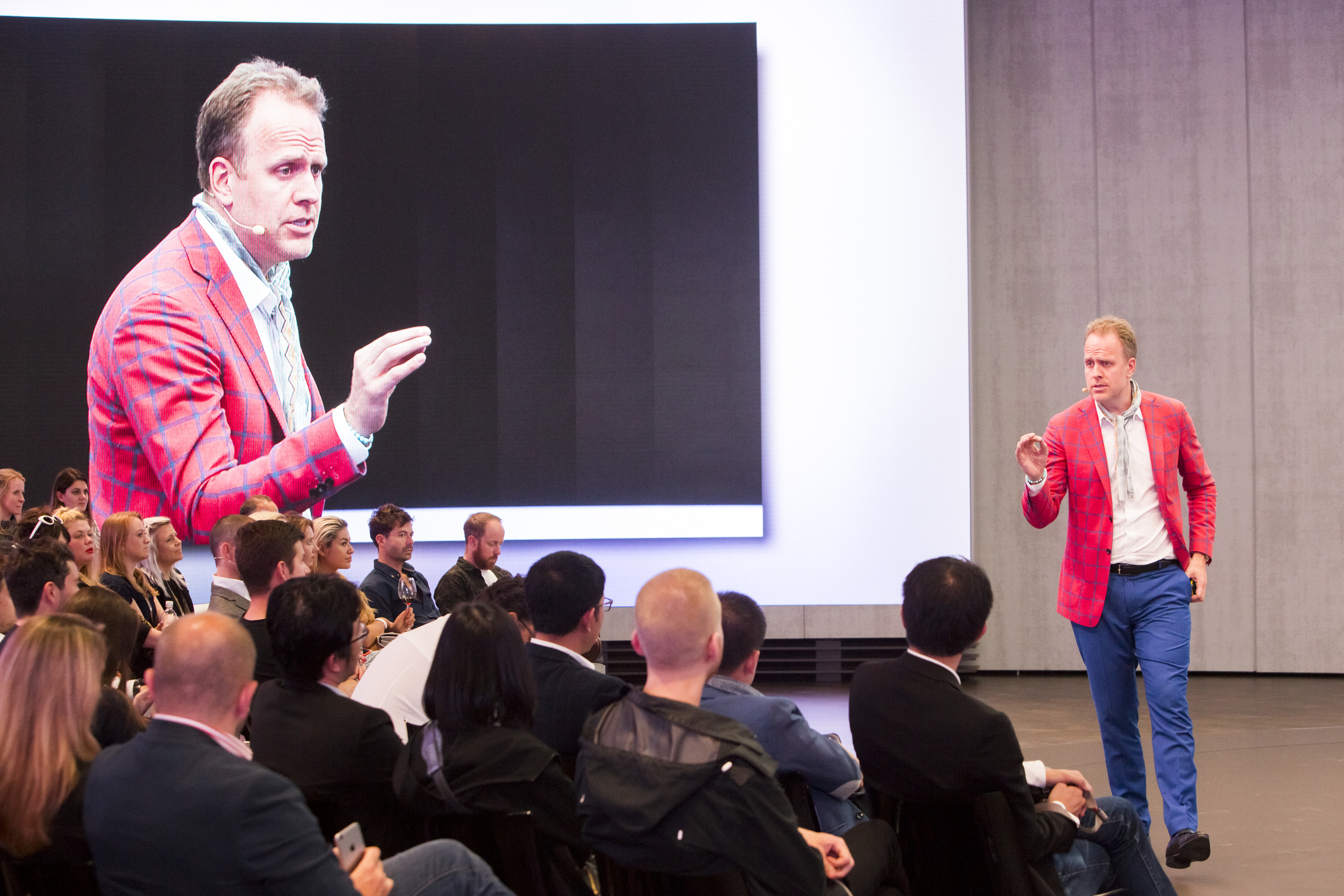
But as Mark Adams, Head of Innovation at Vice, took to the stage, we quickly realised that the future that we were about to vision, was not just about creating the newest and best technology, but was also about innovating our ways of thinking.
Here are 3 of my favourite insights into the future of cities from the event.

1. Cities will be collaborative
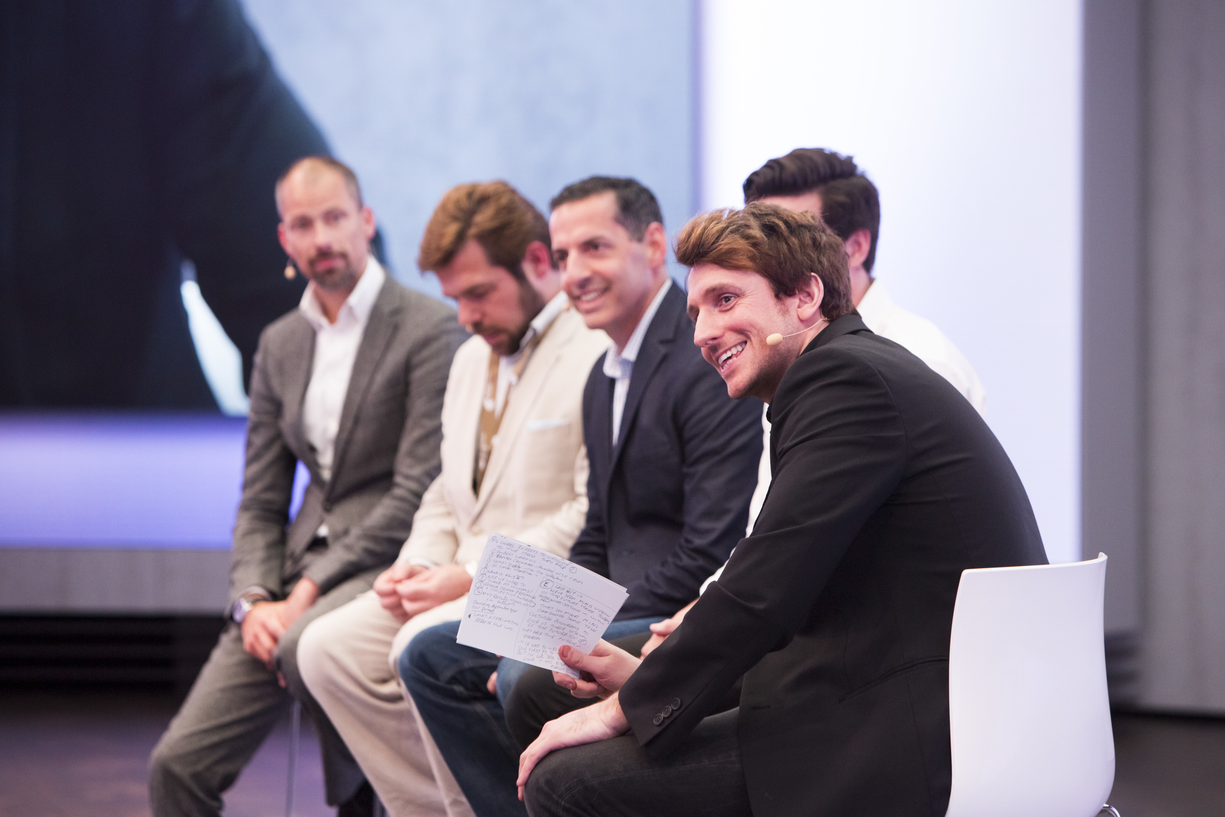
Speakers with expertise in psychology, property and design took to the platform to speak about the importance of ‘collaborative consumption’ and the need to address global problems by evolving into a society which shares.
It only takes looking around a city to realise that the way we eat, live, and travel is unsustainable. And with the world’s population growing so quickly, it's easy to see that at our current rate, it won’t be long before we all run out of clean air, clean water, or simply, space to live and move.
But by sharing buildings, cars, bikes and services (made possible with apps), we’re quickly evolving into a society which can better reuse, rather than waste. It won’t really matter who owns what, because at the end of the day, by sharing, we all save time and money. It just makes sense, right?
2. Less will be more
Gone are the days of mass consumption, sterile shopping malls, huge cars and unnecessary gadgets. The future of cities will be about minimising everything from the space that we use on streets, to the time that we spend getting to and from work to maximise time with hanging with friends and doing the things we love.
Already in the past decade or two, young people have opted for smaller, shared housing in urban areas to cut down on travel times. In places like Japan, we’re seeing young people completely cut down on possessions altogether.
Our parent’s generation was the era of consumption, but this century’s urban generations are more satisfied with experiences over things. Sharing a car and flat won’t be a problem when your possessions comprise just a couple of digital tablets and maybe a bike and book or two.
3. ‘Mobility’ will replace ‘cars’
Once only a possession for the wealthy classes, the 1950s saw cars become a product for the masses: people were given freedom to move where they wanted – whether in a city, or between cities. They became a symbol of adulthood, freedom and independence.
But it wasn’t long before the car began to dominate. Roads and car parks ripped through city centres as we became unhealthy dependant on the machine with four wheels. But by recognising problems with congestion and pollution, brands like BMW are now part of the solution to quickly improve urban transport, and help the natural environment.
Explaining that car parks now comprise 30% of our cities, futurist Magnus Lindkvist, told us how cities of the future will improve by swinging back the pendulum away from car dominance.
Instead of simply talking about ‘cars’, we will talk about ‘mobility’ – an integrated urban system of bikes, cars and public transport. We will choose our transport options based on efficiency, comfort and style, depending on what we feel like, and when.
The cars we do choose to use will be compact, energy efficient, beautifully designed, and constructed from high quality materials, such as the brass and copper comprising the inside of the MINI Vision Vehicle.
Lasting decades rather than years, and carrying dozens of people across cities each day, cars of the future will be a beautiful and efficient addition to our cityscapes. Just like a good watch, they will be cherished and maintained.
4. Our world will be personalised
Every one of the 7 billion humans on this planet is unique. So why not make objects and environments just as unique as we are?
Last month I met designer Ross Atkin, who is using digital technology to personalise our streets for the blind or less abled. I was super impressed with his work – which is both inspiring and practical. By using technology and data which already exists, Ross’ work can improve the lives of millions.
But as artists Margot Bowman and Marcus Lyall took to the stage on Monday night, I realised that the future of personalisation won’t just stop there. These artists work at the intersection of art and technology, creating bespoke environments which respond to our needs, wants and emotions. Not only can technology help to solve problems, but it can also enhance our day-to-day experiences and pleasure.
As Anders Warming, Head of Design, MINI, showed us how the MINI Vision Vehicle will respond to our emotions through lighting, I started to foresee an urban future which only a few years ago was completely unfathomable.
Objects will no longer just be objects. But just like my smart phone rather than my chunky old Walkman, future belongings will become completely integrated into just about every aspect of my life.
Helping us to move, plan, manage and organise, we create more time to do the all things we love.
Heading along to Monday’s event, I thought I would be checking out some cool technology and design ideas. But I had no idea that the conversation around the future would open my mind to so many interesting insights into the way we might behave, and perceive the world around us in the future.
It made me super excited to see the shape of things to come. I’d love to know your thoughts – what is your ideal future city?
The BMW Group Future Experience, showcasing MINI’s Vision Vehicle is taking place at the Roundhouse in London until Sunday 26th of June. Visit www.mininext100.co.uk or @MINIUK for more information. #MINI #NEXT100
Feature photo: Mark Fischer
Urban photography needs snap judgement /
Taking good urban and architectural photos requires snap judgment to capture spontaneous city moments.
I usually find I get the best shots when I’m least expecting it – the light may looks particularly nice when I’m out to meet friends, or the roads may be emptier than normal on my way to work. But because carrying a big DSLR camera around can be pretty damn awkward, I’ve been waiting for the day that a camera phone is just as good in quality.
After hearing that EE was bringing out the Huawei P9 co-engineered with one of my favourite camera companies, Leica, I was super keen to try it out. Thanks to EE, it wasn’t long before I had one in my hands on one and was heading out for a day on my bike in London.
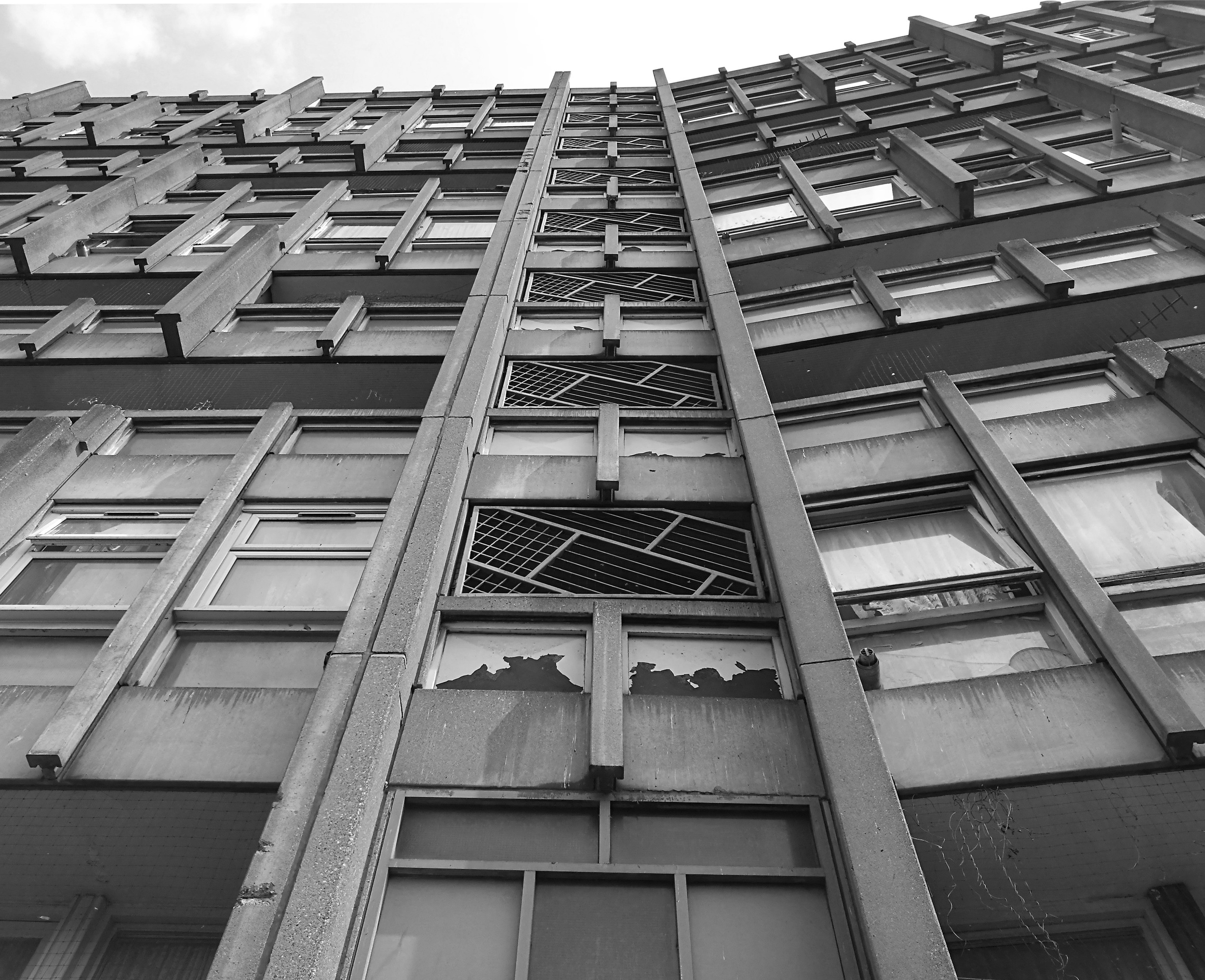
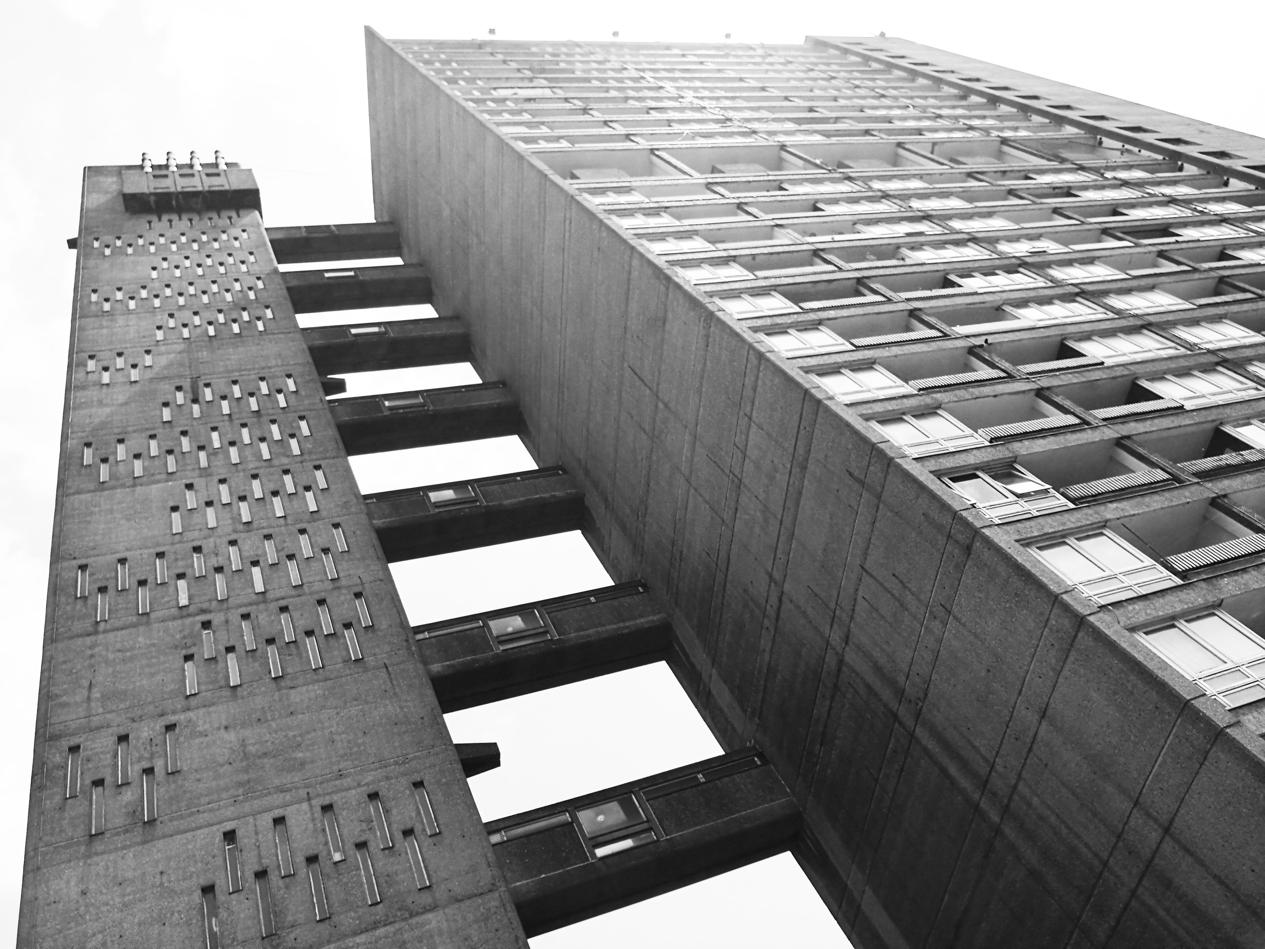
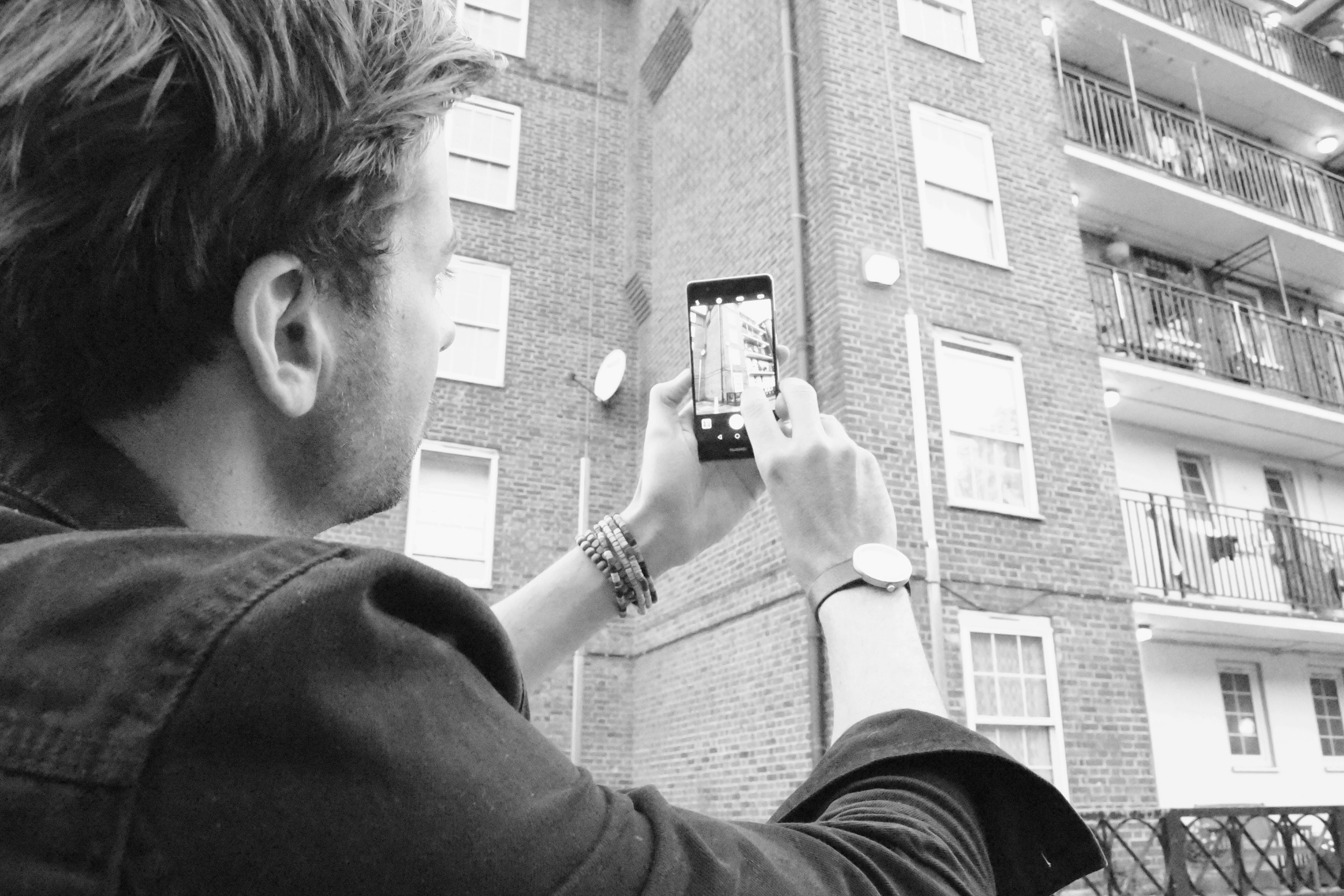
Riding towards Canary Wharf, I checked out some Brutalist architecture in London’s east end. From Balfron Tower to the Isle of Dogs, I meandered my way through dozens of estates, capturing the shapes of the concrete buildings around me.
Lying awkwardly in the grass, trying to get a photo of famous 1970s, Robin Hood Gardens, I was approached by an elderly man who told me that the buildings would soon to be demolished. I suddenly appreciated the ability to capture these buildings at this moment in time, right before the neighbourhood was to vanish… And who knows, the photos might even be worth money some day.
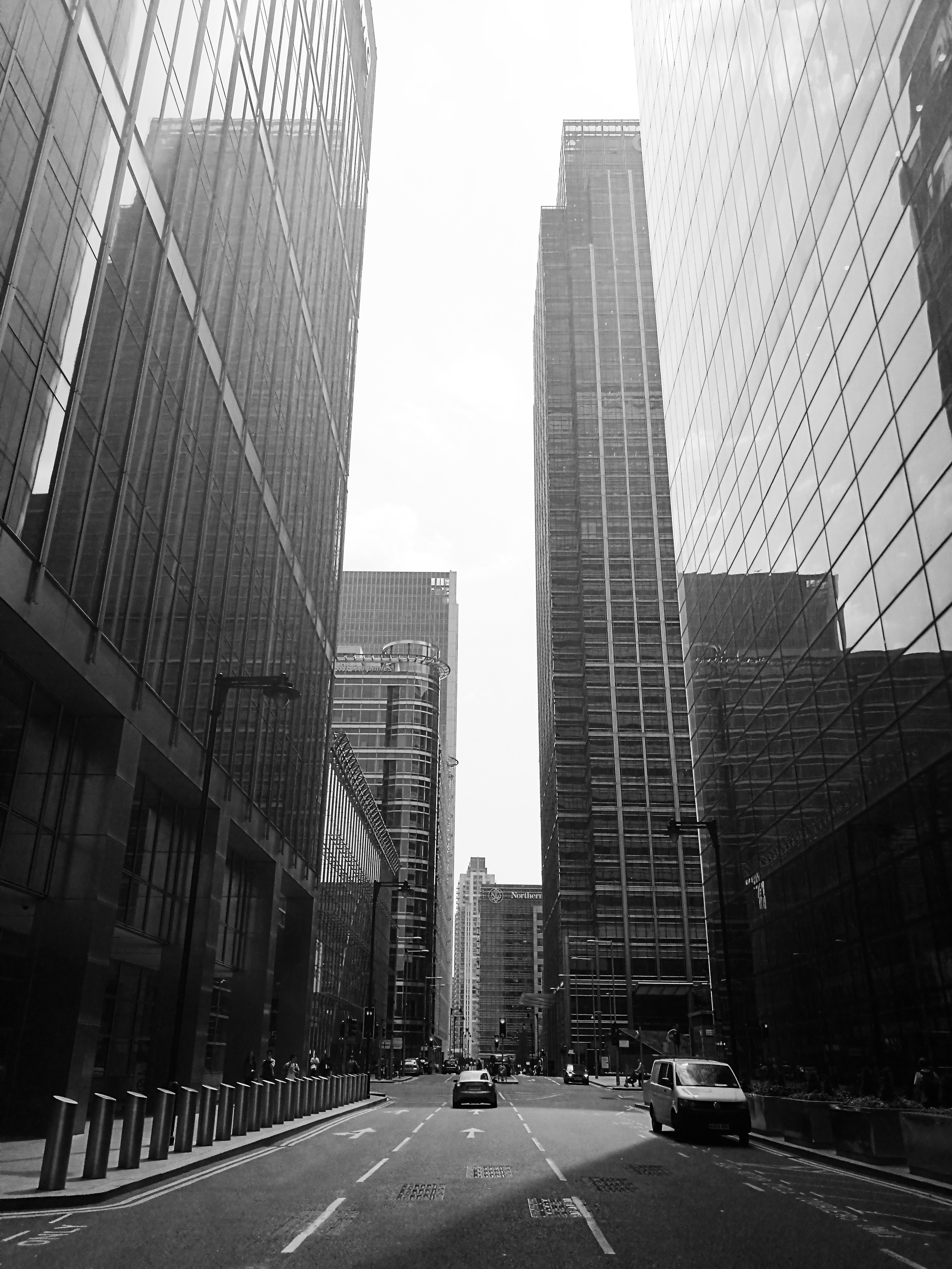
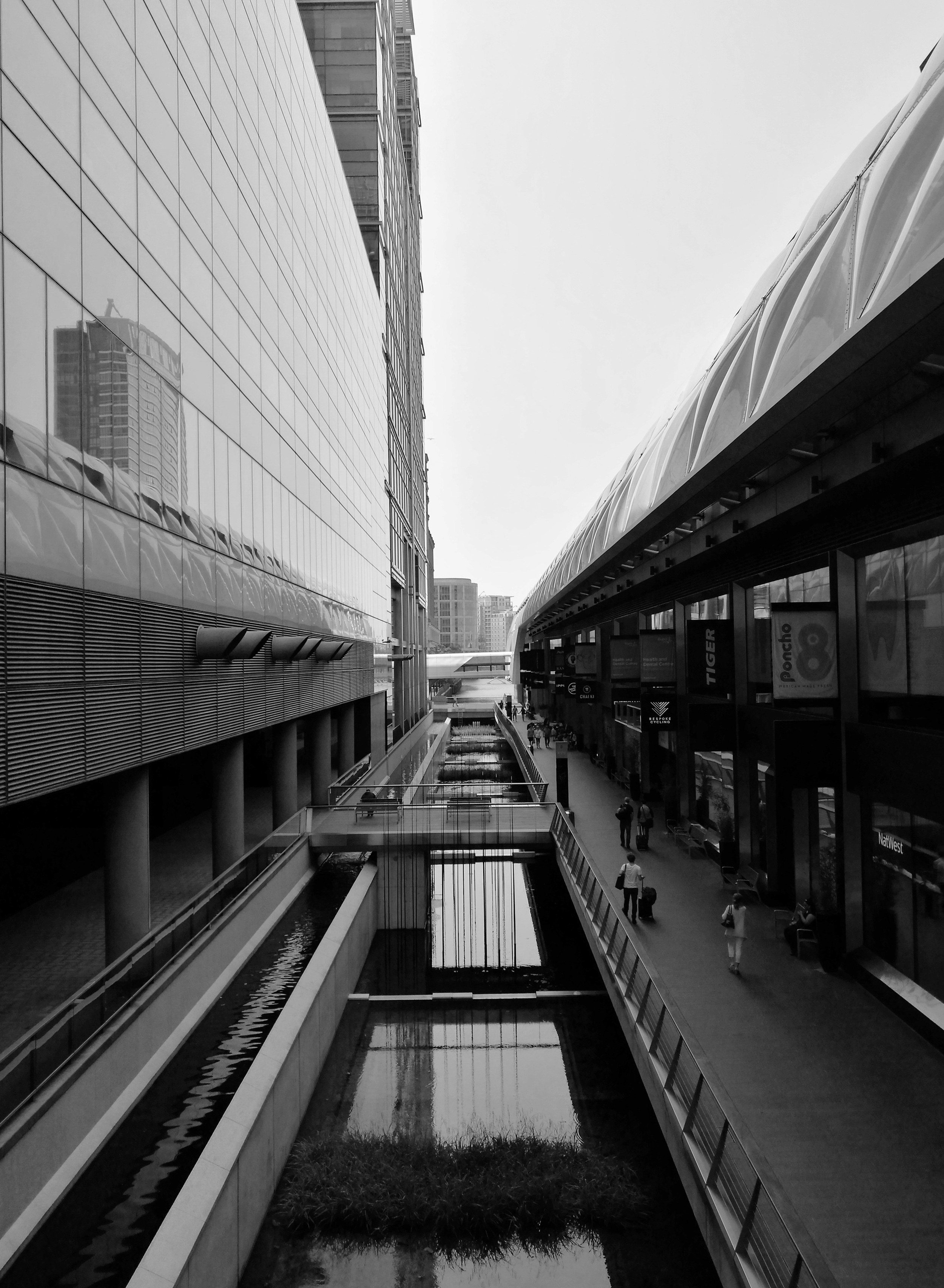
As I crossed into Canary Wharf, I was amazed by the sudden contrast from the 1970s concrete buildings I had just left to glass and steel now towering above me. I was now looking at some of Europe’s tallest skyscrapers - all mirroring the beautiful blue sky and fluffy clouds above. While I would never want to live or work in this financial district, I knew that when the sun was out – like it was today - it was an awesome place to photograph.
As I pointed the Huawei P9 towards the towering office blocks above, I appreciated the camera’s wide lens, which helped me to fit the enormous buildings in frame. This is something I’ve always used on my DSLR, but have never had the benefit of on a camera phone. And just like my camera, the P9 also comes with manual features like shutter speed and ISO, which enabled me to make the most of the heavy shadows over me when converting to black and white.
I soon found myself riding through London’s city centre, photographing the strange triangular shape of the Leadenhall Building, the dome-like roof of The Gherkin and the rugged rawness of the Barbican Estate. After a week of rain, I couldn't have asked for better weather to shoot in.
Towards Tower Bridge, I was confronted by a bottleneck of traffic, and soon realised that the bridge had risen to let a boat pass through. After years of living in this city, I’d never seen this old bridge open its gates.
Just as a cyclist rode ahead of me, the road over the bridge ahead lifted itself vertically. I quickly took out my phone and grabbed a shot of the man on his bike in front of the vertical road. As I looked at the photo I’d just taken, I realized how few people would have had the opportunity to capture such a moment. Standing in the middle of one of the world’s most famous bridges, I snapped a view that few others had seen. A spontaneous moment forever recorded - I was quickly falling in love with having a high quality camera phone.
As much as I love my DSLR, taking the P9 out for the day showed me that the concept of the camera phone has now been reinvented and can almost compete with even the best digital cameras. Unlike DSLRs however, it fits straight in my pocket, ready to capture any moment, at anytime. The marriage of EE’s super fast network and dual lens camera makes the Huawei P9 the perfect smart phone when I’m on the road and want to capture spontaneous moments.
All photos taken on the Huawei P9. In collaboration with EE, the 4G Network that’s 50% faster than O2, Vodafone and Three.
Creating digital cities: Interview with Ross Atkin /
Time is flying, and the world is developing at a rate of knots. Blink and we’re onto the next iteration of iPhone. The world is changing, and quickly. I mean, who knew that it’s been 100 years since the first BMW went into production. To mark its centennial year, the BMW Group and its four brands – MINI, BMW, Rolls Royce and BMW Motorrad, are exploring groundbreaking technology that will affect how we live over the next 100 years.
MINI particularly has always been recognised for its personalisation in design so it’s fitting that as part of the centenary year it has created the ‘Future Shapers’ project. Bringing together cutting edge designers Marcus Lyall, an audio-visual director, Margot Bowman, a multi-media artist, and Julia Koerner a fashion designer, to explore the future of personalisation in design, technology, fashion, and mobility.
MINI’s project inspired me to find other pioneers doing great things to improve our future. I’ve often wondered why technology isn’t more widely used to improve cities. It seems kind of stupid that we can chat face to face with friends on the other side of the world at any given moment, yet I have no idea when a free black cab is going to pass or when the traffic lights will change.
This is when I discovered Ross Atkin. I interviewed Ross - maker of Sight Lines - about his own vision for the future of mass personalisation.


As a designer who integrates technology into public spaces, and gives talks around the world on how we can better use technology in the city, Ross’s work is both inspiring and practical. Focusing his ideas on improving cities for the elderly and disabled, it’s clear his heart is in it for the right reasons.
Trained as an engineer, Atkin worked in design before getting involved in technology for cities. From this experience, his focus has always been on the small-scale – creating specific items for specific purposes, “by working from the ground up”, he told me “we’ll end up shaping an amazing future.”
Most of Ross’s work focuses on street design and using technology to help disabled people to navigate the city. He does things like create street lights which brighten for pedestrians with poor vision and has created an app which tells its user whether access routes are open. By following his ambition, his day-to-day work has branched out into a whole range of areas. He now creates a wide range of products, as well as advises companies and government bodies.
I had never given much thought before to how difficult it must be to move about the city as an elderly or disabled person. Ross explained to me the frustrations of people bumping into a temporary sign, or walking onto the road when there’s no way of knowing the pavement will end. I soon realised that for many people, the whole idea of trying to navigate the city – which changes every day – seemed pretty damn scary. My constant complains about bad bus timetables and traffic lights suddenly seemed pretty petty.
Chatting with Ross, it became clear to me that although his interests are broad, he’s mainly passionate about improving urban environments for people who need it most, “different people experience different things in cities which are inconvenient and annoying,” he told me, “I’m very interested in working with disabled and elderly people because the level of inconvenience they experience in cities is much higher. So, there is an amazing opportunity to make a big impact.”
With over half of the world’s population now living in cities, and with an ageing population, it’s easy to see just how big an impact this will have. The race for cities across the globe to become more beautiful and more ‘liveable’ has begun, and technology will no doubt play a huge role in the way this race folds out.


In addition to creating apps and responsive street furniture, one of Ross’s coolest technology projects is called ‘Sight Line’, which enables people with bad sight to learn all the details of construction sites through a transmitter, or app. Not only will the pedestrian quickly know how wide the construction site is, but they will know how long it will be there and even how to get around it.
“Construction works on footpaths is seriously hard for the visually impaired,” Ross told me, “if somebody can’t access the path that they normally take, and they have no idea how to get around the construction works, they can get completely stuck.”
The awesome thing about Sight Lines is that it taps into existing data already recorded by contractors, so there’s no extra management work needed. By using existing technology and information, Ross’s work is able to completely transform the way people interact with their surroundings. Pretty cool.
When I asked Ross how he imagined the future of cities, he told me that it would probably look something pretty similar to today. Slightly disappointed, I asked, “no changes at all?”
Ross explained, “I just don't really buy into the idea of having a ‘grand vision’ for how the city will look in the future. Instead, I’m focused on solving the problems that exist right now, with the technology we have today.” He imagines an incredible future with amazing improvements, but he doesn't think we’ll get there by drawing big plans. Instead, he thinks, we should focus more on making practical improvements to all the little things - one at a time.
With such simple, yet useful ideas, it was awesome to meet Ross who is at the forefront of creating products that will undoubtedly help to shape the future of our cities.
As part of MINI’s Future Shapers project, in the next few weeks I’ll have the opportunity to see how MINI is exploring its own vision of the future as part of its exhibition ‘BMW Group Future Experience", at the Roundhouse 17 – 26 June 2016. The exhibition will look at groundbreaking new technology that will affect how we live in 100 years. Visitors will be able to see a future MINI, a “Vision Vehicle”, that demonstrates applications of this new design and technology in an iconic car.
Visit MINI.co.uk for free tickets.
(And make sure you check out the full interview below!)
What I loved about Lisbon /
Last week I took off down to Lisbon, Portugal. I spent most of our days romping about the city on bikes, drinking beers and soaking up the glorious sunshine. It took just a matter of hours before I was in love with the city. Here's why:
1.Lisbon is life-sized
Lisbon's streets, buildings and squares have been built at a human-scale. And because of that, the entire city feels intimate. Its parks and squares are bustling with people, small bars and cafes flow out onto the busy streets, and the miniature laneways of the Alfama neighbourhood are full of people - young and old - chatting and hanging out. Forget huge shopping centres, oversized buildings and massive car parks, Lisbon is a life-sized city where people interact.
2. It's colourful
There's no doubt that a lot of cities around the world are a bit - well - grey. Take my city of London for example. It's a great place to live, but weeks on end of men in grey suits, surrounded by grey skies and grey buildings, can begin to get you down.
As my plane descended through the bright blue skies into Lisbon, I saw a city of reds, blues and yellows below. Exploring its streets, everything seemed to be splashed with colour. People's clothes, the building facades, and even the cars were bright and colourful. On top of that, there was loads of awesome street art spread right across the city for constant visual stimulation.
3. Getting around is easy
One of the best things about a small city is that there is little need to drive a car. And not only is Lisbon small, but it's filled with huge sidewalks and beautiful public spaces, bike paths, a underground metro and even a cool little tram network.
Local guide Jorge told me, "in the last few years so many people are riding push bikes. We still have some traffic problems but its getting so much better". Looking around, it was easy to see why. The government is spending tonnes of money into building segregated bike paths across the city and improving public spaces along main roads to encourage people to get out of their cars.
4. The food is amazing
Man, I loved Portuguese food! Tapas, seafood, Enchidos, beer and wine. Just about everything I ate in Lisbon was amazing. But it's not just what Lisboeta's (yep - that's what someone from Lisbon is called!) eat, but its where they eat. Amazing little tapas bars line the street, and hot nuts are cooked up on sidewalks. If you feel like a nibble, its super easy to grab a small cheese and bread snack. There are loads of awesome Portuguese dishes - but make sure you try a Francesinha, Portugese Steak or the local shellfish.
5. The locals love their city
You know a city is good when the locals themselves rave about it. From day one in Lisbon, everyone I met had such an awesome love for their city. From random old people telling me about the history of a place, or local dudes giving me a mini tour guide of their neighbourhood, the passion that people had for their town gave the whole trip such an amazing vibe.
Have you been to Lisbon? What did you love about it?
Inner Sydney’s best new architecture /
Back in January I returned to my home city of Sydney for a month. As the plane crossed the beautiful harbour, I could see dozens of new buildings now gracing the skyline. Here is - in my opinion - the best of inner Sydney’s new architecture.
1. One Central Park
When I was in my early 20s my friends and I would head to a music night on Sydney’s Broadway called Purple Sneakers... No doubt I was annoyed when the bar was to shut to make way for a bunch of new towers.
Turn the clocks forward a decade and all is ok! One Central Park is beautifully designed (by Jean Nouvel), and with a whole load of bars, shops and cafes, it’d be hard to argue that the new area isn’t an awesome addition to the city. Having now won dozens of design and sustainability awards around the world, this is the sort of development that makes Sydney's architecture a talking point around the world.
I was lucky enough to get a tour by friend of mine, and urban planner, John O’Callaghan. Check out the film below.
2. Dr Chau Chak Wing Building
Known for using unusual materials and incorporating a unique sculptural style, Frank Gehry is one of the world’s most celebrated architects.
In the past he’s been criticised for being a ‘Starchitect’ whose showey buildings overwhelm their surroundings.But in my mind, Gehry brings a sense of humanism to cities, which across the world, suffer from lifeless, boring buildings. And Sydney is no exception to this. It only takes looking at the city skyline to see that many of Sydney's existing tall building architecture is unimaginative and unambitious.
Whether you see it as ‘a beautiful paper bag’ or a ‘treehouse’, the new UTS building is a awesome new addition to the Sydney skyline.
Photo by Jason James
3. Paramount House
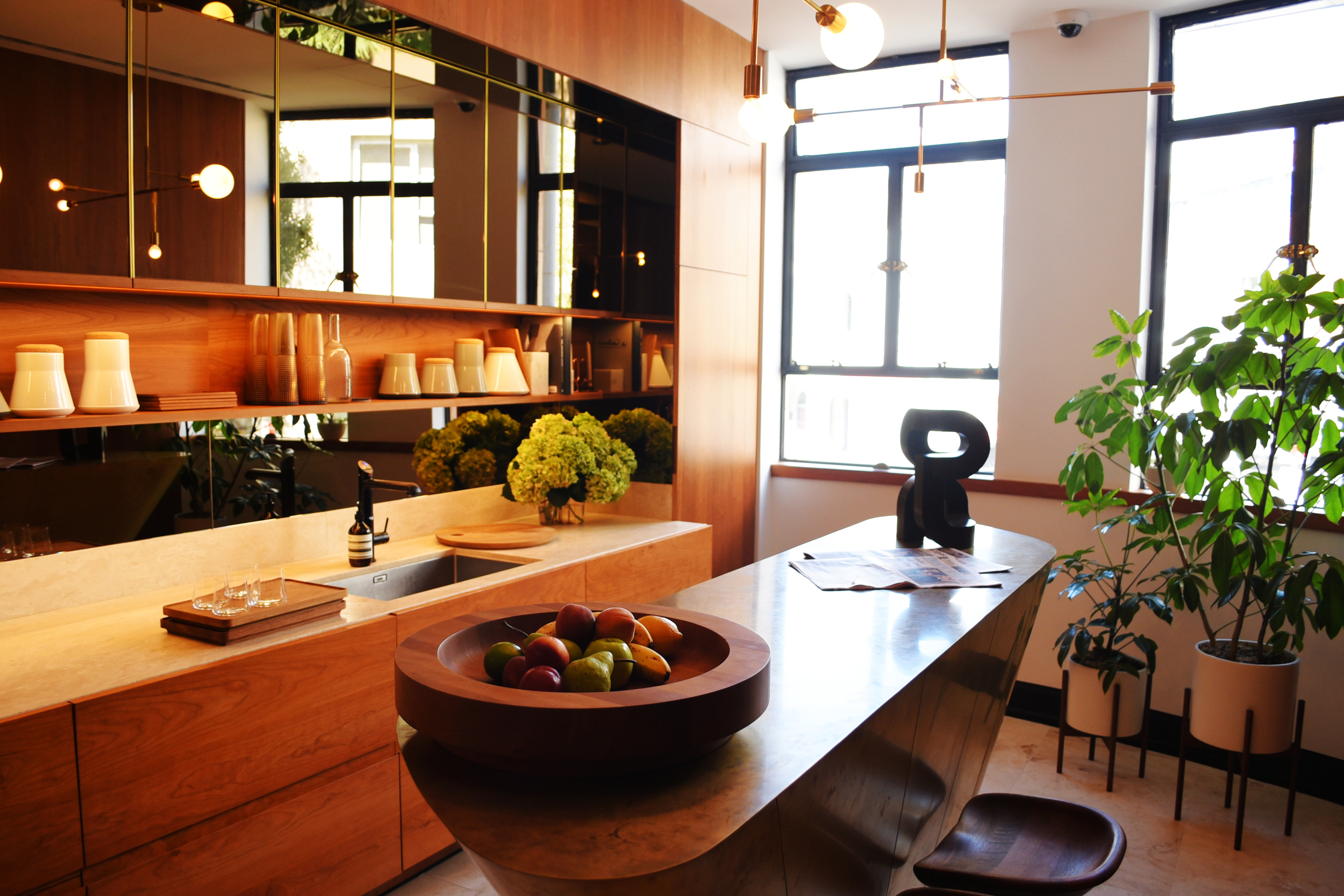
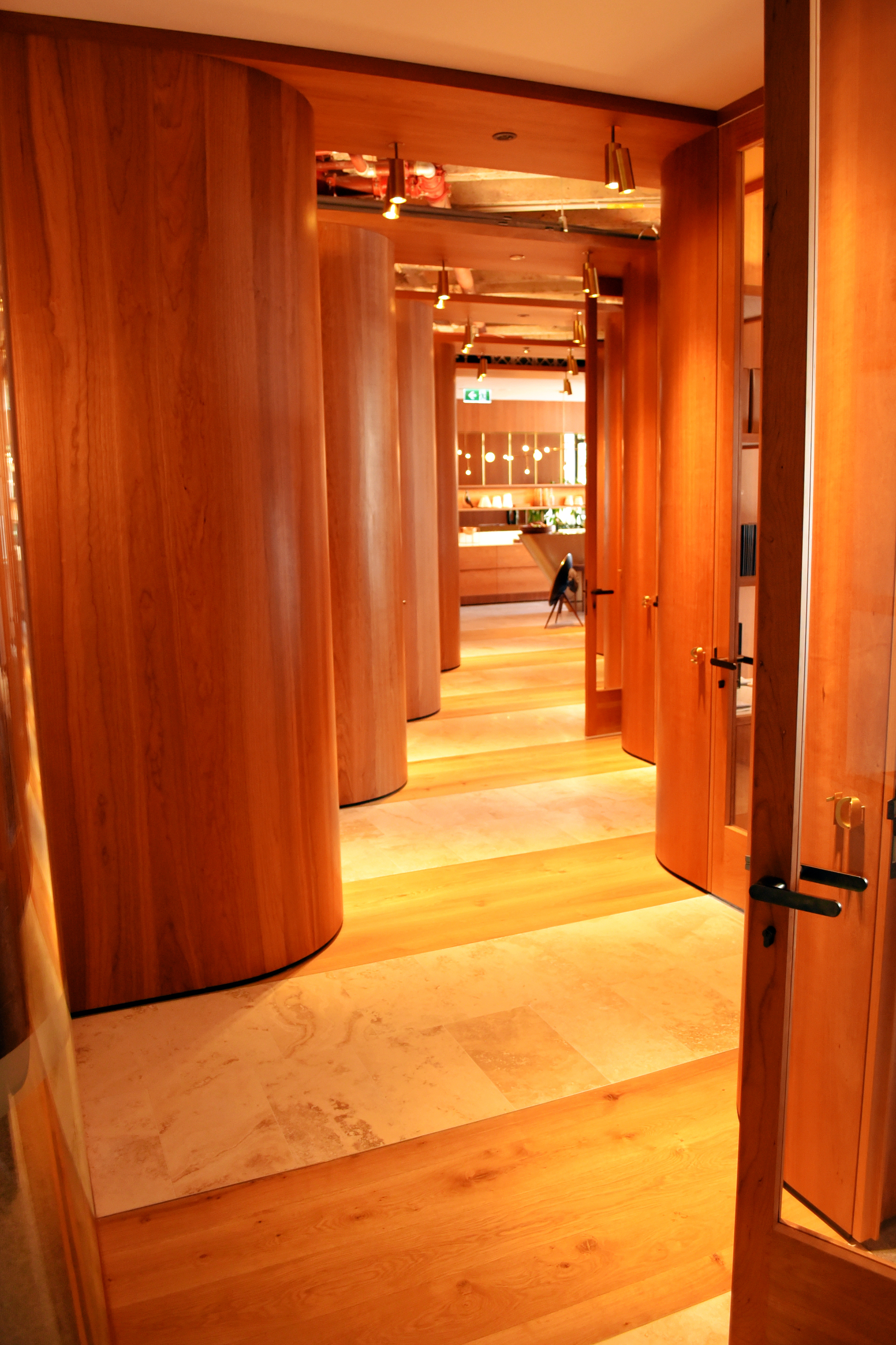
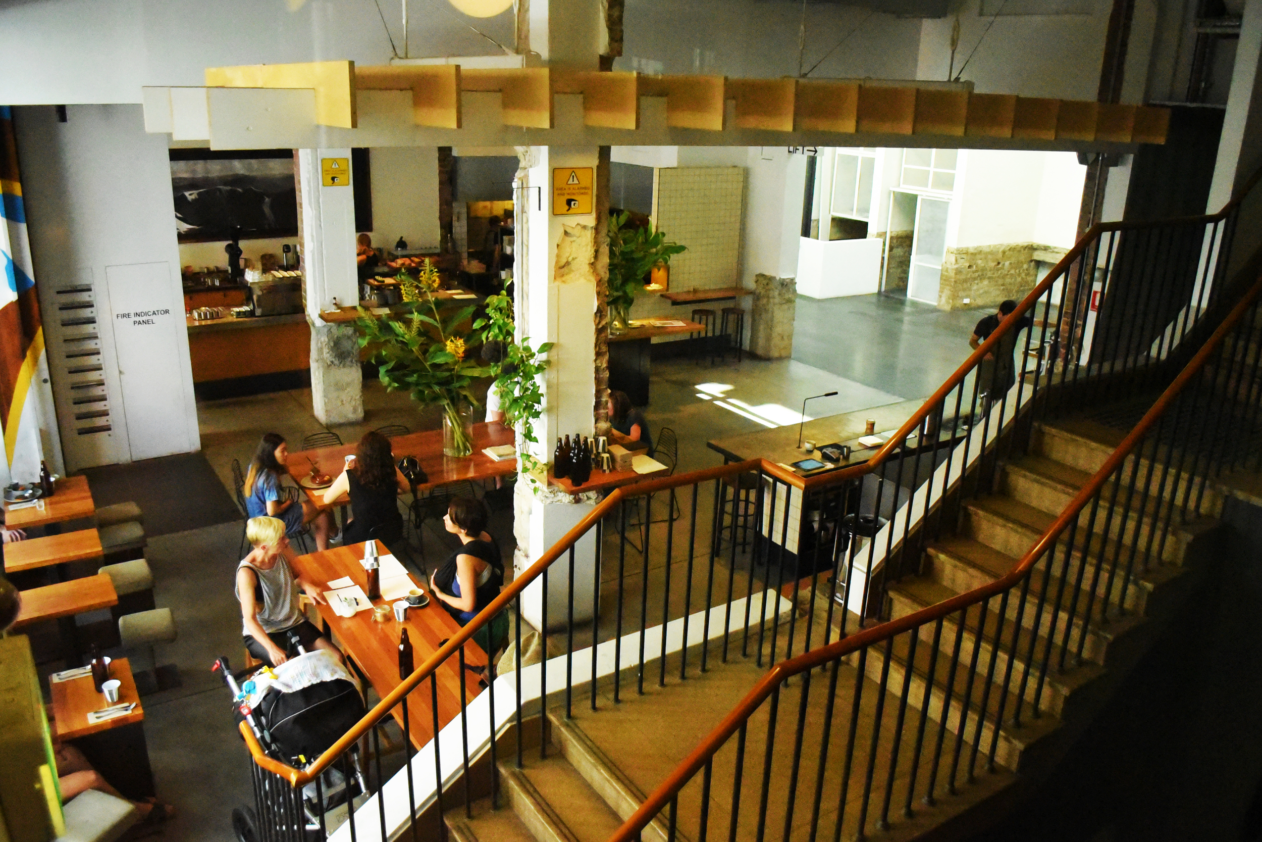
Through the enhancement of a beautiful 1940s art-deco building, the collaborative work of Woods Bagot architects, Fox Johnston Architects and Right Angle Studio, among others, has proved that Sydney's heritage buildings can be beautifully readapted into innovative and creative spaces for modern-day use.
The recent refurbishment has created a dynamic space for a mix of uses, including a cinema, café and workspaces. I was super impressed with Wood Bagot’s use of traditional joinery and artisan furnishings in its incredible shared office space.
Sydney has a strong record of destroying old buildings, so its awesome to see a project like this, which has seen the art-deco Paramount so nicely brought back to life.
I was originally going to include a section on the city's worst architecture, so that I could have a good old rant about Barangaroo. But for now... I'm keeping it positive!
Any other buildings that should be on this list?
